Givewp: fix: trend percentages in Reports mini-charts should be more informative
Bug Report
User Story
As an admin, I want percentages rendered with mini-charts on the Reports page to be more informative/intuitive so that I can more quickly get an accurate idea of donation trends on my site.
Current Behavior
Currently, these trend percentages compare the queried period with the previous period of equal length. This is intuitive and works well enough for smaller periods, but is significantly less helpful when exploring larger periods (especially if it is close to an all-time query).
Expected Behavior
These percentages should be helpful to users, and when entering a range where that may not be the case, should possibly be hidden (rather than confuse users more).
Bug Type
- [ ] This bug describes functionality that once worked as expected in version X.X.X.
- [x] This bug describes functionality that never worked as expected.
- [ ] I am not sure whether this functionality ever worked as expected.
Visuals

Acceptance Criteria
- [ ] Reports mini-chart trend percentages are predictable
- [ ] Trend percentages are intuitive/informative
- [ ] Users gain real value from trend percentages when they are present
 henryholtgeerts
All 5 comments
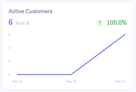
The core concept here is that a previous 0 is a special case, mathematically.
| Last Value | Current Value | Formula | Growth |
|------------|---------------|----------------|--------|
| 50 | 100 | (100 / 50) - 1 | 50% |
| 250 | 75 | (75 / 250) - 1 | -233% |
| 2500 | 0 | (0 / 2500) - 1 | -100% |
| 0 | 150 | 1 | 100% |
Programatically:
const numberIsZero = value => Math.abs(value) === 0;

const getTrend = (currentPeriodAggregate, lastPeriodAggregate) => {
    if (numberIsZero(lastPeriodAggregate) && numberIsZero(currentPeriodAggregate)) {
        return 0;
    }

    if (numberIsZero(lastPeriodAggregate)) {
        return 1;
    }

    return (currentPeriodAggregate / lastPeriodAggregate - 1);
};
 JasonTheAdams
on 22 May 2020
JasonTheAdams
on 22 May 2020
I will revisit the logic driving our calculations, but I'm fairly certain we had been simply hiding the percentages when the previous period had a total of 0 (since displaying a 100% increase is also not entirely true/useful in any way).
The greater issue I see is that if the previous period has any amount at all, it will be compared to the current period. In the screenshot form a user at the top of this issue, I imagine that April 2019 might have had some miniscule test donation amount (like $1), which would still cause our current percent trend calculations to result in the above percentages.
My real question in this issue is this: is there a point or ratio at which these kinds of percentages are just useless and should be hidden rather than confuse users? Or is it better to be consistently showing percentages, even when a 520,60,000% increase might appear?
henryholtgeerts
on 28 May 2020
We have two different topics, so let's address them separately:
Previous Value of 0
This is a tricky scenario. Any number divided by 0 is positive infinity, and that's not a meaningful percentage. So math doesn't help, here. There is no "right" way to handle this scenario, either, as it really depends on the context. The most common suggestion I'm finding is a "n/a" or omitted value. We'll need to think through this a bit more, though, as some metrics (such as donations refunded) will commonly move back and forth between 0. I'll do some more research on this, and I'm curious if @kevinwhoffman has any thoughts.
Small previous value
I don't personally find this problematic. If two periods have a value, then the math between them is clean. Even if the previous period is tiny, it's still accurate. In math and reporting, the viewer has to keep the comparison in mind. If the previous value is mostly non-data (e.g. 6 months before donations were accepted, so only 1 week has donations) it's really up to the reporter to recognize this. If someone is really using their reporting for any serious purpose (beyond, "oh cool, it's higher!") they will keep this in mind and compare two meaningful periods. I don't think we need to cap percentages, as an arbitrary cap would be hard to define and would lead to new confusion.
JasonTheAdams
on 28 May 2020
Previous Value of 0
We followed the Baremetrics behavior for GiveIO. If the previous value was 0, then any increase is considered a 100% increase. Obviously this isn't mathematically accurate because you can't divide by 0, but I think a "100% increase" matches the user's interpretation of the data.
Small previous value
I agree with @JasonTheAdams here.
Regarding large percent values, consider showing one decimal place only for values less than 100%. The idea is that the level of detail communicated by the trend is appropriate for the amount change that has taken place. If the metric has only changed a fraction of a percent, then decimals matter. If the metric has changed more than 100%, then the decimal is less relevant.
This also helps with design as it prevents large numbers from taking up too much horizontal space.
Examples
0.56would be displayed as0.6%100.56would be displayed as101%
 kevinwhoffman
on 28 May 2020
kevinwhoffman
on 28 May 2020
If it's helpful, @henryholtgeerts, I put together this function for GiveIO:
/**
 * Sets a fixed amount of decimal digits conditionally based on the number of signficant digits
 *
 * @since 0.9.0
 *
 * @param {Number} value – the value to format
 * @param {Number} totalDigits – the max digits
 * @param {Number} afterDecimal – the max decimal places
 * @returns {Number}
 */
function numberToDigits(value, totalDigits, afterDecimal) {
    const lengthBeforeDecimal = Math.floor(value).toString().length;

    return value.toFixed(Math.max(0, Math.min(afterDecimal, totalDigits - lengthBeforeDecimal)));
}

export default numberToDigits;
Examples:
numberToDigits(53.55, 4, 2); // 53.55
numberToDigits(53.55, 3, 2); // 53.6
numberToDigits(123456.58, 6, 2); // 123457
It will always show all the integer positions, but will only show as many decimal positions as is available based on the length of the value and the totalDigits. We're using this to conditionally show percentages on the GiveIO reports.
JasonTheAdams
on 28 May 2020
Related issues
 mathetos
·
4Comments
mathetos
·
4Comments
 gingerling
·
4Comments
gingerling
·
4Comments
 ravinderk
·
4Comments
mathetos
·
4Comments
ravinderk
·
4Comments
mathetos
·
4Comments
 DevinWalker
·
3Comments
DevinWalker
·
3Comments