Givewp: design(admin-plugins): improve content tab layout for add-on activations
Content Tab Layout
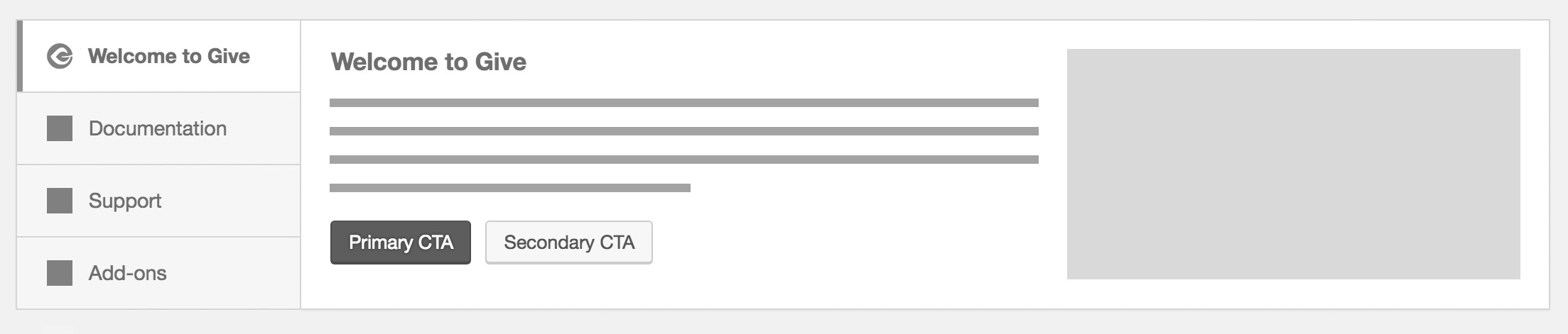
The content tab layout would be used for the Welcome, Documentation, and Support tabs. Each tab includes:
- Heading
- Description
- Primary and optional secondary CTA buttons
- Decorative image aligned right
Add-ons Tab Layout
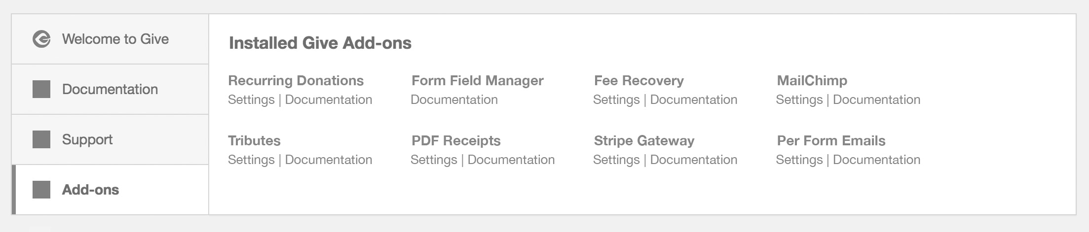
The Add-ons tab would have a special layout that simply lays out the installed add-ons in a grid with relevant links below each add-on title.
- Add-on title
- Documentation link
- Settings link (if available)
Installation Behavior
The scenarios below define the state of the tabs depending on how Give and its add-ons are activated.
- Give Core activated without add-ons
- Welcome (selected)
- Documentation
- Support
- Give Core + Add-ons activated together
- Welcome (selected)
- Documentation
- Support
- Add-ons
- Add-ons activated*
- Welcome
- Documentation
- Support
- Add-ons (selected)
*In the event that only add-ons are activated with an existing Give installation, then the Add-ons tab would be selected by default because it is assumed the user has already seen the welcome screen.
 DevinWalker
>All comments
Design Decision
Rather than scraping the entire welcome screen, I'm going to scale this back to simply take care of the original problem of excessive banner displays when activating multiple add-ons. Here's what I propose:
Single Add-on Banner:
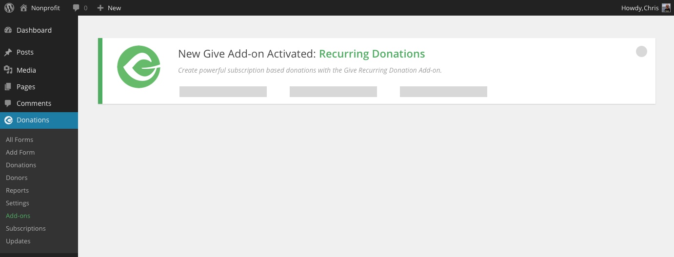
Same functionality, the only change is that I would like to now pull the add-on description from the plugin's details to display additional text below the main banner title.
Multiple Add-on Activations:
A tabbed interface displays on the left hand side with the same layout within the tabbed contents per the banner. The same content appears. Dismissing the notice removes it from the screen.
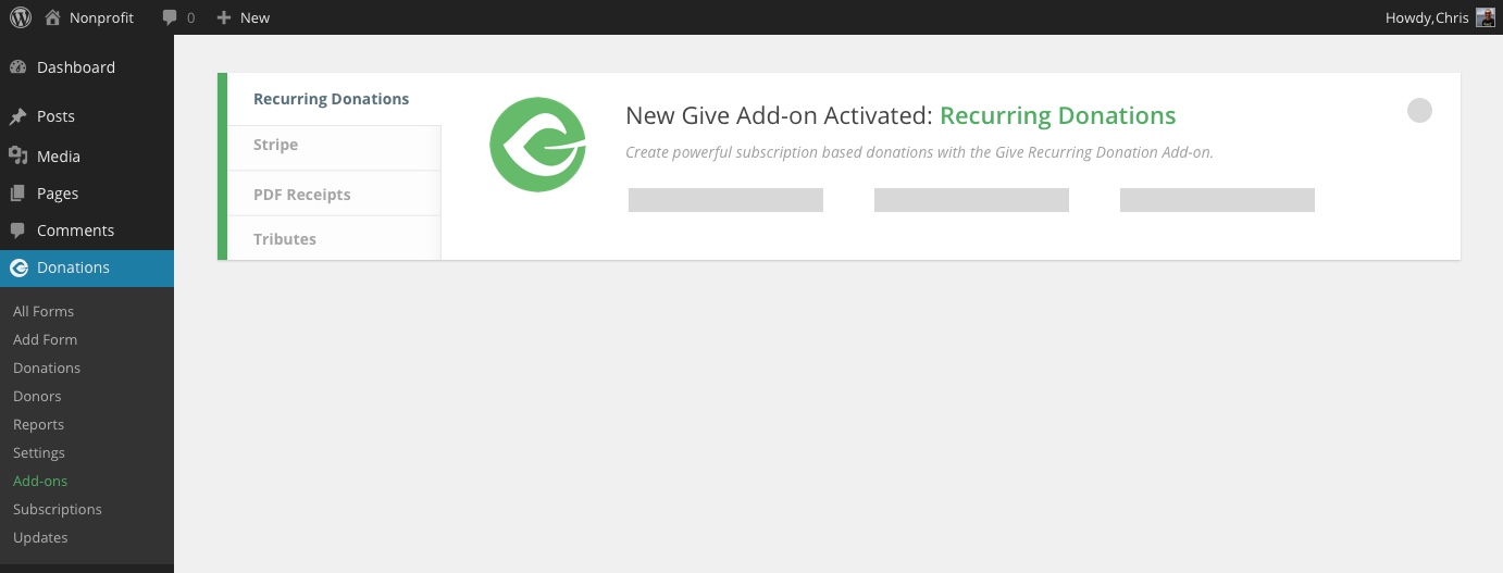
Notes:
- You shouldn't have to dismiss each individual tab to get the banner to be removed
- This banner will only display on the plugins listing screen
- Currently each banner adds a user meta when dismissed so that it doesn't appear again if reactivated. This will have to be refactored so that when the new banner is dismissed it saves a flag to user meta that the single banner was dismissed but when any give add-on is activated the banner should display again properly.
This should remove the blocker for you @emgk - please let me know if you have any questions.
DevinWalker
on 14 Mar 2018
Related issues
 samsmith89
·
3Comments
samsmith89
·
3Comments
 mathetos
·
3Comments
mathetos
·
4Comments
mathetos
·
3Comments
mathetos
·
4Comments
 vukvukovich
·
4Comments
vukvukovich
·
4Comments
 raftaar1191
·
4Comments
raftaar1191
·
4Comments
Most helpful comment
Design Decision
Rather than scraping the entire welcome screen, I'm going to scale this back to simply take care of the original problem of excessive banner displays when activating multiple add-ons. Here's what I propose:
Single Add-on Banner:
Same functionality, the only change is that I would like to now pull the add-on description from the plugin's details to display additional text below the main banner title.
Multiple Add-on Activations:
A tabbed interface displays on the left hand side with the same layout within the tabbed contents per the banner. The same content appears. Dismissing the notice removes it from the screen.
Notes:
This should remove the blocker for you @emgk - please let me know if you have any questions.