This keybinding only works on macOS, I am on macOS so I do not know whether Windows/Linux users see the same or not, but giving a non-working hint can be bad.
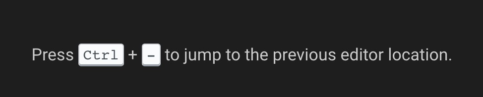
Go back: isOSX ? 'ctrl+-' : isWindows ? 'alt+left' : /*isLinux*/ 'ctrl+alt+-'
Go forward: isOSX ? 'ctrl+shift+-' : isWindows ? 'alt+right' : /*isLinux*/ 'ctrl+shift+-'
 kittaakos
All 7 comments
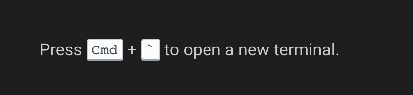
And this one is incorrect, we open a new terminal with Ctrl+` on each platform. Long sotry short; Cmd should be Ctrl.
kittaakos
on 20 Feb 2019
To piggy-back on this issue, I think the tips are awesome, but:
I find it really confusing that commands are blue, the color of links (I actually tried to click it):

Also, actual links, are white (maybe they should be blue, instead of the commands?):
And some tips are very long. As a lazy person, I'll never read this:

 jankeromnes
on 20 Feb 2019
jankeromnes
on 20 Feb 2019
Additionally, I suggest we add this tip:
Hold
Option+Shiftto select code vertically.
because vertical selection is really cool and useful, and more people could benefit from it.
And maybe the wording of:
Check docs.gitpod.io to learn what's possible.
could be improved, e.g. with something like "to learn more about what Gitpod can do for you"? Or "to see all the ways to fine-tune your developer experience"?
jankeromnes
on 20 Feb 2019
Hold
Option+Shiftto select code vertically.
For me the shortcut moves lines. What operation do you want to highlight?
 svenefftinge
on 20 Feb 2019
svenefftinge
on 20 Feb 2019
I agree with the blue. But would like to keep the links white, too. To make the messages less noise.
svenefftinge
on 20 Feb 2019
Hold
Option+Shiftto select code vertically.For me the shortcut moves lines. What operation do you want to highlight?
Ah, sorry for the ambiguous wording. I meant holding Option + Shift and clicking to select text (this selects vertically, instead of line-by-line). On a side note, Option + Shift + Arrow is so weird, its goal is to duplicate lines above or below?
jankeromnes
on 20 Feb 2019
One more small thing, the magnifying glass looks weird in the prefix-tip URL bar:
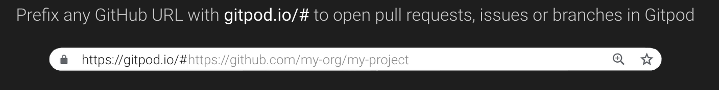
I initially thought it was placed there by hand (padding on right seems exaggerated, and vertical alignment looks off) but then I realized that it's this way in Chrome's URL bar too.
Still, can we remove it? I feel like the magnifying glass distracts from the prefix, and doesn't add any value.
jankeromnes
on 20 Feb 2019
Related issues
 Kreyren
·
3Comments
Kreyren
·
3Comments
 alesanchezr
·
3Comments
alesanchezr
·
3Comments
 tekumara
·
3Comments
tekumara
·
3Comments
 ColbyWTaylor
·
3Comments
ColbyWTaylor
·
3Comments
 PatMyron
·
3Comments
PatMyron
·
3Comments