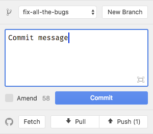
Github: It's not immediately obvious that the 'branch switcher' & 'fetch, pull/push' buttons are actions
When playing with the package for the first time I staged and committed some changes, but when it came time to push them I couldn't work out how at first.
I basically assumed that the footer was purely informational and didn't realise that I could click on the arrows (even though the number changed!) or the other buttons.

Perhaps it might be an idea to give the buttons a highlighted state on first run?
Versions
Atom Version (atom --version):
Atom    : 1.13.0
Electron: 1.3.13
Chrome  : 52.0.2743.82
Node    : 6.5.0
GitHub Package Version (git --git-dir ~/.atom/packages/github/.git rev-parse head): bea2da8b554d8528dae3065a2917aec8aab05570
 lukehefson
All 7 comments
Thanks for the feedback @lukehefson! @simurai perhaps you have 💭 ?
 kuychaco
on 13 Jan 2017
kuychaco
on 13 Jan 2017
We could add an underline to make it more clear that you can click it.

Same as the updates and grammar picker. Although it's not really a convention that all packages follow. Deprecation cop doesn't, for example.
https://github.com/atom/github/issues/311 might also help to make it more clear that it's an action. Although only for pull/push.
 simurai
on 17 Jan 2017
simurai
on 17 Jan 2017
The issue I had is that I didn't know where to find Push/Pull in the first place (I just didn't think to look in the status-bar – so I'm not sure that a underline on hover (or even the changes in #311) would fix this 🤔.
lukehefson
on 17 Jan 2017
(I just didn't think to look in the status-bar – so I'm not sure that a underline on hover (or even the changes in #311) would fix this 🤔.
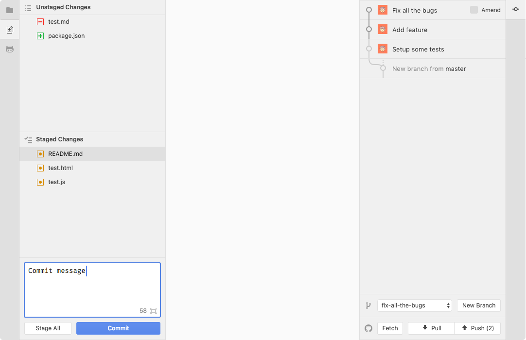
Oh, I see. Hmm.. Having the word "Push" instead of just the arrow icons might still grab your attention since it's right underneath the commit button? Here in context:

In the past, we had it at the top of the panel, but moved it into the status-bar to save space: https://github.com/atom/github/pull/276
There are also options to educate on first use, like having a tooltip appear after committing for the first time. But would still be nice to make it more intuitive without it.
Also pinging @atom/design for 💭. And @mdo that had similar feedback.
simurai
on 18 Jan 2017
From #808
For a purely UI user:
- In order to Push changes, you'll need to open the git panel to add changes and commit. So the panel will already be open before Push.
- Without opening the git panel, the only use for the status bar buttons is Pull.
To conclude:
- There is a discoverability issue
- There is an extra step in opening the little panel in the bottom to click the button
- This split in the git UI elements makes it harder to understand these things belong to the same system
- The panel currently only serves those who want to pull changes and use commands to do the rest
I'm going to see if I can make hiding the buttons in popups optional, turning #276 into a true/false setting
 PascalPixel
on 24 Oct 2017
PascalPixel
on 24 Oct 2017
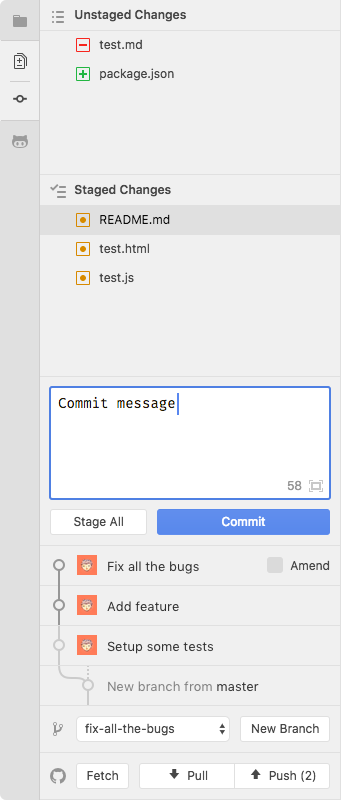
If Persistent Controls for Docks get added and the GitHub package moves to the left, it's probably even harder to find the branch switcher and fetch/pull/push buttons hidden in the tooltips.
Here how it would look when they get added back to the panel. But instead at the top like they used to be #276, around the commit message input. So that travel distance are kept to a minimum. Then a common workflow would go like this:
- Stage files
- Make sure you're on the right branch
- Commit
- Push
The extra space needed for the two rows of buttons shouldn't be too big of a concern. 10% of users have a small screen, like an 11 inch MacBook Air, that might feel cramped, but still "usable". 75% of users have a 13 inch or bigger.
768px (11 inch) | 900px (13 inch)
--- | ---
 |
| 
simurai
on 13 Dec 2017
Another UI iteration in case "Persistent Controls for Docks" https://github.com/atom/atom/issues/16116 become reality (which I hope 🙏 ):
I would find it super useful be able to see the last few commits. But that would need even more space, so how about splitting the Git Panel into two dock items.
- The unstaged/staged changes and the commit input
- History, branch switcher and fetch/pull/push
As default they would still be in the same dock group, appearing together (on top of each other):
But for very small screens, you could break them apart and toggle between them. Or move one to the right:
Again, most users could keep it together, but there would be the option to rearrange them however you like.
simurai
on 15 Dec 2017
Related issues
 sebastianroming
·
4Comments
sebastianroming
·
4Comments
 Ben3eeE
·
4Comments
simurai
·
3Comments
Ben3eeE
·
4Comments
simurai
·
3Comments
 jazeee
·
3Comments
jazeee
·
3Comments
 danielbayley
·
5Comments
danielbayley
·
5Comments
Most helpful comment
If Persistent Controls for Docks get added and the GitHub package moves to the left, it's probably even harder to find the branch switcher and fetch/pull/push buttons hidden in the tooltips.
Here how it would look when they get added back to the panel. But instead at the top like they used to be #276, around the commit message input. So that travel distance are kept to a minimum. Then a common workflow would go like this:
The extra space needed for the two rows of buttons shouldn't be too big of a concern.
10%of users have a small screen, like an 11 inch MacBook Air, that might feel cramped, but still "usable".75%of users have a 13 inch or bigger.768px (11 inch) | 900px (13 inch)
 |
| 
--- | ---