Githawk: Move the “lock” button to below the divider line
Is your feature request related to a problem? Please describe.
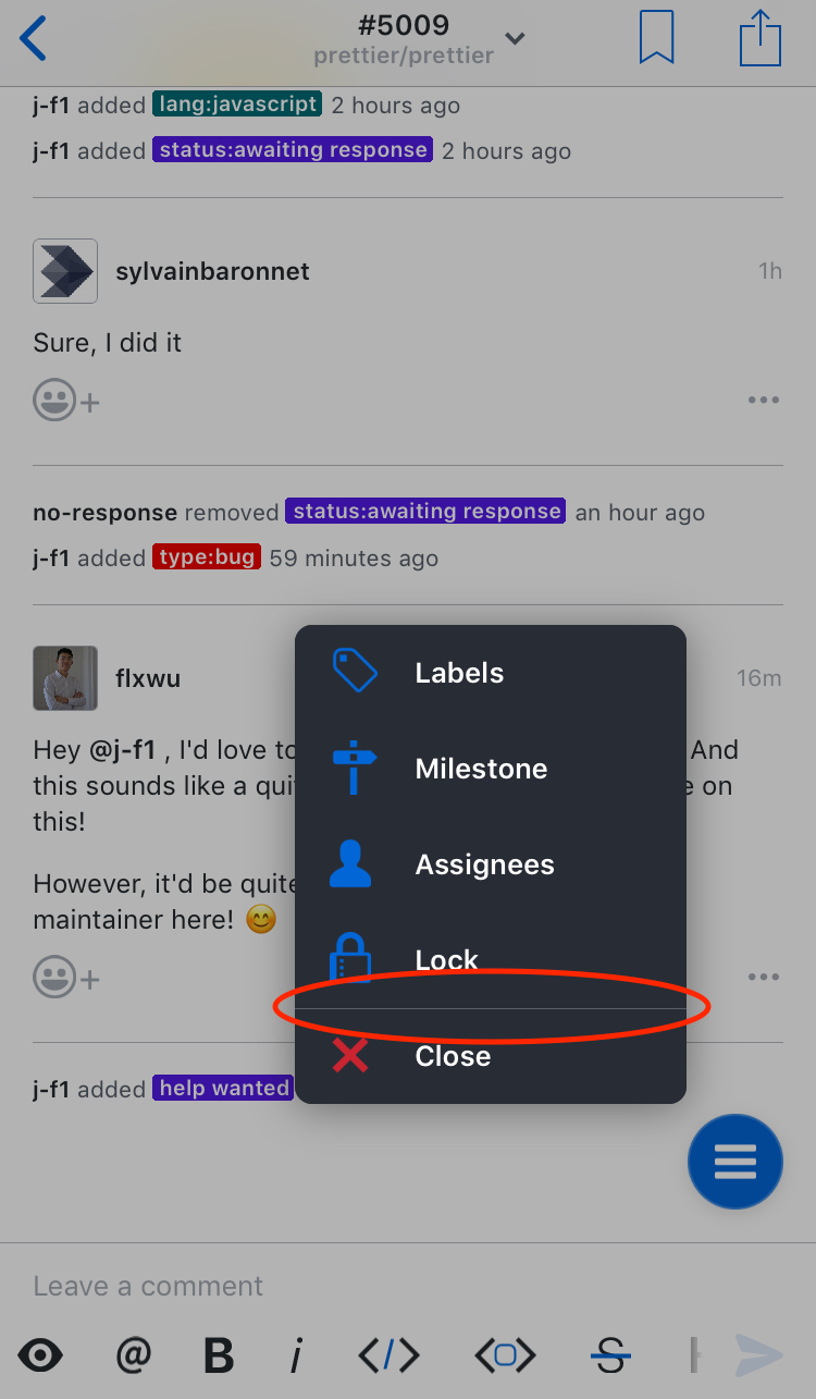
When clicking on the hamburger button to modify the issue, the buttons are grouped into two groups: the close option and everything else:
Describe the solution you'd like
I suggest this divider be moved up one spot, above the lock button. This would divide the options into ones that prompt for more information (above the line) and ones that take action immediately (lock/close).
Describe alternatives you've considered
We could leave it as-is, but there’s currently no indication that locking the issue will lock it right away instead of prompting for confirmation, like all similarly-styled options do.
 j-f1
j-f1
All 8 comments
I agree
Maybe a color change
Sent with GitHawk
 Huddie
on 24 Aug 2018
Huddie
on 24 Aug 2018
I’m down with this. Lift gray would be good for the icon. Easy issue for someone to pick up.
Sent with GitHawk
 rnystrom
on 13 Sep 2018
rnystrom
on 13 Sep 2018
This issue should be able to be closed
Huddie
on 30 Sep 2018
FYI @Huddie if you put “Fixes #XXX” (where XXX is an issue number) in the initial comment of a PR, the issue will be closed when the PR gets merged.
j-f1
on 30 Sep 2018
@j-f1 really?! Even if I don’t normally have the ability to close the issue? That’s cool. Thank you
Sent with GitHawk
Huddie
on 30 Sep 2018
@Huddie https://help.github.com/articles/closing-issues-using-keywords/
Sent with GitHawk
 BasThomas
on 30 Sep 2018
BasThomas
on 30 Sep 2018
I think the requirement is that either you or the person merging the PR has the ability to close the issue (although I’m not sure about the former).
j-f1
on 30 Sep 2018
@j-f1 Well, thanks for the tip. I never knew that.
Huddie
on 30 Sep 2018
Related issues
rnystrom
·
3Comments
 jessesquires
·
3Comments
jessesquires
·
3Comments
 weyert
·
3Comments
rnystrom
·
3Comments
weyert
·
3Comments
rnystrom
·
3Comments
 Iron-Ham
·
3Comments
Iron-Ham
·
3Comments
Most helpful comment
FYI @Huddie if you put “Fixes #XXX” (where
XXXis an issue number) in the initial comment of a PR, the issue will be closed when the PR gets merged.