Updated the background of the Merge Button in #2049:
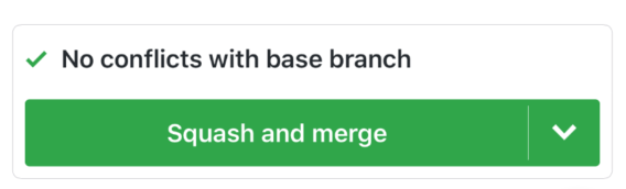

Is this consistent with the design patterns in the app? There aren't any gradients applied elsewhere. On the other hand, the merge button is one of the larger UI elements on which a gradient background would stand out.
 BrianLitwin
All 5 comments
I’m torn if it’s consistent.
Looks great but there’s no gradient anywhere else. That being said, there aren’t many places a gradient could be.
Labels seems to be the closest thing that aren’t gradient and I could see the distinction being actionable vs non-actionable.
Sent with GitHawk
 Huddie
on 6 Aug 2018
Huddie
on 6 Aug 2018
Ya I think it looks slick, just wondering about consistency. Maybe we should just try it and see how it feels? Since this button is huge and kind of special, it could emphasize the importance.
Sent with GitHawk
 rnystrom
on 7 Aug 2018
rnystrom
on 7 Aug 2018
Seeing this on the phone I have the same feeling. Looks nice but a bit out of place. Maybe if we went the card design route rather than the horizontal divider if would have fit in better. I’d say if the app ever moved slightly away from the flat look it employs right now, this button would be amazing for it.
Sent with GitHawk
Huddie
on 9 Aug 2018
Idk I’m actually kind of digging it. Let’s try it for a week and see if it sticks.
Sent with GitHawk
rnystrom
on 9 Aug 2018
I think this can be closed @BrianLitwin
Huddie
on 30 Sep 2018
Related issues
rnystrom
·
3Comments
 Iron-Ham
·
3Comments
rnystrom
·
3Comments
Iron-Ham
·
3Comments
rnystrom
·
3Comments
 BasThomas
·
3Comments
BasThomas
·
3Comments
 viktorgardart
·
3Comments
viktorgardart
·
3Comments
Most helpful comment
Idk I’m actually kind of digging it. Let’s try it for a week and see if it sticks.
Sent with GitHawk