Githawk: Making send button inline with edit buttons
I love the new send icon but I still feel that two button stacked above each other has abit of a tight feel (Send + 1 of the bar buttons)
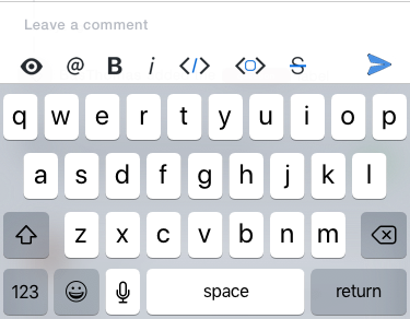
I know slack has the send button on inline with the bar items.
Heres a quick render of the concept.
 Huddie
All 6 comments
Considering the actions scroll, how would we render the rest of them? Maybe a gradient on the right and fix the send button?
I’m pretty open to this idea. The send button and manage button are too much visual clutter to me
Sent with GitHawk
 rnystrom
on 6 Aug 2018
rnystrom
on 6 Aug 2018
Yes a gradient was what I was thinking would look great!
Sent with GitHawk
Huddie
on 6 Aug 2018
Ok I’m sold
Sent with GitHawk
rnystrom
on 6 Aug 2018
Yes! As much as I’d love to help with this one I’m not sure I could do it justice. I looked into it and seems like it will require a bit of restructure change In MessageViewController.
Just out of curiosity, MVC doesn’t have the edit bar below it that’s added in GitHawk itself right?
Sent with GitHawk
Huddie
on 6 Aug 2018
It doesn’t, but I’ve got some ideas to unblock this one! Shouldn’t be an issue.
Sent with GitHawk
rnystrom
on 7 Aug 2018
Sent with GitHawk
Huddie
on 9 Aug 2018
Related issues
 weyert
·
3Comments
weyert
·
3Comments
 BasThomas
·
3Comments
rnystrom
·
3Comments
rnystrom
·
3Comments
weyert
·
3Comments
BasThomas
·
3Comments
rnystrom
·
3Comments
rnystrom
·
3Comments
weyert
·
3Comments
Most helpful comment
Considering the actions scroll, how would we render the rest of them? Maybe a gradient on the right and fix the send button?
I’m pretty open to this idea. The send button and manage button are too much visual clutter to me
Sent with GitHawk