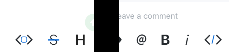
Githawk: Leave a comment input section feels a bit cluttered
This new update shrunk the input section of the issue page and changed the send button.
1) I personally am a bigger fan of the old send button
2) The input section feels a bit cramped now that its shrunk, some padding should be added between the textfield and the options section (preview/@/bold...etc), like it used to have.
Example (Idk how to do that cool UI measure/outline stuff):
🎨 design
 Huddie
👍1
All 3 comments
Agreed, it’s really tight. I’ll give it some more spacing
Sent with GitHawk
 rnystrom
on 30 Jul 2018
rnystrom
on 30 Jul 2018
👍1
@rnystrom Cool! Awesome updates this weekend!
Sent with GitHawk
Huddie
on 30 Jul 2018

 BasThomas
on 30 Jul 2018
BasThomas
on 30 Jul 2018
👍3
Was this page helpful?
0 / 5 - 0 ratings
Related issues
BasThomas
·
3Comments
BasThomas
·
3Comments
 weyert
·
3Comments
BasThomas
·
3Comments
BasThomas
·
3Comments
weyert
·
3Comments
BasThomas
·
3Comments
BasThomas
·
3Comments
Most helpful comment
Yeah, definitely too small of a hit area at the moment
Sent with GitHawk