Githawk: Small tweak on tab bar icons
 zhubofei
All 7 comments
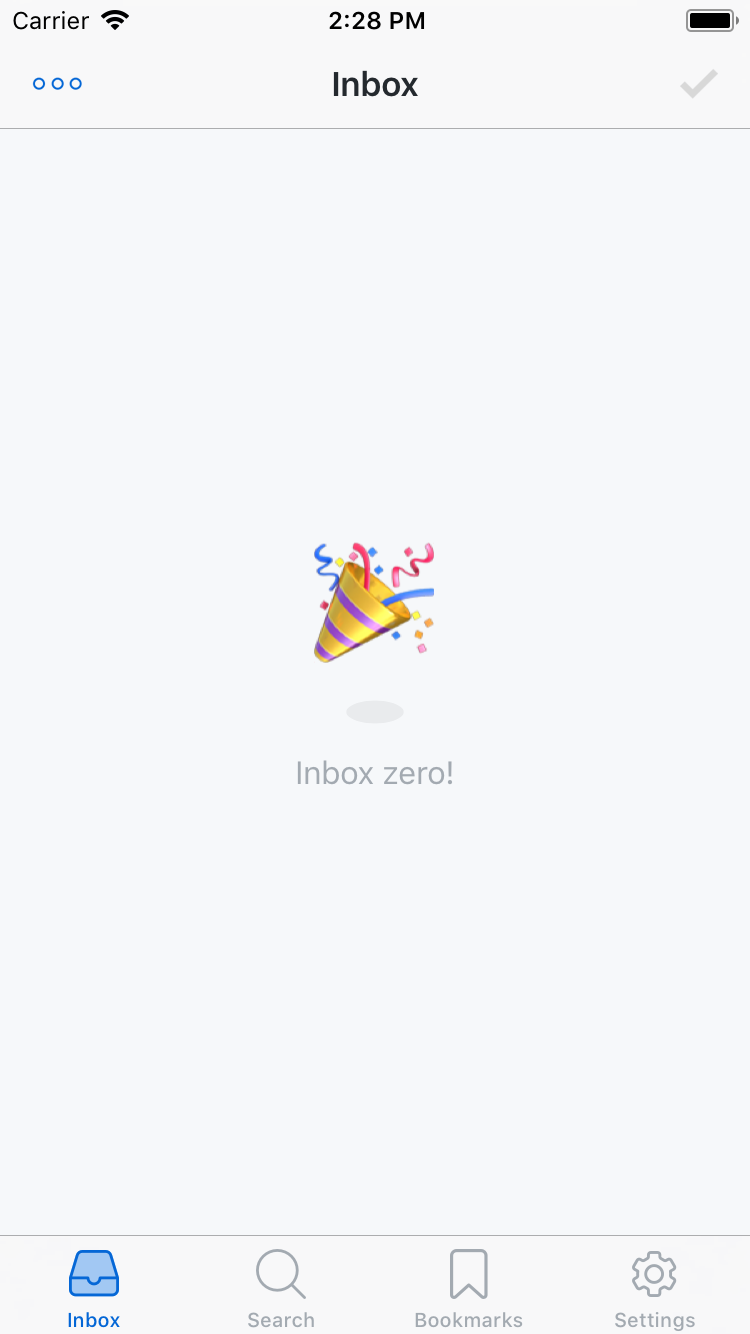
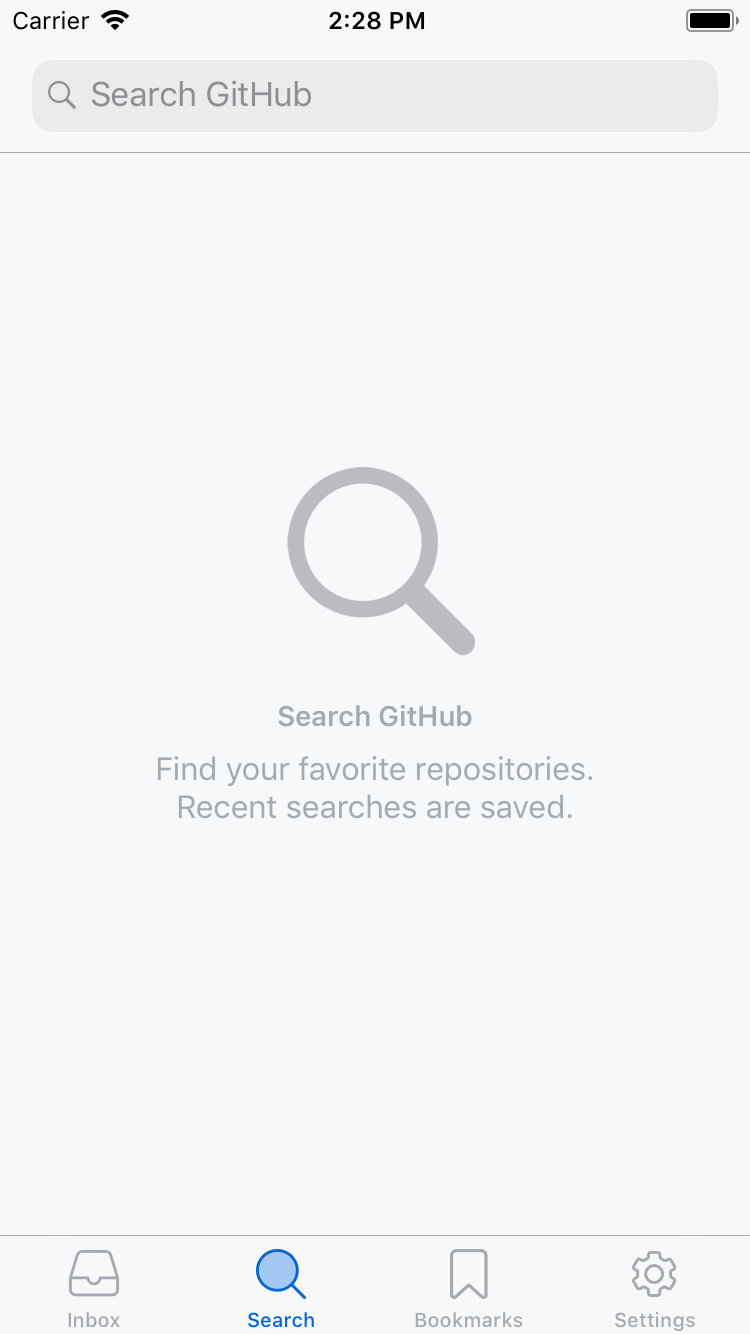
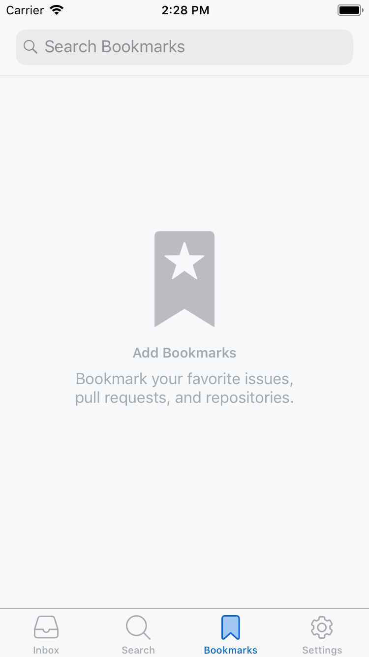
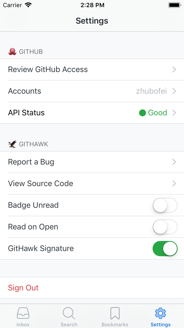
Remove sharp edges and give them the same stroke-thickness. Bring tab bar icons closer to the Outlook style in #1271
zhubofei
on 20 Jul 2018
Just keep bookmark consistency (issue #1950)
Sent with GitHawk
 Huddie
on 20 Jul 2018
Huddie
on 20 Jul 2018
Is the font heavier too?
Sent with GitHawk
 rnystrom
on 20 Jul 2018
rnystrom
on 20 Jul 2018
@rnystrom The font is the same. iPhone8 simulator might be the reason why it looks heavier.
zhubofei
on 20 Jul 2018
@zhubofei @rnystrom If you look at Outlook or Twitter they remove the text from the Tabbar. I think this could allow for a cleaner look in GitHawk as well. (#1956)
Huddie
on 20 Jul 2018
👍1
I'm gonna make a call to leave them as is. Don't feel persuaded that this is the right change.
rnystrom
on 29 Jul 2018
@rnystrom I agree! Icons are also of lower priority compare to feed layouts. These tweaks can wait until the layouts are stable 👍
zhubofei
on 29 Jul 2018
👍1
Was this page helpful?
0 / 5 - 0 ratings
Related issues
 BasThomas
·
3Comments
rnystrom
·
3Comments
BasThomas
·
3Comments
rnystrom
·
3Comments
 weyert
·
3Comments
BasThomas
·
3Comments
BasThomas
·
3Comments
weyert
·
3Comments
BasThomas
·
3Comments
BasThomas
·
3Comments