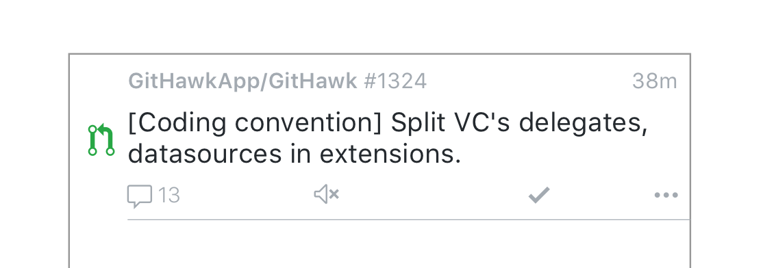
Teaching myself Sketch.app and using the inbox cell as a starting point. I'm trying to accomplish a few things:
- Faster interactions (tap button instead of hidden swipe)
- More, balanced whitespace
- Better information hierarchy
cc @orta you've always had great insight!
 rnystrom
All 9 comments
One thing I can see being tricky with this (if I am correct that the buttons are supposed to be buttons) is tap targets being too small.
 BasThomas
on 15 Apr 2018
BasThomas
on 15 Apr 2018
Taking a lot of inspiration from Twitter where I find these little buttons really easy to use. Tap targets are easy to adjust.

Sent with GitHawk
rnystrom
on 15 Apr 2018
I'm into it.
The "..." should probably have the same right margin as the date above. Perhaps a 0 comment could be greyed vs one with comments which could have darker text/type?
 orta
on 15 Apr 2018
orta
on 15 Apr 2018
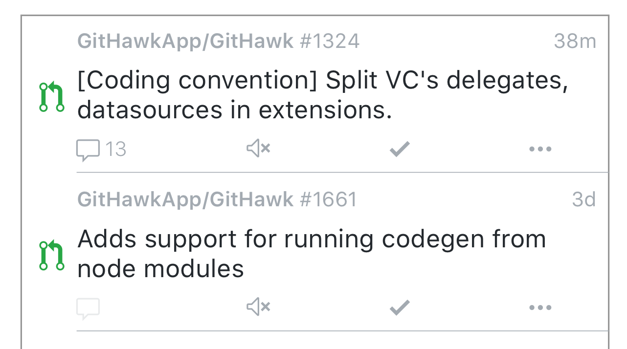
Pinched in the ... so its the same padding as comments. Here's a quick attempt at what 0 comments would look like.
What do you all think about the "swipe to read" feature? Keep it as another option.
Some other things that I'm going to mock up to see how it looks:
- "Last timeline action" summary
- We can get the last timeline item via GraphQL. Could maybe show what the last thing was (commit, comment, assign, etc)
- Bookmark
- Maybe put this is in the ... menu
- Or replace the mute/unmute toggle w/ bookmark? Put the mute stuff in the ...?
- ... menu can contain:
- Share
- Go to repo
- Other ideas?
- Labels
- This might be way too much, but we can also get the labels via GraphQL
rnystrom
on 15 Apr 2018
My suggestion @rnystrom would be:
Swipe right to read.
Swipe left to bookmark
… menu can also contain “copy link” and “mute/unmute”
Sent with GitHawk
 jdisho
on 15 Apr 2018
jdisho
on 15 Apr 2018
Also another idea would be to replace “... more” with a long press on the cell? 🤔
Sent with GitHawk
jdisho
on 15 Apr 2018
@jdisho you're suggesting no buttons?
rnystrom
on 16 Apr 2018
Yes, no buttons, just the the icons for comments, un/subscribe indicating the un/subscribe action and ....
What do you think @rnystrom? 😊
jdisho
on 16 Apr 2018
Hmm, since marking read is the primary action that you'd take here, I think it deserves a button vs a hidden interaction.
rnystrom
on 16 Apr 2018
Related issues
BasThomas
·
3Comments
rnystrom
·
3Comments
rnystrom
·
3Comments
 weyert
·
3Comments
BasThomas
·
3Comments
weyert
·
3Comments
BasThomas
·
3Comments
Most helpful comment
Taking a lot of inspiration from Twitter where I find these little buttons really easy to use. Tap targets are easy to adjust.
Sent with GitHawk