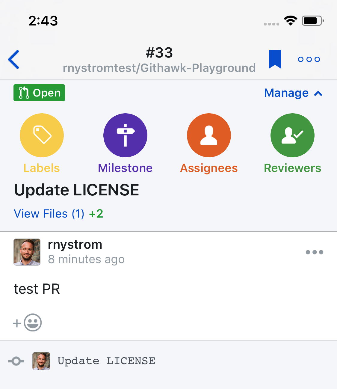
Githawk: Manage buttons have different colors
- White icon
- Different colors
- Labels same color as bg
https://dribbble.com/shots/3990108-Graphic-designers-community
This should reduce time thinking about what button is what, instead use color and pattern matching.
Bug Report Dump (Auto-generated)
Version 1.16.0 (1513090523)
Device: iPhone X (iOS 11.2)
TestFlight: true
 rnystrom
All 12 comments
Love this!
 Sherlouk
on 16 Dec 2017
Sherlouk
on 16 Dec 2017
Feedback on this direction? I pulled the colors from this page's header graphic (looking for diverse brand colors).
Not crazy about the yellow, pretty hard to read.
It's pretty busy once you start adding labels and other stuff. Here's the design w/ just blue:
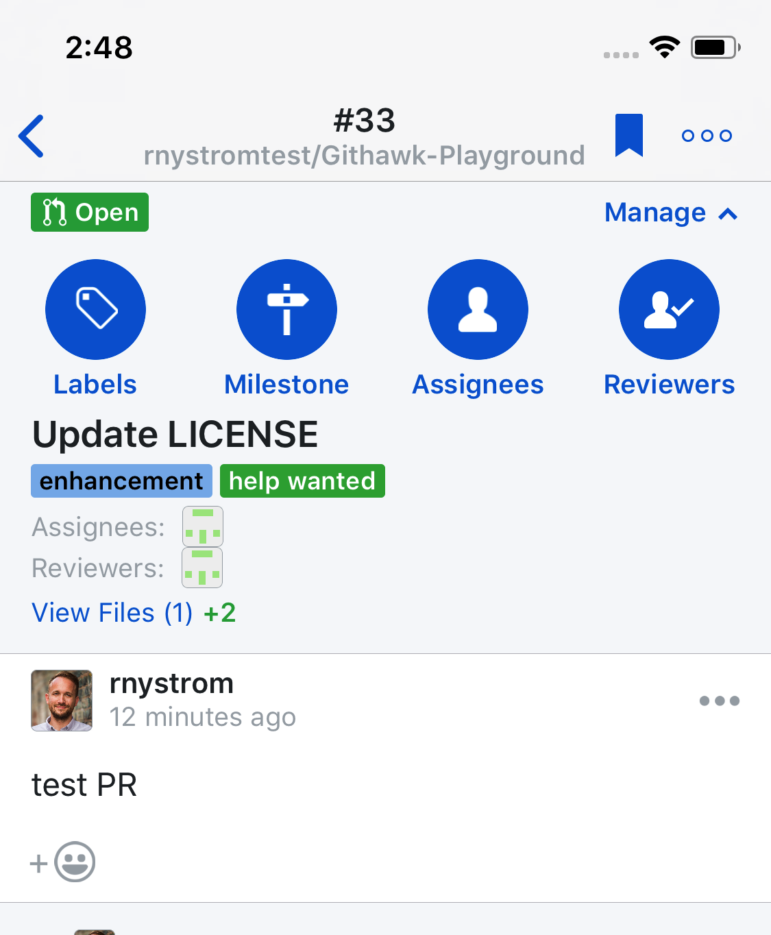
(caught another layout bug w/ assignees + reviewers)
rnystrom
on 17 Dec 2017
Prefer colors over all blue, but probably because the dark blue is screaming a bit too much with some many large circles.
 BasThomas
on 17 Dec 2017
BasThomas
on 17 Dec 2017
Also the contrast with the yellow one isn't the best.
BasThomas
on 17 Dec 2017
Prefer the colors one (minus the yellow)!
Sherlouk
on 17 Dec 2017
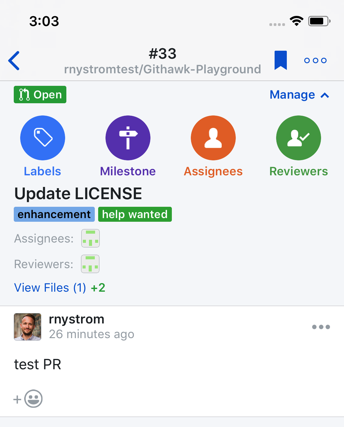
Here's GitHub's lighter blue, and a shot w/ a lot of other stuff going on. Too busy? Or you liking it? I think I'm going to ship a beta w/ this and try it out myself.
rnystrom
on 17 Dec 2017
I'd genuinely like to see it with a row two for Lock and Close tbh!
I also think with a bit more spacing as well it won't look so dense?
We can obviously change the colour as well super easily
Sherlouk
on 17 Dec 2017
Oooh. Lock and close would be interesting. Easy colors (would need to swap close & re-open).
Maybe even a merge button eventually?
rnystrom
on 17 Dec 2017
Merge could work but I'd like to consider that a bit more especially since all the states it can be in (Conflict, Pending, Mergable but mergable with 3 different methods, etc)
but deffo up for movin close/lock out of the overflow!
Sherlouk
on 17 Dec 2017
I can see merge logic going into "view files", you would want to look at the files before merging often anyway (assumption!).
Plus otherwise it would get a bit much super quickly I think
BasThomas
on 17 Dec 2017
Oh well we know what all those status events mean 😉 😉
Sherlouk
on 17 Dec 2017
maaaaaaaaaaybe
rnystrom
on 17 Dec 2017
Related issues
 viktorgardart
·
3Comments
viktorgardart
·
3Comments
 weyert
·
3Comments
weyert
·
3Comments
 jessesquires
·
3Comments
rnystrom
·
3Comments
BasThomas
·
3Comments
jessesquires
·
3Comments
rnystrom
·
3Comments
BasThomas
·
3Comments