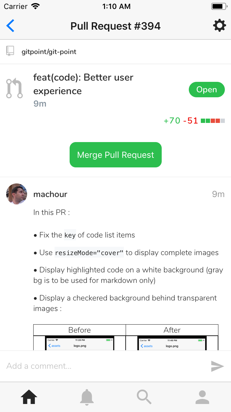
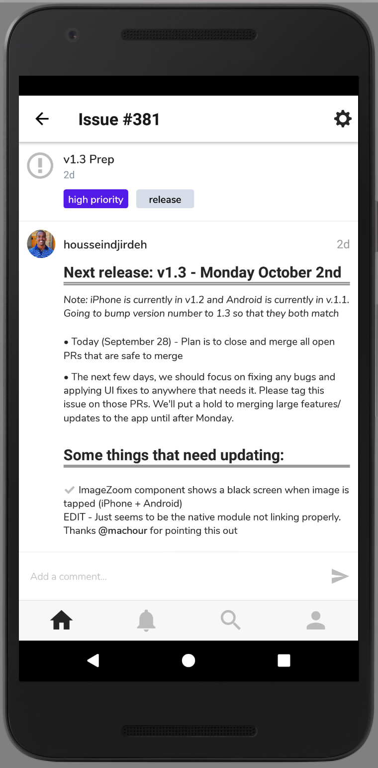
Next release: v1.3.0 - Monday October 2nd
Let's use this ticket to list all the some details we'll need to fix/update before our next release.
EXCITED TO GET A NEW RELEASE OUT!

 housseindjirdeh
All 37 comments
After our release, we'll spend some significant amount of time improving a number of things in the app:
- Streamlining release flow and CI using Fastlane and Buddybuild or bitrise
- Rearchitecting our state to leverage normalizer (progress began here #350)
- Moving over to GraphQL incrementally (progress began here #347)
- Lay out a more concrete UI guideline flow (similar to how buttons are being mapped here #374)
- Keep adding more features! For me the real big wins are things like Enteprise support as well showing pull request review comments for example. But there's still a ton of amazing things left to add
All the above is for future discussion, but just wanted to put that here in case people where were wondering what's next :)
housseindjirdeh
on 28 Sep 2017
Implement a solid and verbose
v3client implementing all high level api calls (v3.user.getOrgs(), etc.) and use only the high level api in*.actions.js. No more direct calls to v3.get() and other low level methods.oupsy *
 machour
on 28 Sep 2017
machour
on 28 Sep 2017
Super excited for this!!
Side note, can we be sure to use the semver terms for releases (v1.3.0) just in case we have to release a patch?
 andrewda
on 28 Sep 2017
andrewda
on 28 Sep 2017
Yep that's a good point, will make sure to use semver from now on 🙌
housseindjirdeh
on 28 Sep 2017
@lex111 Just noticed two minor things:
- [x] The 99+ icon doesn't show perfectly for iPhone:
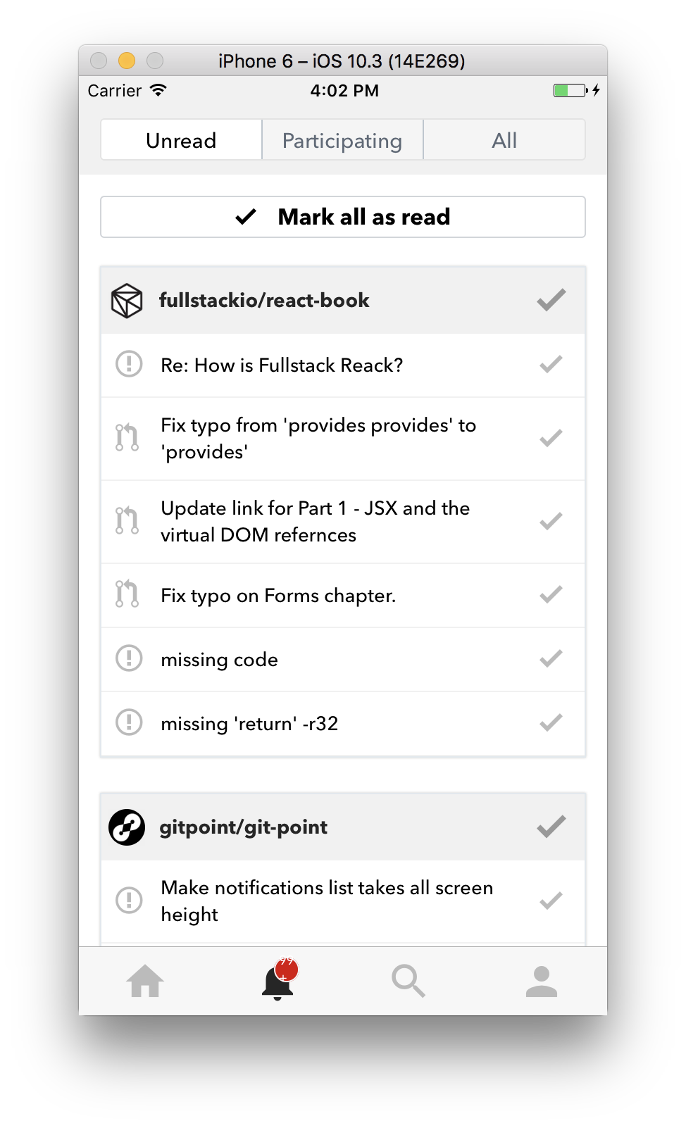
- [ ] When Mark all Notifications is tapped, it doesn't refresh the pending and all notifications screens:
- [ ] Think we can update the Mark All Notifications Button as
greenmaybe to match the merge button?
Please don't feel like you have to get to this right now. Just putting it here so we can address it before our release on Monday :) (more than happy to take care of it myself)
housseindjirdeh
on 29 Sep 2017
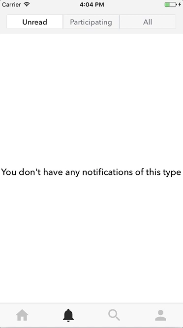
When Mark all Notifications is tapped, it doesn't refresh the pending and all notifications screens:
This I fixed in #371, but need to check so.
The 99+ icon doesn't show perfectly for iPhone:
Ooops, I'll fix it, admit I did not look at iOS :(
By the way, will we change the fonts so that they have the same everywhere?
Think we can update the Mark All Notifications Button as green maybe to match the merge button?
371 is not yet merged, so it's better to write it down there :)
 lex111
on 29 Sep 2017
lex111
on 29 Sep 2017
This I fixed in #371, but need to check so.
Seems to be what's happening on #371 unfortunately. No worries it isn't anything major breaking. I'll merge it in and we'll triage it in master.
Ooops, I'll fix it, admit I did not look at iOS :(
By the way, will we change the fonts so that they have the same everywhere?
Yep exactly so that's why I don't want you to stress over it, I'm going to be applying UI updates with the font change anyway
371 is not yet merged, so it's better to write it down there :)
Yep was thinking the same thing :)
housseindjirdeh
on 29 Sep 2017
@housseindjirdeh Ok, for the weekend I think we'll do it, but the font you can do?
lex111
on 29 Sep 2017
@lex111 Yep I can take care of that :) If not today then tomorrow!
housseindjirdeh
on 29 Sep 2017
⚠️ we need to merge https://github.com/gitpoint/git-point-site/pull/10 and change the host in MarkdownWebView before the release.
machour
on 30 Sep 2017
hey everyone, I was talking with @machour on gitter about #327 as he said, some user normally keeps his finger on the screen while scrolls the app. In issue screen, we added the long press event and for these users, this long press event could be very annoying.
Personally, I have this exact problem when I use facebook app :/
What do you think about to remove it?
 jouderianjr
on 30 Sep 2017
jouderianjr
on 30 Sep 2017
Font on events screen seems too bold on iPhone (only seeing this issue myself, @machour can't reproduce it which is interesting 🤔)
I can't reproduce it too 🤔 Descriptions (grey parts) doesn't look bold at all
Something that I've been thinking, update fonts in app to Nunito
I can try to add Nunito instead of AvenirNext and OpenSans and give you some screenshots !
Excited by this new release 😍 🎉
 Antoine38660
on 30 Sep 2017
Antoine38660
on 30 Sep 2017
@machour Noted!
@jouderianjr yep personally very okay with removing the long press entirely :)
@Antoine38660 Interesting i have no idea why it's just me lol 🤔 Would love it if you can help out adding Nunito :) Please let me know as soon as you can how it goes!
housseindjirdeh
on 30 Sep 2017
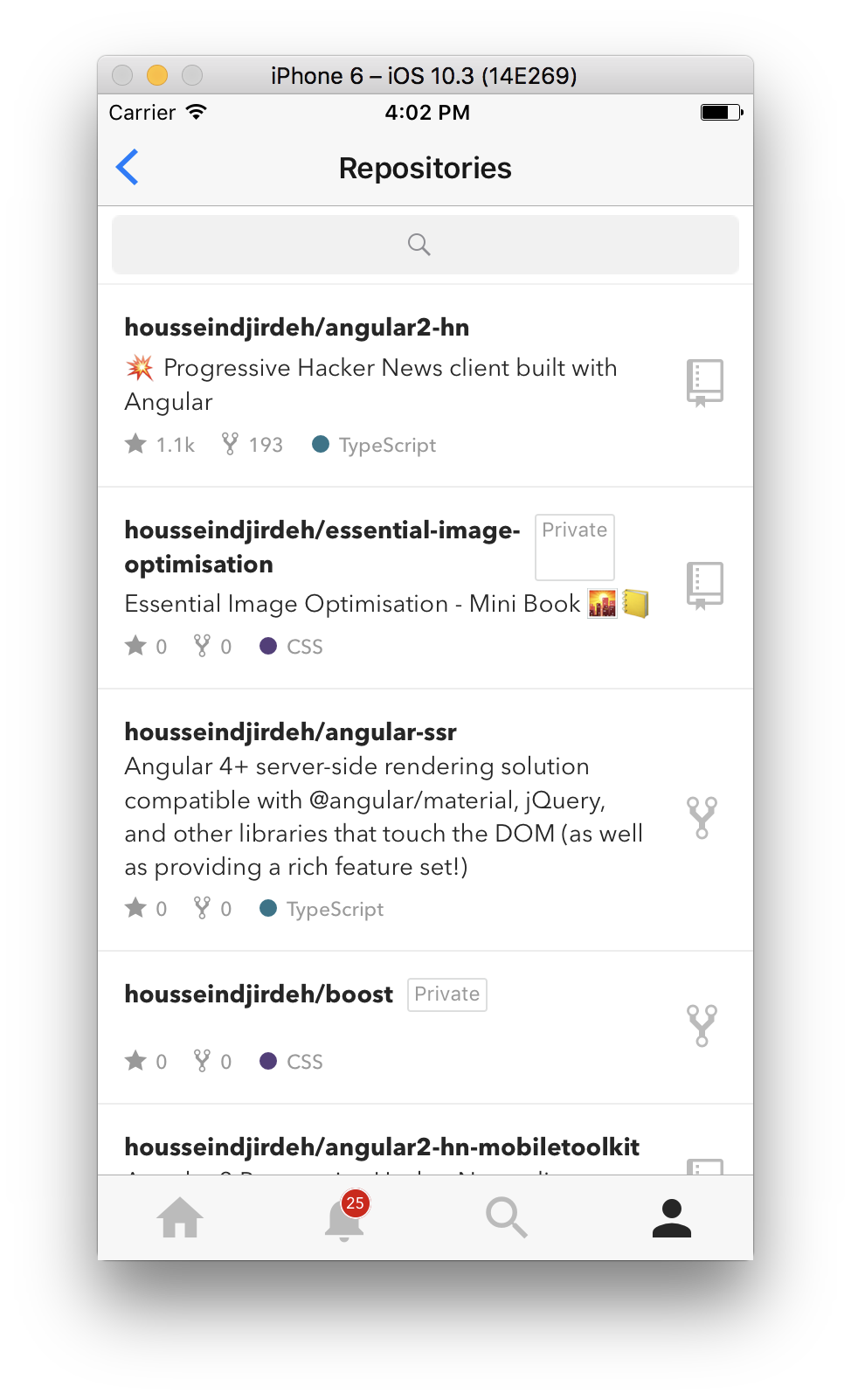
🐛 Noticing the private box gets squeezed with long repo titles:
housseindjirdeh
on 30 Sep 2017
@housseindjirdeh I'll try to fix it.
lex111
on 30 Sep 2017
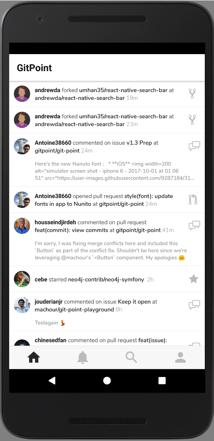
Here's the new Nanuto font :
iOS
Android (Thanks to @machour ❤️ )
Antoine38660
on 1 Oct 2017
@Antoine38660 It looks soooo good, running it on my simulator and its sweet :clap:
housseindjirdeh
on 1 Oct 2017
:warning: The events screen doesn't immediately update with a language change :thinking:
housseindjirdeh
on 1 Oct 2017
:warning: We'll need to fix any remaining translations (shouldn't be too many)
housseindjirdeh
on 1 Oct 2017
:bug: Noticing the private box gets squeezed with long repo titles:
I can not fix it :confused: . I thought to put this Text in another Text component, and then everything is fine, but padding and border do not work.
lex111
on 1 Oct 2017
@chinesedfan maybe you can help? How did you put the icon at the end of the title? At us now a problem with that it is incorrectly displayed an notice "Private", it too is in the end.
lex111
on 1 Oct 2017
Here's the gist I linked to @chinesedfan showing how to flex position something to the right. Unfortunately this is going to be a little trickier since there's already an icon positioned to the far right. We'll have to flex position both the icon and private box as a column view within the whole flexed row.
I can help with that in a few hours when I'm back on my machine :raised_hands:
housseindjirdeh
on 1 Oct 2017
IssueListItem subtitle looks too bold and title doesn't look bold enough. Should look more like this (in terms of boldness):
housseindjirdeh
on 1 Oct 2017
Issue parent comment isn't padded with the border bottom properly. We could add functionality to only _edit_ the parent comment if the user is the current user but if we're in a rush we can leave that to a future release and just add the bottom padding
housseindjirdeh
on 1 Oct 2017
Editing issue comment doesn't show the comment by default.
Exploring now :mag:
housseindjirdeh
on 2 Oct 2017
@housseindjirdeh might be related to api changes
machour
on 2 Oct 2017
@housseindjirdeh @lex111 Does the private box problem fixed? The screenshot shows wrong height. I agree that pending it at the end of the repository name is better than the current left-right structure. But it will meet the same space problem as I mentioned in #387.
 chinesedfan
on 2 Oct 2017
chinesedfan
on 2 Oct 2017
@chinesedfan in general, yes, but she decided that the name of the repository was reduced, i.e. not really a solution to the problem. It's strange that there is no way to place something at the end of Text component, given that it can be multi-line.
lex111
on 2 Oct 2017
@lex111 You can add View as a child of Text, then it will flow to the end of the text. For example:
<Text>
  <Text>aaaaaaaaaaa</Text> // very long
  <View style={{ width: 10, height: 10 }} /> // without size, it will throw an error
</Text>
The result is:
aa<View>
without size, it will throw an error
Now I understand why I had a mistake. And it turns out to dynamically determine the real dimensions through onLayout?
lex111
on 2 Oct 2017
I don't know the inner logic, but network articles say it only works with the size is set. I like this layout except for the following problem:
aa_<View> // we need padding
aaaaaaaaa  // just one line
_<View>    // but starting with padding is annoy
but starting with padding is annoy
And it starts with a new line?
lex111
on 2 Oct 2017
I mean the text and the view flow in multiple lines. If the length of the text happens to be the length of one line, then after wrapped, the second line will start with the view. But the padding is still there, like the 3rd item in the next screenshot.
By the way, maybe we can chat at Gitter.
chinesedfan
on 2 Oct 2017
@housseindjirdeh when is the release?
lex111
on 3 Oct 2017
@lex111 Literally put it up for iOS app review:
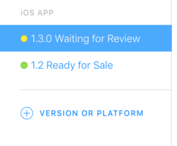
Hopefully by tomorrow it'll be approved and rolled out 🙏
housseindjirdeh
on 4 Oct 2017
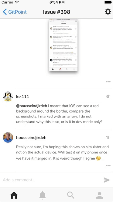
@lex111 Running a production build for a final run through for Android and I'm noticing icon issues 😞
Did you mention running link solved the problem?
housseindjirdeh
on 4 Oct 2017
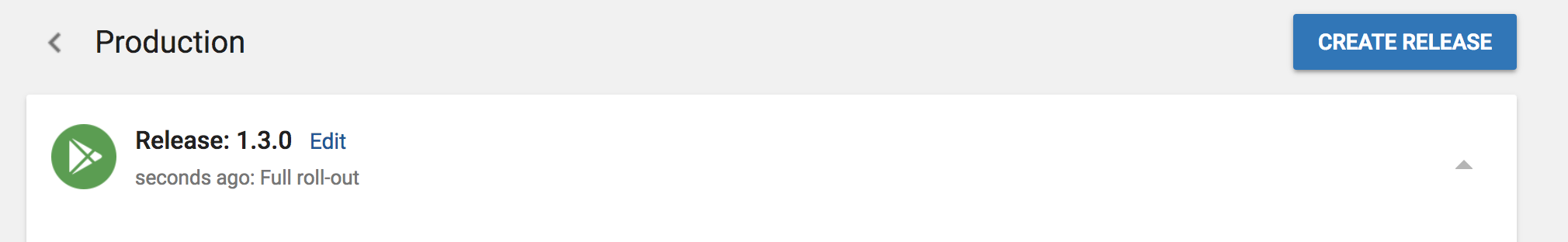
^ Nvm, running yarn and link again fixed things :o
Next release rolled out for Android!
housseindjirdeh
on 4 Oct 2017
Related issues
housseindjirdeh
·
3Comments
Antoine38660
·
3Comments
jouderianjr
·
5Comments
machour
·
3Comments
 cheshire137
·
3Comments
cheshire137
·
3Comments
Most helpful comment
Super excited for this!!
Side note, can we be sure to use the semver terms for releases (
v1.3.0) just in case we have to release a patch?