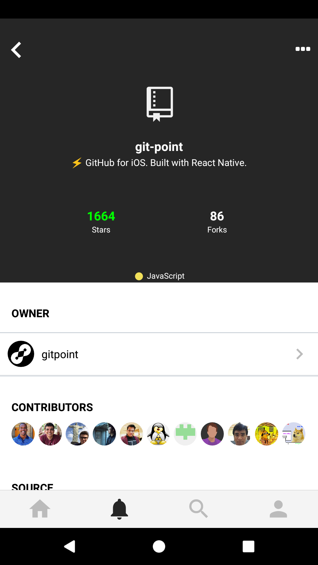
Git-point: Display repository language
The repository's primary programming language string can be found at repository.language.
 andrewda
All 16 comments
Do you have an idea of where you'd like to show it on a repository page?
I don't think create a new Section is a good idea, it takes up too much space
 Antoine38660
on 19 Jul 2017
Antoine38660
on 19 Jul 2017
No idea. I really like how it's displayed on the pinned repositories section on GitHub, so we could use that for reference!
andrewda
on 19 Jul 2017
Hum, something like that ?

Antoine38660
on 19 Jul 2017
Yea that looks great @Antoine38660!
andrewda
on 19 Jul 2017
Ok, I'll try to do this one 😉
Last one, do you have any idea about how to generate/choose the circle color ? (To be consistent with Github web)
Antoine38660
on 19 Jul 2017
Not sure if they're necessary (though I kinda like them :wink:), but we can use https://github.com/ozh/github-colors/blob/master/colors.json
andrewda
on 19 Jul 2017
Oh nice! There is also this one https://github.com/github/linguist/blob/master/lib/linguist/languages.yml (Officially used by Github)
Antoine38660
on 19 Jul 2017
I already take care of language colors in the codebase, theres a langaugeColors object in the colors config file. That's how I display repository language colors in the repository list screen :)
 housseindjirdeh
on 19 Jul 2017
housseindjirdeh
on 19 Jul 2017
Definitely understand not needing another section list for this - but not sure if I like it hooked to the bottom of the top section. Play around with it and we can easily move its location at a later point, but I'm thinking along one of the corners maybe?
housseindjirdeh
on 19 Jul 2017
You can compare location :
| Left aligned | Centered |
|:-:|:-:|
|  |
|  |
|
Of course, we should add some margin but I currently prefer the centered one.
Testing on Android today, the rendering is nice :smiley:
Antoine38660
on 19 Jul 2017
They both look good to me, but in the screenshots above I slightly prefer the centered.
andrewda
on 19 Jul 2017
What about putting it after "Forks" in the right-center?
 TautFlorian
on 19 Jul 2017
TautFlorian
on 19 Jul 2017
This is great @Antoine38660, I'm personally a fan with having it either left or right aligned instead of centered. However my bigger concern than location is adding a little padding from the edges.
I'll leave you with the decision to either have it in the center or not :) but I think it might look a little nicer if it's not _touching_ the edges/corner and there's a little margin/padding regardless of location.
housseindjirdeh
on 19 Jul 2017
Actually - I think a better place to put it would be right up top now that I think about it:
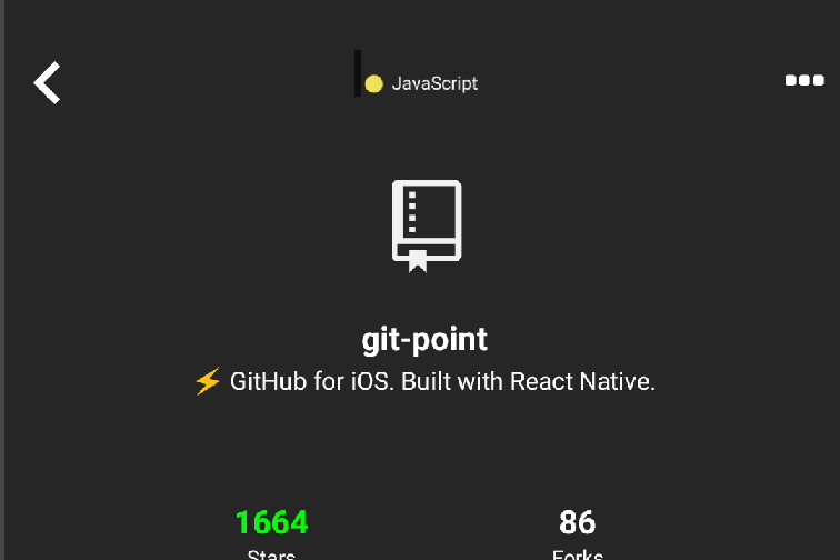
Once the user scrolls down the sticky header would hide it anyway - but I think it can live nicely up there :D
What do you folks think?
housseindjirdeh
on 19 Jul 2017
That sounds (and looks) good!
andrewda
on 19 Jul 2017
Yes, the top centered option looks good :)
Antoine38660
on 19 Jul 2017
Related issues
 gulien
·
5Comments
gulien
·
5Comments
 nikolaevigor
·
3Comments
nikolaevigor
·
3Comments
 kamasheto
·
3Comments
kamasheto
·
3Comments
 JayBizzle
·
4Comments
housseindjirdeh
·
5Comments
JayBizzle
·
4Comments
housseindjirdeh
·
5Comments
Most helpful comment
Actually - I think a better place to put it would be right up top now that I think about it:
Once the user scrolls down the sticky header would hide it anyway - but I think it can live nicely up there :D
What do you folks think?