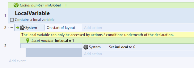
Gdevelop: Add thumbnail icons in the event sheet
Add thumbnail icons to the event sheet for:
- Objects
- Global variables
- Scene variables
- Object variables
Discussion:
https://github.com/4ian/GDevelop/issues/927#issuecomment-463143236
 Wend1go
All 72 comments
See feature request on Trello:
https://trello.com/c/l6Id9dj0/251-add-thumbnail-icons-for-objects-in-event-sheet
Wend1go
on 14 Feb 2019
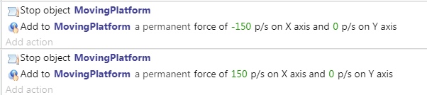
Thumbnail for different objects is a broader task as it requires generating it from the sprite if there is such :)
This is actually how it is in both clickteam fusion and construct2. It is great because the event sheet better communicates visually the specific to the game objects
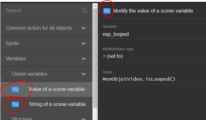
My suggested approach is to store the thumbnail in as a base64 image string in the object metadata, but another approach is to use caching
Here is a list of material-ui icons
https://material.io/tools/icons/?style=baseline
 blurymind
on 14 Feb 2019
blurymind
on 14 Feb 2019
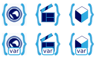
suggested icons:
Global variable
 or
or 
Scene variable

object variable

We need to also apply the same theme color to these three to communicate they are variables. My suggestion is to use Blue - as it is commonly used in code editors to communicate that something is a variable. Another one we could use is green or red. Using green would make us look too much like construct, so lets not use that
blurymind
on 14 Feb 2019
Thanks for opening the card on Trello :)
Would be a great thing to do. Adding for variables is a first step that should be not too hard.
The first global variable icon would work I guess. Not sure about the two others, I like the idea but not sure this convey well the notion of variable (assuming there is a way to represent a variable at all ^^')
 4ian
on 14 Feb 2019
4ian
on 14 Feb 2019
Thanks for opening the card on Trello :)
Would be a great thing to do. Adding for variables is a first step that should be not too hard.
The first global variable icon would work I guess. Not sure about the two others, I like the idea but not sure this convey well the notion of variable (assuming there is a way to represent a variable at all ^^')
It would be great if we can come up with icons for it. The ones I suggested copy the design from construct2 a little bit. Users coming to us from that engine will be familiar with the meaning
blurymind
on 14 Feb 2019
Here are some icons representing variables
https://www.google.com/search?q=variable+icon&safe=strict&rlz=1C1GCEA_enGB785GB785&source=lnms&tbm=isch&sa=X&ved=0ahUKEwjciZ7RirvgAhUTtnEKHe2JDsIQ_AUIDigB&biw=1680&bih=919
The more important thing here is representing the scope of the variable. We can represent that it is a variable via the color. In terms of representing the scope I think the icons are good.
The second is a dot on a globe (scene) and the final is a dot on a location marker (owned by an object)
blurymind
on 14 Feb 2019
I would like to draw your attention to Pelitaiteilija's research
He does analyses on the GD interface, he could have an idea and maybe make us the icons.
 Bouh
on 14 Feb 2019
Bouh
on 14 Feb 2019
he/she seems to have an icon for a var in the thread, but it only represents that it is a variable. The more important information about the scope is lost
blurymind
on 14 Feb 2019
I didn't represent scope, because I think the best symbols to describe an objects scope are 'global', 'scene' and 'object'. I think the words "global variable" describe that idea better than visual icons.
Any way, a few color variations for the Variable-icon I made earlier:
http://www.forum.compilgames.net/download/file.php?id=4314
Or the whole thread, here:
http://www.forum.compilgames.net/viewtopic.php?f=18&t=11156&p=70717#p70717
Icons often used for variables are variations of an X inside a box or in parentheses: (x) or [x]. The <> or symbol is probably inspired by HTML. The third common type is "var" inside a shape of some sort. The X symbol is probably more of a mathematical variable, instead of a programming variable.
Something using a pair of parentheses or brackets or braces of some sort < >, { }, [ ] etc could also work. The advantage with those is that the scope symbol could be put INSIDE the braces - variable-of-world, variable-of-object type of thing. Like so:
http://www.forum.compilgames.net/download/file.php?id=4316
Any way, scope, and symbols for different scopes. Object icon is easy, it's a stylized cube that can be seen here:
http://www.forum.compilgames.net/download/file.php?id=4315
It doesn't work against all background colors at the moment. I'll try adding a small one-pixel outline around the whole thing, that should help a bit. Also, the stylized cube basically becomes a hexagonal shape when it's displayed like this. Ideally, the different variables would have really distinct shapes.
That leaves Scene and Global. Global in this context means project-wide, not worldwide. So besides earth / planet / globe, symbols that mean everything / the whole project / multi-dimensional etc would also work. Circles are good for this, and a planet icon happens to be circular.
Earth / planet might seem like the easiest solution, but "global variable" might not use the word "global" (or something similar) in all languages. It could be "public" or "open", instead, for example. Besides, "world" can sometimes be the same thing as a "level", but that'd be a scene variable, not global variable. Still, earth / planet is all I can think of at the moment.
Scene does have an icon, but it's not a very good one. It's a triangle and a square / triangle and a circle, close to each other. Basically it looks like a pyramid with a shadow. I did a few mock-ups for Scene-related buttons in this image (on the right), but they didn't change the basic idea at all.
http://www.forum.compilgames.net/download/file.php?id=4246
A triangle combined with a different geometric shape doesn't communicate "level", "area" or "zone" in any way. The icons is mostly a symbol for "a space where you can put multiple objects", I think. But that doesn't work too well with variables.
I don't understand what a CD icon, or an LP icon, or a circle-with-a-dot has to do with a level. An object with a specific, recognizable scale might work - a tree or a house, for example, or a character on a level. Below are some quick ideas. I don't think any of them work particularly well.
http://www.forum.compilgames.net/download/file.php?id=4317
Any way, which of these should I save as separate images? Which format? PNG? SVG?
The height seems to be 16 pixels. These sketches are twice that. I can make them smaller, but small details won't be visible. This means that earth / planet icons will be even less readable than here.
Edit: Here's a link to a ZIP archive with 16 and 32 pixel icons for: Object, Variable, and two different versions of Global Variable / variable-with-scope. The first global variable icon doesn't have a 16 pixel version because the design can't be downscaled easily.
http://pelitaiteilija.fi/GDevelop/UIFiles/test_icons_ver1.zip
 Endoperez
on 14 Feb 2019
Endoperez
on 14 Feb 2019
It's worth remembering that the user will take a number of steps to add these things to the event sheet. They will already know that it is a variable and if its global when adding it. So the three variable icons need to look like they are apart of one family yes. Having all circular shape helps. If they are to communicate scope- incrementing a number of cubes or increasing the shade of a border doesn't really communicate that at all imo. The cube can represent an object. Several cubes together- a group yes. But nothing about the scope of one vs the scope of the other.
The third example is planets - planet to me = global. Something that contains everything else. That is why construct2 uses a planet to communicate if a variable is global
While a local variable looks a bit like a location marker - representing something that exists on that world. What unifies them is the colour,but the main goal of the graphic is not to communicate that they are a variable- but to say what the connection between the two types is.
People who created it will know it is a variable, but the icon at first glance will give them the information that they are working in a local scope.
The icons are not there to teach the user an abstract concept of what a variable is. They are there to intuitively help them build their logic
Thinking about the concept of the three types of variables we are looking at- what is the main difference between them. What is the thing that needs to be read? If all three are variables and you want to say that they are variables with a similar looking icon- we might as well use one icon for all three and the word global/scene everywhere.
But repeating it everywhere creates visual noise. When showing expressions construct2 actually doesnt even show the icon, nor the word variable or global

Those are presented only when it is created
Variables are depicted on the event sheet via bolder text alone. The killer feature that really makes it clear what object they belong to is the procedurally generated object icon - made from the first sprite of that object.
That is actually the thing that would make a huge difference imo. We are gravely underestimating it's importance in helping the user's intuition when building the logic. They tell your eyes what part of the event sheet is affecting which object with zero words. Your eyes can pick out the color and shape in that tiny thumbnail and you immediately know
blurymind
on 14 Feb 2019
Maybe we can add a new option into the right click menu of the object animation editor to "Set frame as thumbnail"
As for the variable icons, how about this? (just imagine a more pretty design ^^)
Wend1go
on 15 Feb 2019
@wend1go that is an excellent idea. I tried yesterday to generate a base64 string of an image, but couldn't get to the method in pixi to get it from canvas. The other way would be to get it from filesystem, but that won't work for the web editor.
I could get the pixi texture, but didn't know how to convert it to base64 string to store as metadata
blurymind
on 15 Feb 2019
@Wend1go Something like that works great in the Ribbon (the top bar) and other places with big buttons, but they won't work on the event sheet itself. Especially the small var-boxes, the text is barely legible even if it's the only thing the icon.
Any way, it seems like the parentheses idea works pretty well. Should it use the { } ones, or the < > ones? I think those are the two most commonly associated with programming. ( ) is more about mathematics, for me, and [ ] are about arrays and tables.
The world and the cube icon also seem to work nicely. The scene icon is visually pleasing, but isn't a good match, symbol-wise. In English, one "cut" or "act" of a film is called a scene. However, that's a homonym, and not the same thing as a game engine's scene, layout or level. The ideas are different, even though the same word is used for both. Because the ideas are different, they might not use the same symbols.
I like how the clapperboard looks, I'm just not sure if it's a good fit. :/ Maybe a place / terrain icon would work better? Here are the Layer, Scene and World icons made for Blender's new 2.8 version.
And here are a few icons for "picture". They're typically a simple landscape. That's pretty close to what a "scene" is. Some of them also have the geometric objects used in the current Scene symbol.
@blurymind I agree that having a preview image created from the first frame of the first animation of the sprite would be very useful. However, that won't work for ALL the game objects that can exist. Since we're talking about new features any way, I think it'd be worthwhile to add the ability to somehow customize the displayed icon-image as well. Perhaps the user could choose any frame of any animation, but the default is the 1st of the 1st?
P.S. Wait, you can embed images in GitHub? That seems pretty useful! And I didn't even notice the file attachment thing before I started trying to figure out how all you guys are doing that.
Endoperez
on 15 Feb 2019
Yes you can just drag and drop an image to the edit field :)
For objects that have no graphic, their class icon is used instead. I believe GD already does that.
My concern with the thumbnail is that the graphic needs to be resized first, as using the original sizes might overload the event sheet. So my idea was to use pixi somehow to create a scaled down version and convert it to a base64 string, then store it as metadata. I am not sure if that's possible
blurymind
on 15 Feb 2019
I added some pictures to my earlier post. This is SO much easier than just putting in links. :D
Endoperez
on 15 Feb 2019
Thanks for your brainstorming about icons :)
For objects that have no graphic, their class icon is used instead. I believe GD already does that.
Yes exactly.
I think that if we want to converge on a solution, there is nothing better than to try. So feel free to create mockups where you take an existing event sheet and add the icons/tweak the sentences dispayed.
Remember that some changes might be easy and other much longer to make, so we'll have to do progressive improvements.
4ian
on 15 Feb 2019
@blurymind I thought about adding a resize mechanic when writing the screenshot tool. But that would have involved using an additional, hidden HTML canvas that would first be filled with a copy of the original canvas's content, then resized and at last its content would be saved.
I didn't want to add it in the runtime for performance reasons but in the IDE it shouldn't hurt.
You can have a look at my screenshot extension on how to grab an image from a canvas as Base64 (and save it as png).
https://github.com/4ian/GDevelop/blob/master/Extensions/Screenshot/screenshottools.js
@Endoperez I don't think that it is possible to find an icon that represents a scene in a game with just a few pixels of space. When looking at the Blender icon, I wouldn't have guessed that this should stand for a scene.
I think using a movie related scene icons isn't a bad idea since both scenes hold the actors and scenary of a closed fraction of the game/movie. The game creators will remember the icon anyway so it is important to create on that can quickly be recognized.
Wend1go
on 15 Feb 2019
@Wend1go I used saving/loading base64 string images in piskel, but they are instead loaded from filesystem. In any case, I won't try to do anything without @4ian 's blessing as to how to approach this. :)
To be fair I am more interested in getting the procedural thumbnail than I am in adding the icons - but both can be done in one pull if that works
As for the variable icons, how about this? (just imagine a more pretty design ^^)
I like the bottom three btw.. Nice work
blurymind
on 15 Feb 2019
There are lots and lots of icons that are easy to recognize, yet distinct.
The problem with scene (movie) and scene (game level) isn't that noticeable in English, but can become really big when GDevelop is translated. I agree that both hold actors and scenery, which is why I'm trying to figure out an icon with emphasis on those parts
Endoperez
on 15 Feb 2019
There may actually be a problem with them, as if used in the event sheet they will need to be smaller - and might not read well
blurymind
on 15 Feb 2019
Custom object icons:
I think we're overcomplexifying/overengineering things for object icon. Let's forget about caching, canvas, custom object icons for now. While I don't disagree that this is a potential feature, this is only slowing us down in this discussion.
We already have a way to get the thumbnail of an object. It's in ObjectsRenderingService and it's called getThumbnail:
https://github.com/4ian/GDevelop/blob/8866719ef055b08b9e7a494ed04aa9bdd5bd530a/newIDE/app/src/ObjectsRendering/ObjectsRenderingService.js#L30
(You might be thinking "yeeeaaah right, true but still 4ian, being able to create custom icons for our objects would be suuuper useful". Maybe, but I think that's a separate feature request. Let's go step by step. Actually, once we have finished improving the events sheet with icons, it's possible that we might never ever speak again about it - because nobody will care about customizing these icons ;) Or maybe people will want just to choose the icon amongst the animation of a Sprite. Or maybe an improved thumbnail for other objects based on the content of the text or the colors of the particles... tons of possibilites! But it's another problem - and we're not even sure we need any of that. Let's start simple, and iterate once we have something working with current icons)
Variable icons:
As for the variable icons, how about this? (just imagine a more pretty design ^^)
I like them too! :)
Also remember that's it's a not a huge deal if we discover that we have a better icon in 2 weeks or one month from now. We'll just replace the files, it will be a 10 minutes task.
4ian
on 15 Feb 2019
@4ian that would actually be much easier to implement in that way :) I can try it if somebody else is not interested?
blurymind
on 15 Feb 2019
Yeah if you want to give it a try, use for now either <img /> or better <SvgIcons /> (for parameters like variables, that have a "fixed" image) or <img /> with getThumbnail for objects. You'll potentially have to update methods to accept more parameters (project and layout mainly) and have to fetch the real "gdObject" so that you can give it to getThumbnail, which is the "resource expensive" part I was talking about. We'll see to improve this if needed later.
Take a look at ParameterRenderingService, if I recall correctly I talked in another thread about it and renderParameterString (that could be improved).
4ian
on 15 Feb 2019
If it is not too much work this would be a a nice feature:
https://trello.com/c/xkWjlvOu/254-set-a-certain-animation-frame-as-thumbnail
Wend1go
on 15 Feb 2019
Yeah that would solve most issue I think - though I don't recall people complaining about object thumbnail (but might be the case later if images are used more).
4ian
on 15 Feb 2019
It is useful for effects where the object slowly appears. Like explosions, fade ins or teleportation etc.
Wend1go
on 15 Feb 2019
It looks like I got the two threads mixed up! Sorry about that. Any way, here are the individual icons for variable-with-scope as 32x32 pixel PNG images.
variable-global.png

variable-scene.png

variable-object.png

Endoperez
on 15 Feb 2019
Those icons are very nice
I think we have a winner :D
blurymind
on 15 Feb 2019
The icons in blurymind's test gif are too small. Too many details are lost, and the icons aren't clear.
The icons are currently 16x16 pixels. They're shown 16 pixels high, with 2 pixels of empty space to their left and right. However, basically all the icons only fill part of the 16x16 pixel space reserved for them, so there's additional empty space - usually to the top and the bottom.
I did a few tests. Below is a simple mock-up of an image that's 24x24 pixels, has light blue background color (if all the icons have this, all the icons will be the same size), and is actually shown as 24 pixels high, with 2 pixels of empty space to both sides.
Currently, the action icon is chosen based on the action itself, and/or its category. This works pretty well, in my opinion. All actions and all conditions have a basic grouping, but only some actions and only some conditions have object of class items.
If you wanted to display object icons, I believe you should look into _PARAMx_ commands, and how they're drawn. _PARAM0_ that is an 'instruction-parameter' and an 'object' would be drawn as text value and an image file, instead of just as text.
Endoperez
on 16 Feb 2019
Here's another possible icon for animations. This is quite a bit simpler, so it should work even in smaller sizes.
These icons are 16x16 pixels, but the icon actually uses all of that space.
Endoperez
on 16 Feb 2019
Not bad. Would be interesting to see how it looks with a whole event sheet full of conditions/actions with 24x24px icons. If it doesn't reduce the visible part of the sheet too much it would be great. But the movie strip could cause confusion since @Bouh is currently working on a video object extension.
Wend1go
on 16 Feb 2019
Well, you'll be interested in this pair of mock-ups I just finished, then! Here's a whole event sheet full of 16 pixel and 24 pixel icons, with most of them changed to at least use matching colors.
Some icons work better without a light blue background, like the top-down movement icon (arrows pointing to 8 directions). So there's a bit more testing to be done in that direction. Even so, remaking all the icons so that they use the same basic colors is already pretty nice.
16 pixels
24 pixels
Endoperez
on 16 Feb 2019
24 looks much better, I wonder if its possible to have a zoom for the event sheet at some point?
That video icon is perfect for the video extension, perhaps the same frame with a man running inside would be good for anim?
 zatsme
on 16 Feb 2019
zatsme
on 16 Feb 2019
I prefer 16x16, because 24 is too big.
If this 3 icons are added in event sheet, the icons can be updated in list of conditions/actions instead current icons, because all varaibles icons are same.
Bouh
on 16 Feb 2019
If 24 pixels is too big, the current design for world/scene/object icons will not work. They're too small. They might be still salvaged if I enlarged the world/scene/object part to be exactly 16 pixel high, but then the curly braces would have to be moved further out, and the image would need to ba made wider.
Is it possible to use non-square images that are 16 pixel high?
The generated HTML code looks like this:
<img src="path/animation.png" style="vertical-align: middle; padding-left: 2px; padding-right: 2px;" alt="" width="20" height="16">
Width in the HTML is set to 16 + 2*2 (for padding). I think it's done this way because CSS box-models (which let you define whether padding is counted to the width or not) don't seem to work properly. Also, width=calc(100%+4px); doesn't seem to work.
Am I correct in assuming that using non-square icons would be too much work for such a small change?
If so, then these variable-with-scope icons can't be used in the event sheet. They can be used when choosing the event, where the bigger icons are used.
Endoperez
on 16 Feb 2019
@4ian should I put the object thumbnail in the ObjectSelector module? That way the dropdown list of other objects can have a thumbnail
Edit: ok the selector list should be left for some other task
blurymind
on 16 Feb 2019
16 pixel versions of the variables-with-scope icons. These are a bit better, but if even these won't work, these icon design will most likely be impossible to make work properly. And in my opinion, they don't work very well.


Here's what they'd look like if they were non-square, 20x16 pixels.

Endoperez
on 16 Feb 2019
Thank you, I will get them replaced asap
blurymind
on 16 Feb 2019
Why is 24 px too big, looks OK to me in the mock up above? Also if we're going to use mini sprites as object icons then 24 would seem minimum to me, or they will not look very good?
zatsme
on 16 Feb 2019
I think this might work better:
Also, I'm not expecting to see these immediately implemented in your code. I want to get feedback about how they look, and whether you like them. Using them in the code and seeing how they look is nice and all, but I still think just looking at the image can be more useful.
Also, since I still think of these as ideas, just running with the first idea I post might end up with you guys doing lots of extra work. Changing the positioning of objects in an image is simple, but adding a few pixels of empty space can be quite complicated in code!
Some more variations on the two-icons idea
Endoperez
on 16 Feb 2019
Currently all icons are 16x16
Thumbnail icons is small, and reworking all icons (for convert to 24) when we add 3 is waste of time.
This is fine :
IMO The best argument is : the current sizes are fine, why changing for bigger.
In the post above mine, the three previous image have too much icons and action are unreadable.
This is incredible difficult choice just for three icons ahah ^_^
Bouh
on 16 Feb 2019
@Bouh The image you posted has 20x16 pixel icons, not 16x16 pixel icons. So it would also require changes, to support wider icons, but all the old 16x16 pixel icons would still work.
I'm planning on reworking all (or most) icons any way. And a 32 pixel icon won't look right if it's downscaled to 16 pixels. So I'll most likely have to make 2 different versions of every icon, any way.
Endoperez
on 16 Feb 2019
Lets avoid using two icons to describe one thing. I agree with @Bouh
blurymind
on 16 Feb 2019
Okay, so that's a no to two icons.
If the tiny icons aren't clear enough, replacing "global variable", "local variable" etc texts with icons might make it more difficult to understand what's going on in GDevelop. I think this is still worth trying, but even if the new code works, if it doesn't make the user experience better, it is better to just leave it be. :(
Endoperez
on 16 Feb 2019
Personally, I like the bigger icons. Construct 3 also uses 20x20px icons in their events sheet. Anything smaller will render the object thumbnails undistinguishable.
And since our icons only have 3 colours we either need the details to differentiate between them or use more colours.
Wend1go
on 16 Feb 2019
We choose the scaling of the 32x32 icons to any size in code, so its a matter of amending the line wherever applicable to set them to 20x20
@Endoperez for graphics please stick to 32x32 - consistent size. If required we can scale them down in code
blurymind
on 16 Feb 2019
Scaling them down in code gives horrible results. Small details become blurry, and the icon is no longer as clear or recognizable. Compare this (32 pixel images downscaled to 16)
to this (icons redrawn in 16 pixels):
Also, it looks like I messed up something while copying the image, since the background color is noticeably different. Oh well.
However, it is not true that you need more than 16x16 pixels to make different icons recognizable. Think about letters - ALL the letters of all the alphabets in the world can be portrayed by 16x16 pixels, with just SINGLE color. 16x16 pixels. Most of the Chinese characters can be done with that, too. And, again, those only take a single color. 16x16 is a lot. I'm not concerned about not having enough details, I'm concerned about if a specific design works within the limitations of 16x16 pixels.
Also, when talking about icon sizes, you should say if you're using a high resolution (e.g. 1920x1080) or lower; and whether you're using a physically big screen or a small one. I believe the people who think 16x16 is too small might be using 1920x1680 or bigger screens, and those who thinks 24x24 pixels is too big might be using smaller screens.
Endoperez
on 16 Feb 2019
Scaling them down in code gives horrible results.
Yes, which is why bigger icons give better results. True, we/you can make 16px icons that work well in the event sheet. But I thought we were also talking about downsizing in code the sprite images to add to the event sheet, like construct does, and in this case the bigger the better as the scaling will lose more details the lower you go. Which is why I thought 24px was a good size 🙂
zatsme
on 16 Feb 2019
Here is some progress:
Object thumbnails now working!! 😄
I will try with 24x
blurymind
on 16 Feb 2019
@Endoperez I think I didn't explain in enough detail what I wanted to say. It is true that it is possible to distinguish even monochromatic alphabetical letters. What I had in mind was distinguishing the icons from each other when quickly skimming through a large event sheet in search of a specific event.
So my point was to create some kind of eye catcher that immediately tells you what kind of logic you are looking at.
Maybe we could even add different hues to the icons depending on the purpose of the action/condition they belong to. So for example everything related to movement is blue. Storage/filesystem related stuff is orange, etc.
So when you quickly scroll through the event sheet and spot an area where orange colour is dominating, you immediately notice "Ah this has to do with loading/saving".
I'd also pledge for a more playful/comic style icon theme that better compliments the purpose of this software: Making games. I like the three coloured boxes for object more than the blue box for example.
Or the icons from the file system extension:
https://github.com/4ian/GDevelop/blob/master/Binaries/Output/Release_Windows/JsPlatform/Extensions/filesystem_create_folder24.png
https://github.com/4ian/GDevelop/blob/master/Binaries/Output/Release_Windows/JsPlatform/Extensions/filesystem_folder24.png
Scaling icons in a more "painted" look should also look better when they get scaled down.
Wend1go
on 16 Feb 2019
here it is with 24x size icons/thumbs:

blurymind
on 16 Feb 2019
Totally agree with colour coded events to easily spot them. Also, if we could have the object always at the start of the action line it makes it easier too, see how easy it is to spot the bullets etc in this shot from construct...

At the moment the icons in blurry post are uncoordinated and a mess, the construct sheet looks more ordered, so I believe we need to move the object icons, var type icons etc to the start of the action like construct 🤔
zatsme
on 16 Feb 2019
@zatsme I aggree with you that a reorder is needed.In my pull here
https://github.com/4ian/GDevelop/pull/936
I am only going to add object thumbnails and variable type icons.
The reorder is for a sepparate task that @4ian has marked as planned on trello
https://trello.com/c/0CfDCJIk/248-make-events-sheet-actions-conditions-more-english-like-set-x-to-y-add-y-to-x-y-is-equal-to-x
I was actually trying to make the same point that we need a consistent order of describing an event. We also need the description to start with the object that is being affected- like in construct.
One thing that Gdevelop is already doing better is using more colour coding. So if we get our order and thumbnails to be as good, we will actually have a better event sheet than construct. Or at least slightly better 🏆
blurymind
on 16 Feb 2019
Totally agree with you blurrymind, and was not criticizing your work. GD is getting better every day and I'd love to see more users, especially from construct 😉
I think the icons make it a prettier and more beginner friendly environment 😁
zatsme
on 16 Feb 2019
The thumbnails make it easier for me at least to read the event sheet much faster. They are quite important for readibility :)
blurymind
on 16 Feb 2019
Oh boy, that's a lot of text!
I totally forgot to consider how the size of the icons affects the idea of dynamically generating images for Sprite objects. For that, yes, 24 pixels is better than 16, because there's (usually) less downscaling, and downscaling random sprites down to 24 should give much better results in most cases than scaling them down to 16 pixels.
@blurymind It's looking great! However, you might need to think a bit about the positioning of the sprites, and about how much empty space (padding) there is around them. I think the mini images you create can already be non-square. Cool!
There are also some edge cases that could cause problems with that, though. For example, what if the user makes an image that's 24 pixels high, and 500 pixels wide? That'd be stupid, but someone might do it any way.
About image order:
You can't just copy the way Construct2 has objects in the beginning. That's a direct result of how code is built in Construct, and GDevelop makes code differently. In GDevelop, commands are not tied to an object!
Currently GDevelop uses icons that describe each action and each condition, which are grouped into specific and distinct categories. This is different from Construct, but no necessarily worse. The problem is that the icons themselves are bad. This is a great icon, and helps to understand that all of these conditions belong together, and check for the same thing:

However, these icons are bad. They're different from the other icons used by GDevelop, they're too small so the details can't be seen, they use pale colors that disappear into the white backgrounds, and they look like they are separate commands that have nothing to do with each other!
Also, sometimes icons look like a blurry mess because they are, literally, blurry. This has been resized without making it any less sharp. Anything that looks blurry here is blurry at its normal size.
If the icons are remade, GDevelop's current system will start working better. It's a UX problem.
You guys are programmers, so when you see this problem, you of course start thinking about how you can program a better system. I'm an artist, and I see it as an art problem, and I'm thinking about how I can draw better icons to fix it. That doesn't mean I'm automatically right, but even if I'm wrong, you can always fix the system later.
However, I suggest that we at least wait a bit, and see how GDevelop looks like with better icons for the different actions and conditions. You can still change it later, if it's necessary, but I'm sure there's other stuff you guys could work on that I can't even try to fix with art.
Like the fact that the bounding box / selection box of rotated objects doesn't rotate, or match the object. Or how GDevelop has much fewer behaviors compared to Construct - beginners rely heavily on behaviors, so something like the Sine behavior (for moving platforms, lifts, floating coins etc) or other simple movement behaviors, or being able to hide or mirror objects in the Properties panel, or ability to have split-screen multiplayer / multiple cameras... Or even that better particle system someone mentioned in the other thread. There's no lack of programming tasks!
Having automatically generated icons for Sprite and Tile objects is already an improvement. I mean, imagine if all of these suggestions went through in the same update? Imagine a kid who just figured out how to use expressions, and then all the icons are different, the icon order is different, all the descriptions of what stuff does is different... Doing all of this over a period of 6 months or so would still be perfectly fine. There's no rush.
@Wend1go had a great idea about using different colors for different groups of commands. I'd use different highlight colors for different categories - one color for commands that are common to all objects, one for Sprite, another for Tile, and so on. Text and Text Input would either share one color, or use two similar colors. Input commands of all sorts (keyboard, mouse/touch) would share one color, music and audio stuff could have its own color, and so on. I only figured out how to replace the icons today, so I haven't done much with them. I can test this stuff out with a few simple categories, first, and we'll see how it goes.
If there's a category which is potentially risky or dangerous to use, it would use red or red-orange color. Something that isn't generally used much, but which should catch the user's attention when it has been used. Perhaps file system stuff, or networking? Yellow or yellow-orange could similarly be a warning color, perhaps reserved for some of the stuff that's especially confusing for new users. Maybe AND/OR condition blocks?
However, there are only a limited number of colors that can be used. The colors that are easiest to tell apart from each other are white, black, red, blue, yellow, green, purple, brown, gray, pink. Beyond that is starts getting difficult. That means there's only about 10 different colors that can be used, at most, and even that might be too colourful and confusing.
Another thing about colors would be the ability to change the colors of comments and/or groups. It was possible in GDevelop 4, and I think GDevelop 5 might even be able to display groups and commands with non-default colors. However, you can't change the colors in the editor, or at least I couldn't find a way. It's not actually related to the topic of this thread, but we're already talking about colors and organizing...
Endoperez
on 16 Feb 2019
I'm not too much for putting too many things in the event sheets.
For me, reading is much more understandable when everything is written. I don't like reading rebus puzzles.
Bouh
on 17 Feb 2019
Perhaps we can remove the object variable icon, as the object thumbnail is already showing its doing in on an object.
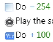
Also the old 'Var' icon will also need to go, or be replaced by scales or a calculator or something - as it is describing the action of changing something and we are now adding a type icon next to the actual variable.
The thing is these things need to be consistent across the board and will take more than my pull to sort out. Remember I am only adding object thumbnails and variable icons there. I am not solving the other design tasks for the event sheet
For example, what if the user makes an image that's 24 pixels high, and 500 pixels wide?
I already have that covered in my pull- by introducing a maximum width limit- 48 pixels is the maximum
Also @4ian told me to stick to 16x16 for icons and thumbnails, so we can't do 24x24 sorry
blurymind
on 17 Feb 2019
Okay, 16x16 pixels. That's good to know. The most important thing is knowing what the limits are before I start.
In that case, I think having image icons for variables of a specific scope can't be done. I think it's better to say "global variable [__] score", with some symbol marking the variable as, well, variable. Not a global variable or scene variable, just a variable. If the icon works well, it might be possible to simplify it into "global [__] score" or something similar.
The old 'var' icon is is on the chopping block, yes. There are a few different ways I'm considering, but I there are a few different ways to do it. I hadn't considered having different icons for different variable-related conditions and actions, but it does make sense.
Endoperez
on 17 Feb 2019
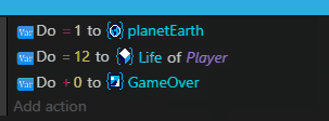
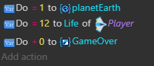
What about...
Add 3 to player.score
Add 1 to global.level
Set scene.enemycount to 12
Set enemy.health to 40
To represent vars in text?
zatsme
on 17 Feb 2019
@zatsme Yeah, that could work. Worth trying / making a mock-up, at the very least.
Endoperez
on 17 Feb 2019
The type.property notation looks interesting indeed but it might look weird in a sentence since the dot also stands for the end of a sentencs.
@4ian Is there any space for negotiation of a value between 16 and 24px like the size of "20px" in Construct3?
Wend1go
on 17 Feb 2019
How about we give object thumbnails a 24x - but keep icon size to something smaller like 16x?
Example:
Alternatively give all icons and thumbnails a 20x20 size
I believe that object thumbnails have a slightly different role to play in communicating logic - different than pre-designed icons. Their procedurally generated nature makes them very specific to the project they are on.
Giving them slightly more pixels will help readability imo and can be something we actually do better than construct. It will also make them easier to distinguish from icons at a glance.
Also please note that object thumbnails will almost always be in portrait ratio - as most game characters are bipedal. Cramming a portrait image in 16x16 pixel space is going to most of the time come out tinier than a 16x16 icon that is designed to take all the space. It will come out as 10x16. The sprites are not designed to read as 16x16 icons, so we shouldn't be treating them the same. Thumbnails are procedural and unique to each project.
blurymind
on 17 Feb 2019
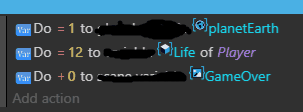
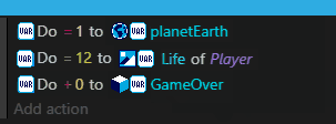
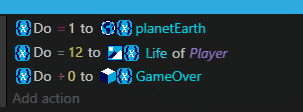
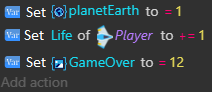
The other thing I am thinking is that object variables dont really need an icon, as the object thumbnail already communicates that they belong to it. Doing this:
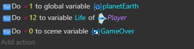
(note how Life has no icon, but still has the variable color coding. The other two variables have an icon communicating what they belong to)
would reduce the visual noise a bit
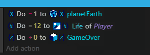
If I have to be fair, ideally it should be:
but with a different word order. That is how it is in Construct2, minus the color coding and minus the better thumbnails. I believe we can do object thumbnails better than them too
blurymind
on 17 Feb 2019
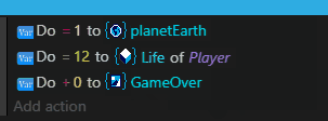
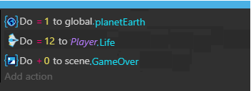
Here is a better mockup of what I mean:
blurymind
on 17 Feb 2019
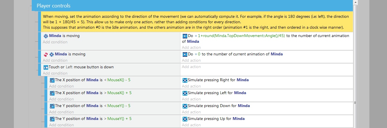
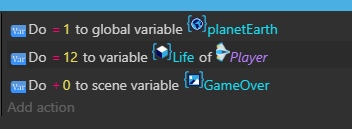
@blurymind 's last example looking nice, but there are a few things I would still change. I don't think the "global variable" and "scene variable" symbols work at this size, I don't think the +=1 marking works, and so on. But it's already a lot better than the old one.
I know you like the word "set", but it just doesn't work when doing addition or subtraction or, really, anything but the = (set to) operation. +=, -=, *= and /= only make sense to programmers. People who don't do programming won't know what they are.
If you leave change the += symbol to just +, and -= to -, it won't work either. Set Life of Player to -1... It means something very different from Player.life -= 1!
There are few options, like this:
Replace life by 1
Increase life by 1
Decrease life by 1
Multiply life by 1
Divide life by 1
It most likely won't work in all localization languages.
There could be more variation in the word order, like
Set life to 1
Add 1 to life
Subtract 1 from life
A passive sentence might work better?
Player's variable Life is increased by 1
Player's variable Life is decreased by 1
Player's variable Life is divided by 2
Global variable score is multiplied by 2.5
Scene variable GameOver is set to 0
For a more mathematical notation, maybe something like this?
Calculate new value for Player's variable: life +1
Calculate new value for Player's variable; life * 2
Calculate new value for Player's variable: life = 3
It's a variation of these
Change value of variable: life = 3
Modify value of variable: life - 1
It might even work with Set, but I don't think it works quite as well.
Set value of Player's variable: life = 1
Set value of Player's variable: life - 1
Set value of Player's variable: life * 1
Endoperez
on 17 Feb 2019
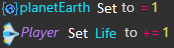
@Endoperez what do you think about my idea on thumbnail size being bigger than icon size. This is the two having the same size:
and this is object thumbnails being slightly bigger than icons
My goal here is only the thumbnail - getting its size right. The variable icons design is something that can be worked out. The old icons design is another thing that can be sorted in another issue. Lets try to separate the issues and focus on whats being worked on in my pull
Btw if you all think we should have bigger icons than the current 16x , please state what the size you think should be. That means that I will need to change their size in code :)
blurymind
on 17 Feb 2019
We can make more tries, but from a UX point of view I'm really uncomfortable with having icons that are bigger than other.Also, they should not be bigger than the text. Otherwise, they break the flow of reading, instead of make it easier: icons should feel part of the text. That's why they must be:
1) Consistent in size (avoiding having a "mess")
2) Of the same size as the text (this is why I chose 16x16).
It's fine to try 20x20, but in this case all should be set to 20x20.
4ian
on 17 Feb 2019
let's try 20x20 - I will change it for all icons and for the object thumbnail. I will post a screenshot after that
Btw some icons still need to be centered -the old var icons at the start for example. I dont think there are any styling rules on them atm to enforce vertical centering - so they contribute a little to that messy feeling we have
blurymind
on 18 Feb 2019
Why not fake how we want them to look in the end and see how it looks. I mean with the global, scene icons at the start along with the object icon, then the text follows. Colour coded too if you like and then we can get a feel for the finished article even if it's going to take a while and a few more PRs 🤔
zatsme
on 18 Feb 2019
Not proposing this as the finished article, but something like this, I like using the scope.var approach 😁
By the way did this on my phone, don't recommend it to anybody 😂😂😂
zatsme
on 18 Feb 2019
Not proposing this as the finished article, but something like this, I like using the scope.var approach 😁
By the way did this on my phone, don't recommend it to anybody 😂😂😂
From an implementation side of things, the object thumbnail needs to be next to the object name.
Same for variables and their icon. The current starting icon is the icon of the action being done.
The idea atm is to get the thumbnail and variable icons to render. Another task would change the order, so it can be
for example
We are talking a lot about the order and wording, whereas what the task is actually to just put an icon or a thumbnail before the items that don't have it. Please comment on the icons/thumbnails and their size.
Remember that the icon or thumbnail can only be rendered next to its owner for now
@4ian we could make the icons/thumbnails sizes themable - so the one size value can be stored in the theme
blurymind
on 18 Feb 2019
Related issues
 Phenomena3
·
5Comments
4ian
·
4Comments
Phenomena3
·
5Comments
4ian
·
4Comments
 shadow00dev
·
4Comments
shadow00dev
·
4Comments
 PascalLadalle
·
3Comments
Bouh
·
3Comments
PascalLadalle
·
3Comments
Bouh
·
3Comments
Most helpful comment
It looks like I got the two threads mixed up! Sorry about that. Any way, here are the individual icons for variable-with-scope as 32x32 pixel PNG images.
variable-global.png


variable-scene.png
variable-object.png