Gatsby: feat(www): Language selector dropdown
Summary
Implement a language dropdown for gatsbyjs.org.
Design
Courtesy of @fk
Figma clickable prototype / design

Feature list
- "Languages" nav item only appears when
langslist is non-empty - Language dropdown appears on mouseover
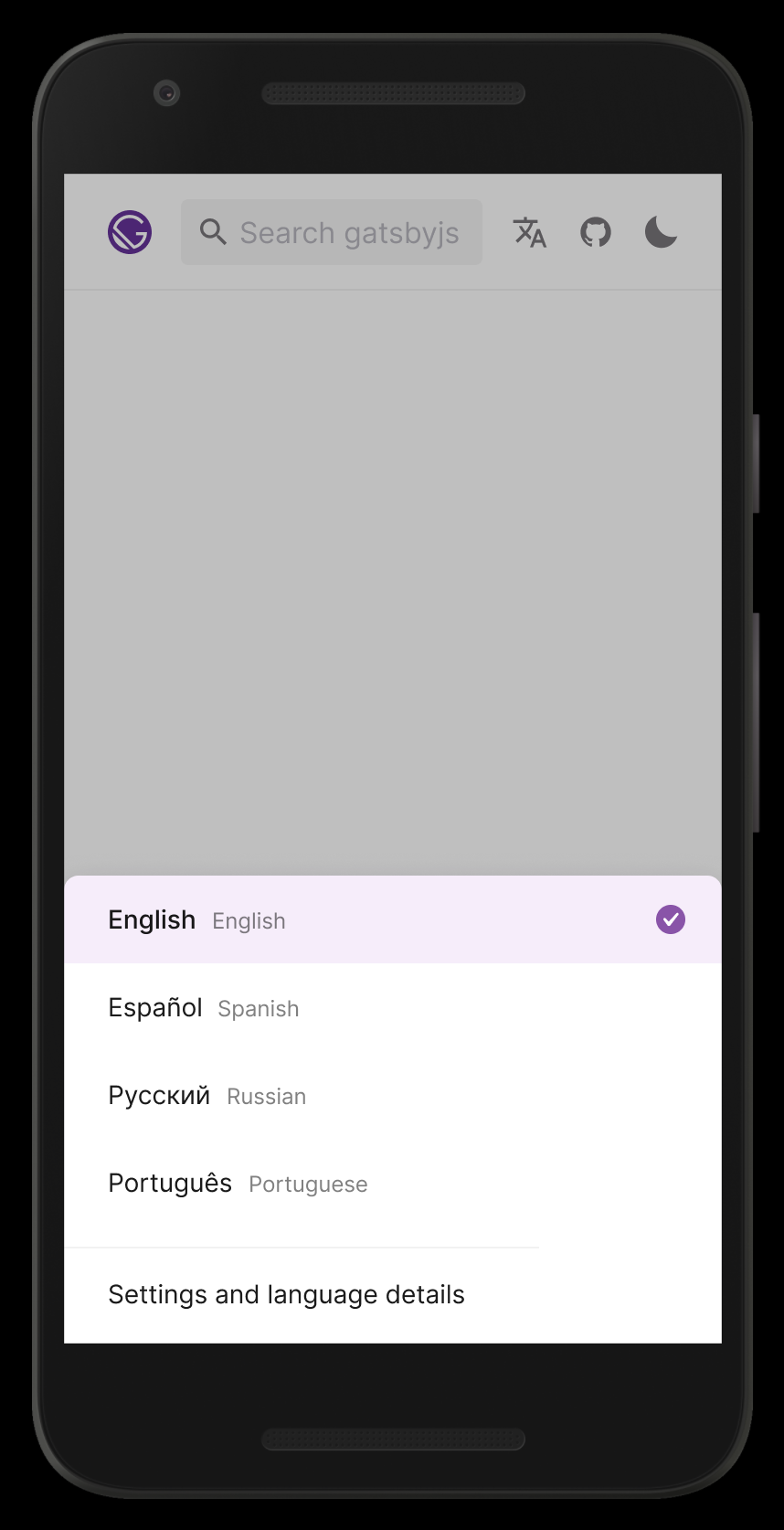
- Dropdown only shows "featured" languages. For now, these are Spanish (es), Indonesian (id), Japanese (ja), Portuguese Brazilian (pt-BR), Polish (pl), Simplified Chinese (zh-Hans)
- Clicking the link for each language changes the URL to the same page with that locale (e.g. from en/tutorials to ja/tutorials)
- _Bottom link takes users to the
/languagespage_
TODO (@fk): Mobile version of this design
 tesseralis
All 5 comments
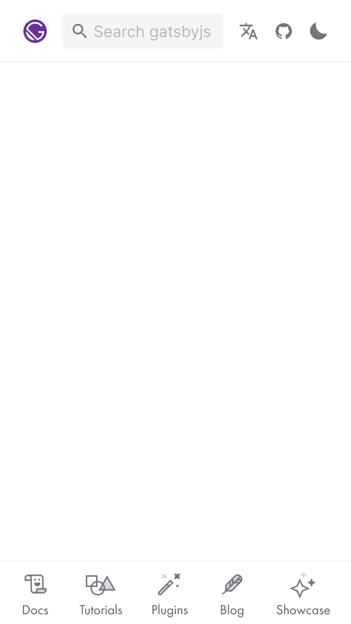
👋 First thoughts regarding the mobile version: From 360px device/viewport width up, we don't have any space issues with the current header layout if we drop the "Languages" title/label:
Google Nexus 5X
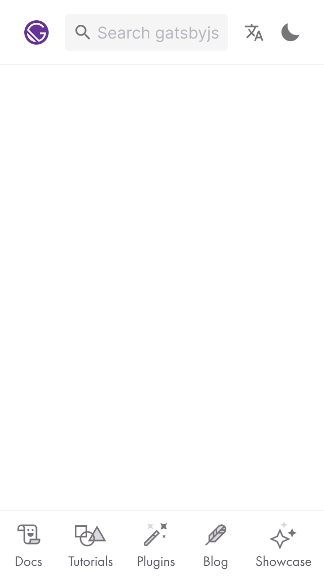
For 320px keeping the search input like it is now, stuff gets a little crowded. One thing (that is cheap) is to drop the GitHub link, but well, … don't really want to do that. Just to see how that'd look:
iPhone SE
If we didn't want to just "truncate" the search input (and it's placeholder) — _which IMO is absolutely fine for the first shot (let's check analytics for those viewport widths though)_
— there are other obvious solutions … hello usual suspects:
- Collapse the search form and just show the icon, like we already do for a range of smaller screens, and e.g. reactjs.org does.
- Tuck (at least certain) things away in a hamburger menu.
TL;DR: _TODO: Look at analytics regarding clicks on the GitHub link and usage stats x devices/viewport dimensions)_
Last but not least, the dropdown: Also IMO OK to do that for the first shot, and assuming that we will start out with up to ~5 languages in there. Depending on the number of items this will get icky, esp. if we want to be nice and start to be a little more conscious about landscape orientation.
Braindumping:
- Link to a basic version of the language switcher page.
- Bottom sheet pattern or similar — sidebar is already there (and could use a rinse, e.g. "tap outside to close" yada yada): Figma prototype
What do y'all think?
(PS: Edited the issue description to contain the link to the Figma "Desktop" design source file along the link to the clickable prototype; hope that was OK?)
 fk
on 28 Feb 2020
fk
on 28 Feb 2020
I like it! Thanks for all the detail and research you put into this Flo. I agree that we can start off with the dropdown for v0, and iterate from there. After all, our search bar also doesn't have a specific UI for mobile either :)
tesseralis
on 28 Feb 2020
After all, our search bar also doesn't have a specific UI for mobile either :)
💯 💯 💯 … 🙉 😅
fk
on 28 Feb 2020
Hiya!
This issue has gone quiet. Spooky quiet. 👻
We get a lot of issues, so we currently close issues after 30 days of inactivity. It’s been at least 20 days since the last update here.
If we missed this issue or if you want to keep it open, please reply here. You can also add the label "not stale" to keep this issue open!
As a friendly reminder: the best way to see this issue, or any other, fixed is to open a Pull Request. Check out gatsby.dev/contribute for more information about opening PRs, triaging issues, and contributing!
Thanks for being a part of the Gatsby community! 💪💜
![github-actions[bot] picture](https://avatars2.githubusercontent.com/in/15368?v=4&s=40) github-actions[bot]
on 19 Mar 2020
github-actions[bot]
on 19 Mar 2020
Hi,
I'd be happy to start working on this.
Just a few questions:
- The current page doesn't look like the mockup, as there are more icons and the search bar is expanded.
would that be okay?

- are there any other dropdowns currently in the project, or should I implement one from scratch?
Thanks!
edit:
so far I have this:

 id0Sch
on 28 Mar 2020
id0Sch
on 28 Mar 2020
Related issues
 Jivings
·
112Comments
Jivings
·
112Comments
 KyleAMathews
·
97Comments
KyleAMathews
·
97Comments
 EdinK1
·
69Comments
EdinK1
·
69Comments
 TuckerWhitehouse
·
69Comments
TuckerWhitehouse
·
69Comments
 ehowey
·
97Comments
ehowey
·
97Comments
Most helpful comment
👋 First thoughts regarding the mobile version: From
360pxdevice/viewport width up, we don't have any space issues with the current header layout if we drop the "Languages" title/label:Google Nexus 5X
For
320pxkeeping the search input like it is now, stuff gets a little crowded. One thing (that is cheap) is to drop the GitHub link, but well, … don't really want to do that. Just to see how that'd look:iPhone SE
If we didn't want to just "truncate" the search input (and it's placeholder) — _which IMO is absolutely fine for the first shot (let's check analytics for those viewport widths though)_
— there are other obvious solutions … hello usual suspects:
TL;DR: _TODO: Look at analytics regarding clicks on the GitHub link and usage stats x devices/viewport dimensions)_
Last but not least, the dropdown: Also IMO OK to do that for the first shot, and assuming that we will start out with up to ~5 languages in there. Depending on the number of items this will get icky, esp. if we want to be nice and start to be a little more conscious about landscape orientation.
Braindumping:
What do y'all think?
(PS: Edited the issue description to contain the link to the Figma "Desktop" design source file along the link to the clickable prototype; hope that was OK?)