Gatsby: Move ecosystem links into top docs nav
I've heard a number of reports that people have to google the starters library to find it e.g. https://github.com/gatsbyjs/gatsby/pull/12622. I often have trouble finding the link as well.
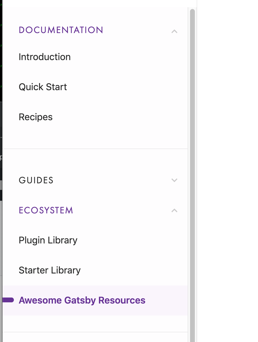
The problem arises because a) you have to know to open the ecosystem nav and b) if you have "guides" open, this is remembered when you return which means that ecosystem is now pushed very far down the screen so you might not even see if as you scroll by.
Moving the starter/plugin/awesome links to the top might be the right solution. Or perhaps a tweak to how the sidebar nav works in general.
 KyleAMathews
All 8 comments
Could those items go into the top level of the sidebar instead of being in a collapsed accordion? That might help with discoverability too.
 marcysutton
on 22 Mar 2019
marcysutton
on 22 Mar 2019
Yeah hmm, not sure why "documentation" is collapsible. /cc @shannonbux @fk
KyleAMathews
on 23 Mar 2019
Could those items go into the top level of the sidebar instead of being in a collapsed accordion? That might help with discoverability too.
Yes, they can.
Yeah hmm, not sure why "documentation" is collapsible.
Yes, that makes no sense and is my bad. Will get a PR going to fix this. Currently thinking that it'd be nice to have a headline for the whole sidebar for mobile ("Documentation", "Tutorial", etc.).
 fk
on 24 Mar 2019
fk
on 24 Mar 2019
Yeah hmm, not sure why "documentation" is collapsible.
I just saw that this actually was added in https://github.com/gatsbyjs/gatsby/pull/9898/files#diff-355f19a97a68170ef2cd96a7e96c3398 to
show distinctly where the user is.
As I wrote above, I can follow that thought. Taking a look now!
fk
on 25 Mar 2019
12842 updates the sidebar to allow setting a title for the sidebar, as well as configure sidebar behavior, via the sidebar YAML. The PR description tries to explain all the gymnastics that we are currently doing, and doing _wrong_ :-/ — it's not 100% there yet, but I'd appreciate a first look. 🙏
fk
on 25 Mar 2019
Thinking about this specific issue again — we already have https://www.gatsbyjs.org/ecosystem/ as a landing page for plugins and starters.
I guess we soon will have themes (at least ;-)) next to starters … maybe now is the right time to replace the main nav's "Plugins" with "Ecosystem"? (related: https://github.com/gatsbyjs/gatsby/pull/12622#issuecomment-475737352)
fk
on 25 Mar 2019
^ Found some mockups for this from last year in https://github.com/gatsbyjs/gatsby/issues/7544#issuecomment-416998865:


fk
on 25 Mar 2019
The reason "documentation" is collapsible was to give a sense of context
since the tutorial and doc sidebars look exactly the same and the top nav
bar isn't always a clear enough indicator to people about where they are.
E.g. lots of people in tutorial usability tests try to compare the quick
start guide to the tutorial by toggling back and forth between them and
then say "wait, where am I?" because they look the same but the sidebars
have different content.
So the overall problem to solve is just making it clear that you're either
in docs or the tutorial and/or making it easier to compare tutorial to
quick start w/o confusing people. The way we get that done could be to make
them clearly different designs (color + something else for people who don't
use color as a differentiator)
I agree that "documentation" as a category name isn't the best long term
solution.
Also, I think using using ecosystem now could be the right time, @fk! Will
take a look at sidebar PR right now
On Mon, Mar 25, 2019 at 12:17 PM Florian Kissling notifications@github.com
wrote:
^ Found some mockups for this from last year in #7544 (comment)
https://github.com/gatsbyjs/gatsby/issues/7544#issuecomment-416998865:[image: desktop_ ecosystem]
https://user-images.githubusercontent.com/21834/44797652-fdc56a00-abaf-11e8-96f3-59a70c15ddc0.png[image: mobile_ ecosystem]
https://user-images.githubusercontent.com/21834/44797999-c0151100-abb0-11e8-8e57-3c725ac467ef.png[image: desktop_ expo]
https://user-images.githubusercontent.com/21834/44798088-f5216380-abb0-11e8-97d0-a28ff956b545.png—
You are receiving this because you were mentioned.
Reply to this email directly, view it on GitHub
https://github.com/gatsbyjs/gatsby/issues/12767#issuecomment-476340075,
or mute the thread
https://github.com/notifications/unsubscribe-auth/Ae9o2kuGMoGiYKFJ620VNZEYOMZvl-9Hks5vaSDagaJpZM4cEM4L
.
 shannonbux
on 25 Mar 2019
shannonbux
on 25 Mar 2019
Related issues
 kalinchernev
·
3Comments
kalinchernev
·
3Comments
 totsteps
·
3Comments
KyleAMathews
·
3Comments
totsteps
·
3Comments
KyleAMathews
·
3Comments
 dustinhorton
·
3Comments
dustinhorton
·
3Comments
 mikestopcontinues
·
3Comments
mikestopcontinues
·
3Comments
Most helpful comment
The reason "documentation" is collapsible was to give a sense of context
since the tutorial and doc sidebars look exactly the same and the top nav
bar isn't always a clear enough indicator to people about where they are.
E.g. lots of people in tutorial usability tests try to compare the quick
start guide to the tutorial by toggling back and forth between them and
then say "wait, where am I?" because they look the same but the sidebars
have different content.
So the overall problem to solve is just making it clear that you're either
in docs or the tutorial and/or making it easier to compare tutorial to
quick start w/o confusing people. The way we get that done could be to make
them clearly different designs (color + something else for people who don't
use color as a differentiator)
I agree that "documentation" as a category name isn't the best long term
solution.
Also, I think using using ecosystem now could be the right time, @fk! Will
take a look at sidebar PR right now
On Mon, Mar 25, 2019 at 12:17 PM Florian Kissling notifications@github.com
wrote: