Gatsby: Semantic UI <Responsive> component in production build causes child components to render incorrectly
Description
Semantic UI React's <Responsive> component is causing a child <Dropdown> component to render incorrectly in my production build. However, this is fixed after a refresh or navigation to another page. This issue does not occur when running gatsby develop.
In src/components/Header/index.js, <DesktopMenu> is called as such:
<React.Fragment>
  <Responsive minWidth={Responsive.onlyTablet.minWidth}>
    <DesktopMenu
      title={data.site.siteMetadata.title}
      token={auth.token}
      cartCount={cart.cartCount}
    />
  </Responsive>
  <Responsive maxWidth={Responsive.onlyMobile.maxWidth}>
    <MobileMenu
      title={data.site.siteMetadata.title}
      token={auth.token}
      cartCount={cart.cartCount}
    />
  </Responsive>
</React.Fragment>
src/components/Header/DesktopMenu.js contains this <Dropdown>, which is rendered to HTML incorrectly:
<Dropdown item text="Products">
  <Dropdown.Menu>
    <Dropdown.Header>Categories</Dropdown.Header>
    <Dropdown.Item
      as={Link}
      to="/bikes/"
      activeClassName="active
    >
      Bikes
    </Dropdown.Item>
  </Dropdown.Menu>
</Dropdown>
I have narrowed the issue down to the <Responsive> component, as the issue does not occur without it. My guess is that it might be related to the window object not being available during the production build process, but I don't have any evidence to support this.
Steps to reproduce
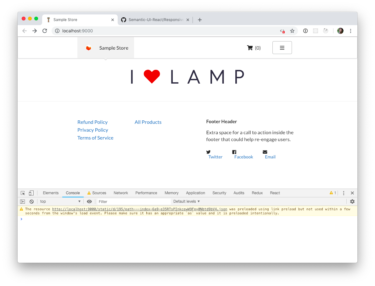
I have created this example repo that reproduces the issue. Run npm run serve, visit the homepage, and you should be able to view the issue.
To reproduce the issue after loading the page, "Clear Site Data" under "Application" in Chrome DevTools and hard refresh the page.
Expected result
The component is expected to render correctly on first page load, but is only rendered correctly after the page is refreshed or when navigating to another page.


Generated HTML:
<div role="listbox" aria-expanded="false" class="ui item dropdown" tabindex="0">
  <div class="text" role="alert" aria-live="polite">Products</div>
  <i aria-hidden="true" class="dropdown icon"></i>
  <div class="menu transition">
    <div class="header">Categories</div>
    <a role="option" class="item" href="/bikes/">Bikes</a>
  </div>
</div>
Actual result
The component is not rendered correctly on first page load.

Generated HTML:
<div class="ui text container">
  <div class="right menu">Products</div>
  <i aria-hidden="true" class="dropdown icon"></i>
  <div class="menu transition">
    <div class="header">Categories</div>
    <a role="option" class="item" href="/bikes/">Bikes</a>
  </div>
</div>
Environment
  System:
    OS: macOS 10.14.1
    CPU: (8) x64 Intel(R) Core(TM) i7-4770HQ CPU @ 2.20GHz
    Shell: 2.7.1 - /usr/local/bin/fish
  Binaries:
    Node: 11.3.0 - /usr/local/bin/node
    npm: 6.5.0 - /usr/local/bin/npm
  Languages:
    Python: 2.7.10 - /usr/bin/python
  Browsers:
    Chrome: 71.0.3578.98
    Firefox: 57.0
    Safari: 12.0.1
  npmPackages:
    gatsby: ^2.0.77 => 2.0.77
    gatsby-image: ^2.0.22 => 2.0.25
    gatsby-plugin-google-analytics: ^2.0.8 => 2.0.8
    gatsby-plugin-less: ^2.0.8 => 2.0.8
    gatsby-plugin-manifest: ^2.0.12 => 2.0.12
    gatsby-plugin-nprogress: ^2.0.7 => 2.0.7
    gatsby-plugin-offline: ^2.0.20 => 2.0.20
    gatsby-plugin-react-helmet: ^3.0.5 => 3.0.5
    gatsby-plugin-sharp: ^2.0.17 => 2.0.17
    gatsby-plugin-styled-components: ^3.0.4 => 3.0.4
    gatsby-source-filesystem: ^2.0.12 => 2.0.12
    gatsby-transformer-sharp: ^2.1.9 => 2.1.9
  npmGlobalPackages:
    gatsby-cli: 2.4.8
 rahuldhir
All 5 comments
Thank you for opening this and including a reproduction repo @rahuldhir
This looks like a React hydration issue
When the production build is rendered, the desktop menu is not included in the HTML (disabled
This is because Responsive as seen below defaults width to 0 in non browser environments
https://github.com/Semantic-Org/Semantic-UI-React/blob/d53b3545476954baa9f5e7f783179fdded0ecb8f/src/addons/Responsive/Responsive.js#L50
As a result, when the app is hydrated you get a strange state that is a mix of both desktop and mobile
 sidharthachatterjee
on 14 Jan 2019
sidharthachatterjee
on 14 Jan 2019
@sidharthachatterjee I'm fairly new to React. Do you think you could explain further or point me to a resource where I could learn how to mitigate this issue from occurring?
I'd like the Responsive component to play nicely with Gatsby, such that the desktop menu is rendered correctly on a desktop viewport and the mobile menu is rendered correctly on a mobile viewport.
rahuldhir
on 10 Feb 2019
You're using window APIs to decide what to render.
What you'll want to do is render both the desktop and mobile views and show/hide them based on media queries in your CSS. This way they'll work when SSRed and in the browser.
 KyleAMathews
on 11 Feb 2019
KyleAMathews
on 11 Feb 2019
Got it, thanks!
rahuldhir
on 11 Feb 2019
I also have the same problem, but with custom built Responsive component. It uses window.innerWidth & window.innerHeight. When I set the defaulting values of width and height to 0 I always get the mobile views on the initial load and 1 second later page re-renders and I get the desktop version (unless I am on a mobile device of course). This is a bad user experience.
This approach is not a good solution for the case of statically generated websites, and using CSS like "display: none" is also not a good solution because react renders those components as well and the html size gets bigger.
Is there any solution that will allow to render Mobile components on mobile devices and Desktop components on laptops & PCs without the drawbacks of the above 'solutions'?
 Ivan-Parushev
on 14 Aug 2019
Ivan-Parushev
on 14 Aug 2019
Related issues
 brandonmp
·
3Comments
brandonmp
·
3Comments
 totsteps
·
3Comments
totsteps
·
3Comments
 ferMartz
·
3Comments
ferMartz
·
3Comments
 andykais
·
3Comments
andykais
·
3Comments
 kalinchernev
·
3Comments
kalinchernev
·
3Comments
Most helpful comment
I also have the same problem, but with custom built Responsive component. It uses window.innerWidth & window.innerHeight. When I set the defaulting values of width and height to 0 I always get the mobile views on the initial load and 1 second later page re-renders and I get the desktop version (unless I am on a mobile device of course). This is a bad user experience.
This approach is not a good solution for the case of statically generated websites, and using CSS like "display: none" is also not a good solution because react renders those components as well and the html size gets bigger.
Is there any solution that will allow to render Mobile components on mobile devices and Desktop components on laptops & PCs without the drawbacks of the above 'solutions'?