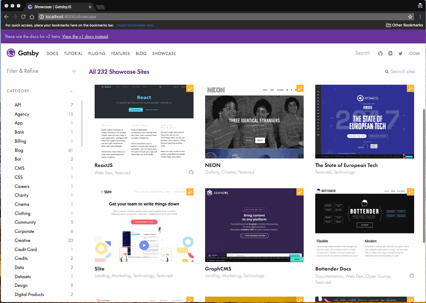
Gatsby: [Site showcase] we should make the column width for sites flexible so that we fill all the space at different screen widths
Currently there's often odd amounts of white space to the right and some computers only have two columns when three would easily fit.
 KyleAMathews
All 6 comments
We want to do the same for the starter showcase, right? :P
 fk
on 7 Sep 2018
fk
on 7 Sep 2018
Yeah both :-)
KyleAMathews
on 8 Sep 2018
Just looking for something easy as a first ever open source contribution here.
can I suggest something like this with fluid images to fix the whitespace on the right issue?
I also noticed the starter-showcase doesn't always use the shared styles so I'll add those if that's ok. (or should there be a separate issue/pr for that?)
 riencoertjens
on 8 Sep 2018
riencoertjens
on 8 Sep 2018
Hey @riencoertjens! 👋
Woahh, this is looking exactly like what we (well, I 😉— but I'm quite sure @KyleAMathews agrees) were thinking of! This looks almost ready to get merged in!? 😍🎉
Want to get a PR up with what you've got?
I also noticed the starter-showcase doesn't always use the shared styles so I'll add those if that's ok. (or should there be a separate issue/pr for that?)
Def. would be great to have what we need to make this happen for both showcases consolidated; no need to split that up into two separate PRs IMO! Looking forward to review this! 🤗
fk
on 8 Sep 2018
@fk @KyleAMathews we have fixed the site showcase. But what about starters showcase?
 kakadiadarpan
on 20 Sep 2018
kakadiadarpan
on 20 Sep 2018
@kakadiadarpan Both are fixed! 👍
Forgot to close this, this was fixed via #7998.
fk
on 20 Sep 2018
Related issues
 totsteps
·
3Comments
KyleAMathews
·
3Comments
totsteps
·
3Comments
KyleAMathews
·
3Comments
 mikestopcontinues
·
3Comments
mikestopcontinues
·
3Comments
 timbrandin
·
3Comments
timbrandin
·
3Comments
 3CordGuy
·
3Comments
3CordGuy
·
3Comments
Most helpful comment
Just looking for something easy as a first ever open source contribution here.
can I suggest something like this with fluid images to fix the whitespace on the right issue?
I also noticed the starter-showcase doesn't always use the shared styles so I'll add those if that's ok. (or should there be a separate issue/pr for that?)