Gatsby: Invisible "Load More" button on the Showcase
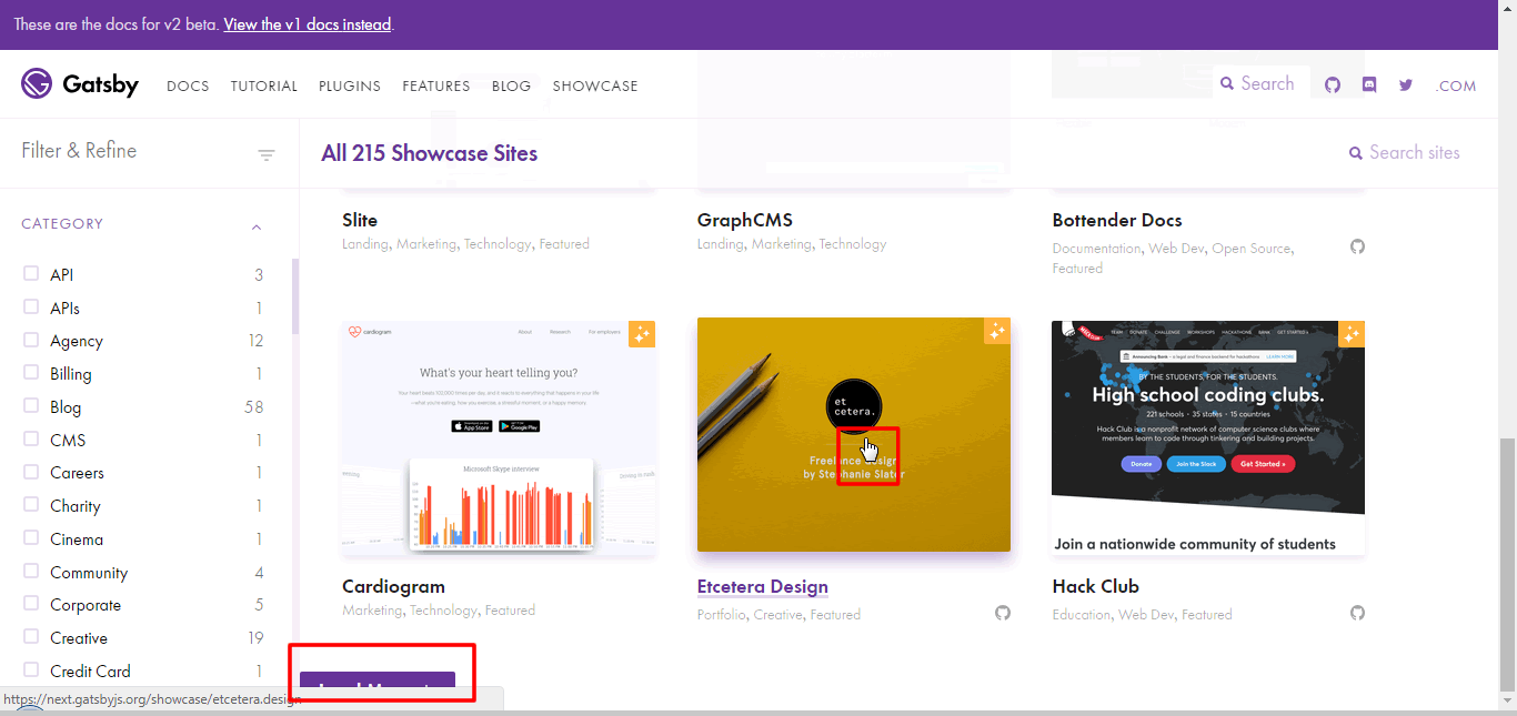
When I'm browsing the Showcase, I scroll to the bottom and I'm looking for the "Load More" button, but if my pointer is over a link area and that is almost always the button is covered by Chorme link preview.
I think that's a good case to be bold. The button should be big centered and surrounded by white space.

 greglobinski
All 4 comments
Hey Greg 👋, thanks for reporting this!
almost always the button is covered by Chrome link preview
This worked in the past, it seems the margin styles that prevented this (and indented the button correctly) broke during a recent merge.
I think that's a good case to be bold. The button should be big centered and surrounded by white space.
I agree, and I really like your mockup—much better! Let's do this!
 fk
on 15 Aug 2018
fk
on 15 Aug 2018
There you go. Hope I did everything correctly :)
 Manoz
on 15 Aug 2018
Manoz
on 15 Aug 2018
Fixed and merged in #7353
Manoz
on 16 Aug 2018
Whoops, forgot to close this! Thanks again @Manoz!
fk
on 17 Aug 2018
Related issues
 omrllm
·
83Comments
omrllm
·
83Comments
 dustinhorton
·
156Comments
dustinhorton
·
156Comments
 TuckerWhitehouse
·
69Comments
TuckerWhitehouse
·
69Comments
 KyleAMathews
·
97Comments
KyleAMathews
·
97Comments
 kripod
·
74Comments
kripod
·
74Comments