Gatsby: [www] IA redesign: Allow "accordions" on any navigation level
… not only the top-level items.
While we're at that, add the following as discussed around https://github.com/gatsbyjs/gatsby/pull/6245#issuecomment-403487321:
- add optional toggle and direct-click areas for items with subitems: an item can thus either be
- a "plain" item which on click shows the associated page
- a "item list header" item which on click expands/collapses its contents
- a "hybrid" item that allows both expanding a subsection of the item by clicking on the caret as well as navigating to the page associated with the item itself directly by clicking on the item title
- auto-collapse nested subitems
- allow navigation items to be infinitely nested
- adjust UI to clearly convey the "hybrid" item functionality:
 fk
fk
All 4 comments
@calcsam @KyleAMathews @shannonbux
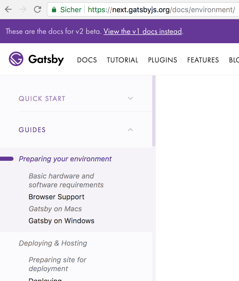
I set up the PR for this to build on Netlify from my fork so that we have a deploy preview to take a look at together. Could you take a look at https://elated-goldwasser-ec35d0.netlify.com/docs/ please and let me know what you think?
- This is mainly about the
/docs/section and the subitems there -- - "Tutorial" works OK but does not yet "auto-expand" all subitems like we currently do on https://next.gatsbyjs.org/tutorial/
- the "Features" sidebar UI suffers quite a bit from the horizontal lines that currently are the default for every sidebar navigation item
- we could bring back bespoke UI designs for those two sections that are close(r) to what we currently have on https://next.gatsbyjs.org/tutorial/ and https://next.gatsbyjs.org/features/
The main thing I'm worried about is if this is not in parts a regression from what we currently have at https://next.gatsbyjs.org/.
While it implements everything outlined in the issue description, I think I understood that the benefit of this mainly lies in
- not requiring for subitems like "Guides -> Preparing your Environment" to have to link to an item, which frees us of having to create "overview" pages (related: #6194)
- being able to initially collapse sub-subitems (the children of "Preparing your Environment") to grant the user a better overview of a top-level section and its direct children
IMO the horizontal lines -- which are mainly there to facilitate the "split button" functionality (for an item that both links to a page and has subitems which can be expanded/collapsed, we wanted a horizontal line separating the item's title/link from the item's button to expand/collapse its children) -- add a lot of visual noise and use more vertical space than the previous approach. (while also _clearly_ separating items, and increasing the clickable area).
What I'm wondering is
- do we _really_ need that functionality given 1) above -- how many subitems would both link to a page and have subitems? (again throwing in #6194 here)
- maybe the first of the two mockups from would have been the better choice -- def. not as clear, but takes away less vertical space and does not need the horizontal lines:
- the only user benefit of the split button is to be able to collapse/expand the item's children without having to change pages -- how often is this really required?
fk
on 31 Jul 2018
Wow Flo -- the https://elated-goldwasser-ec35d0.netlify.com/docs/ looks
amazing.
The clear distinctions are really great & super helpful -- I feel like that
was missing from the other version.
I wouldn't worry about the vertical space -- we're saving so much by not
auto-expanding everything we can spend a bit on this. Totally worth it. The
IA is so much clearer this way.
And the "split" button is great as well. I'd say this is good to go as is!
On Tue, Jul 31, 2018 at 11:13 AM, Florian Kissling <[email protected]
wrote:
@calcsam https://github.com/calcsam @KyleAMathews
https://github.com/KyleAMathews @shannonbux
https://github.com/shannonbuxI set up the PR for this to build on Netlify from my fork so that we have
a deploy preview to take a look at together. Could you take a look at
https://elated-goldwasser-ec35d0.netlify.com/docs/ please and let me know
what you think?
- This is mainly about the /docs/ section and the subitems there --
- "Tutorial" works OK but does not yet "auto-expand" all subitems like
we currently do on https://next.gatsbyjs.org/tutorial/- the "Features" sidebar UI suffers quite a bit from the horizontal
lines that currently are the default for every sidebar navigation item- we could bring back bespoke UI designs for those two sections that
are close(r) to what we currently have on https://next.gatsbyjs.org/
tutorial/ and https://next.gatsbyjs.org/features/The main thing I'm worried about is if this is not in parts a regression
from what we currently have at https://next.gatsbyjs.org/.While it implements everything outlined in the issue description, I think
I understood that the benefit of this mainly lies in
- not requiring for subitems like "Guides -> Preparing your
Environment" to have to link to an item, which frees us of having to create
"overview" pages (related: #6194
https://github.com/gatsbyjs/gatsby/issues/6194)- being able to initially collapse sub-subitems (the children of
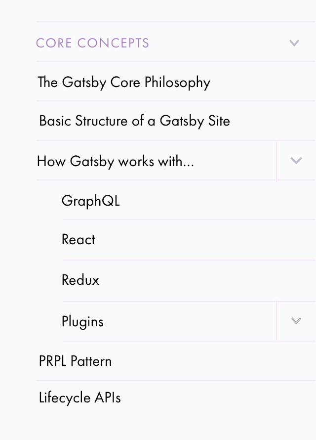
"Preparing your Environment") to grant the user a better overview of a
top-level section and its direct children[image: bildschirmfoto 2018-07-31 um 19 36 18]
https://user-images.githubusercontent.com/21834/43477207-e792d64e-94fa-11e8-905e-edec8a09df36.pngIMO the horizontal lines -- which are mainly there to facilitate the
"split button" functionality (for an item that both links to a page and has
subitems which can be expanded/collapsed, we wanted a horizontal line
separating the item's title/link from the item's button to expand/collapse
its children) -- add a lot of visual noise and use more vertical space than
the previous approach. (while also clearly separating items, and
increasing the clickable area).
What I'm wondering is
- do we really need that functionality given 1) above -- how many
subitems would both link to a page and have subitems? (again throwing in
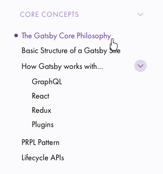
#6194 https://github.com/gatsbyjs/gatsby/issues/6194 here)- maybe the first of the two mockups from would have been the better
choice -- def. not as clear, but takes away less vertical space and does
not need the horizontal lines: [image: image]
https://user-images.githubusercontent.com/21834/42453453-13904846-838d-11e8-8454-14d52c567af3.png- the only user benefit of the split button is to be able to
collapse/expand the item's children without having to change pages -- how
often is this really required?—
You are receiving this because you were mentioned.
Reply to this email directly, view it on GitHub
https://github.com/gatsbyjs/gatsby/issues/6605#issuecomment-409316996,
or mute the thread
https://github.com/notifications/unsubscribe-auth/AEL3WwMhKpzqzunFFE9uSzvaVDKba-wEks5uMJ40gaJpZM4VX9Gj
.
 calcsam
on 31 Jul 2018
calcsam
on 31 Jul 2018
Keeping the split button--
I'm about to do some usability tests over the next week (have 4 people
signed up) so I'll pay attention to the split button.
On Tue, Jul 31, 2018 at 12:13 PM, Florian Kissling <[email protected]
wrote:
@calcsam https://github.com/calcsam @KyleAMathews
https://github.com/KyleAMathews @shannonbux
https://github.com/shannonbuxI set up the PR for this to build on Netlify from my fork so that we have
a deploy preview to take a look at together. Could you take a look at
https://elated-goldwasser-ec35d0.netlify.com/docs/ please and let me know
what you think?
- This is mainly about the /docs/ section and the subitems there --
- "Tutorial" works OK but does not yet "auto-expand" all subitems like
we currently do on https://next.gatsbyjs.org/tutorial/- the "Features" sidebar UI suffers quite a bit from the horizontal
lines that currently are the default for every sidebar navigation item- we could bring back bespoke UI designs for those two sections that
are close(r) to what we currently have on https://next.gatsbyjs.org/
tutorial/ and https://next.gatsbyjs.org/features/The main thing I'm worried about is if this is not in parts a regression
from what we currently have at https://next.gatsbyjs.org/.While it implements everything outlined in the issue description, I think
I understood that the benefit of this mainly lies in
- not requiring for subitems like "Guides -> Preparing your
Environment" to have to link to an item, which frees us of having to create
"overview" pages (related: #6194
https://github.com/gatsbyjs/gatsby/issues/6194)- being able to initially collapse sub-subitems (the children of
"Preparing your Environment") to grant the user a better overview of a
top-level section and its direct children[image: bildschirmfoto 2018-07-31 um 19 36 18]
https://user-images.githubusercontent.com/21834/43477207-e792d64e-94fa-11e8-905e-edec8a09df36.pngIMO the horizontal lines -- which are mainly there to facilitate the
"split button" functionality (for an item that both links to a page and has
subitems which can be expanded/collapsed, we wanted a horizontal line
separating the item's title/link from the item's button to expand/collapse
its children) -- add a lot of visual noise and use more vertical space than
the previous approach. (while also clearly separating items, and
increasing the clickable area).
What I'm wondering is
- do we really need that functionality given 1) above -- how many
subitems would both link to a page and have subitems? (again throwing in
#6194 https://github.com/gatsbyjs/gatsby/issues/6194 here)- maybe the first of the two mockups from would have been the better
choice -- def. not as clear, but takes away less vertical space and does
not need the horizontal lines: [image: image]
https://user-images.githubusercontent.com/21834/42453453-13904846-838d-11e8-8454-14d52c567af3.png- the only user benefit of the split button is to be able to
collapse/expand the item's children without having to change pages -- how
often is this really required?—
You are receiving this because you were mentioned.
Reply to this email directly, view it on GitHub
https://github.com/gatsbyjs/gatsby/issues/6605#issuecomment-409316996,
or mute the thread
https://github.com/notifications/unsubscribe-auth/Ae9o2omVg6SOrkwdAU0DHobJV30WkLz6ks5uMJ49gaJpZM4VX9Gj
.
 shannonbux
on 4 Aug 2018
shannonbux
on 4 Aug 2018
👍
fk
on 6 Aug 2018
Related issues
 timbrandin
·
3Comments
timbrandin
·
3Comments
 andykais
·
3Comments
andykais
·
3Comments
 Oppenheimer1
·
3Comments
Oppenheimer1
·
3Comments
 signalwerk
·
3Comments
signalwerk
·
3Comments
 benstr
·
3Comments
benstr
·
3Comments
Most helpful comment
Wow Flo -- the https://elated-goldwasser-ec35d0.netlify.com/docs/ looks
amazing.
The clear distinctions are really great & super helpful -- I feel like that
was missing from the other version.
I wouldn't worry about the vertical space -- we're saving so much by not
auto-expanding everything we can spend a bit on this. Totally worth it. The
IA is so much clearer this way.
And the "split" button is great as well. I'd say this is good to go as is!
On Tue, Jul 31, 2018 at 11:13 AM, Florian Kissling <[email protected]