Gala: Show window titles in Multitasking View
Prerequisites
- [x] I have searched open and closed issues for duplicates.
Feature
Is your feature request related to a problem? Please describe.
Recently I had lots of pdf viewers open and they showed similar pdf files. I wanted to choose with SUPER + DOWN (window overview? ) but I couldnt because they look so similar.
Describe the solution you'd like
Show a tooltip with the window's title so I can distinguish them better.
Existing work
Describe alternatives you've considered
On Windows they show the window's title below the picture of the window.
Additional context
 snowparrot
All 10 comments
Yeah, I've wondered about exposing the window title somewhere as well. A tooltip could work to keep the UI looking the same, though it's less discoverable than just putting a label in the UI.
 cassidyjames
on 12 May 2020
cassidyjames
on 12 May 2020
I think that this should absolutely be a feature. Without it, I have to regularly resort to guesswork switching windows (many times every day), which is not a great experience. Some arguments both ways on the labeling style for your consideration:
- I think that a plain label would be more helpful than a tooltip for scanning. That way I don't have to hover my mouse over every candidate window, although it would require some work to make these labels readable. The simple solution would be to give them a solid background, but I'm not sure that's something we want to do.
- The tooltips don't provide this information at a glance, but if we make them responsive they can be fairly fast. This would be less cluttered, since every window would have to have a label in the other version. If there are a lot of windows on the desktop, that would be a lot of text, and would force each preview to be even smaller. IMO if we implement this version, we should make sure that the tooltips appear instantly, so I'm not waiting for a fraction of a second over each window I want to check. It would also make the labels discoverable, since they'd appear every time someone uses the multitasking view.
FWIW, GNOME uses permanent labels and macOS uses tooltips.
 mcclurgm
on 29 Jul 2020
mcclurgm
on 29 Jul 2020
An example when the multitasking view is difficult to use, happening to me very frequently:
 Akryum
on 12 Feb 2021
Akryum
on 12 Feb 2021
@Akryum that's me every day :rofl:
I'm putting something together, it is still in a early stage, but I'll open a PR tomorrow so @cassidyjames can make his magic with the design...
I think it looks better with bigger text:
 JoseExposito
on 3 Mar 2021
JoseExposito
on 3 Mar 2021
@JoseExposito I know it’s early, but I would say that the icon should always overlap the edge of the window. I would also consider only showing the title on hover (recreating a tooltip) because it _should_ be relatively obvious which app is which in the default use case, while a title on hover can help disambiguate when needed without adding a ton of visual noise all the time.
cassidyjames
on 3 Mar 2021
@cassidyjames But then if you have a lot of windows open (4 or more), it's easier to find the window you want with the names always visible instead of checking them one by one.
Akryum
on 3 Mar 2021
On Windows 10 for reference:
Akryum
on 3 Mar 2021
Chrome OS:
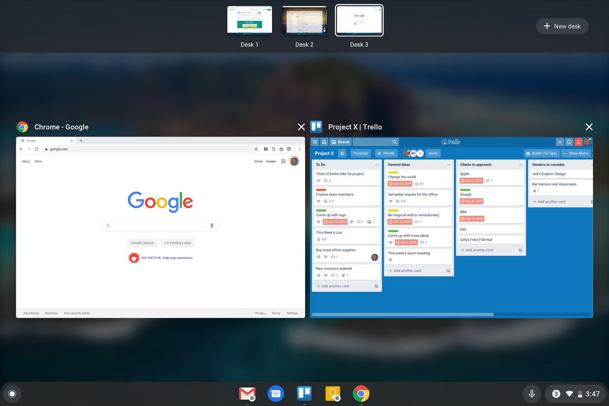
Akryum
on 3 Mar 2021
Just created a PR with more screenshots of how could it look like.
I'm not a big fan of Windows approach, because, depending on your wallpaper, the text could have little or no contrast. I guess that's why Chrome OS is blurring the background.
JoseExposito
on 4 Mar 2021
I think Windows is adding a transparent black overlay on top of the wallpaper
Akryum
on 4 Mar 2021
Related issues
cassidyjames
·
4Comments
 techdev5521
·
3Comments
techdev5521
·
3Comments
 steakscience
·
3Comments
steakscience
·
3Comments
 Janiczek
·
4Comments
Janiczek
·
4Comments
 brigazvi
·
3Comments
brigazvi
·
3Comments
Most helpful comment
Yeah, I've wondered about exposing the window title somewhere as well. A tooltip could work to keep the UI looking the same, though it's less discoverable than just putting a label in the UI.