Fullpage.js: In responsive mode first slide's anchor changes to last slide's anchor
Hi!
I've tried to replicate this issue with your demos but had no luck.
I have a very strange behaviour with responsive mode (tried different configurations, also from your demo).
Once in the responsive/mobile mode you slide from the first slide (#intro) to next one and come back to the first slide. In such way, the URL in the address bar shows not the first anchor, as it should, but the last one!
Here is live demo
The config:
        $('#splitscreen').fullpage({
            scrollingSpeed: 800,
            responsiveHeight: 820,
            anchors: ['intro', 'profilis', 'portfolio', 'kontaktai'],
            navigation: false,
            css3: true,
            autoScrolling: true,
            fitToSection: true,
            fitToSectionDelay: 1000,
            verticalCentered: false,
            easing: 'easeInOutCubic',
            easingcss3: 'ease',

            keyboardScrolling: true,
            animateAnchor: true,
            recordHistory: true
        });
    First and last slides have simple structure with responsive classes:

    **First:**
        <section class="section fp-auto-height-responsive">
            <div class="column column-left introduction">
                <div class="valign">
                    <div class="valign-inner">
                        <video>
                            <source data-src="" type="video/mp4" />
                        </video>
                        <div class="intro-content">

                        </div>
                    </div>
                </div>
            </div>
            <div class="column column-right">
                <div class="valign">
                    <div class="valign-inner profile">
                        <div class="profile-content clearfix">
                            <div class="col-sm-12 col-xs-12">
                            </div>
                        </div>
                    </div>
                </div>
            </div>
        </section>
**Last:**
        <section class="section fp-auto-height-responsive">
            <div class="column column-left">
                <div class="valign">
                    <div class="valign-inner contact-page-bg-color">
                        <div class="contact-style">
                            <div class="contact-form col-sm-11 clearfix">
                                <div class="form-container">
                                    <form method="post" class="row onyx-gap contact-form">
                                    </form>
                                </div>
                            </div>
                        </div>
                        <div class="contact-details clearfix">
                        </div>
                    </div>
                </div>
            </div>


            <div class="column column-right hidden-xs">
                <div class="valign">
                    <div class="valign-inner contact-page-bg">
                        <div class="image-container">
                        </div>
                    </div>
                </div>
            </div>
        </section>
Many thanks!
 01Kuzma
All 22 comments
I do not check private websites here, I only provide premium support for people who acquired the Organization license.
Please provide an isolated reproduction in jsfiddle or Codepen, with no CSS or JS files external to fullPage.js and the minimum amount of HTML code. Use empty sections unless strictly necessary for the reproduction.
Perhaps you might find useful to read my article regarding how to create isolated reproductions.
 alvarotrigo
on 19 Apr 2019
alvarotrigo
on 19 Apr 2019
Definitely I would isolate it, but none of jsfiddle or CodePen sandboxes displays the anchor changes in the browser's URL address bar... While this issue relates to URL bar :/
01Kuzma
on 20 Apr 2019
You can then create the isolated reproduction in your own server.
alvarotrigo
on 20 Apr 2019
Thank you!
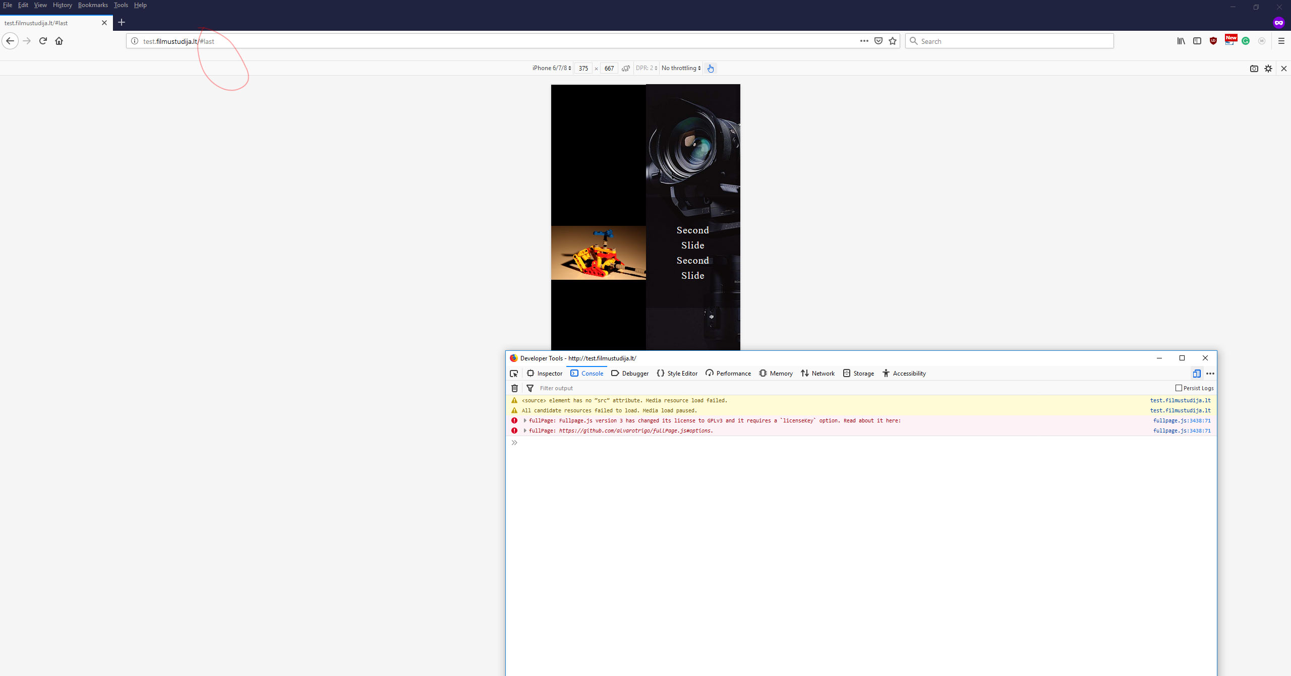
I've made this test subdomain with a minimum of excessive code and with image and video placeholders.
Navigate to link, engage the responsive mode, slide down till #last hash anchor appears in the URL address bar.
Then slide up and you will see that firstly the #intro anchor is reached and at the very top of the page the #last anchor appears.
So somehow the last section becomes active while the first is reached...
The main script.js
$(document).ready(function () {

    'use strict';


    var fullPageCreated = false;
    createFullpage();

    function createFullpage() {
        if (fullPageCreated === false) {
            fullPageCreated = true;
            $('#splitscreen').fullpage({
                scrollingSpeed: 1000,
                verticalCentered: false,
                anchors: ['intro', 'first', 'last'],
                navigation: true,
                navigationPosition: 'left',
                css3: true,
                scrollingSpeed: 800,
                autoScrolling: true,
                fitToSection: true,
                fitToSectionDelay: 1000,
                scrollBar: false,
                easing: 'easeInOutCubic',
                easingcss3: 'ease',
                keyboardScrolling: true,
                animateAnchor: true,
                recordHistory: true
            });
        }
    }

    function createFullpageMob() {

        $('#splitscreen').fullpage({
            scrollingSpeed: 800,
            responsiveHeight: 820,
            anchors: ['intro', 'first', 'last'],
            navigation: false,
            css3: true,
            autoScrolling: true,
            fitToSection: true,
            fitToSectionDelay: 1000,
            verticalCentered: false,
            easing: 'easeInOutCubic',
            easingcss3: 'ease',

            keyboardScrolling: true,
            animateAnchor: true,
            recordHistory: true
        });

    }

    if (document.documentElement.clientWidth < 400) {
        $.fn.fullpage.destroy('all');
    }

    $(window).resize(function () {
        //moblie width change 400
        if ($(window).width() > 400) {
            createFullpage();
        } else {
            if (fullPageCreated == true) {
                fullPageCreated = false;
                $.fn.fullpage.destroy('all');
                createFullpageMob();
            }
        }

    });


});
And two style sheets are used.
style.css (this is minimized version):
html,
body {
    height: 100%;
}

.valign {
    display: table;
    table-layout: fixed;
    width: 100%;
    height: 100%;
    margin: 0;
    padding: 0;
}

.valign .valign-inner {
    display: table-cell;
    width: 100%;
    height: 100%;
    margin: 0;
    padding: 0;
    vertical-align: middle;
}

#splitscreen {
    width: 100%;
    height: 100%;
}

.section {
    overflow: hidden;
    position: relative;
    float: left;
    width: 100%;
    height: 100%;
}

.video {
    position: absolute;
    top: 50vh;
    left: 0;
    transform: translateY(-50%);
    width: 50vw;
    height: 100vh;
    z-index: -1;
    -webkit-transition: opacity 2s ease;
    -o-transition: opacity 2s ease;
    -moz-transition: opacity 2s ease;
    transition: opacity 2s ease;
    background-color: #000;
}

.intro-content {
    position: relative;
    top: 35%;
    z-index: 10;
    opacity: 0.9;
    -webkit-transform: translateY(-50%);
    -moz-transform: translateY(-50%);
    -ms-transform: translateY(-50%);
    -o-transform: translateY(-50%);
    transform: translateY(-50%);
}
responsive.css
@media screen and (max-width: 740px) {
    .section {
        height: auto !important;
    }
}

@media screen and (min-width: 741px) {

    #splitscreen > .section .column-left {
        transition: all 1s ease 0s;
        transform: translateY(100%);
        backface-visibility: hidden;
    }

    #splitscreen > .section .column-right {
        transition: all 1s ease 0s;
        transform: translateY(-100%);
        backface-visibility: hidden;
    }
    #splitscreen > .section.active {
        z-index: 1;
    }
    #splitscreen > .section.active .column-left {
        transform: translateY(0);
    }
    #splitscreen > .section.active .column-right {
        transform: translateY(0);
    }
    #splitscreen > .section.active ~ .section .column-left {
        transform: translateY(-100%);
    }
    #splitscreen > .section.active ~ .section .column-right {
        transform: translateY(100%);
    }
}

@media screen and (min-width: 741px) {
    #splitscreen {
        transform: translate3d(0px, 0px, 0px) !important;
    }

    #splitscreen > .section {
        position: absolute;
        top: 0;
        left: 0;
    }
}

@media only screen and (max-width : 420px) {
    #splitscreen > .section .column-left {
        width: 100%;
    }
    #splitscreen > .section .column-right {
        width: 100%;
    }
    .video {
        position: absolute;
        width: 100vw;
        height: 100vh;
        z-index: -1;
    }

}
Can you please remove these files too?
<link type="text/css" rel="stylesheet" href="bootstrap/css/bootstrap.min.css">
<link rel="stylesheet" type="text/css" href="css/style.css">
<link rel="stylesheet" type="text/css" href="css/responsive.css">
And also get rid of all JS code that is not the fullpage.js initialisation in the following file?
alvarotrigo
on 20 Apr 2019
Also please get rid of the 2 columns sliding.
alvarotrigo
on 20 Apr 2019
I've removed the bootsrap.min.css and left only one init of FullPage.js in script.js without mobile detection logic.
But 2 column sliding is disabled once you enter the responsive mode.
By the way could the meta viewport be the issue?
Thank you!
01Kuzma
on 20 Apr 2019
Can you please remove these files too?
<link rel="stylesheet" type="text/css" href="css/style.css">
<link rel="stylesheet" type="text/css" href="css/responsive.css">
Can you also update fullpage.js file to the latest version 3.0.5?
alvarotrigo
on 20 Apr 2019
Btw, I don't manage to enter into responsive mode?
alvarotrigo
on 20 Apr 2019
I've updated library to 3.0.5 and removed the responsive.css, without style.css it not gonna work.
Btw, I don't manage to enter into responsive mode?
This issue is reproducing only in responsive mode:
01Kuzma
on 20 Apr 2019
@01Kuzma thanks for that! I was able to reproduce the issue!
when in responsive mode scrolling to the very top shows the last section's anchor.
I'll mark it as a bug and hopefully we can get it fixed for the next release!
Thanks for reporting it!
alvarotrigo
on 21 Apr 2019
Great, I will wait for the news
01Kuzma
on 21 Apr 2019
Hi!
Any updates? possible release date?
01Kuzma
on 9 Jun 2019
@01Kuzma not yet. But I'll try to take a look at it for this week.
alvarotrigo
on 9 Jun 2019
@01Kuzma can you please provide another isolated reproduction of it in in a new simple page with the minimum amount of code?
I was trying to reproduce it on my end and I can't seem to be able to reproduce it here:
https://alvarotrigo.com/fullPage/examples/bug.html
alvarotrigo
on 10 Jun 2019
Hi!
I've mostly removed everything from test.filmustudija.lt/
The section from right is removed.
I hope that it's the minimum of required code to demonstrate the issue
01Kuzma
on 11 Jun 2019
Thanks! I'll take a look at it!
alvarotrigo
on 11 Jun 2019
@01Kuzma as pointed in the the fullpage.js documentation you should be using the compulsory <!DOCTYPE html> at the top of your HTML page.
Use it and you'll see now your site looks different.
You can't have absolute positioned elements in section with fp-auto-height-responsive as otherwise the section will be smaller than its content because it can not detect its content height.
Consider changing it to position:relative; on responsive.
alvarotrigo
on 11 Jun 2019
Thank you very much!
It is a clue.
As a base demo, I took this tutorial to make a vertical split screen.
However, adding the <!DOCTYPE html> breaks the functionality...
Any advice?
01Kuzma
on 11 Jun 2019
@01Kuzma perhaps using my other component? multiScroll.js
alvarotrigo
on 11 Jun 2019
Great, thank you!
01Kuzma
on 11 Jun 2019
Related issues
 anonet1
·
3Comments
anonet1
·
3Comments
 mxnvkv
·
4Comments
mxnvkv
·
4Comments
 ortonomy
·
3Comments
ortonomy
·
3Comments
 LukeCarlThompson
·
4Comments
LukeCarlThompson
·
4Comments
 piaomiao
·
5Comments
piaomiao
·
5Comments