The original icon prettier than the new MacOS one I think. :)
 hellonoko
All 5 comments
Can I confirm that you mean the original icon shown here: https://www.producthunt.com/posts/fsnotes

 gingerbeardman
on 11 May 2019
gingerbeardman
on 11 May 2019
It's not the original icon but perhaps @hellonoko was referring to the icon from #197?
 peavine
on 11 May 2019
peavine
on 11 May 2019
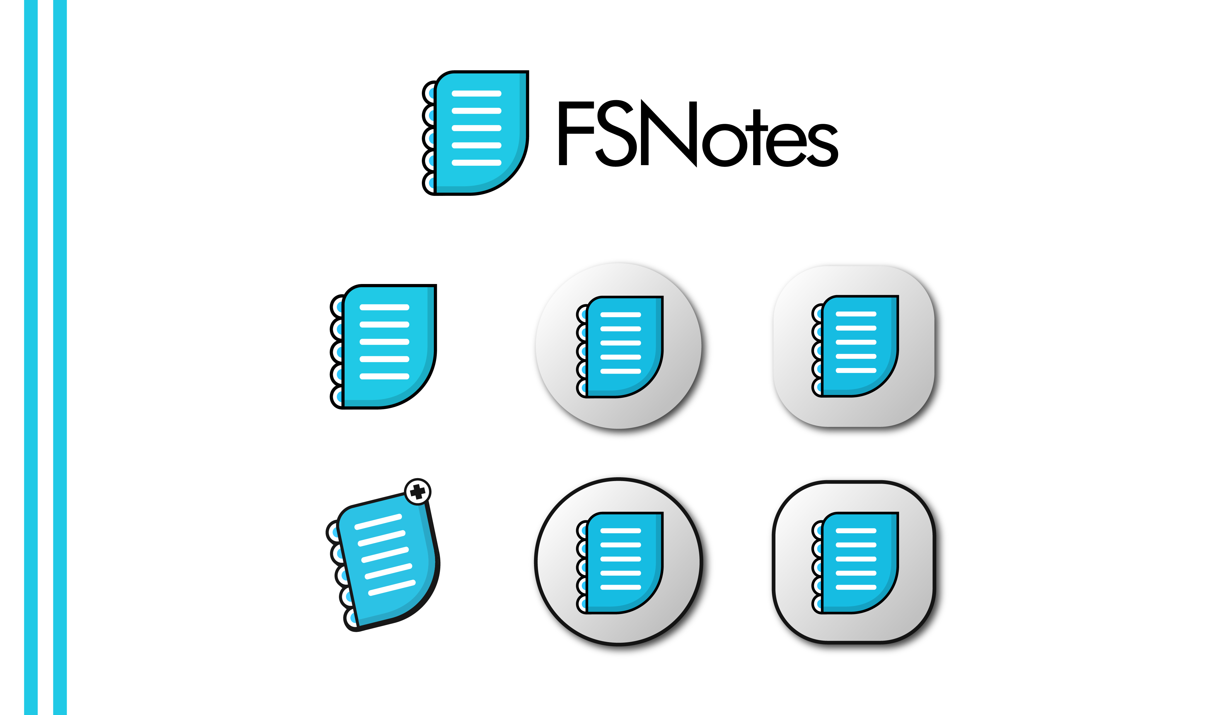
Ah yes sorry, I mean the version 2 icon Blue with the white stripes and tabs.
hellonoko
on 11 May 2019
I prefer the mac "thunder" icon though I can see why some people might prefer the previous icon.
The thunder icon does feel a bit heavy on the eye - probably because the note color goes from yellowish at the top to pinkish at the bottom.
The alternative icon with yellow thunder which you can select from the settings feels a lot "easier" on the eye but then again that one won't stand out as much because yellow thunder is pretty generic.
Also, there might be too heavy of a "shadow" on the icon compared to for instance Apple's own icons and this perhaps makes the thunder icon feel less sharp/polished.
 sven-gh
on 12 Jun 2019
sven-gh
on 12 Jun 2019
@sven-gh all good points, the thunder icon needed a bit more work but we had to launch. we'll look at it going forward, I think it's safe to say this will not be the last icon for FSNotes, there have been three so far!
gingerbeardman
on 12 Jun 2019
Related issues
 jakemkc
·
4Comments
jakemkc
·
4Comments
 fi0
·
4Comments
fi0
·
4Comments
 dmattera
·
3Comments
dmattera
·
3Comments
 volt4ire
·
4Comments
jakemkc
·
3Comments
volt4ire
·
4Comments
jakemkc
·
3Comments
Most helpful comment
@sven-gh all good points, the thunder icon needed a bit more work but we had to launch. we'll look at it going forward, I think it's safe to say this will not be the last icon for FSNotes, there have been three so far!