Frontend: New weather card: multiple issues
Checklist
- [x] I have updated to the latest available Home Assistant version.
- [x] I have cleared the cache of my browser.
- [x] I have tried a different browser to see if it is related to my browser.
The problem
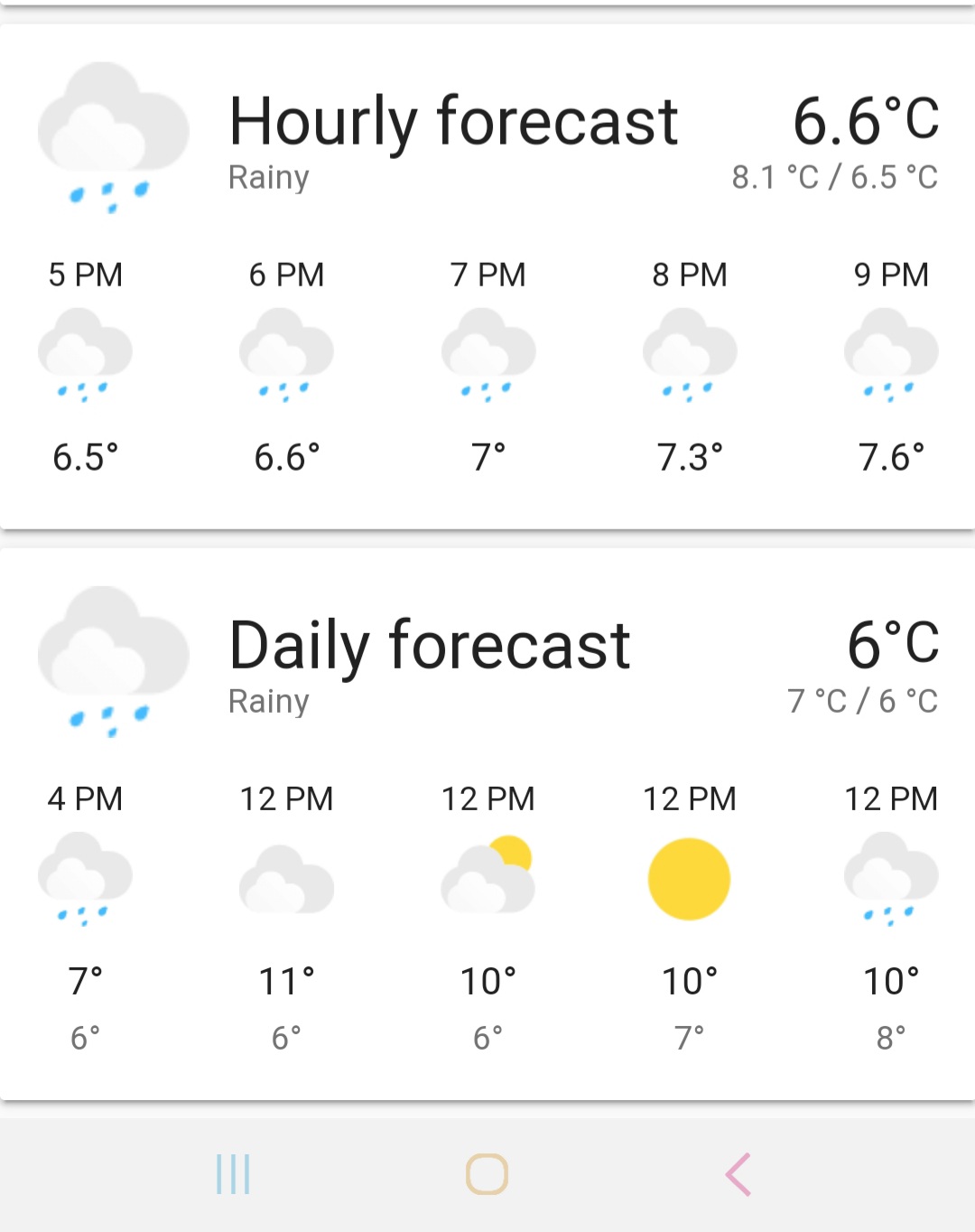
1) Important weather information has been removed such as wind speed/wind direction along with air pressure
2) Daily forecast doesn't show names of the days in mobile version, only 12 PM for each day. It displays names of the day correctly in desktop version though.
3) 24h time format is ignored in hourly forecast (old bug not related to the new card but not fixed)
4) Design of the wheather condition icons is not consistent with rest of mdi icons used in the interface
5) Icons such as clouds are barely visible due to lack of contrast with background when default theme is used
6) Big font for the name of the card which is static and not the most important information, not consistent with other cards
Expected behavior
Improvements in behaviour of the card compared to the previous version but not the downgrade in usefulness and not deviating from the overall design.
Steps to reproduce
Environment
- Home Assistant release with the issue: 0.109.x
- Last working Home Assistant release (if known): 0.108.x
- Browser and browser version: mobile Chrome 81.0.4044.117
- Operating system: Android 10
Problem-relevant configuration
Javascript errors shown in your browser console/inspector
Additional information
 Molodax
All 20 comments
This is true. That information is in More information and can be extracted via sensors and displayed using other cards.
hmm it seems your daily forecast is different than others. It starts the first time at the current time an that makes the time between the first entry and the second entry less than a day. Therefore it uses hours
Can you link the issue?
This is correct. They are better. MD Icons are not great for Large Cards/ Large Icons
Idk seems like good contrast with the back grey cloud
The font is set to the most important information. The state is not important as the icons show state
 zsarnett
on 30 Apr 2020
zsarnett
on 30 Apr 2020
- Correct. It is even possible to get this information from separate sensors. However, what should be the case of using this card? You know that in some regions wind is more important than temperature because it affects you more.
- The same card shows names of the day in desktop browser. So there is no consistency.
- Sorry, I will issue the new one.
- It becomes apparent that there is no consistency in the interface design. Will you change other icons then? Seems very subjective.
- Many on forum would disagree with you.
- Is the name of the card is the most important information for the weather?
Molodax
on 30 Apr 2020
Not arguing on this. The card use should be to show to most important information. Which is the Temp, State and Name.
Yea I don't understand that haha. I don't know why it would be different on different browsers
I can see this as an issue. I will have to make sure the data comes correctly from the integrations fro 24hr first
MD Icons are used, images are used, this is just an image.
Link some discussion. I will look at the SVGs and see if I can color them a bit more
The importance is Temp, State, Name, Extra info. State is show via Icon. Same reason the state is no longer on the weather row
zsarnett
on 30 Apr 2020
- Where does it come that name is more important than weather conditions such as wind in weather card? Any good example from weather aps, dashboards etc?
- It doesn't seem funny rather some new bug.
- Thanks.
- I understand this. Though it doesn't help for visually consistent design, rather do the opposite.
- Thanks. It is in the 0.109 discussion but I will link this issue to a separate discussion on the forum if needed.
- Same as 1.
Thanks for the option to not show forecast.
Molodax
on 30 Apr 2020
I do agree with the 6th point. Seeing 'Home' or 'Dark Sky' in larger text is a bit useless imho. I think we should swap the condition with the name
 timmo001
on 30 Apr 2020
timmo001
on 30 Apr 2020
I don't think you are reading my messages. I said importance Temp, STATE, name. The state is in the Icon. and it is below the name. Two places. TWO. More important than the name
Clearly you are a no humor kind of person. But yes I agree this is a bug. I just, without looking at code and without reproducing it, can't offhand think of why that is happening.
👍
I disagree. Just because we use icons and images doesn't Make it not consistent. Weather row uses the same images now. Just because we use Icons, does that mean we should use person images for entity rows? Or media card images?
I will take a look again at the discussion. Just know just because a few people want something different doesn't mean it will change. 🙂
same as 1
zsarnett
on 30 Apr 2020
The biggest problem is, when using the default HA theme, or no theme at all, half the icons are invisible.
 francisp2
on 1 May 2020
francisp2
on 1 May 2020
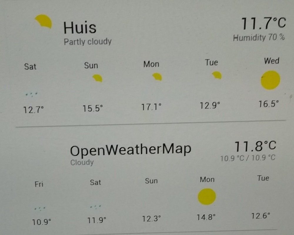
No matter ow I play with the setting of my monitor, this is what I get :
francisp2
on 1 May 2020
@francisp2 you have a terrible contrast on that screen 😬
 bramkragten
on 1 May 2020
bramkragten
on 1 May 2020
In my opinion contrast of those cloud icons is a bit low as well. Not much, but there might be slight room for improvement. My suggestion for colors would be:
EFEFEF for front cloud
CFCFCF for back cloud
Or something similar. I understand that this is highly dependent on one's personal opinions, display hardware and calibration, and theme being used.
All in all I very much prefer this new weather card over the old one (it wasn't bad either though). Thank you all for good work and listening to us users (regardless of making the requested changes or not).
 mtijas
on 1 May 2020
mtijas
on 1 May 2020
Unfortunately, there is another downgrade that was noticed:
https://community.home-assistant.io/t/0-109-new-integrations-page-and-weather-card-frontend-lost-weight/191097/305
Molodax
on 2 May 2020
The new weather card, unfortunately also doesn't play well with "DYI weather sensors".
I know it's probably abusing the weather card for a purpose it isn't intended for, but it worked well with the old weather card.
 wneessen
on 2 May 2020
wneessen
on 2 May 2020
Can we get a choice of icon set? This would solve a few issues as the mdi icons are designed to be readable under most conditions, although they aren't the prettiest, and others seem to like these new icons.
I think adding more configurability would go a long way to addressing most of these issues, like adding a choice of number of forecasts to show (within reasonable bounds) and which preferred secondary attribute to show.
 MatthewFlamm
on 4 May 2020
MatthewFlamm
on 4 May 2020
You should check the newest PR for the weather card 😉
zsarnett
on 4 May 2020
I can only concur to the original issue from @Molodax , please see here: https://community.home-assistant.io/t/0-109-new-integrations-page-and-weather-card-frontend-lost-weight/191097/377?u=friedrieck
I am not smart enough to be sure that the PR I saw will solve these issues. Please do consider an option to have the former layout back!
Thanks.
 Friedrieck
on 5 May 2020
Friedrieck
on 5 May 2020
The original design will not be coming back. The new design may add more features in the future but for now, if you want the old card please downgrade from 0.109.
zsarnett
on 5 May 2020
The original design will not be coming back. The new design may add more features in the future but for now, if you want the old card please downgrade from 0.109.
Any rationale for such a definite answer? Can you depict the guide that you are following for the design overall in the project if any? Or it is just personal preferences?
And again, apart from questionable design, there is a clear downgrade in the functionality that will be not adequately resolved by the option of changing icons only.
Molodax
on 5 May 2020
Few things:
All the attributes being on the card is not something I will be adding back to the card. Like other cards, we are trying to display the most import information, not every attribute for the entity.
Something I think can be added after discussion with Maintainers. The ability to choose which Attribute is shown under the temperature
Going to look into showing the 5-day forecast longer. It only shows 3 on smaller screen because of size. Also, potentially the ability to force the card to show X number of forecast elements. I don't necessarily like this idea but will look into it.
I will play with switch the state and the name in importance. Meaning State on top (large text), name below (smaller, grey text)
Icons/Images are getting a big improvement. Check out the linked PR above for those changes.
zsarnett
on 5 May 2020
Please continue any discussion in the newly created issues to separate the topics
zsarnett
on 5 May 2020
For complitness since it doesn't seem like it is recognized as an issue despite numerous comments that it is important, perhaps more than humidity:
Molodax
on 5 May 2020
Related issues
 SeanPM5
·
3Comments
SeanPM5
·
3Comments
 Misiu
·
3Comments
Misiu
·
3Comments
 TheZoker
·
3Comments
TheZoker
·
3Comments
 Fusseldieb
·
4Comments
Fusseldieb
·
4Comments
 infestdead
·
3Comments
infestdead
·
3Comments
Most helpful comment
I do agree with the 6th point. Seeing 'Home' or 'Dark Sky' in larger text is a bit useless imho. I think we should swap the condition with the name