Frontend: Lights cannot be grouped in UI
Checklist:
- [x] I updated to the latest version available
- [ ] I cleared the cache of my browser
Home Assistant release with the issue:
0.104.0
Last working Home Assistant release (if known):
UI (States or Lovelace UI?):
Lovelace UI
Browser and Operating System:
Firefox on Windows 10
Description of problem:
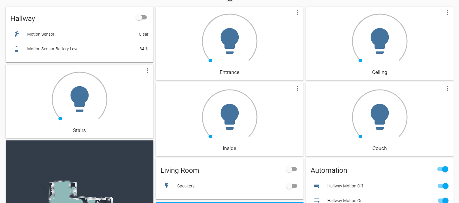
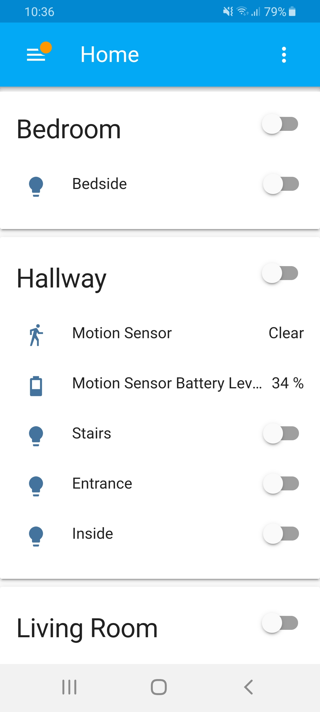
Lights that are part of a group (in groups.yaml) do not appear as a group in the Lovelace UI. They appear as large icons standing alone instead of grouped together. Other entities in groups show up correctly but it appears anything that is a light does not show up as being in a group. The group itself actually does work in automations but just not shown correctly in the UI.
Note that this is not related to removing the default "all" groups. These are custom groups that are created in groups.yaml.
The lights do not appear organized into groups. This is an example of what it looks like - note that these "Office_Fan" lights are supposed to be in the above group called Office. https://imgur.com/a/jLCAsug
Expected behaviour:
Lights should show up as part of a group that is defined in groups.yaml.
This how lights previously appeared in groups and how I would expect them to appear now. There are no lights in this screenshot but it is just intended to show what it should look like. https://imgur.com/a/5WmzPQU
Relevant config:
Here's the configuration of one of the groups in my groups.yaml showing the lights in the group. Note that only the binary sensor actually shows up in the group in the UI.
OfficeFan:
name: Office
entities:
- light.officefan1
- light.officefan2
- light.officefan3
- light.officefan4
- binary_sensor.office
Steps to reproduce this problem:
Update to 0.104.0 and have lights defined in groups in groups.yaml.
Add a group in groups.yaml and add light entities to it. That's pretty much it.
Javascript errors shown in the web inspector (if applicable):
Additional information:
 VMmatty
All 17 comments
Share your relevant portion of groups.yaml
 iantrich
on 16 Jan 2020
iantrich
on 16 Jan 2020
Thanks for this bug report, I'm experiencing the same problem as well. All my lights became big individual cards after the update. However, the difference is that I'm not using groups but areas. Before the new version all the lights were grouped by area in the UI nicely. So I guess the problem is not only related to groups but areas too.
 hhromic
on 16 Jan 2020
hhromic
on 16 Jan 2020
I don't have the time to dig into this now, but it looks to be with this change: https://github.com/home-assistant/home-assistant-polymer/pull/4356/files#diff-da786a038dac2fd7c1e24c0a92c95a4bR135
If defined in a group, or an area, it should to have the card creation logic applied to it, it should be put in an entities card.
cc @bramkragten
edit: confirmed that removing that portion puts the light back in the entities card. It is true for any domain listed in that for-loop, e.g. climate
iantrich
on 17 Jan 2020
Why should a light be different than a thermostat?
 bramkragten
on 17 Jan 2020
bramkragten
on 17 Jan 2020
It shouldn't, but I thought the notion was that all entities in a group/area would be placed in a single entities card
iantrich
on 17 Jan 2020
This not so much a problem as a design choice. The great thing about Lovelace is you can tailor it to your needs. If you don't like the default look and feel, take control and adjust it to your liking.
bramkragten
on 17 Jan 2020
Apologies but that way of thinking is not very friendly for new-comers I'm afraid.
The nice thing about the automatic, i.e. auto-controlled, version of Lovelace is how nicely it gives a starting dashboard for new users without the need for them to do anything special. Before this version update, my area-based dashboard looked nice and tidy out-of-the-box, everything was self-organised automagically. This is what anyone would expect when you create areas and associate your entities to them. This is also what made me love Home Assistant from the very beginning.
However after this update, this is no longer the case and my entiites are now all over the place:
Some of these lights belong to the Living Room area and others to the Hallway area. This not even considering how ugly these huge cards look for each light instead of a simple switch in the grouped card. Let's also not forget the Android App that now has a huge single light card occupying most of the screen. These things don't look like good design for starters to me.
I know I could take control of the UI and organise however I like, but I just started with Home Assistant and I would like to learn at my own pacing. Now I'm being forced to learn how to customise the UI instead of using an out-of-the-box starter experience. Also, every time I add a new device I would need to go and tune the dashboard instead of letting the UI adapt by itself?
In summary, I'm very disappointed by the decision to just ignore this huge usability issue. Honestly the automatic UI was fine as it was before. Is this change needed for something else?
hhromic
on 17 Jan 2020
I'm sorry you feel that way, but we have been doing the same thing for thermostats, media players, alarm panels and cameras for a long time. We just now also added a specific card for lights.
Maybe we can come up with a better solution that works for all those cases and not just for your case with lights?
bramkragten
on 17 Jan 2020
I get your point but media players and thermostats don't have a need to be group together so they can all be turned on/off at the same time like lights would. For example in my office I have a ceiling fan with 4 individual bulbs. I have them in groups and the previous interface allowed me to turn them all off/on at once within Lovelace. This change required me to use Configure UI in order to get them back into a single group for control.
I get your point about trying to standardize but in the case of lights I hope you can see why respecting group memberships in the UI makes sense when compared to things like thermostats and media players (which I agree make sense to be standalone).
VMmatty
on 17 Jan 2020
@bramkragten thanks for still being open to resolve the issue, really appreciated.
I'm sorry you feel that way, but we have been doing the same thing for thermostats, media players, alarm panels and cameras for a long time. We just now also added a specific card for lights.
I don't think adding the card for lights is to blame, in fact is nice to get more functionality for customising the UI. I think the problem is making those cards the default for the automatic UI mode. Moreover I think that no matter the device type, if the user defined a set of areas and placed device/entities on them, the automatic UI should always give priority to this and respect the grouping. Is the logical expected behaviour when you put things into groups.
For example, if a user puts two thermostats and three media players in the same area (Living Room), I'm sure he/she expects them to appear under the same grouped card in the automatic UI by default. The user for sure would expect to be able to switch-off everything in the area with one button, i.e. what @VMmatty is also mentioning.
Maybe we can come up with a better solution that works for all those cases and not just for your case with lights?
Sure, what do you propose? I'm not familiar with Home Assistant internally so I can't really provide suggestions programming-wise, but I think the key is for the automatic UI to respect user-defined groupings. The customised UI of course should not force any groupings. I don't think something like this should break the new internal design you are doing.
hhromic
on 17 Jan 2020
Note that I understand that the above example is not universal. I'm sure there are users with legitimate use cases to not group things in the UI even if they are in an area in the system. However when we deal with automatic UIs we have to make assumptions.
For example it is unlikely for a starter user to actually have two thermostats or three media players in the same area, but is very likely for the same starter user to have multiple switches and lights in a single area.
There is where the customised UI mode should enter into action, for when the assumptions from the automatic UI don't apply anymore to a particular user. However, these assumptions should be designed logically and senseful.
Perhaps the automatic UI should have a special case for unassigned areas and then display the big cards for these devices/entities?
hhromic
on 17 Jan 2020
this has significantly affected the usability of the auto-generated dashboard. now lights are strewn all over the place rather than grouped by area.
if the auto-generated dashboard is being deprecated, i could understand this change, but if not, i'd say this is a major regression in user experience.
if it's not possible to group these "cards", maybe the auto-generated interface should keep the old toggle switches? or, at least have some option for configuration.yaml that restores the old behavior.
 tofurky
on 17 Jan 2020
tofurky
on 17 Jan 2020
I'll release a hotfix that will add lights to entities cards of a group or area if they exist. Only standalone light will be added as a light card.
bramkragten
on 17 Jan 2020
That sounds like a great idea @bramkragten !
Thanks for reconsidering. Looking forward for the update :)
hhromic
on 17 Jan 2020
bramkragten
on 17 Jan 2020
The update showed up this morning in my Home Assistant. Looking great again!
Thanks again @bramkragten for being understanding and quickly fixing it. Really appreciated!
hhromic
on 18 Jan 2020
i just upgraded to 0.104.2 and can also confirm that the autogenerated dashboard no longer has the light cards - thanks for the quick turnaround.
tofurky
on 18 Jan 2020
Related issues
 agneevX
·
3Comments
agneevX
·
3Comments
 SeanPM5
·
3Comments
SeanPM5
·
3Comments
 Misiu
·
3Comments
Misiu
·
3Comments
 infestdead
·
3Comments
infestdead
·
3Comments
 TheZoker
·
3Comments
TheZoker
·
3Comments
Most helpful comment
I'll release a hotfix that will add lights to entities cards of a group or area if they exist. Only standalone light will be added as a light card.