Friendica: Login Dialog is Confusing
As discussed in the forums the login page is quite confusing.
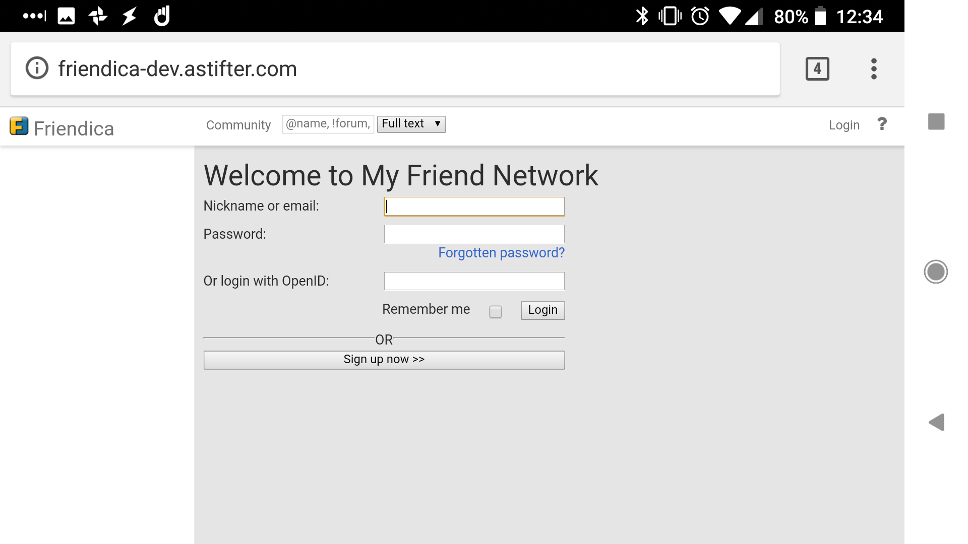
I have rearranged the login dialogs for vier and frio: https://github.com/astifter/friendica/tree/reorganize_login.
Enjoy.
 astifter
All 3 comments
Can you please provide screenshots before/after?
 MrPetovan
on 21 Apr 2018
MrPetovan
on 21 Apr 2018
👍1
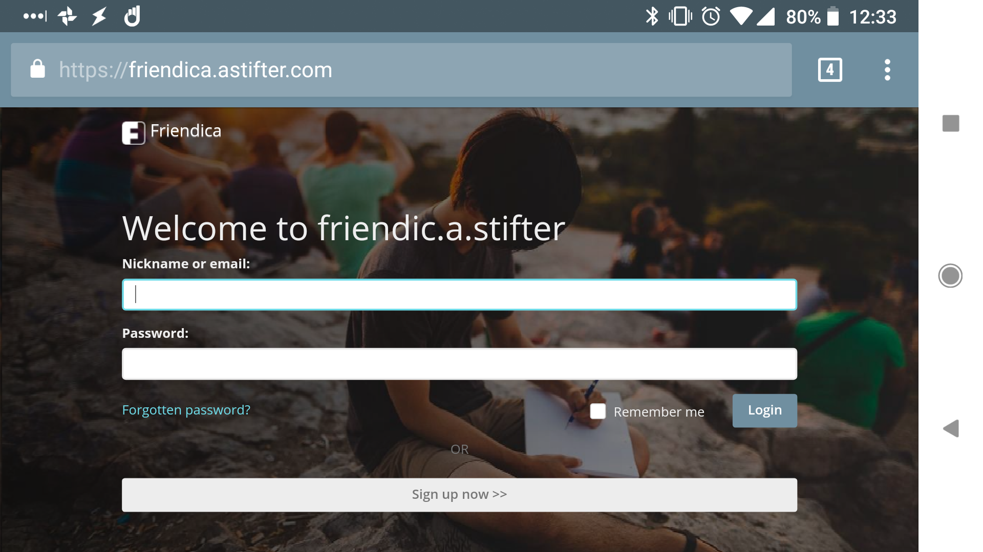
I can only privde "after" quickly, before can be seen here (https://nerdica.net) or (https://friendica.togart.de)
astifter
on 21 Apr 2018
👍1
I have a change suggestion, can you please submit a PR from your branch against friendica/develop?
MrPetovan
on 21 Apr 2018
👍1
Was this page helpful?
0 / 5 - 0 ratings
Related issues
 hoergen
·
3Comments
hoergen
·
3Comments
 tobiasd
·
3Comments
tobiasd
·
3Comments
 AlfredSK
·
3Comments
hoergen
·
3Comments
AlfredSK
·
3Comments
hoergen
·
3Comments
 loma-one
·
3Comments
loma-one
·
3Comments