Freecodecamp: Redesign proposal for settings page
The current settings page is not easily understandable - settings are all over the place, it's not very clear what pertains to a user's profile vs other things (such as account), and is quite overwhelming.
I have attached wireframes of a new design proposal that I'd be happy to implement. I tried to minimize changes in function - the focus is on organizing the existing content with clearer categorization. Any feedback appreciated!
Wireframes: freeCodeCamp-settings-wireframes.pdf
 ritute
All 10 comments
@raisedadead, @Bouncey This looking interesting.
 RandellDawson
on 21 Mar 2019
RandellDawson
on 21 Mar 2019
Deferring to @QuincyLarson
 raisedadead
on 21 Mar 2019
raisedadead
on 21 Mar 2019
@ritute Thanks for creating these mock-ups. We can definitely improve the settings page. A couple design decisions we've made that you should be aware of as you redesign this:
- We don't want drop downs in the navigation. That's why we have a single "settings" button in the mock-ups:
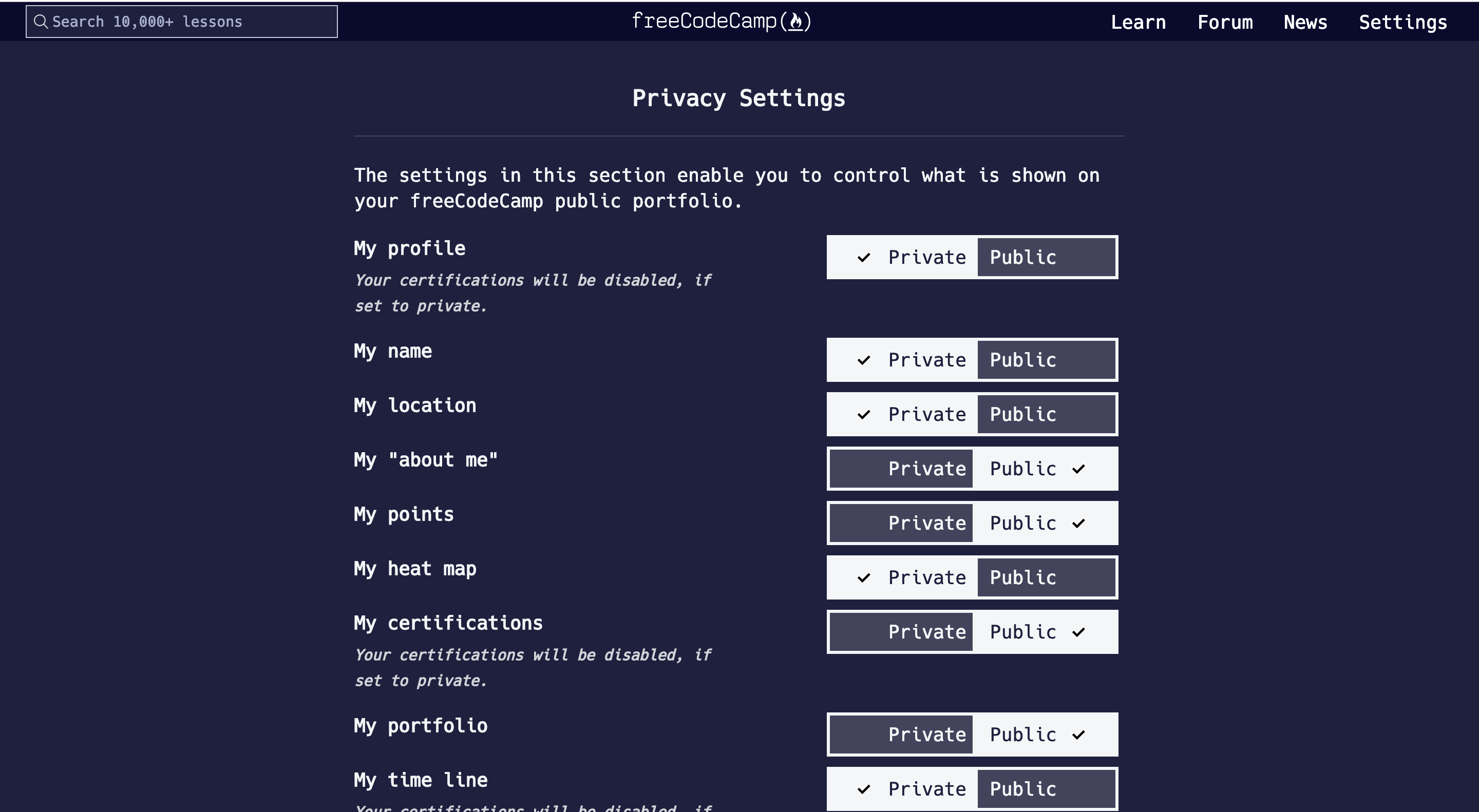
- We want everything to be a single-column layout. We could have links at the top of the settings page to jump to different sections. But all of the settings should be immediately accessible without having to click on anything, just by scrolling down or using control+f to search.
We don't want to bury settings behind different tabs. We get a lot of redesign submissions that involve trying to fit things into a single screen, but in practice just having everything on one tall page people can scroll through is better usability.
Also, we plan to remove the "preview" section from the profile and make the profile section more in line with the other sections.
Would you be interested in updating your designs to factor in these constraints?
 QuincyLarson
on 30 Mar 2019
QuincyLarson
on 30 Mar 2019
I think ease of access should be considered as well. While visits to that page might not be very frequent, it's still a lot of stuff to scroll through and people still ask where the certifications are.
 kirubiel
on 30 Mar 2019
kirubiel
on 30 Mar 2019
Sound like it has a really good potential.
@raisedadead should we move it to deferred and work on shipping it with the upcoming design overhaul on the next iteration?
 ahmadabdolsaheb
on 8 Aug 2019
ahmadabdolsaheb
on 8 Aug 2019
@QuincyLarson
We want everything to be a single-column layout. We could have links at the top of the settings page to jump to different sections. But all of the settings should be immediately accessible without having to click on anything, just by scrolling down or using control+f to search.
We don't want to bury settings behind different tabs. We get a lot of redesign submissions that involve trying to fit things into a single screen, but in practice just having everything on one tall page people can scroll through is better usability.
I'd argue strongly for tabbed categories, like in the wireframe. Although on the surface it may seem you are 'burying' things under tabs, you are instead _helping_ the user find they need faster. You don't put everything in one huge clothes drawer at home, because it's going to be harder finding that pair of socks you want.
 JonKaric
on 23 Aug 2019
JonKaric
on 23 Aug 2019
Hi @QuincyLarson and team, I just want to throw in a few thoughts & suggestions before I remove myself from this thread as I won't be working on this further, in hopes that it’ll help going forward and reconsidering some decisions made.
I think it would be beneficial for your team to reconsider the design constraints that were decided on:
On deciding to not have drop-downs in the navigation, why? What was the thought process that led to this? Having drop-downs in the primary navigation is such a common UI practice that users already expect to see on sites.
On deciding to restrict to a single-column layout:
- I don't see how this is going to help with “immediate accessibility” or “better usability”; it seems like the result is opposite of what you're hoping to achieve according to known best UI practices
- users having to scroll down a long page to find what they're looking for and using ctrl+f to search is good enough reason to argue for using tabs or other means to categorize the content; I understand a lot of users opt to use search as their primary means of finding content on sites, but they shouldn't be forced to use a built-in browser dummy search function
- the current cognitive effort in figuring out this page is high (there is a lot of reading, scanning & confusion involved)
- ctrl+f is a poor workaround users are forced to use because of the current design - this isn’t even a good search mechanism as it doesn’t have the ability to suggest relevant content or auto-correct user errors that are commonly made
- on “burying settings” behind tabs -- I understand your point of view and concern for settings being lost and not found by users, this is a valid concern; however, this is why it’s important to categorize information as users would expect and test that with them. I’ve found this categorization to be appropriate after doing a quick card sorting exercise; however, there could be improvements made. Perhaps a secondary mechanism of including a smart search, maybe integrating with site wide, could be useful as more content is added. But, forcing users to scroll down a long page of settings and ctrl+f is a far worse form of “burying” -- burying content behind tabs vs burying content within a huge page of content.
- look at examples of setting pages and primary navigation of well-designed sites with large user bases (e.g. Github, Google); they should help point your team in the right direction using methods users now expect, without reinventing the wheel on this
ritute
on 23 Aug 2019
Thanks for your detailed feedback @ritute and @JonKaric.
Feature creep is a real problem (just look at something like Microsoft Word and how much more complicated it is than, say, Dropbox Paper). When you eschew complicated menuing like dropdowns, nested side-navigations, etc. it forces you to stay focused on what really matters. The average Microsoft Word user probably uses less than 1% of the total features, and even power users probably only use 10% to 20%.
Instead of making our settings more complicated, we should be removing all but the most important configurations. This is the real design work. People are busy and things need to be as simple as possible.
QuincyLarson
on 7 Sep 2019
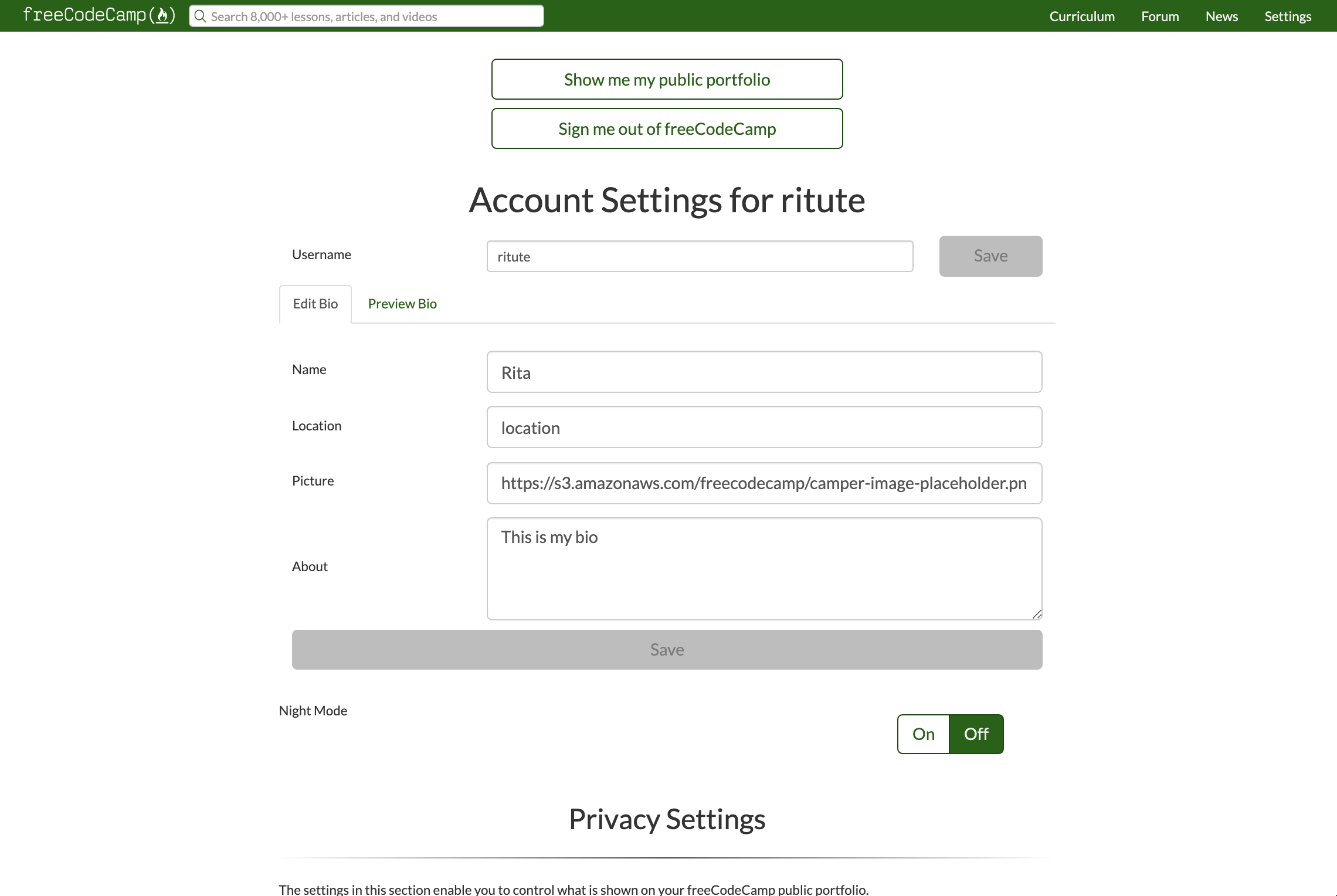
It’s confusing why you would heart my comment and then close this issue right after without referencing anything. You guys are not planning to redesign the settings page and are happy with where it’s at currently? Or is there another issue you have open (I couldn’t find one)? While I won’t be able to, somebody else might want to pick this up at some point, and it’s a waste to toss away former discussion. To ensure the same page is being discussed since you posted a slightly different pic, I attached a screenshot of what I was basing this on (freecodecamp.org/settings).
While I agree with feature creep being a real problem in many sites/apps, the central idea discussed here was not to introduce new features, but rather to categorize the existing features/content to help users find what they’re looking for. I agree with striving for simplicity and reducing to the most important configurations; however, something to also consider is that simplicity and reduction in feature set doesn’t always lead to ease of use — it’s not as simple as always adhering to “reduce # clicks”.
One question I had in my mind, and would not be surprised if many users had in their mind, is after logging in and using the site for awhile, questioning how to sign out. Normally, users expect this feature often appears under a “My Account” dropdown in the top-right for desktop; currently it’s hidden under “Settings” which isn’t where someone would necessarily think to go. Hence my reasoning for including the account dropdown in the wireframes that is resemblant of what users expect.
While scrolling on a single page might seem simpler, this seems more of a mobile-first approach that presents as a simple linear experience and a story-telling visual narrative, or browsing/discovering with a single purpose in mind. Categories, on the other hand, organize content into meaningful sections, to help users easily find different types of information that don’t need to be viewed/compared with another (single focus per section, less distraction, disclosing only what is important to them). The discussion intended here was navigation design for finding content, not adding/removing features, although I agree that removing any unnecessary configurations matters too and should be part of the discussion of the page redesign.
Some reads:
https://www.freshconsulting.com/uiux-principle-21-when-and-when-not-to-use-tabs/
https://baymard.com/blog/account-drop-down-structure
https://www.nngroup.com/articles/menu-design/
Hope this helps. Good luck on your team's initiative.
ritute
on 7 Sep 2019
@ritute Thanks again for sharing these links. As I said above, we are not planning to introduce more complicated navigation to the settings page, but rather to simplify the settings options.
We would welcome your contributions in other areas, though.
QuincyLarson
on 7 Sep 2019
Related issues
 danielonodje
·
3Comments
danielonodje
·
3Comments
 vaibsharma
·
3Comments
vaibsharma
·
3Comments
 jurijuri
·
3Comments
jurijuri
·
3Comments
 MichaelLeeHobbs
·
3Comments
MichaelLeeHobbs
·
3Comments
 ar5had
·
3Comments
ar5had
·
3Comments