Freecodecamp: Side navigation redesign for the guides.
Describe the bug
The guide on master and .rocks does not have navigation to other articles on mobile devices and tablets. the hamburger navigation that exist in the production version of the guides is allocated to settings.
On the other hand, the current sidebar navigation on the guides for larger screens is too large causing an unwanted scroll and UX issues.
Proposed solution:
- designing a nested navigation for the guides that only displays children and possibly parent nodes.
- the design should include a back button for previous nodes.
- the number of children for each node should be displayed.
 ahmadabdolsaheb
All 10 comments
This redesign would resolve #35102 and issues that require the footer to be under the largest element.
ahmadabdolsaheb
on 16 Feb 2019
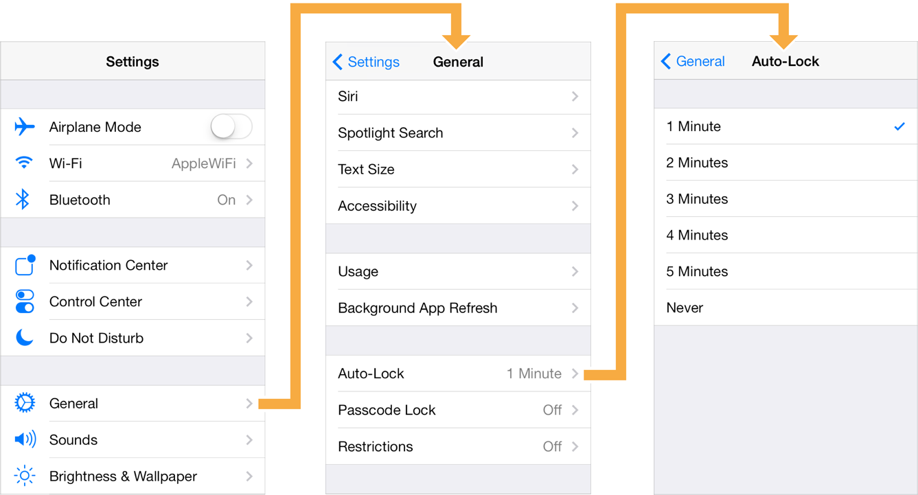
Although displaying the sibling nav items were discussed, I think it would be best to move forward with something similar to the following convention where only children and parent nodes are in nav.
ahmadabdolsaheb
on 16 Feb 2019
@ahmadabdolsaheb I prefer this especially for mobile as it becomes easier to use the nav.
 Nirajn2311
on 16 Feb 2019
Nirajn2311
on 16 Feb 2019
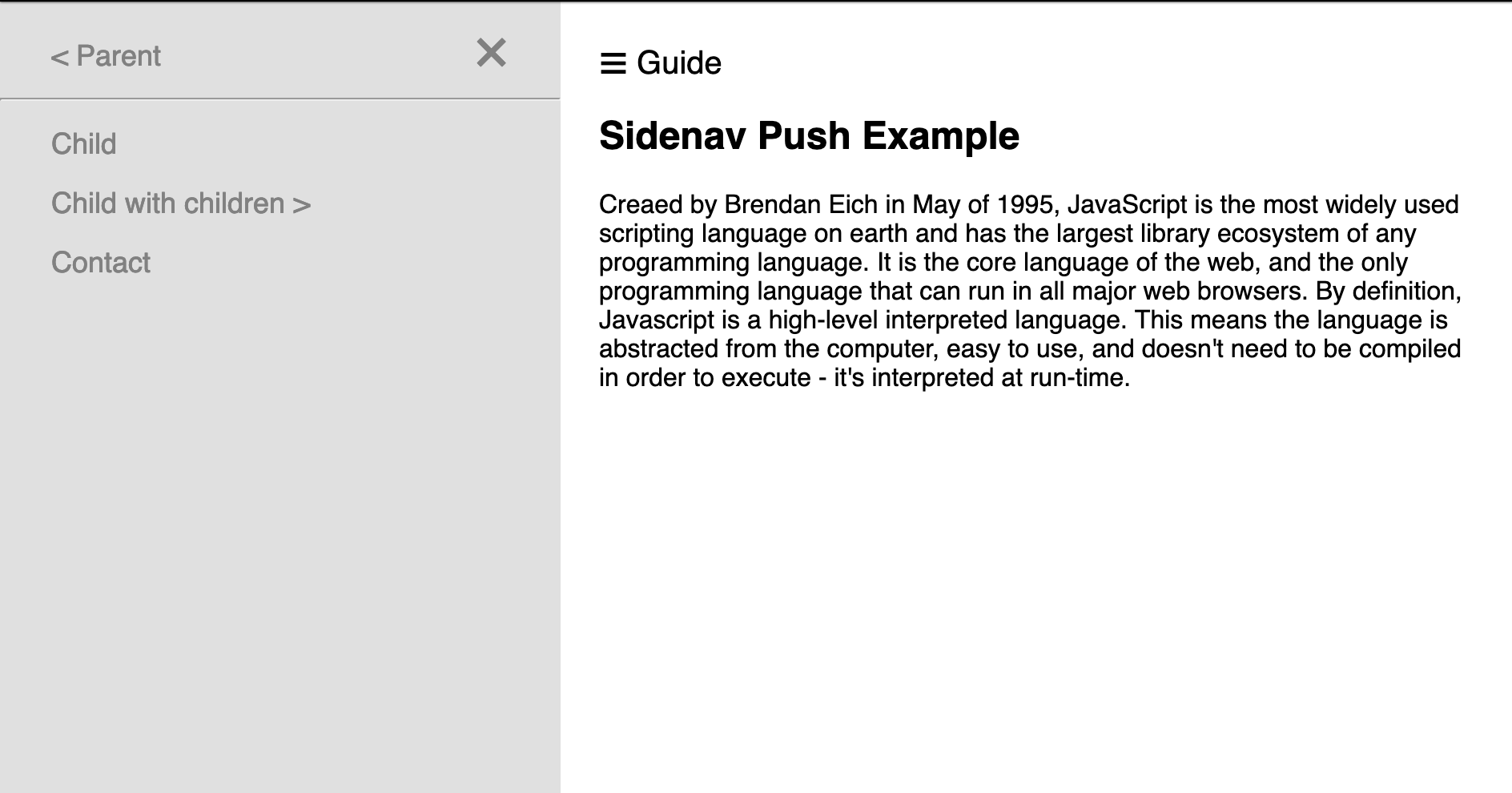
@QuincyLarson. since we currently don't have navigation for the guide on mobile. here is a proposal nav proposal for guide on mobile. for the desktop, the navigation will be to the side of the article.
on the next iteration the number of subarticles for each topic could be added
ahmadabdolsaheb
on 16 Feb 2019
@ahmadabdolsaheb Let's hop on a call to discuss the specific UX considerations in real time.
Regarding the look of the side navigation - it's OK for there to be a different colored background to indicate a boundary between navigation and content, but it shouldn't be gray text on gray background. It needs to be higher contrast.
Also, I don't think we actually use the hamburger menu icon anywhere on freeCodeCamp because it still isn't widely understood by users. Instead we use the word "Menu" - usually within a ghost button.
And we definitely need breadcrumbs up top in addition to side navigation. Going forward we want every page of the freeCodeCamp guide and learn to have breadcrumb menus up top, as these are extremely intuitive for navigating hierarchy.
 QuincyLarson
on 17 Feb 2019
QuincyLarson
on 17 Feb 2019
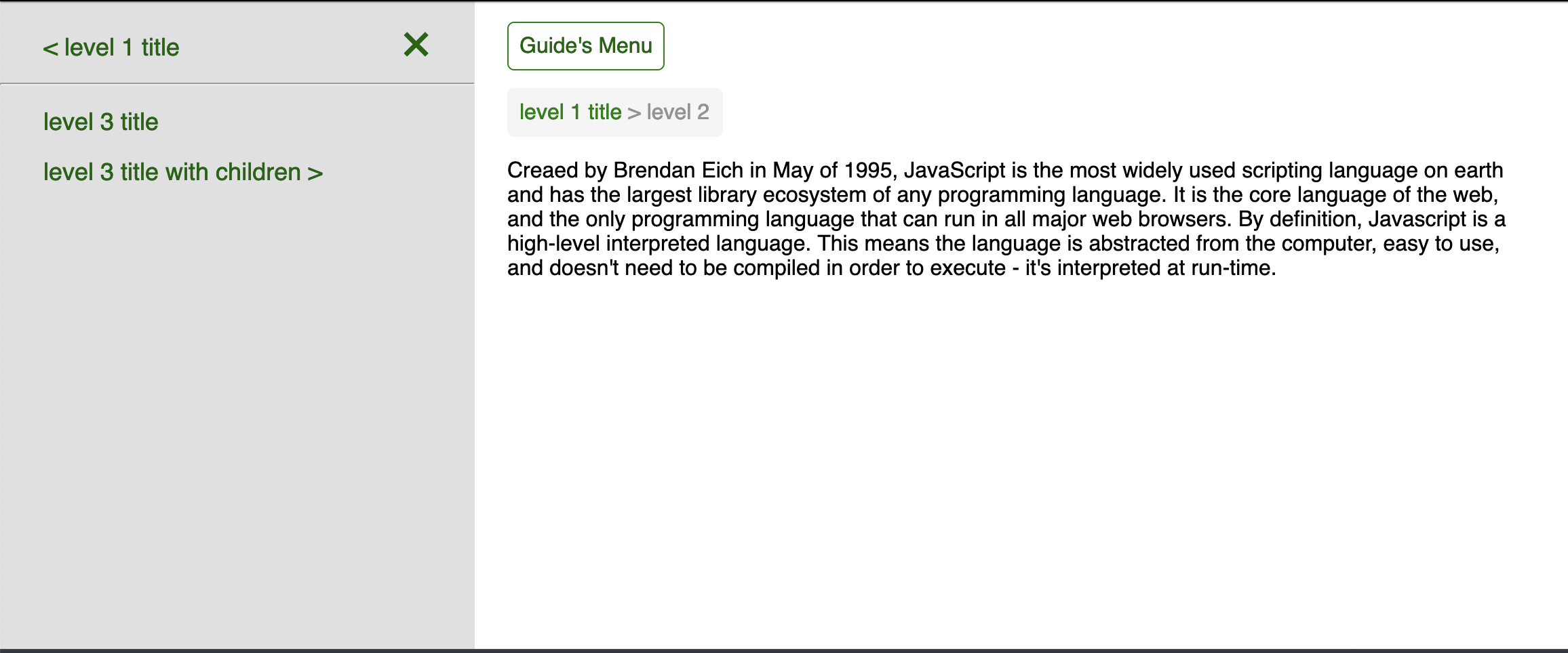
You are absolutely right. the design was simplified to save time. Here is the updated version.
The reason that the nav is called "guide's menu" is because this whole page is going to be under the main navbar that has its own menu button.
ahmadabdolsaheb
on 17 Feb 2019
Moving it from critical path as discussed.
 raisedadead
on 18 Feb 2019
raisedadead
on 18 Feb 2019
@ahmadabdolsaheb Thanks for sharing this updated design. This looks much better.
What exactly will the options be under "Guide's Menu"?
QuincyLarson
on 18 Feb 2019
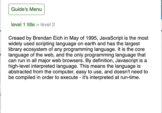
@QuincyLarson. "Guide's Menu" will open the drawer (off-canvas) nav and bring it to the view either by covering the main content or pushing it to the side.
Here is the demo:
ahmadabdolsaheb
on 19 Feb 2019
The direction for the guide has been changed. therefore, this fix is not longer needed.
ahmadabdolsaheb
on 19 Jul 2019
Related issues
 danielonodje
·
3Comments
danielonodje
·
3Comments
 Tzahile
·
3Comments
Tzahile
·
3Comments
 vaibsharma
·
3Comments
vaibsharma
·
3Comments
 itsmikewest
·
3Comments
raisedadead
·
3Comments
itsmikewest
·
3Comments
raisedadead
·
3Comments
Most helpful comment
@ahmadabdolsaheb Let's hop on a call to discuss the specific UX considerations in real time.
Regarding the look of the side navigation - it's OK for there to be a different colored background to indicate a boundary between navigation and content, but it shouldn't be gray text on gray background. It needs to be higher contrast.
Also, I don't think we actually use the hamburger menu icon anywhere on freeCodeCamp because it still isn't widely understood by users. Instead we use the word "Menu" - usually within a ghost button.
And we definitely need breadcrumbs up top in addition to side navigation. Going forward we want every page of the freeCodeCamp guide and learn to have breadcrumb menus up top, as these are extremely intuitive for navigating hierarchy.