Freecodecamp: Improvements to Footer
Expected behavior
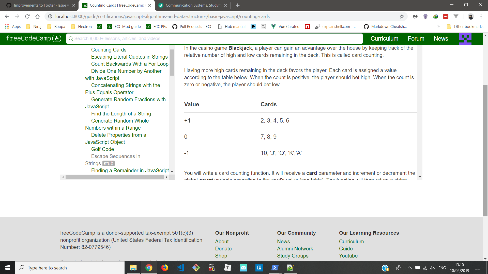
Please see attached screenshot for more details.
Basically:
- [x] "Contact email" should be "Email Us"
- [x] We should get rid of the outbound link icons
- [ ] The footer should always go below the tallest element. Currently on the Guide, it seems to go under the least tall element.
Screenshots

 QuincyLarson
All 28 comments
Side note (perhaps a separate issue): the footer on the news page is difficult to get to due to the loading of content on a scroll down. So you have to keep scrolling and keep loading content until there's no more to load to reach the footer. I suppose there would be a similar issue on the forum or anywhere else that uses the loading on a scroll.
 moT01
on 9 Feb 2019
moT01
on 9 Feb 2019
I'll give it a try.
 Nirajn2311
on 9 Feb 2019
Nirajn2311
on 9 Feb 2019
@QuincyLarson I have fixed the first two issues but couldn't quite reproduce the third one either in Chrome or Firefox(In Windows 10).
cc - @ahmadabdolsaheb @moT01
Nirajn2311
on 10 Feb 2019
@QuincyLarson @Nirajn2311 There is a UX trade off for doing that for implementing the third one.
In order for the footer to go under the tallest element, both elements should have the height of 100% (no-scroll). In that case, when user clicks on a side nav that is taller than the content, the page should either go to the top to show the top of the content (loses the location of the scroll), or keep its scroll which means the user will scroll up and down just to change the tabs.
here is a demo:
with no footer, our layout would have behaved similar to the default Gatsby sidebar example.
https://www.gatsbyjs.org/docs/end-to-end-testing/
With the footer, the optimal solution would be to add some javascript and have a floating sidebar that stops at the footer.
https://codepen.io/pudan_k/pen/EgEakA
We could also have a fixed sidebar that the footer would overlap at the end of the page.
imho, the current setup does the job, but please let me know which solution you would like me to explore.
 ahmadabdolsaheb
on 11 Feb 2019
ahmadabdolsaheb
on 11 Feb 2019
Hi @QuincyLarson
I agree with @ahmadabdolsaheb
I think the key here is to use the site as an end user, and then decide on the tradeoff. I agree that the current sidebar is far better UX for the user, who are more likely browsing through an article and have it in view rather than have them scroll a long way to switch to the next topic of their interest.
That will definitely increase a session time and reduce bounce rate.
 raisedadead
on 11 Feb 2019
raisedadead
on 11 Feb 2019
@ahmadabdolsaheb @raisedadead
which means the user will scroll up and down just to change the tabs.
That is fine. People will scroll. I think you all are dramatically overestimating the inconvenience of scrolling. On mobile, this will all be a single column layout anyway.
the optimal solution would be to add some javascript and have a floating sidebar that stops at the footer.
This is what people thought was the optimal solution back in the 1990s. In practice, it's confusing to users. Users would much rather scroll up and down a page then have to move their mouse around to different "frames" and scroll up and down within those in a more confined space.
Just look at this page here on GitHub. The footer is always at the bottom of the tallest column, which in this case is the middle one. If I want to see who this issue is assigned to, yes - I have to scroll back up to the top of the page. That's no big deal - it takes less than a second.
We should use a similar approach with footers everywhere on freeCodeCamp. Separate horizontal scrolling portions are bad enough, and I'd like to move away from them - let alone separate vertical portions.
Here's an example of how having separate scrolling areas is hurting usability on learn:

A new user might not even realize that there are buttons and tests underneath the "run test" button.
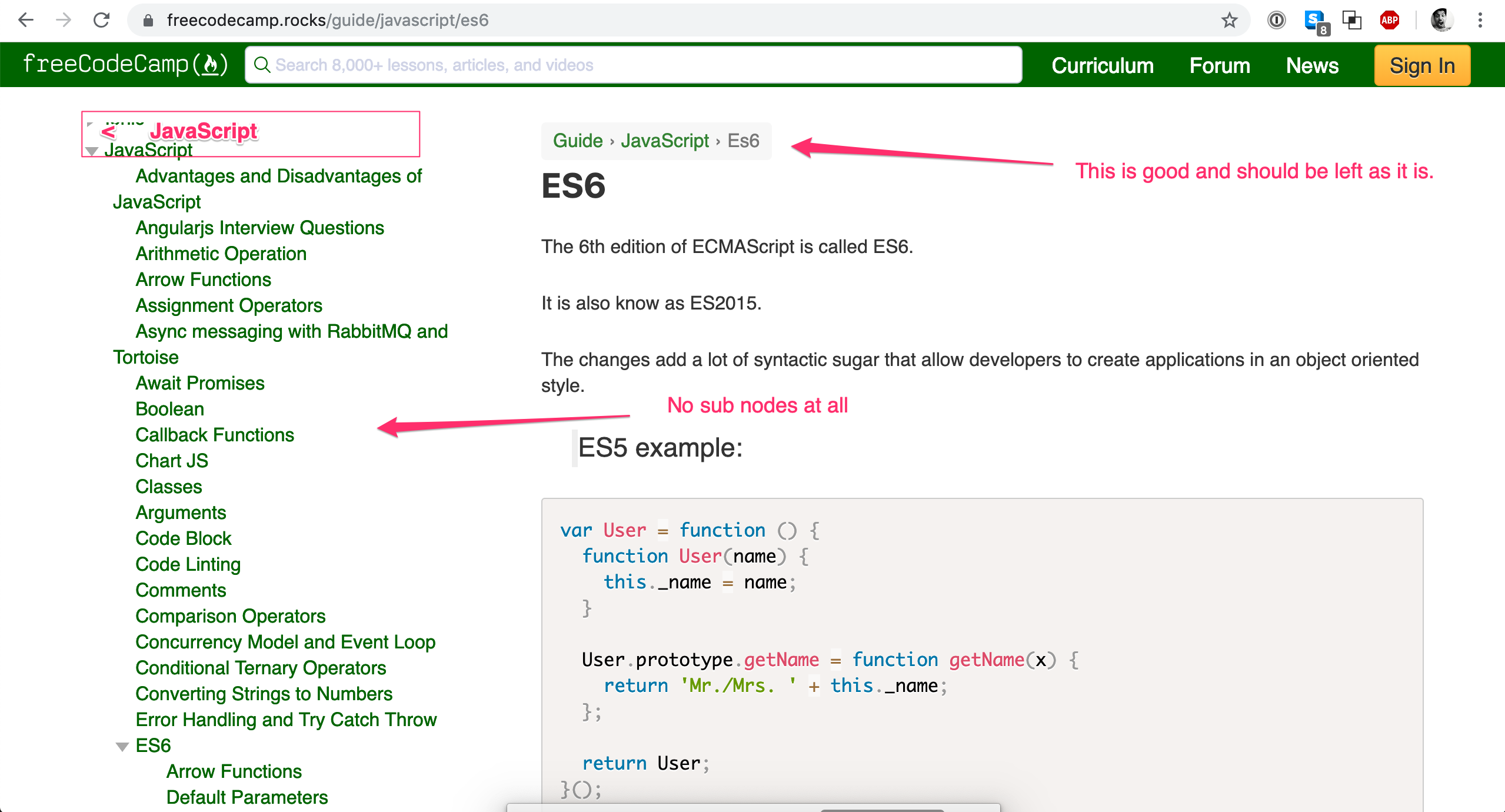
The footer should always be at the bottom of whichever column is tallest, and we should not have independently scrolling columns. At some point in the past year or two, the independently scrolling columns were introduced.
@ahmadabdolsaheb could you start working on a version that puts the footer at the bottom of the tallest column?
QuincyLarson
on 12 Feb 2019
I strongly recommend testing the app as user would to derive the best UX for our app's use case.
For the Guide, I think the tallest element principle does not work in practice, you can test that locally yourself, it's just weird to scroll through whitespace vs content.
People will scroll through content, not whitespace?
For Learn I had given my feedback in a comment here: https://github.com/freeCodeCamp/freeCodeCamp/issues/35061#issuecomment-460994487
But, we quickly realized that the tallest element won't work either.
Here is what we should do though is to use the buttons as a fixed component on learn. This gives us the ability to scroll the "content" as much as we want, while keeping the most used component buttons in our case in view.
Also, I would like to bring light to the fact that several feedback (fairly frustrated) threads that we have had here on GitHub and forum is the ability to use the challenge map about scrolling.
It works when you are casually browsing, not when you are looking for something specific. But that's a different problem unrelated to this thread.
Anyways, let's start working on a version that does put the footer at the bottom of the tallest element and do a A/B test.
raisedadead
on 12 Feb 2019
@QuincyLarson @raisedadead @ValeraS.
I will make a MVP and have you test it ASAP.
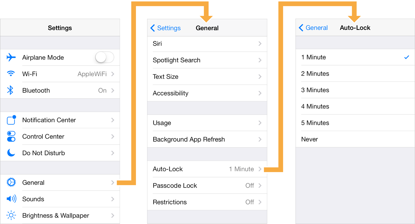
Here is how Khan academy does it when the scroll meets the footer.
Notice the shadow indicating that side nav is continuing and scrollable
.
ahmadabdolsaheb
on 12 Feb 2019
Please let me know if you wanna move forward with this design, and if you want the user to go to the top of the page after clicking the side nav or not so I could adjust it accordingly.
ahmadabdolsaheb
on 12 Feb 2019
@raisedadead Please take a look at this document: https://uxmyths.com/post/654047943/myth-people-dont-scroll
Also consider this: very few people are actively looking for the footer. And if they are, they're just going to swipe down really fast and get there immediately, regardless of how tall the page is.
The main purpose of the footer is SEO and for the 0.001% of people who are actively looking for it. (how many times a day do you find yourself trying to scroll down to content in a footer?)
For the Guide, I think the tallest element principle does not work in practice, you can test that locally yourself, it's just weird to scroll through whitespace vs content.
The Guide's sidebar is only 109 entries tall.
It's not going to be that much space. If they have one of the bigger categories expanded, yes, it could be more. But I don't think the footer is important enough to warp the experience of the guide.
QuincyLarson
on 14 Feb 2019
@raisedadead @ahmadabdolsaheb A good example of how to handle a documentation page with expandable side menu items, and a footer, without extra scrolling is the MDN: https://developer.mozilla.org/en-US/docs/Learn/HTML/Introduction_to_HTML
When you expand the menu items on the left, the footer just gets pushed further down the page.
QuincyLarson
on 14 Feb 2019
@QuincyLarson with these changes, this issue will back https://github.com/freeCodeCamp/freeCodeCamp/issues/34285#issuecomment-455045048
Or am I missing something?
 ValeraS
on 14 Feb 2019
ValeraS
on 14 Feb 2019
@ValeraS, so I think @QuincyLarson wants the page scroll to go to zero only when a node with no children is clicked on the side nav. I cannot think of a way that I could implemented it without recording and resetting the scroll with JS, so if anything comes to your mind, let me know.
ahmadabdolsaheb
on 14 Feb 2019
@ahmadabdolsaheb Nodes with children also have articles.
ValeraS
on 14 Feb 2019
@ValeraS very good point, so we would be reverting to the bug, then.
@QuincyLarson if the height of both elements are set to 100% our footer would be pushed down when an element is expanded; however, in the mozilla doc, Nodes with children do not have articles. So users can click on an end node on the side nav and then it page goes to the top. in our case, if a user wants to visit for example Working in Tech>OpenSource>the Battle for Open Source. She would be scrolling the whole side nav 3 times.
If we really need to go in that direction, the other option would be not take the users to the top of the page regardless of where they click on the nav. but when they reach their destination in the sidenav tree, they will have to scroll up to see the article's beginning.
ahmadabdolsaheb
on 14 Feb 2019
Hi @QuincyLarson
IMHO, and all honesty I really do not care about the footer. Meaning we are on the same page about its priority.
The idea is the best usability of the site itself.
I am not advocating that we should not make it so that people do not have to scroll.
All I am interested in is making the UX intuitive and not painful from a user's viewpoint. I completely agree on your well researched thoughts about scrolling.
But I keep re-iterating to test the site ourselves in A/B strategy and see what works best for us.
In my tests, I found it weird and awkward to scroll when I am working through challenges, or looking through guide articles (not casually browsing like on a news site).
So, from my tests:
On the guide, the footer should be below the content element (the right guide article itself). The content element will expand in height depending on its content.
This will keep the footer out of the view at all times. That is The footer can be hidden out of view under the viewport.
Your MDN example, does something same. At all times, the content block is on the top of the footer.
On the learn,
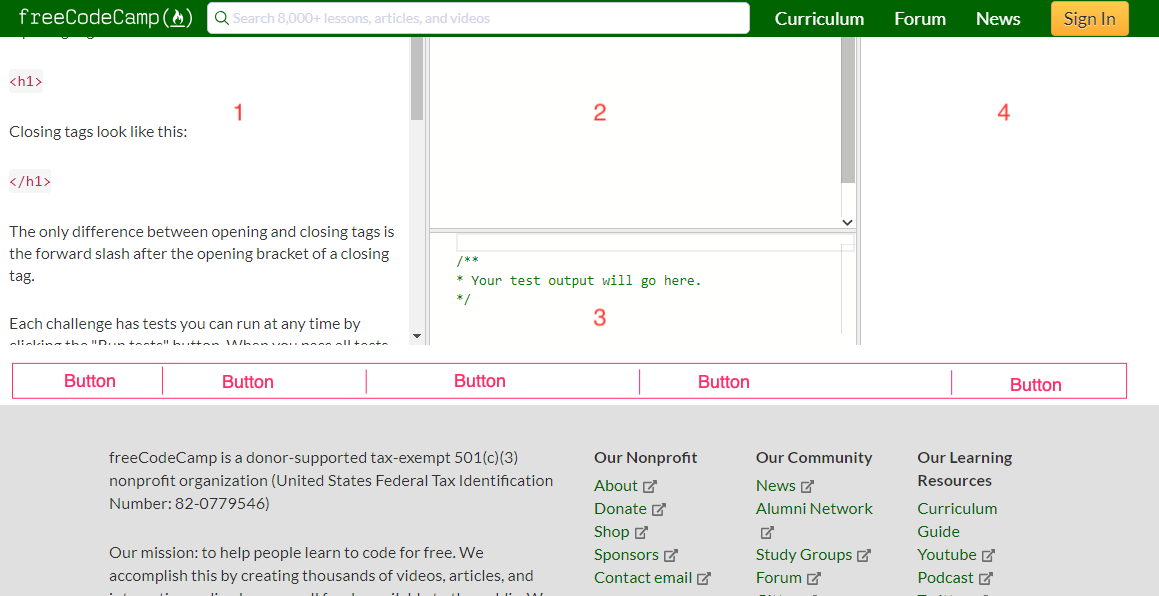
I think we should get rid of the internal scrolls. But this also means, we should keep three things always in view:
- The editor (labeled 2 on my screenshot)
- The buttons
- The preview panel (labeled 4 on my screenshot)
These are the most interacted elements on the learn app.
Only the instructions (without the buttons, will scroll)
The footer can be hidden out of view under the viewport.
raisedadead
on 14 Feb 2019
Maybe for the challenges and guide page we could make a smaller footer similar to the one github uses.
Nirajn2311
on 14 Feb 2019
raisedadead
on 14 Feb 2019
Re-opening. GitHub closed it automatically. This issue will be taken care of in repeated iterations.
raisedadead
on 14 Feb 2019
@QuincyLarson @raisedadead I believe the decision is to make the sidebar more concise so there would not be a need to scroll.
Although displaying the sibling nav items were discussed, I think it would be best to move forward with something similar to the following convention where only children and parent nodes are in the sidebar.
ahmadabdolsaheb
on 15 Feb 2019
@ahmadabdolsaheb Yes, let's get a variation that you propose in, and test it out.
raisedadead
on 15 Feb 2019
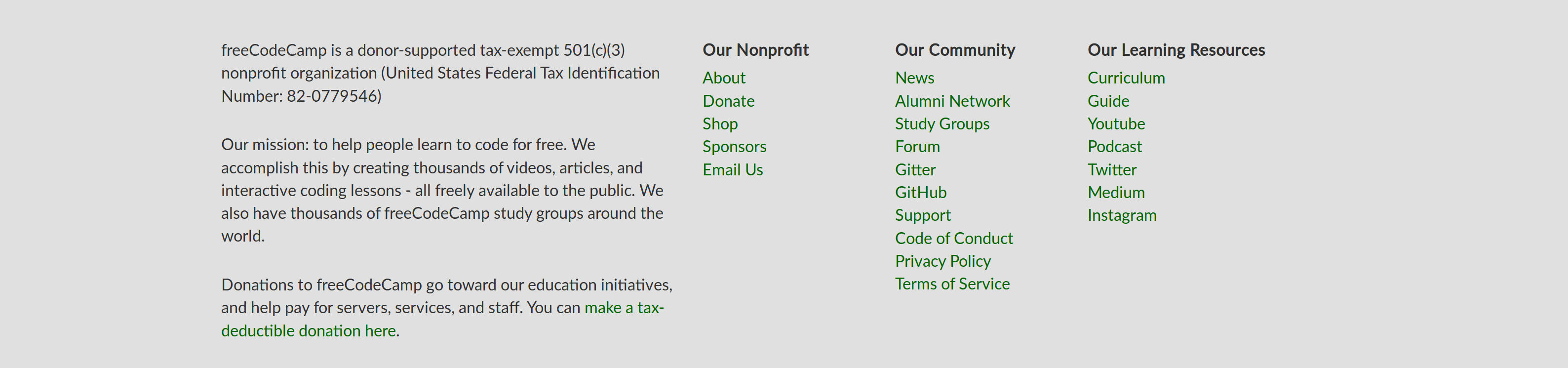
I have a couple of suggestions on the footer:
- I feel the links are too cramped and need a little more padding between them
- Headings can be simplified
- There should be substantial space between the block of text on the left and the links
At the end, it could look somewhat like this:

 ayoisaiah
on 16 Feb 2019
ayoisaiah
on 16 Feb 2019
@ayoisaiah, I really like your design, it definitely looks better than the current one. Here are a couple of considerations.
- The logo looks great, but it makes the footer area taller. As a general rule we would like to save as much screen real state as possible.
- To be accessible we need a way other than color to establish visual hierarchy between headings and footer items.
I encourage you to take screenshot of both the current version and your design so we could compare their sizes and their white space allocation better. After that let's have a pr and merge the changes.
ahmadabdolsaheb
on 16 Feb 2019
@ayoisaiah Also I don't think you're allowed to change the colour of logo according to https://design-style-guide.freecodecamp.org/
Nirajn2311
on 16 Feb 2019
let us address side-nav related suggestions and improvement in the above-referenced issue so it does not get confused with the footer.
ahmadabdolsaheb
on 16 Feb 2019
@ahmadabdolsaheb Here are the screenshots for screenshots for comparison.
Before
After

Without the logo
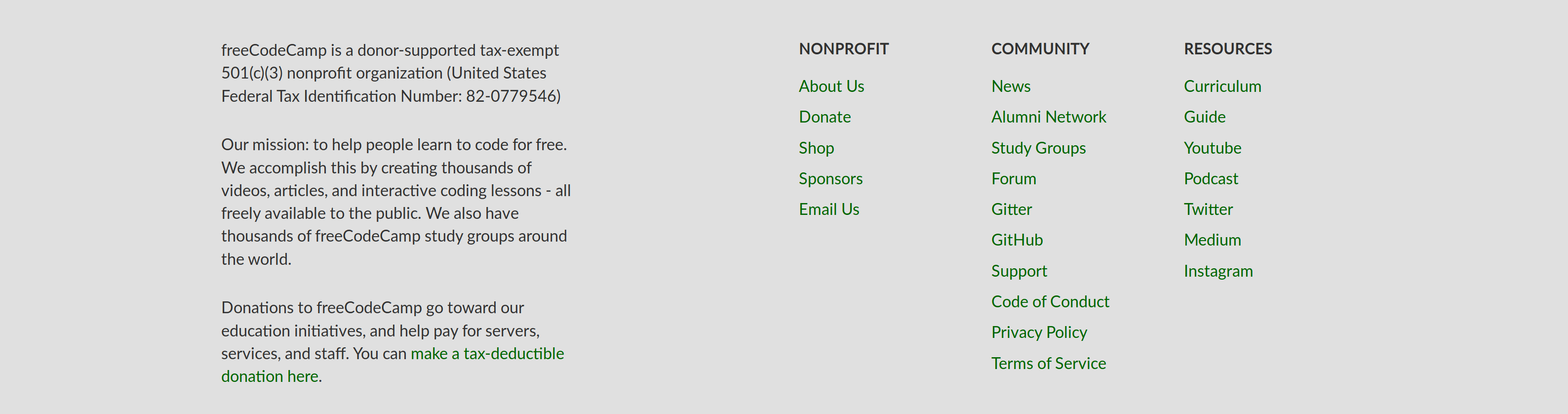
ayoisaiah
on 17 Feb 2019
@QuincyLarson, would you be interested in making the footer titles more concise as @ayoisaiah suggested?
ahmadabdolsaheb
on 19 Feb 2019
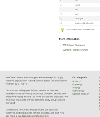
I always have this message always poping up when i run my code "Your Footer do not all have a white color" i have done all i could but cannot detect any fault in my code. this stopped my html from running further. I gave an inline style with white as color yet the problem continued. I just don't know what to do again
 hardwo
on 14 Mar 2019
hardwo
on 14 Mar 2019
Related issues
 MelissaManning
·
3Comments
MelissaManning
·
3Comments
 EthanDavis
·
3Comments
EthanDavis
·
3Comments
 bagrounds
·
3Comments
bagrounds
·
3Comments
 ROWn1ne
·
3Comments
ROWn1ne
·
3Comments
 kokushozero
·
3Comments
kokushozero
·
3Comments
Most helpful comment
I have a couple of suggestions on the footer:
At the end, it could look somewhat like this: