Freecodecamp: Design Top Contributor 2018 Name Badges for parties
We recently announced freeCodeCamp's 2018 Top Contributors.
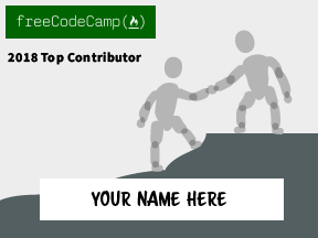
We are hoping to design a nice lanyard that Top Contributors can pick up when they arrive at the party with their names on them.
We welcome your design ideas for these lanyards. You can base them off of the freeCodeCamp Design Style guide, though we do want them to be visually interesting (and not completely minimalistic like our general design is). So illustrations are also welcome.
 QuincyLarson
All 22 comments
Hey @QuincyLarson Here are a few ideas I came up with for an illustration. They are more like wireframes, to help demonstrate the idea.
The first scene is two hikers on a trail. One is helping the other climb a particularly large steep. It represents how freeCodeCamp contributers help programmers learn new skills through curriculum, blogs, and forums.
The second design is a person standing proudly with a Top Contributor T-shirt, showing how he or she wears the shirt as a badge of honor.

The final one is a few people putting together a puzzle, similar to how open source contributors helped build freeCodeCamp into what it is now.

 renojvarghese
on 5 Jul 2018
renojvarghese
on 5 Jul 2018
I'm interested! Any examples from around the web that you like?
Also, will the lanyard just have their name or also other info like city, state, country, job, etc?
 haydmills
on 5 Jul 2018
haydmills
on 5 Jul 2018
Hey @QuincyLarson. I haven't heard anything about this in some time. Are there any updates to the issue?
And @haydmills. If you're interested, do you want to work on this project together? We can collaborate to get an awesome badge rolled out.
renojvarghese
on 10 Jul 2018
@renojvarghese yeah sure let's do it! I have a few ideas in mind. I'll post them once I get some time soon.
haydmills
on 11 Jul 2018
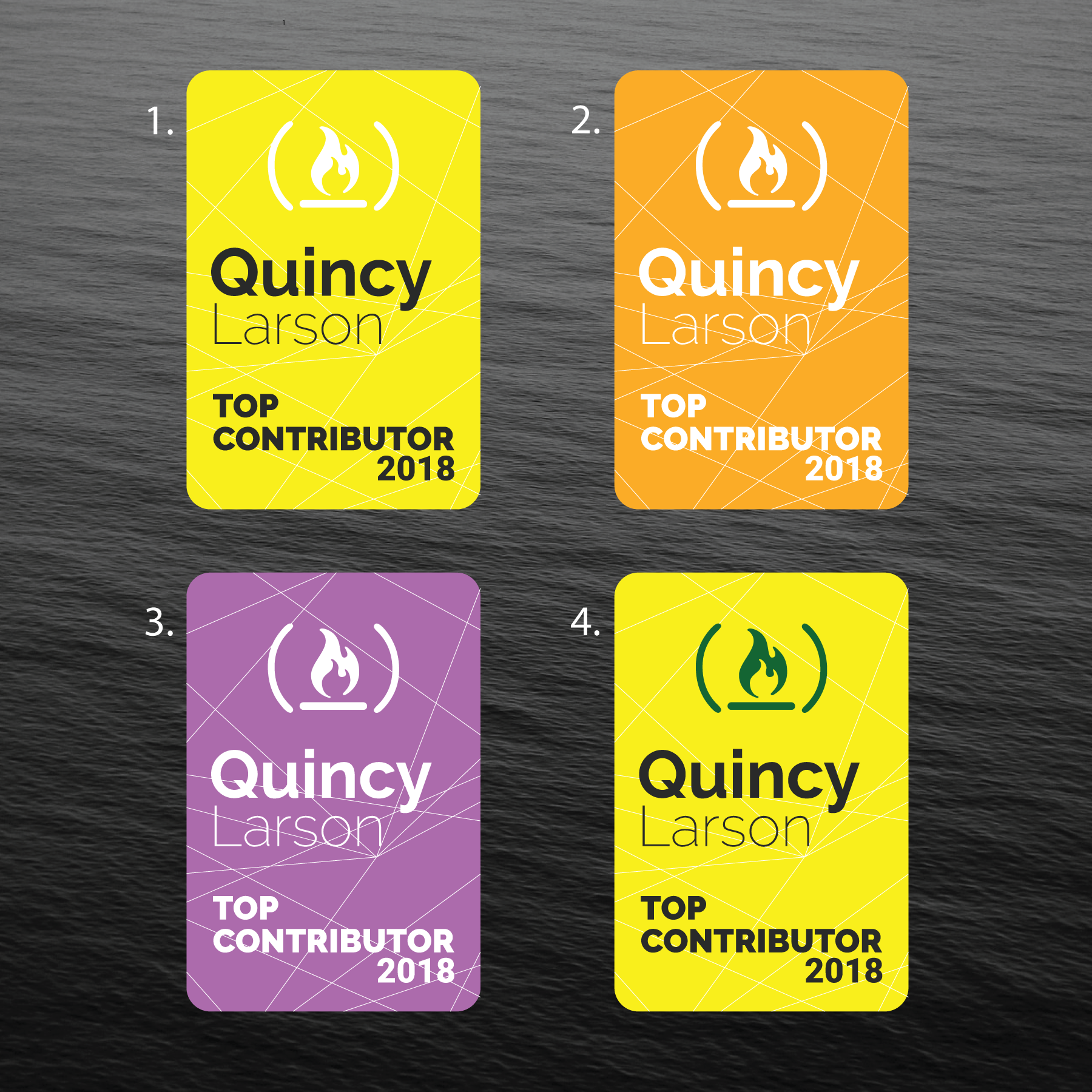
Hey @QuincyLarson , I made the following designs for the lanyards.
Would like you to have a look at it, and share your feedback.
Hope to hear back soon... 😃
 PhoeniXAbhisheK
on 18 Jul 2018
PhoeniXAbhisheK
on 18 Jul 2018
@PhoeniXAbhisheK Thanks for your patience! I just saw these. Wow - thank you for creating such a wide range of designs!
@haydmills what do you think of these designs?
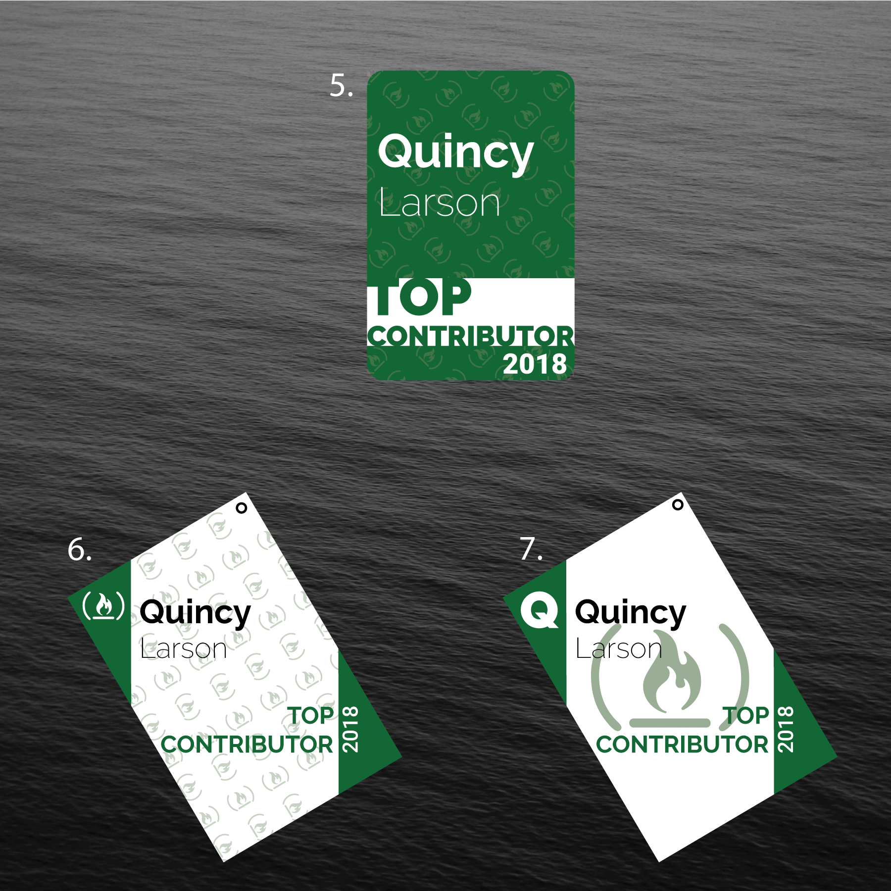
Legibility is a high priority since people need to be able to glance at these and reliably read the name. 4, 5, 9, and 11 have pretty good contrast.
I'm partial to 11 myself, since it is colorful and festive, and has good contrast.
I think the last name could also have a heavier font weight to further improve legibility.
QuincyLarson
on 31 Jul 2018
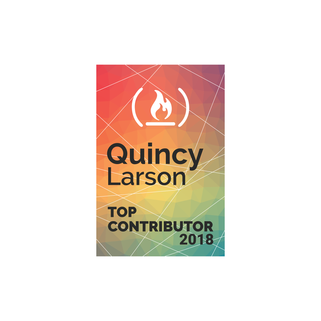
@QuincyLarson Something like this..???
PhoeniXAbhisheK
on 31 Jul 2018
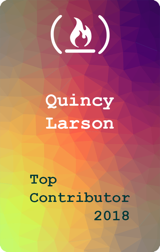
 sdabhi23
on 31 Jul 2018
sdabhi23
on 31 Jul 2018
@PhoeniXAbhisheK Wow - that was fast. Yes - something like that.
@sdabhi23 Thanks for creating that. I think the monospace font is cool looking and thematically appropriate, but there's no denying that @PhoeniXAbhisheK's typography looks more aesthetically pleasing.
QuincyLarson
on 31 Jul 2018
@QuincyLarson Thanks...
Actually, I was waiting for your comments. So as soon as I got them, I made sure you don't have to wait for the changes and got to work. 😄
Glad you liked it 🙇
PhoeniXAbhisheK
on 31 Jul 2018
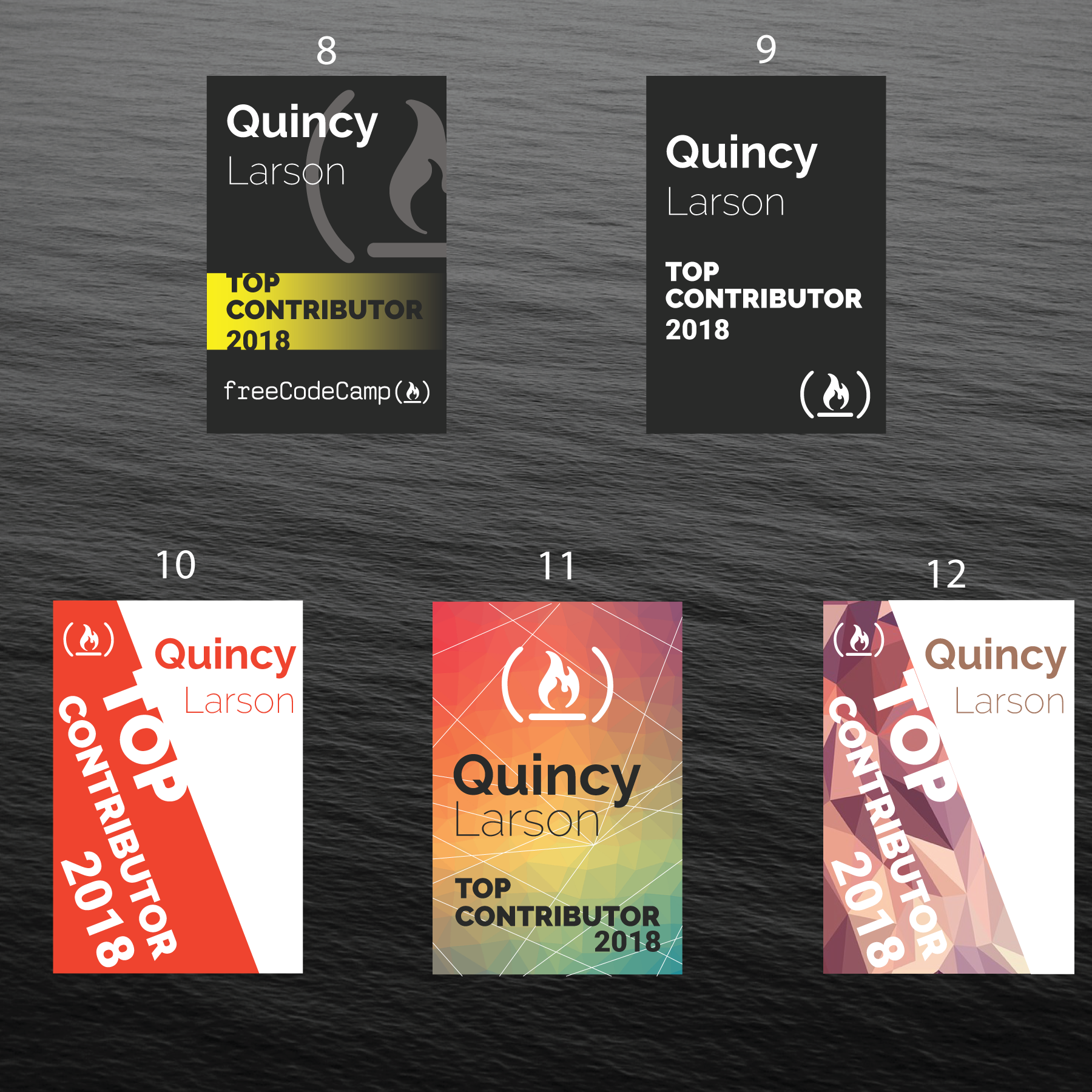
I like 9 and 11 looks pretty awesome. I would love to have 8's layout but without the yellow.
I think the function call logo is important.
Thanks @PhoeniXAbhisheK for mocking these up.
@QuincyLarson Could we have different designs for each event? I would love to collect them :laughing:
 Bouncey
on 31 Jul 2018
Bouncey
on 31 Jul 2018
Hey @Bouncey thanks for the comments...
Here you go... 😸 8's layout without the yellow

PhoeniXAbhisheK
on 1 Aug 2018
@QuincyLarson I think all these designs are great explorations! Nice work everyone.
I would say the simple black and white design that @PhoeniXAbhisheK just posted would be my vote. The typography used creates a nice visual hierarchy that should make the badge readable when hanging around someones neck.
As mentioned, you could do the same design on the fCC green or one of the other primary colors.
I haven't seen anyone try illustrations yet. Any fun ideas?
haydmills
on 1 Aug 2018
@haydmills Thanks for sharing your opinion on this.
@PhoeniXAbhisheK I agree - this looks solid!
QuincyLarson
on 1 Aug 2018
@QuincyLarson these are all so great! I love number 11, too. I do like the plain black one @PhoeniXAbhisheK posted most recently as well if we want something simpler/less colorful. I agree with @Bouncey that the function call logo is important.
 AbbeyRenn
on 1 Aug 2018
AbbeyRenn
on 1 Aug 2018
@QuincyLarson @haydmills @AbbeyRenn Thank you for all the amazing comments.
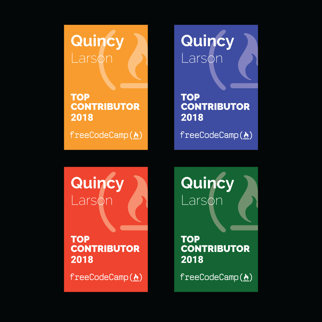
Also, here is the same design, but on different primary colors
I personally think that the yellow one doesn't have good contrast, I tried pairing it with black but the fcc logo has to be either in white or green so I skipped that 😅
PhoeniXAbhisheK
on 1 Aug 2018
@PhoeniXAbhisheK these look amazing. I think we have a winner! Could you open a pull request to add the files necessary for us to go to a print shop and print these out to https://github.com/freecodecamp/assets?
The dimensions of our lanyard's card holders are 3.65"(Height) x 2.6"(Length) - could you make sure these match those dimensions and are as high resolution as possible for sharp printing?
QuincyLarson
on 2 Aug 2018
@QuincyLarson Sure thing... 😄
But just to confirm, which design/color exactly..???
These latest one I posted with 4 colors, or the original black one..???
Also, do I make the font weight heavier on these designs just like I did for design 11..???
PhoeniXAbhisheK
on 2 Aug 2018
@PhoeniXAbhisheK these do look amazing! I'm partial to the freeCodeCamp green, myself, but I'll let @QuincyLarson weigh in :) Thanks so much for designing these!
AbbeyRenn
on 2 Aug 2018
I like the freeCodeCamp green as well.
 KoniKodes
on 4 Aug 2018
KoniKodes
on 4 Aug 2018
@QuincyLarson I've made a pull request with the necessary files, I added the files with all 5 colors, and in both designs(normal and bold fonts for last name).
PhoeniXAbhisheK
on 6 Aug 2018
@PhoeniXAbhisheK Thank you for all your help! I've merged your pull request!
QuincyLarson
on 7 Aug 2018
Related issues
 danielonodje
·
3Comments
danielonodje
·
3Comments
 Tzahile
·
3Comments
Tzahile
·
3Comments
 SaintPeter
·
3Comments
SaintPeter
·
3Comments
 EthanDavis
·
3Comments
EthanDavis
·
3Comments
 kokushozero
·
3Comments
kokushozero
·
3Comments
Most helpful comment
@PhoeniXAbhisheK Wow - that was fast. Yes - something like that.
@sdabhi23 Thanks for creating that. I think the monospace font is cool looking and thematically appropriate, but there's no denying that @PhoeniXAbhisheK's typography looks more aesthetically pleasing.