Freecodecamp: Navbar breaks at 768px to 786px
Screenshot
 ooade
ooade
All 27 comments
Thanks for the bug report @ooade! I can confirm that this is indeed an issue. At 768px it switches to the layout where the buttons are hidden in favor of a single menu toggle button, which is why it's fixed at that width.
 systimotic
on 3 Sep 2017
systimotic
on 3 Sep 2017
I would love to fix this but can't code for now. Someone else can take this up or i fix it myself on Thursday :sweat_smile:
ooade
on 3 Sep 2017
Hi @systimotic @ooade Could I grab this. First Time Contributor. Would like to work on a issue regarding responsiveness.
 dipikaisdbest
on 3 Sep 2017
dipikaisdbest
on 3 Sep 2017
@dipikaisdbest Sure you can. Just go through the guidelines laid out here.
ooade
on 3 Sep 2017
@dipikaisdbest Since you will be contributing for the first time, this is the area in code you need to investigate
 adityaparab
on 4 Sep 2017
adityaparab
on 4 Sep 2017
Thanks @dipikaisdbest!
I'd like to add to @adityaparab's comment. That is where the old nav is, the current issue has to be solved somewhere in this file. You'll probably have to overwrite some default Bootstrap styles there too.
This issue may be somewhat complicated. If you can't figure it out, please let us know.
systimotic
on 4 Sep 2017
@dipikaisdbest Thanks for your help on this. Please keep us updated on your progress with it.
 QuincyLarson
on 6 Sep 2017
QuincyLarson
on 6 Sep 2017
I have been reading and trying to understand the code part. Haven't made any significant changes yet. Will make a PR once in that stage.
dipikaisdbest
on 6 Sep 2017
@ooade @QuincyLarson
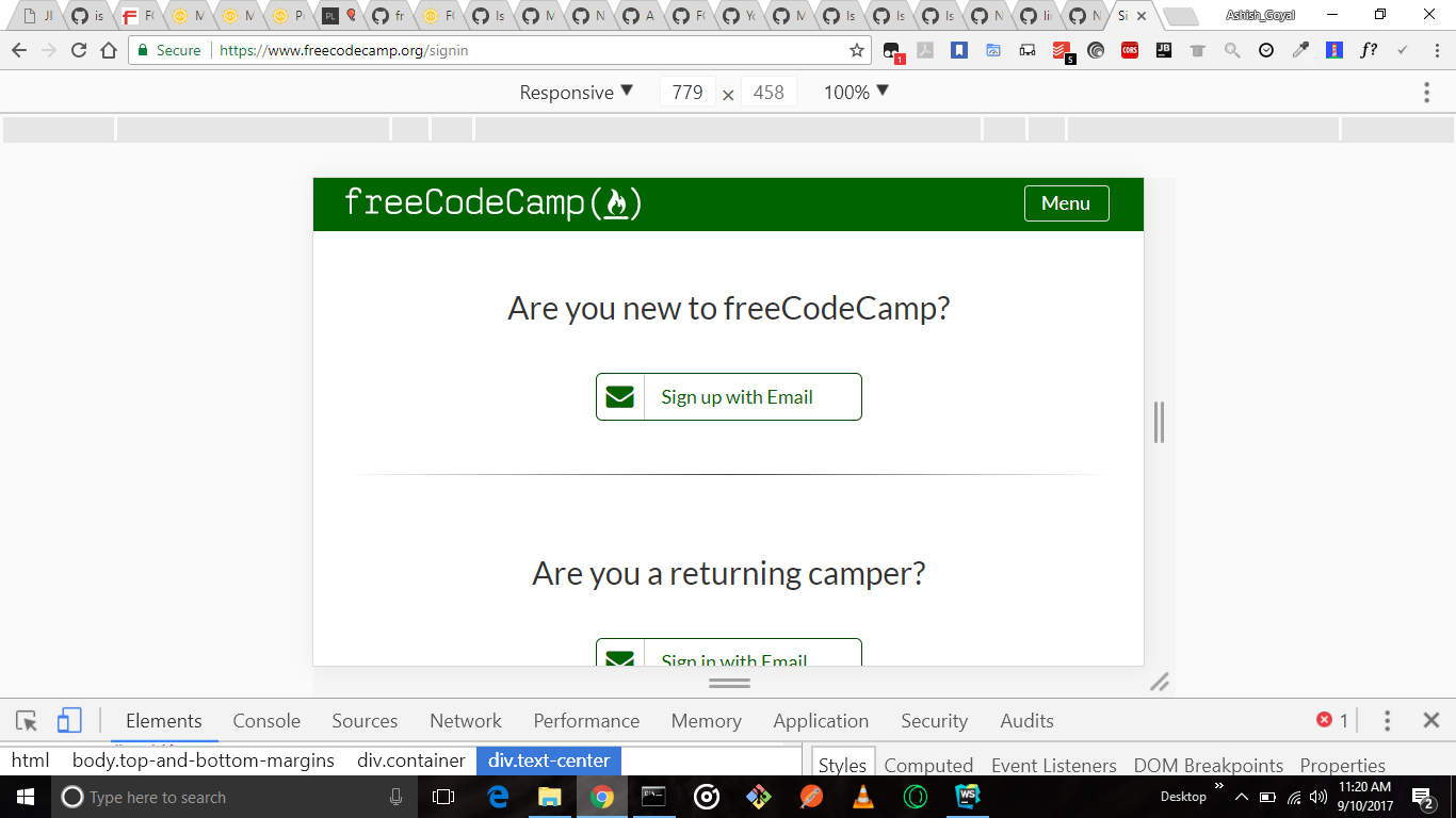
i am not facing this issue while working with google chrome browser
Screenshot of this as
Thanks 👍
 AshishkrGoyal
on 10 Sep 2017
AshishkrGoyal
on 10 Sep 2017
Yes this is true... I have been trying to fix this but everytime I try to find the loophole. It's not there.
dipikaisdbest
on 10 Sep 2017
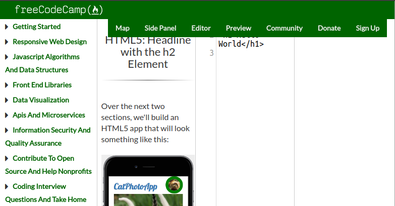
@AshishkrGoyal @dipikaisdbest To reproduce this error, try it on a challenge page of a challenge that has a preview. Any challenge in the Responsive Web Design section will show this error. You can use https://beta.freecodecamp.org/en/challenges/basic-html-and-html5/headline-with-the-h2-element from the screenshot in the report as an example. These break because they have the "Side Panel," "Editor," and "Preview" buttons in the navigation.
systimotic
on 10 Sep 2017
@AshishkrGoyal This is a "beta" issue. Sorry for not making it clear
ooade
on 10 Sep 2017
@systimotic There might be an issue here. I only tested it online when i reported the issue, it's a different case locally. The navbar assumes font-size of 15px locally and 14px online. Hmm... It changed the px at which it breaks, now 768px to 810px
ooade
on 10 Sep 2017
@ooade right thanks..that's a clear direction..
dipikaisdbest
on 10 Sep 2017
@systimotic Will reducing the padding for 768px to 810px be cool? Yes, @dipikaisdbest add this to that file and you're good to go:
.nav > li > a {
  @media (min-width: 768px) and (max-width: 810px) {
    padding-left: 10px !important;
    padding-right: 10px !important;
  }
}
right...may be I was in the correct direction...font-size and padding..
Thanks.
dipikaisdbest
on 10 Sep 2017
@ooade I'm not sure. I'd definitely like to avoid !important if it's possible. It looks like we've previously touched the Bootstrap variables. https://github.com/freeCodeCamp/freeCodeCamp/blame/staging/client/less/lib/bootstrap/variables.less#L290 That might be the ideal solution here.
systimotic
on 11 Sep 2017
hey @dipikaisdbest @ooade, have you made any progress with this? I thought I would give it a try and came up with something but im not sure about it. Maybe we can collaborate a little.
 moT01
on 18 Sep 2017
moT01
on 18 Sep 2017
hi @moT01 please go ahead....I am not able to make a concrete progress on this as yet. It would be good if we could collaborate on this... Your inputs are more than welcome.
dipikaisdbest
on 18 Sep 2017
Well, I was looking for an issue I could maybe handle, this one didn't look too tough. I thought I came up with a solution last night and made a PR. After testing it a second time - it wasn't working like I thought it was. So I closed it, rethought about it this morning and came up with something else, real similar to what was described in earlier posts. It seems to work, so I made another PR, and I'm thinking maybe I should ask around a little and get some more opinions before I just pile on the PR's. So there's a description here of what I did, and you can see the code if you click the files changed tab. Would you want to maybe test it out? See if it works for you? Or is there something you think we should add/change?
moT01
on 18 Sep 2017
@QuincyLarson i am working for this issue and send PR as soon as possible 👍
Thanks in advance 👍
AshishkrGoyal
on 3 Oct 2017
@AshishkrGoyal Awesome! Thanks for keeping us posted!
QuincyLarson
on 3 Oct 2017
@QuincyLarson definitely i will keep you update with my code 👍
Thanks ❤️
AshishkrGoyal
on 3 Oct 2017
@ooade : Using !important is usually a bad practice unless you know what you're doing. A simple change in sequence of style definition would get rid of !important dependency, If you change
.nav > li > a {
  @media (min-width: 768px) and (max-width: 810px) {
    padding-left: 10px !important;
    padding-right: 10px !important;
  }
}
to
@media (min-width: 768px) and (max-width: 810px) {
  .nav > li > a {
    padding-left: 10px;
    padding-right: 10px;
  }
}
You won't need !important anymore. Your media query will always have least priority. Meaning they will be applied last. As of now your styles are getting overridden by bootstrap classes that are defined within a media query.
adityaparab
on 3 Oct 2017
Hi, is anyone working on this issue? I would like to help fix it.
Also, the nav breaks at 856px for me on Firefox. Chrome breaks at 810px.
 JustusFT
on 25 Oct 2017
JustusFT
on 25 Oct 2017
@JustusFT, You can work on it. it seems anyone didn't send PR in while. so you can. thanks!
 texas2010
on 25 Oct 2017
texas2010
on 25 Oct 2017
Ok, I started working on it.
I shaved off some of the padding to give some space. Seems to work for me signed out.
But when I sign in, the username messes it up again.
The username seems like its visible below 1030px; anything higher and it gets hidden.
Shouldn't it be the other way around? That fixes it for me.
JustusFT
on 26 Oct 2017
Related issues
 robwelan
·
3Comments
robwelan
·
3Comments
 kokushozero
·
3Comments
kokushozero
·
3Comments
 vaibsharma
·
3Comments
vaibsharma
·
3Comments
 imhuyqn
·
3Comments
imhuyqn
·
3Comments
 cmal
·
3Comments
cmal
·
3Comments
Most helpful comment
I have been reading and trying to understand the code part. Haven't made any significant changes yet. Will make a PR once in that stage.