Freecodecamp: Remove Brownie Points from top navbar
Anyone on the gitter channels for any length of time has seen inordinately many people confuse the number in square braces at the top of the page with a challenge number. I suggest that the brownie point display be removed entirely from the standard page layout, and shown only on the profile page instead.
Leaving this open for a few days to solicit discusson, after which I'll open a PR to do the deed.
 chuckadams
All 16 comments
@chuckadams, I agree with this proposition. Let's see what the other @FreeCodeCamp/issue-moderators think :smile:
 ghost
on 28 Jun 2016
ghost
on 28 Jun 2016
We are losing the brownies! NOOOOOO! Its a crime, I love the brownies, lets add a setting or something to toggle the display of those cute nos.
 raisedadead
on 28 Jun 2016
raisedadead
on 28 Jun 2016
Add a cookie icon to reflect that's brownie points.
It is confusing that I can't refer to a challenge by a numeric ID. I think it's because challenges mutate and so older resources would get out of date. They should have unique IDs that are shorter than "Sift through text with regular expressions", such as a git commit hash. Although, there could be a simple fix for this. Upon clicking "Help" inside the challenge, the chat input box should auto-populate with "Hi, I have a problem with [link to challenge]".
 wiseleo
on 28 Jun 2016
wiseleo
on 28 Jun 2016
I think the better question is why do campers insist on numbering challenges?
While linear, the challenges do change order or new ones are added. Campers should always use the name of the challenge when referring to it, not the sequence it appears in.
I think a better solution is to start campers out with five points instead of one. This will reduce the number of campers who are getting confused.
Removing the number from the NavBar is not a good idea.
I do like the idea of adding a cookie, but the nav bar is not a good place add more as it is already crowded.
 BerkeleyTrue
on 29 Jun 2016
BerkeleyTrue
on 29 Jun 2016
Campers "insist" on it because every visual cue they get tells them that this is the number of the challenge. Sleight-of-hand is not going to help: campers will believe they started with challenge number 5. There is no indication that this number means anything other than that every challenge they see has an increasing number associated with it. If you make them increase by 10, they will believe challenge numbers increase by 10.
What exactly would be harmed by removing it? Also, by removing it, it frees up space to add a progress indication that actually _could_ contain a challenge number, such as 8/10 (8 out of 10) for reference.
chuckadams
on 29 Jun 2016
I agree. No matter what initial brownie value is added, a lot of campers are going to (and do) associate (incorrectly) the count with 'challenge numbers'. If there was an option to expand the bracket section (with a label) - There would be a clear 'visual training cue' and they would be less likely (imo) to confuse things maybe something like in the gif below would work (only there would a separate li with [+] and a nice css animation (and points would still take them to profile)).

 ImSerenityADev
on 29 Jun 2016
ImSerenityADev
on 29 Jun 2016
How about something on lines of:

raisedadead
on 29 Jun 2016
I'm also against removing the number from the nav bar, since there's nowhere else it's really shown, but I do think that somehow associating it with the user's avatar in a more obvious way would help to signify it's a property of a user and more than just a current-challenge number.
Since both the brownie count and the adjacent avatar both already link to a user's profile, perhaps we could overlap them to form that association, something like this:

Or a combination of this and a CSS animation as @qmikew1 suggests.
As for the conflation of brownie points and challenge number, this doesn't seem to me a persisting problem for any given camper. It's a misconception cleared up much more easily than explaining gitter's markdown formatting to a new user, for example.
 BKinahan
on 29 Jun 2016
BKinahan
on 29 Jun 2016
What about an animation when a brownie point is added? A little floaty +1 that fades out, triggered when a challenge is completed.
Or maybe an additional message on the completion popup:

Maybe the "Brownie Points" is a link to a wiki on them?
This could be in combination with an animated +1.
 SaintPeter
on 29 Jun 2016
SaintPeter
on 29 Jun 2016
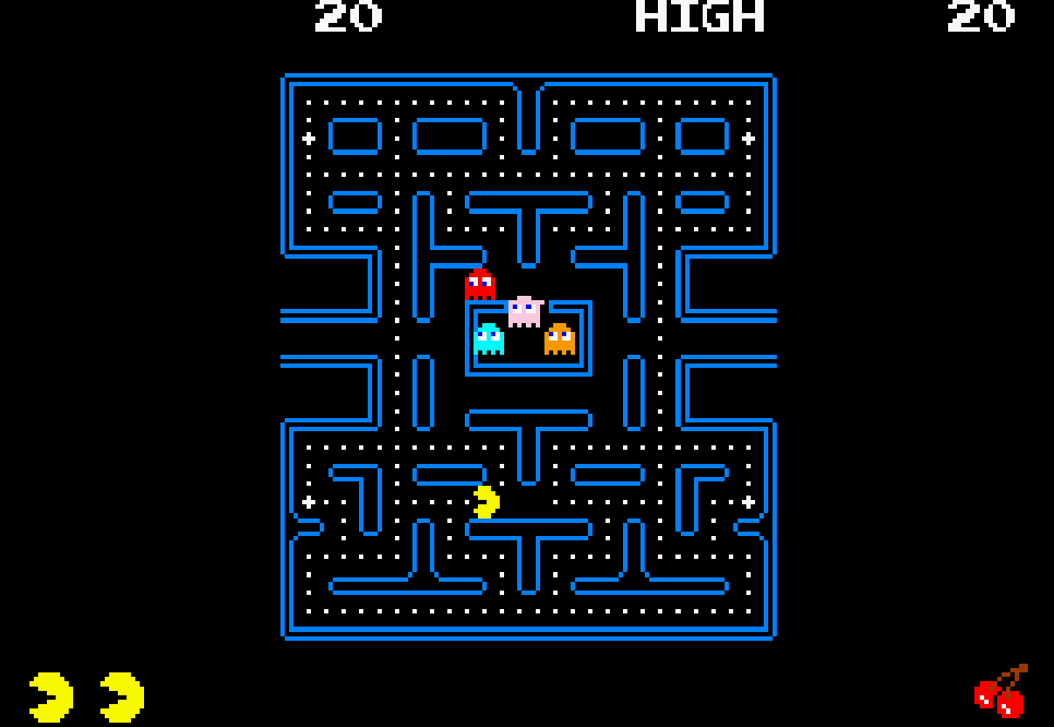
As many have pointed out, we definitely should not remove this number from the navbar. If you look at every major website that uses points, they are prominent in the navbar.
Here's how Stack Overflow shows them:

And Khan Academy:

Codecademy's is a drop down menu (I'm not a fan of complex navigation, as they're an information architecture failure):

I don't think we should add any new UI elements or graphics. Of the proposals so far, @BKinahan's seems the best to me. He's right in that imposing the number above the profile image implies association with the user (and not association with something else, such as the current challenge).
I also very much like @SaintPeter's suggestion of showing a +10 brownie points toast whenever a camper completes a challenge (assuming they haven't previously completed it).
Also, by giving points in increments of 10 instead of 1, we subtly indicate both that these points are not associated with the challenge number and make it more clear that they're points, because in video games, points tend to come in increments of 10 or 100. Here's PacMan:
 QuincyLarson
on 29 Jun 2016
QuincyLarson
on 29 Jun 2016
I could definitely get behind a video-game-style increase in the base score for brownies, so long as users' current point totals and the other ways of getting points are scaled up to match 👍
BKinahan
on 30 Jun 2016
@BKinahan nice catch, I see what you mean.
/cc @BerkeleyTrue this is a good point to consider, which means the current user's points have to be adjusted indeed if we do change the points award scheme including those from the bot.
raisedadead
on 30 Jun 2016
@BKinahan @raisedadead Yes this is the plan. There is already an old issue opened for that.
BerkeleyTrue
on 30 Jun 2016
An overlay on the portrait plus some score increase notification would probably serve to reduce the confusion. I remain unconvinced that 80's video games are an ideal model for gamification, but that's another story.
chuckadams
on 30 Jun 2016
I implemented the portrait overlay on my own branch, and frankly all it does is uglify the profile portrait without clearing up the purpose of the number. Since the original idea is a no-go and the proposed fix isn't likely going anywhere, I'll just drop the whole thing.
chuckadams
on 4 Jul 2016
Hey @chuckadams can post a few screenshots of how it looks? I think we should be resolving this with some suggestions if possible.
raisedadead
on 13 Jul 2016
Related issues
SaintPeter
·
3Comments
 cmal
·
3Comments
cmal
·
3Comments
 robwelan
·
3Comments
robwelan
·
3Comments
 itsmikewest
·
3Comments
itsmikewest
·
3Comments
 MelissaManning
·
3Comments
MelissaManning
·
3Comments
Most helpful comment
As many have pointed out, we definitely should not remove this number from the navbar. If you look at every major website that uses points, they are prominent in the navbar.
Here's how Stack Overflow shows them:

And Khan Academy:

Codecademy's is a drop down menu (I'm not a fan of complex navigation, as they're an information architecture failure):

I don't think we should add any new UI elements or graphics. Of the proposals so far, @BKinahan's seems the best to me. He's right in that imposing the number above the profile image implies association with the user (and not association with something else, such as the current challenge).
I also very much like @SaintPeter's suggestion of showing a +10 brownie points toast whenever a camper completes a challenge (assuming they haven't previously completed it).
Also, by giving points in increments of 10 instead of 1, we subtly indicate both that these points are not associated with the challenge number and make it more clear that they're points, because in video games, points tend to come in increments of 10 or 100. Here's PacMan:
