Franz: "Franz Todos" tab is appearing on top of service area
Describe the bug
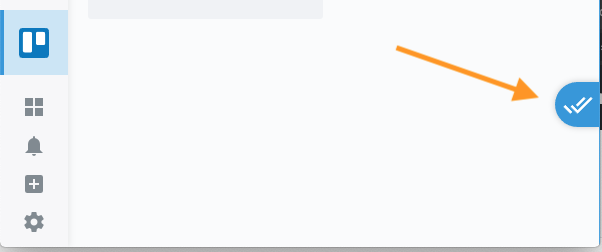
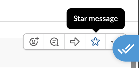
Franz Todos tab is appearing on top of my other services/apps.
To Reproduce
Steps to reproduce the behavior:
- Upgrade to v5.3.0
- Open any given service
- See a blue tab overlaid on the service
Expected behavior
I'd prefer the Todos tab to either be siloed off in the navigation menu on the left with the other services or system features, or to disable Franz Todos entirely. (I use Trello and Todoist for my todos.)
Screenshots
from @HarderBetterFasterStronger:
Desktop (please complete the following information):
- OS: [e.g. iOS] macOS Mojave 10.14.5
- Browser [e.g. chrome, safari]: Franz
- Version [e.g. 22]: v5.3.0.1519
Additional context
No, I don't want to just ignore the existence of the tab over there, since it's interfering with services' UI.
 andytuba
All 4 comments
+1 for or to disable Franz Todos entirely
A few comments:
- I feel the to-do feature could be powerful, but I really hope it was thought out fully in terms of design. The appeal of Franz, for me, is the ability to isolate all my services in to one app container while keeping original features available via that service's web view. It lets me choose where to keep my focus and this is obviously known to Franz as the workspace feature attempts to assist with this further.
I want to relate this to the to-do list and ask whether it adheres to these principles. It appears to me that the to-do list is a giant, everything goes list that spans across Franz as a whole. If this is the case, I would suggest that the feature is no better than a cloud sync notepad/list and let's be real - there are much better tools for that out there.
Now, that said, I do believe that this feature could be useful, but it would have to maintain the idea of a per service level focus. In other words this:
- A
to-doshould have the option of being applicable at a singular, service level - A
to-doshould have the option of spanning multiple services without needing to be duplicated to a new list - A
to-doshould have the option of spanning across workspaces - A
to-doshould have the option of being shared among teams (team members/teams) - A
to-doand allto-dolists should be synchronized via account/cloud
Anyway, I would look at that list and wonder if this is feature is worth pursuing. Not to sound harsh, but I would guess there are many other issues that could be pursued to enhance the Franz core product offering/appeal which is isolating a user's services (web views) in to a single app container while maintaining the identical functionality of the original serivce(s) web view(s).
- @andytuba Makes great points about:
- This feature should be able to be disabled. People already have a to-do application of their choice. Also, no offense: but these apps are definitely more feature rich with all kinds of things like multi-list/scheduling/alerts/sharing.
The placement of this floating tab. This is actually probably what needs to be stressed most. The UX on this. Bad. Actually very distracting. I like his suggestion of putting in the nav bar to the left (condition: if the feature is enabled. Otherwise, hide). If the idea is pulling out list on text highlight, then have a subtle drawer fly out like you would do when clicking the nav icon.
This is one of those scary moments when it feels something was pushed out quickly and then forced on users. It makes me wonder how many other features (and features I will probably not use as well) will be slapped on without the ability to disable.
Anyway, sorry for the long post, but I like your product very much and want to continue promoting it to others. And who knows, maybe everybody loves it and I'm totally off. I would just let the data speak for itself though and 1. make it easy to enable/disable and then 2. metrics/track (anonymously) how many people enable vs. disable the feature.
Also, I will attach a picture showing also why placement is bad choice.
 HarderBetterFasterStronger
on 7 Sep 2019
HarderBetterFasterStronger
on 7 Sep 2019
Interesting side note from the Todos feature: the Todos app is essentially another service, hosted at https://app.franztodos.com. It seems like the Todos app is authenticated using your Franz account, provided by the Franz app.
andytuba
on 7 Sep 2019
Just wanted to say thank you for amazing response time giving the ability to disable this by @adlk in Release v5.3.1
Thank you. Not sure if it was meant as response to this, but thank you if so.
HarderBetterFasterStronger
on 7 Sep 2019
andytuba
on 7 Sep 2019
Related issues
 wibimaster
·
3Comments
wibimaster
·
3Comments
 AGonLen
·
4Comments
AGonLen
·
4Comments
 seanford
·
4Comments
seanford
·
4Comments
 dbfin
·
4Comments
dbfin
·
4Comments
 BinaryBen
·
4Comments
BinaryBen
·
4Comments
Most helpful comment
+1 for
or to disable Franz Todos entirelyA few comments:
I want to relate this to the to-do list and ask whether it adheres to these principles. It appears to me that the to-do list is a giant, everything goes list that spans across Franz as a whole. If this is the case, I would suggest that the feature is no better than a cloud sync notepad/list and let's be real - there are much better tools for that out there.
Now, that said, I do believe that this feature could be useful, but it would have to maintain the idea of a per service level focus. In other words this:
to-doshould have the option of being applicable at a singular, service levelto-doshould have the option of spanning multiple services without needing to be duplicated to a new listto-doshould have the option of spanning across workspacesto-doshould have the option of being shared among teams (team members/teams)to-doand allto-dolists should be synchronized via account/cloudAnyway, I would look at that list and wonder if this is feature is worth pursuing. Not to sound harsh, but I would guess there are many other issues that could be pursued to enhance the Franz core product offering/appeal which is isolating a user's services (web views) in to a single app container while maintaining the identical functionality of the original serivce(s) web view(s).
The placement of this floating tab. This is actually probably what needs to be stressed most. The UX on this. Bad. Actually very distracting. I like his suggestion of putting in the nav bar to the left (condition: if the feature is enabled. Otherwise, hide). If the idea is pulling out list on text highlight, then have a subtle drawer fly out like you would do when clicking the nav icon.
This is one of those scary moments when it feels something was pushed out quickly and then forced on users. It makes me wonder how many other features (and features I will probably not use as well) will be slapped on without the ability to disable.
Anyway, sorry for the long post, but I like your product very much and want to continue promoting it to others. And who knows, maybe everybody loves it and I'm totally off. I would just let the data speak for itself though and 1. make it easy to enable/disable and then 2. metrics/track (anonymously) how many people enable vs. disable the feature.
Also, I will attach a picture showing also why placement is bad choice.
