Franz: Tray icon too small / not scaling on HiDPI screen [Linux]
Issue:
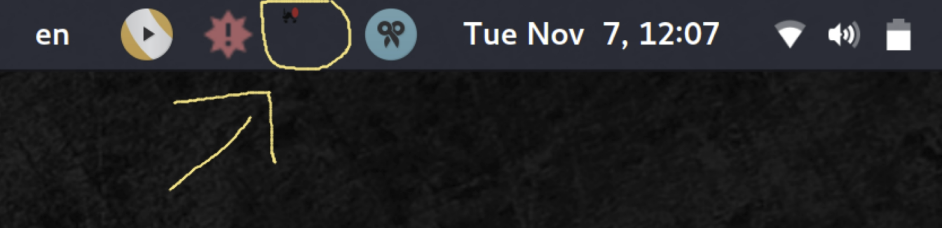
Tray icon is now too small on HiDPI screens after the upgrade to version 5 (5.0.0_beta.12-1).
Environment:
Arch Linux | kernel version 4.11.9-1-ARCH
Screen resolution: 3840x2160
Desktop Environment / GUI: Gnome (version 3.24.2)
Comment:
Normally I would assume it is an OS issue but it was fine before the upgrade (version 4.0.4-5) so I believe it must have something to do with it.
Screenshot (the small red dot is the new message notification):
Possible solution:
Maybe using the main taskbar icon instead would solve the problem (as that one appears in the correct size).
 cpazaras
All 24 comments
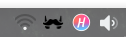
On Ubuntu 16.04.3 (Unity) using 5.0.0-beta.12 it seems too wide. I wish it was white (or light-colored) like my other icons.

Technically this might be a separate issue, but if we're looking at tray icons on Linux it might make sense to gather some data on how different distros/desktops behave?
 colinodell
on 7 Nov 2017
colinodell
on 7 Nov 2017
Technically this might be a separate issue, but if we're looking at tray icons on Linux it might make sense to gather some data on how different distros/desktops behave?
@adlk I am (was) a iconset designer for linux back in the day (see https://github.com/alecive/FlatWoken ). I can give you some hints in that regard if you need. But I think it's more of an electron issue that does not deal with systrays the ways gnome would like it to.
 alecive
on 7 Nov 2017
alecive
on 7 Nov 2017
Also in dark background the beard became invisible, please add a white icon or fallback to the white circle rounding the beard
 DFOXpro
on 7 Nov 2017
DFOXpro
on 7 Nov 2017
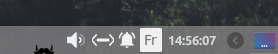
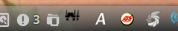
On Arch KDE it currently looks like this:

 pat-s
on 16 Nov 2017
pat-s
on 16 Nov 2017
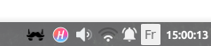
On XFCE it looks OK (white would be better):
But when I add the "Unity like notification area" it does the same thing
However if I start up another app (for example Harmony), it fixes it:
 Nolkaloid
on 17 Nov 2017
Nolkaloid
on 17 Nov 2017
Can I get some dev support from the Linux community here? I'm happy to provide all necessary assets.
 adlk
on 17 Nov 2017
adlk
on 17 Nov 2017
I don't know how it works with electron apps, but the best way to address this is not to rely on custom tray icons / application solutions but rather on system-wide settings. Most of the icons that are in the tray are using an iconset (usually placed in /usr/share/icons for system wide or .icons for user wide).
The applications that perform best in the tray area usually use that. In this way, users can easily change color of the icon according to their theme without re-compiling.
I don't know how it works in the code, but what you should have is the following:
- defining three icon names (e.g.
franz,franz-tray,franz-tray-badge) - access to them through this icon set trick (so that it is customizable)
- install the default icon variations in the default iconset when you install the app
- if you are not doing that already, install also a
franz.desktopfile into/usr/share/applicationsso that users (for example ubuntu users) can find the app in their launcher of choice (for example unity). This file would use a genericfranzname into theIconfield, again to allow customization - Enjoy
Again, I don't know how any of this could be achieved with electron apps, but I hope it helped!
alecive
on 17 Nov 2017
Same here with Cinnamon
Desktop: Cinnamon 3.4.6 (Gtk 3.18.9) Distro: Linux Mint 18.2 Sonya
Display Server: X.Org 1.18.4 drivers: ati,radeon (unloaded: fbdev,vesa)
Resolution: [email protected]
GLX Renderer: Gallium 0.4 on AMD KAVERI (DRM 2.49.0 / 4.10.0-38-generic, LLVM 4.0.0)
GLX Version: 3.0 Mesa 17.0.7 Direct Rendering: Yes
Icon is too small and wrong color:
 MegaV0lt
on 18 Nov 2017
MegaV0lt
on 18 Nov 2017
+1 Arch, gnome it becomes very small and blends in the black background so it becomes almost invisible.
 jbreuer95
on 20 Nov 2017
jbreuer95
on 20 Nov 2017
This is about Statusbar! #300 is about Taskbar!
MegaV0lt
on 20 Nov 2017
Yes, but they are both related to icon management. You fix one, you fix the other.
alecive
on 20 Nov 2017
@alecive's advice is sound, but I would keep it simple for now: just provide a dark icon set and a light icon set, togglable with a binary switch in the settings (probably with different defaults for different targets, e.g. light icons for Windows and Linux, and dark icons for OS X). This is much more user-friendly than telling people to put their custom icons in a special location, specific to their OS type, flavor and version. In another stage, you can add further customization, for the few picky ones (or they can add it themselves).
I've scrolled through the whole list of Electron-based apps, clicking on every familiar name, and all but one - Mattermost - are hardcoded to a single icon, so having a choice between dark and light will already put Franz above the norm. Couldn't check the closed-source ones, of course, but still.
You can take a look at Mattermost's desktop client for inspiration.
 alecmev
on 27 Nov 2017
alecmev
on 27 Nov 2017
This is much more user-friendly than telling people to put their custom icons in a special location
There is no need to put custom icon in a special location, the .deb file should do that automatically. If the user wants the default can be overridden (but it is not necessary since the two black and white icons will be in their respective iconsets and should work out of the box without the need to specify which one you want in the settings).
so having a choice between dark and light will already put Franz above the norm.
True, and that is the main issue. It is too much work to make an app compliant with linux, and nobody cares :) . Your solution is fine, but still it requires another toggle in the settings (which can be avoided).
alecive
on 28 Nov 2017
Okay, done some more googling, found the Icon Theme Spec. Basically, yeah, the Linux way is to put the icons in /usr/share/icons/hicolor (the preferred place). That's where GTK3, Chrome, Firefox, Sublime Text, Skype, MPV, Compton, Pasystray, NetworkManager are on Arch, at least.
However, icon variant != icon theme. Since the Franz icon isn't of any particular color, its main feature is its shape, and an outline probably wouldn't look good at 16x16 (would it? Slack doesn't look too bad), shipping two variants by default - dark and light - is the only sensible way to go. But there's no convention for it, no user preference for "I'd like my icons to be white-ish, if there's such an option". There can only be one main icon, and it can be overridden only by shadowing with some system-wide theme, which is an absolute no-go for a casual user.
the two black and white icons will be in their respective iconsets and should work out of the box without the need to specify which one you want in the settings
But how? How do you switch? What's the default? Semi-safe assumptions can be made about Windows and Mac, based on their versions/settings, but not about Linux. For example, I have Polybar as my taskbar. My tray section's background is a matter of a single line in ~/.config/polybar/config. Even in the less extreme scenario, KDE and LXDE have a light tray section, and GNOME and LXQt have a dark one, and that can be changed with some trivial theming. No heuristic is going to be good enough to determine which icon should be the default, the dark one or the light one.
Hence, for ease of use, some sort of a setting must exist in the application itself. Even if not a toggle, then some standalone helper GUI, which is a bit of an overkill, compared to a toggle.
What do you think?
alecmev
on 28 Nov 2017
@jeremejevs thanks for your answer. It is super helpful.
What I don't get in this discussion... (please forgive my lack of Linux Desktop Environment sensibility)
Wouldn't it be possible to replace the tray icon with a color version like the Franz logo itself? This way it has a white outer border, a blue center and the white logo again. There wouldn't be a contrast issue on any mainstream theme and it even works well with the unread message badge indicator.
Having an in-app toggle to decide the icon color sounds like overdoing it to me. Also, shouldn't it just work for all* users without the need of tweaking your options.
_* let's say 95%_
adlk
on 28 Nov 2017
Sure, though, for example, Slack, Discord, Messenger, Docker for Windows/Mac, Steam, Dropbox, to name a few, all have special monochrome icons for the tray, even though they're originally in color (Slack even has a special icon for that, completely different from its logo). It just makes the tray appear more uniform, instead of looking like a zoo of various styles and colors.
alecmev
on 28 Nov 2017
shipping two variants by default - dark and light - is the only sensible way to go.
@jeremejevs I don't agree. It would simply not work for the vast majority of people, and most would not even notice the toggle in the settings. In ubuntu for example (talking about ubuntu here since it is used by the vast majority of users) there are two iconsets for tray icons - one for dark panels and one for light panels. They are called ubuntu-mono-dark and ubuntu-mono-light. It would be just a matter of adding the two versions to the two iconsets and everything would just work automagically.
Wouldn't it be possible to replace the tray icon with a color version like the Franz logo itself?
Sure, but as @jeremejevs said, nobody does that because by guideline the tray icons should be monochrome.
Having an in-app toggle to decide the icon color sounds like overdoing it to me. Also, shouldn't it just work for all* users without the need of tweaking your options.
Exactly, and this is why I think it is not the way to go.
The apps that @jeremejevs are mentioning are not standard GTK3 apps so I would not refer to them as the example though. They kind of work okay with linux distros but they basically patch their issues with solutions that are not ideal. Since Franz is relatively recent, I would try to follow guidelines for what possible, especially in linux where iconset guidelines are very old and consolidated. But I reckon that I am not the best to deal with this nitty gritty, so I would probably ask for somebody that does this as his job. E.g. Matthias Clasen is one of the contributors of the gnome-icon-theme-symbolic, which is the monochrome icon theme that is used by default in GNOME3, and probably has some good suggestions on how to proceed.
alecive
on 28 Nov 2017
It would simply not work for the vast majority of people, and most would not even notice the toggle in the settings.
The vast majority would probably be fine with a white icon (especially if it had a super thin black outline, like Slack), since many other behemoth apps ship with white icons and nobody seems to be complaining about it (though, admittedly, I didn't look that thoroughly).
talking about ubuntu here since it is used by the vast majority of users
I've seen no poll/ranking where Ubuntu would be ahead of others by a lot, if at all, and it almost definitely isn't the overall majority of desktop distros.
there are two iconsets for tray icons - one for dark panels and one for light panels
This is very much vanilla-Ubuntu-specific. You can't assume that every distro and desktop environment has a light and a dark theme. How should the package maintainers handle that? Some distros, like Arch and NixOS, don't even have a default DE.
Anecdote: I'm an "advanced" *nix user, and I have zero clue how to change my system's icon theme, in any DE, because everything has always been good enough by default. I'd have to use Google for that.
As a user, if I were to go and search "franz can't see tray icon", what would I be happier about: "go toggle a switch in app's settings" or "your princess is in another castle AKA go find out how to change icon themes in your DE and hope that nothing else changes that you didn't want to change"?
However, I have no expertise in this, just opinions. At this point, maybe I'd look into adding a black outline around a white logo and just seeing how that looks first, before going down the customization rabbit hole.
alecmev
on 28 Nov 2017
As for the color matching the theme, svg would be the best way to handle it. Looks like this would have to gain some traction for that though. https://github.com/electron/electron/issues/9642
What about a two-tone icon in the meantime? Like adding a white border around the current black icon?
 m-e-h
on 12 Dec 2017
m-e-h
on 12 Dec 2017

I was able to have the icon displayed correctly by enlarging the app/assets/images/tray/linux/tray.png and tray-unread.png to 24px x 24px (they were 24px x 16px, and were zoomed to a 24px height, hence the poor quality).
The enlarged icons:


Probably something similar can be done to the HiDPI icons too.
 moisadoru
on 22 Dec 2017
moisadoru
on 22 Dec 2017
Hey,
I would like to provide some information about this issue.
First of all, the icons themes on every Linux distro out there follow FreeDesktop standards. The icons must be installed under $XDG_DATA_DIRS/icons/$THEME_NAME, and every icon has to be placed in the right context Applications, Places, Mimetypes....... For the tray icon to be colored using the current Gtk Theme that the user uses, it has to be a symbolic icon, which is simply a monochrome SVG icon. And must be rendered using Gtk, otherwise, it won't be colored using the Gtk theme. So this solution is just impossible anytime soon. As electron doesn't provide any way to use any specific widgets for the systems that use Gtk :(
The second possible solution is to ship the icons in the $XDG_DATA_DIRS as explained before. With some readable by humans icon name franz-tray/franz-tray-notification or whatever you guys like. And then, detect the current icon theme and get the right icon from there. I have started working on something like this few months ago to handle all this for Electron apps, so you don't have to worry about how to detect the theme for this DE. Here's my solution https://github.com/bil-elmoussaoui/linux-icons
The work isn't perfect, but it does the job for PNG icons. The SVG ones as there are not supported by Electron, causes a small issue :( I tried to find a way to make them work, by converting the SVG to a PNG on the fly, and return the PNG content; but sadly, there's no easy way to add that without adding a ton of dependencies which is not really good (adding 10mb just to have a tray icon looking nice......). So the development is currently paused until electron adds SVG support.
The third solution, provide more than one icon example and make it possible to change them from the application itself. Just don't this. Please. It will just overcomplicate those things. And there will be people who won't be satisfied because the tray icons look like aliens compared to the icons provided from their favorite icon theme.
We have been facing this kind of issues before electron was even born. And a lot of guys tried to figure out a solution, I have been working on a solution that works just fine with almost every app out there, which is Hardcode-Tray. It's basically a python script, that detects the DE, the right icon size, the applications that use "hardcoded" tray icons, and detect your icon theme, look in the theme if there's an icon for this application, and patch the application icons to have that nice looking tray icons!
So for me, Franz can't do anything about this. It's an upstream issue of Electron.
 bilelmoussaoui
on 18 Jan 2018
bilelmoussaoui
on 18 Jan 2018
@bil-elmoussaoui wow, thanks for the insight!
 haraldox
on 18 Jan 2018
haraldox
on 18 Jan 2018
What is it you want? Do you need an extra set of icons?
 peter-schaefer
on 14 Feb 2018
peter-schaefer
on 14 Feb 2018
Same issue here.
 dbogdanov
on 3 Apr 2018
dbogdanov
on 3 Apr 2018
Related issues
 larissaales
·
3Comments
larissaales
·
3Comments
 m2kk
·
4Comments
m2kk
·
4Comments
 AGonLen
·
4Comments
AGonLen
·
4Comments
 BinaryBen
·
4Comments
BinaryBen
·
4Comments
 tayfuuun
·
4Comments
tayfuuun
·
4Comments
Most helpful comment
Also in dark background the beard became invisible, please add a white icon or fallback to the white circle rounding the beard