Foundation-sites: Documentation: less video, more meat and potatoes
Here is the documentation for cards...
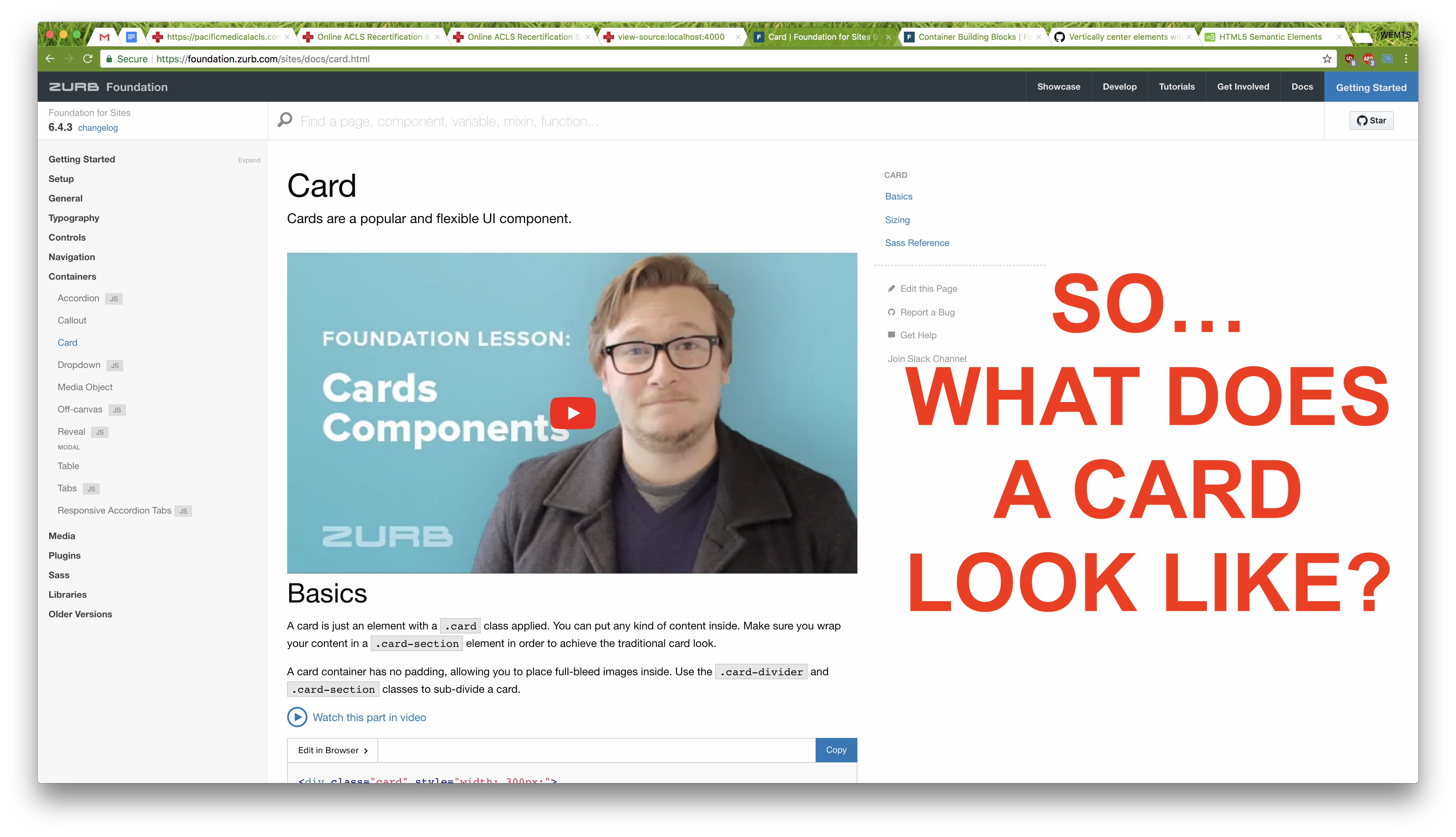
I'm sure the guy in the video is a nice guy. And I'm sure if it was reasonable for me to play sound in my office and I clicked on the video and I waited through some intro and some nerd stuff it might answer the question.
But instead of all that, why not just show me, right up top, what is a card?
 fulldecent
All 9 comments
This is the default template for documentation pages afaik where the video in the frontmatter is shown at the top as intro.
 DanielRuf
on 2 Mar 2018
DanielRuf
on 2 Mar 2018
The actual demos with codepens are underneath the video.
DanielRuf
on 2 Mar 2018
DanielRuf
on 2 Mar 2018
I think the point of @fulldecent is more _why did we choose to display a big video on top_ instead of _how it is implemented_.
I agree with @fulldecent that the video is not the first resources people will go for in the Foundation documentation and that it's more like a _nice side bonus_ for beginners.
The documentation site UI/UX can be improved a lot in tons of aspects and we will try to consider this for the next design (probably coming alongside Foundation 7).
 ncoden
on 3 Mar 2018
ncoden
on 3 Mar 2018
I agree with @fulldecent that the video is not the first resources people will go for in the Foundation documentation and that it's more like a nice side bonus for beginners.
The documentation site UI/UX can be improved a lot in tons of aspects and we will try to consider this for the next design (probably coming alongside Foundation 7).
Maybe add a switch [ beginner | pro ] mode on the top right and store the setting in a JS cookie and hide the videos then? Just an idea.
DanielRuf
on 3 Mar 2018
Maybe add a switch [ beginner | pro ] mode on the top right and store the setting in a JS cookie and hide the videos then? Just an idea.
If only webdesign were that simple 😄. More seriously, no one want to having to customize the website he/she just landed on. If the video is not the more import on the website, move it away, on the sidebar for example. Both pros beginners want to see the code/examples first.
ncoden
on 3 Mar 2018
Or yeah, videos [ on | off ].
DanielRuf
on 3 Mar 2018
Maybe instead we could have a smaller thumbnail with some text to the side of it that says something like "New to Foundation? Watch this video lesson to get familiar with Foundation's Card component." Then have the thumbnail open up a Reveal with the video embedded.
That way there is more context to the video's purpose and it takes up less real estate.
 colin-marshall
on 5 Mar 2018
colin-marshall
on 5 Mar 2018
Tagging @IamManchanda as he is the docs lead.
Lets revisit this for V7.
 JeremyEnglert
on 6 Mar 2018
JeremyEnglert
on 6 Mar 2018
Related issues
 udf2457
·
3Comments
udf2457
·
3Comments
 Mojtaba-Reyhani
·
3Comments
Mojtaba-Reyhani
·
3Comments
 lspoor
·
3Comments
lspoor
·
3Comments
 barrywoolgar
·
3Comments
barrywoolgar
·
3Comments
 Yanchek99
·
4Comments
Yanchek99
·
4Comments
Most helpful comment
I think the point of @fulldecent is more _why did we choose to display a big video on top_ instead of _how it is implemented_.
I agree with @fulldecent that the video is not the first resources people will go for in the Foundation documentation and that it's more like a _nice side bonus_ for beginners.
The documentation site UI/UX can be improved a lot in tons of aspects and we will try to consider this for the next design (probably coming alongside Foundation 7).