Foundation-sites: XY-Grid Container doesn't fit next to each other in Edge
I have got a problem in Microsofts Edge when using the XY Grid with margin gutters and a 13px base font size.
How to reproduce this bug:
Use the following Sass settings for the XY grid. It's important to use exactly the same values because with other cases the bug doesn't show up. Settings that I haven't listed below are using their defaults.
- $global-font-size: 81.25%;
- $global-width: rem-calc(990);
- $grid-margin-gutters: rem-calc(30);
Then place two containers next to each other by using @include xy-cell(6);
What should happen:
Now you should see two containers in one line. This is what happens in every browser. But not in Edge.
What happened instead:
In Edge there seems to be not enough space so the containers are linearised like on a mobile view. Maybe this is a calculation error in Foundation? Maybe you should always round down the calculated results of the container widths? But maybe its an calculation error in Edge and there won't be any fix? Please help.
Foundation Version(s) you are using:
6.4.3
Test case link:
https://codepen.io/artursopelnik/pen/YYyXKp
In the code pen I wasn't able to use the Sass version of Foundation. So I use the CSS version and overwrite the Foundation CSS with the CSS that comes from my site to simulate the settings I have mentioned above.
 Baedda
All 12 comments
Tested with BrowserStack:
- Firefox 49: works.
- IE11: works.
- Edge 15: works.
- Edge 16: don't works (also tested on my own pc).
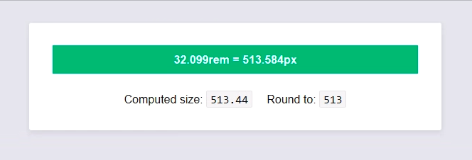
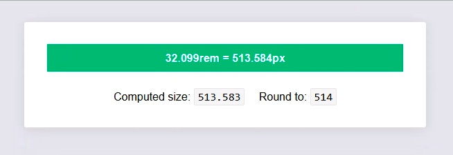
This comes from Edge 16 which _truncate_ numbers to 2 decimal places. So for the width, calc(50% - 2.3075...rem) is truncated to calc(50% - 2.3rem), same for the margins, and _unluckily_ the cell has a too big width.
It may appears only with your configuration because the margins are rounded more than the width, so they can fit in the row. This works with the default configuration only because we are lucky.
I can't believe we have a bug _that stupid_ in Edge. This bug is so stupid that at first I did not trust the Edge developer tool and checked the width row in Js (see https://codepen.io/ncoden/pen/XVMxVN).
That being said... The only thing we can do is allowing to disable to conversion to rem for grid, so the generated CSS may be pixel-perfect. But I am not sure it worth it for a _custom config_ on a browser _nobody uses_ (0.24% on Edge 16, 1.34% on Edge 15).
 ncoden
on 28 Dec 2017
ncoden
on 28 Dec 2017
Edit: all version of Edge and IE seem to truncate values (so I don't know why the grid works on Edge<=15):
While with Firefox, Chrome, etc...
ncoden
on 29 Dec 2017
The only reference I found about value precision in CSS is:
CSS theoretically supports infinite precision and infinite ranges for all value types; however in reality implementations have finite capacity. UAs should support reasonably useful ranges and precisions.
-- W3C (CSS Values and Units Module Level 3)
ncoden
on 29 Dec 2017
It may appears only with your configuration because the margins are rounded more than the width, so they can fit in the row. This works with the default configuration only because we are lucky.
Yes this is exactly what our tests showed too. We have tried some other font sizes too and sometimes the bug appeared and sometimes it did not. I couldn't believe that there has not been any other issue like that. I even could not find anything about it on google what made me believe I was stupid because anyone who works with rem sizing and any kind of frontend grids should have seen this issue in Edge.
But it really seems that only me is using this very unlucky combination of base font size and max width. I can confirm that this is not a foundation issue but an Edge bug. But could you think about any kind of workaround?
In my case I reduced the size of my column so it fits in Edge, too. Instead of 6 columns I have used @include xy-cell(49.9%); This only works because I don't use background colors so you don't notice that the container is way too small in good browsers. But of course this is no workaround that can be used at every point. Switching the whole grid pixels instead of rem is not a real option, isn't it? But maybe there is an Edge detection that we can apply pixels only for Edge?
Baedda
on 3 Jan 2018
I have opened an issue at microsoft for this bug. Maybe they will change the behaviour of Edge.
https://developer.microsoft.com/en-us/microsoft-edge/platform/issues/15305821/
Baedda
on 3 Jan 2018
I'm not sure what the solution is, but this kind of problem is discussed here:
 gmclelland
on 3 Jan 2018
gmclelland
on 3 Jan 2018
We have an answer from microsoft:
This is unfortunately a known issue. If you are looking for a workaround, you could use "calc(…)" to do your computations, the truncating won’t happen until later in the pipeline and you should get the correct result.
But I guess this workaround will not help in our case,
Baedda
on 15 Jan 2018
But I guess this workaround will not help in our case,
Aren't we already using calc here?
 DanielRuf
on 6 Apr 2018
DanielRuf
on 6 Apr 2018
Aren't we already using calc here?
We're using it for XY Grid with margin gutters, to remove gutters from width. Like: width: calc(66.66666% - 2.25rem). But 66.66666 is still round to 66.66. A solution may be to switch to use "calc for everything" but IE have a _lot_ of bugs with it (transitions, nested expressions, inherited calc, etc... https://caniuse.com/#feat=calc).
ncoden
on 7 Apr 2018
But 66.66666 is still round to 66.66
Right and this is the root cause and a bug which is confirmed by the Edge developers. I guess we can not "fix" this by changing the actual code on our side without creating new bugs.
DanielRuf
on 7 Apr 2018
I ran into this bug as well. Obviously this is not a fix but I was able to work around by tweaking the gutter values in the sass settings file. eg: instead of 2rem to 1.87rem.
 jacobcarrington
on 17 May 2018
jacobcarrington
on 17 May 2018
This bug has been a problem for me for months. My work around was to add the "full" class to the "grid-container". I forked the CodePen from Beadda above.
Also make sure you don't have Zoom above 100% in MS Edge. You can see what the Zoom setting is in Edge by using Alt+x.
 cparker-ajla
on 21 Aug 2018
cparker-ajla
on 21 Aug 2018
Related issues
 BicanMarianValeriu
·
3Comments
BicanMarianValeriu
·
3Comments
 udf2457
·
3Comments
udf2457
·
3Comments
 umphy
·
4Comments
ncoden
·
3Comments
umphy
·
4Comments
ncoden
·
3Comments
 anware
·
3Comments
anware
·
3Comments