Foundation-sites: XY Grid - Feedback and Discussion
Now that the new XY Grid has been merged and is included in the RC lets keep all discussion surrounding this in one place, and gather as much feedback to improve it as much as possible before the full release.
You’ll find a Codepen to the new grid here:
https://codepen.io/ZURBFoundation/pen/owvqYp?editors=1000
And the docs:
http://foundation.zurb.com/sites/6.4.0-rc1/docs/xy-grid.html
For previous discussion history see:
 brettsmason
All 67 comments
Currently the plan is to rename .margin/padding-gutters classes to .grid-margin/padding classes.
However feedback on how we can make this more flexible (eg allow padding to be added on all 4 sides, margin on bottom too etc) would be welcomed!
brettsmason
on 5 Jun 2017
Padding to create vertical spacing in the grid - my opinion is that padding as a "gutter" might now be obsolete so combining the .grid-margin with .grid-padding might be the way to achieve this - using the $global-padding variable
 rafibomb
on 5 Jun 2017
rafibomb
on 5 Jun 2017
Is this a bug? https://codepen.io/anon/pen/owjYyR?editors=1100. Seems something isn't getting overridden correctly as the grid overflows the container.
<div class="grid-y margin-gutters">
<div class="cell">cell</div>
<div class="cell">cell</div>
</div>
Also, would be great if this would add vertical gutters only between the cells (not above or below the grid itself, just like grid-x). I often use such a pattern to separate teasers in a content listing where I dont want any trailing whitespace.
 oxyc
on 7 Jun 2017
oxyc
on 7 Jun 2017
@oxyc can you specify browser? It looks fine in Chrome, but I'm seeing an issue in Safari that looks like this:

@brettsmason can you look into it?
 kball
on 7 Jun 2017
kball
on 7 Jun 2017
In your screenshot you can see that the cells background color is not aligned with the heading, which I think it should be.
oxyc
on 7 Jun 2017
Ah, yes, I see it. The left-right negative margin from margin gutters is getting applied even though this is a vertical grid. Good catch!
kball
on 7 Jun 2017
@oxyc with regards to the vertical gutters not applying on the outside, I believe that actually is working but the h4 has a margin-bottom that is offsetting. Can you verify?
kball
on 7 Jun 2017
Another common pattern I use is a combination of grid-x andgrid-y. Basically it would add gutters on all sides of the cells, but still align the cell content with the container. This is useful with block grids Demo https://codepen.io/anon/pen/QgjGRO?editors=1100
Edit, this was very difficult to create with padding grids, a pretty easy fix with margins!
oxyc
on 7 Jun 2017
@oxyc with regards to the vertical gutters not applying on the outside, I believe that actually is working but the h4 has a margin-bottom that is offsetting. Can you verify?
Yes, sorry, you're correct.
oxyc
on 7 Jun 2017
Another common pattern I use is a combination of grid-x and the way I described grid-y above. Basically it would add gutters on all sides of the cells, but still align the cell content with the container. Demo https://codepen.io/anon/pen/QgjGRO?editors=1100
I think this is what @brettsmason @andycochran, and I have been going back and forth about in with regards to positioning gutters on multiple sides in https://github.com/zurb/foundation-sites/pull/10017
Question for you - In this situation how would you expect the gutters to behave on the bottom of the container? Would you expect the grid to be flush with the bottom, or have a gutter beneath it?
kball
on 7 Jun 2017
Question for you - In this situation how would you expect the gutters to behave on the bottom of the container? Would you expect the grid to be flush with the bottom, or have a gutter beneath it?
I would not expect a gutter. For example I might want to wrap the grid in a <div class="padding-1 bg-primary"></div> where I expect the _perceived_ padding to apply equally all around the grid. If there was a gutter below the grid, the vertical spacing wouldn't match the horizontal. Demo of how I would want it to work https://codepen.io/anon/pen/YQyNEp?editors=1100 (update: added an example with padding-vertical as well)
oxyc
on 7 Jun 2017
@oxyc Thanks so much for your valuable feedback! I'm going to take a look at some changes this evening to address this.
brettsmason
on 8 Jun 2017
What are the XY grid equivalents of the Sass mixins @include flex-grid-row() and @include flex-grid-columns()?
 arjendejong12
on 10 Jun 2017
arjendejong12
on 10 Jun 2017
@arjendejong12 Currently the mixins are xy-grid (https://github.com/zurb/foundation-sites/blob/develop/scss/xy-grid/_grid.scss#L23) and xy-cell (https://github.com/zurb/foundation-sites/blob/develop/scss/xy-grid/_cell.scss#L100). With the complexity of the class requirement with the new grid, the mixins have been problematic and I've struggled to find users who use mixins to get feedback.
If you use mixins I'd really appreciate if you are able to give them a try and let me know how you get on!
brettsmason
on 10 Jun 2017
Thank you, it seems I was right about picking those mixins. I was confused by the documentation about xy-cell($size) only accepting full, auto, and shrink, while I was looking for xy-cell() to provide me with the number of columns I'd want, just like flex-grid-columns(). Luckily, it seems xy-cell() also accepts numbers. So it works now and I also tried to change xy-cell($gutter-type) to padding, which gave expected results. Props for making these mixins! Maybe you could edit the documentation to include the possibility to add numbers to xy-cell($size), because for me it was confusing whether it was possible or not. I also think you should move these two mixins to top because they are the most important ones.
A personal wish for these mixins would be to add a map of breakpoint column sizes, something like this: xy-cell($breakpoint: (small: 12, medium: 6, large: 8)). This makes it easier for me to declare various column sizes in one go, instead of using the breakpoint() mixin, but I can see that this might be hard to code.
arjendejong12
on 11 Jun 2017
I think we need to add some docs about cell-block and cell-block container. There's information about the mixins, but it may deserve it's own section in the XY docs.
 JeremyEnglert
on 11 Jun 2017
JeremyEnglert
on 11 Jun 2017
@arjendejong12 Thanks again for the feedback - I'll definitely get those docs fixes added.
I also created a PR with a new mixin: xy-cell-breakpoints based on your suggestion. I decided to add it as a new mixin for now, though I'm not sure if it should be part of the xy-cell mixin or not.
@kball what control do we have over mixin order? I'm assuming its based on the order within the partial? I agree it might be good to change the order to one that's more relevant to the end user.
brettsmason
on 12 Jun 2017
@JeremyEnglert Agreed - @kball can you help me out with that one?
brettsmason
on 12 Jun 2017
@brettsmason you mean in the docs? I believe that is correct, order within the partial and probably order of files in the front matter in the docs as well (I believe you can do an array not just a wildcard)
@JeremyEnglert yes will see what I can put together on cell-block and cell-block-container
kball
on 12 Jun 2017
Also noticed today whilst trying out mixins that xy-cell-layout is going to need the responsive treatment, just like the PR for xy-cell-breakpoints. If we can work out how to code this then it will apply to a few of the mixins. Some of the mixins may even be better merged. Don't have any time until Friday to look at anything now though unfortunately.
brettsmason
on 13 Jun 2017
A few notes while I'm building a site with the new grid:
First off I love the margin grid as it's way easier to align edges without having the side gutters on the grid itself. With the old grid I had to wrap basically every piece of content on the page in a grid to get the content to align. One consequence of having no padding on the outer sides of the grid is that once your viewport becomes smaller than
$global-width(assuming you have a wrappinggrid-container), the content hugs the viewport edge. My own fix was to add:.grid-container { // Add a gutter between the grid and the viewport. @include xy-gutters($gutters: $grid-padding-gutters, $gutter-type: padding); }I'm still learning to use the grid but I dont imagine I will ever nest
grid-containers, I'm thinking I'll only use them for the main layout of the page. Items that I _do_ want to flex to the viewport sides, such as hero banners, are never grids, so I don't think it's going to cause issues.
Might this be useful to have as a variable$grid-container-gutter?I'm still struggling with proper a proper _sticky footer_ component. I was hoping the
grid-ywould be usable for this but seems it's not.I often want the content of a cell to take up as much space as possible, so that everything becomes equal height without resorting to equalizer. Not sure how to solve this in a good way yet, for now I'm enabling it globally on all cells to see what happens and try and fix it once I know the downsides. Some designs would obviously be hurt by this so I'll add it as a separate class after having tested it globally. A helper would be useful, in my opinion it should be on a grid basis, rather than on a per cell basis.
oxyc
on 14 Jun 2017
@oxyc thanks for your continued feedback, I really appreciate it! To answer your points:
I've been wondering about how to handle this too. The trouble with adding padding around the
.grid-containeris the grid wont align with items that arent in a.grid-container. An example is if I wanted a full width grid of images and dont want any padding on the sides. I think adding padding could work, but it should be removed on screens larger than$global-width? Need some other opinions on this one.What do you mean by a sticky footer - do you have an example? It might be possible to do something with
.grid-frame- pretty much creating an app style layout with scrollable panels.I see you found
.align-stretch- I'm working on sorting out this issue at the moment so that will be the way to go to achieve this.
brettsmason
on 14 Jun 2017
I've been wondering about how to handle this too. The trouble with adding padding around the .grid-container is the grid wont align with items that arent in a .grid-container. An example is if I wanted a full width grid of images and dont want any padding on the sides. I think adding padding could work, but it should be removed on screens larger than $global-width? Need some other opinions on this one.
True. Your suggestion would work for me but I do see the possibility for cases where user want text content to have a padding, while grids of images shouldn't. Both types of grids might still have use for the max-width of grid-container though.
- What do you mean by a sticky footer - do you have an example? It might be possible to do something with .grid-frame - pretty much creating an app style layout with scrollable panels.
There are two primary use cases. First is the entire page layout where I want the header and the footer to _shrink_ while the content area in between behaves like _auto_ except that it will grow past the available height if the content takes up more space than is available.
Second use case would be teasers within a grid that uses align-stretch. Same deal, the title and the footer (eg _read more_) should shrink so that they're aligned with the edges of the cell, while the content takes up whatever space is left, but still affects the height of all other cells in the row.
oxyc
on 14 Jun 2017
@kball I've been having a look at the docs and trying to update the order the mixins are listed.
I've put:
sass:
- 'scss/xy-grid/_grid.scss'
- 'scss/xy-grid/_cell.scss'
Into the docs partial, but its still listing cell mixins first, so I'm assuming its doing it alphabetically.
Is there any way around this?
brettsmason
on 15 Jun 2017
Since XY is the new default grid, and based on Flexbox, should global-flexbox be set to true by default?
JeremyEnglert
on 20 Jun 2017
@JeremyEnglert I asked the exact same thing to @kball the other day.
I think the answer was yes - I'll do a PR later for that.
brettsmason
on 20 Jun 2017
I'm playing with the new grid, and I think I found a specific case where something isn't working ok.
My goal was to create a grid with one column shrinked to the width of a thumbnail and a second column expanding to the rest of the width. It works fine with shorter titles but then the columns would stack on each other whenever the title in the expanding column would be wider than the remaining space, instead of word breaking as I was expecting. Am I doing something wrong? Adjust this example by removing the
node from under the second source heading and generally playing with the width of the content in the second column...
<div class="grid-x grid-padding-x">
<div class="small-4 medium-4 large-4 cell">
<div class="grid-x grid-padding-x grid-padding-y align-middle">
<div class="shrink cell small-order-2 medium-order-2 large-order-1">
<img src="http://lorempixel.com/75/75/nature" alt="">
</div>
<div class="shrink cell small-order-1 medium-order-1 large-order-2">
<h1>source second</h1>
<p>This should wrap around nicely... but seems to don't when there's a longer text...</p>
</div>
</div>
</div>
<div class="small-8 medium-8 large-8 cell">
<h1>filler</h1>
</div>
</div>
 janslu
on 20 Jun 2017
janslu
on 20 Jun 2017
@janslu this is a really interesting testcase, and a definite bug thank you! I've traced this to an overly generalized reset introduced in #10164. Gonna put together a PR to address it.
kball
on 21 Jun 2017
@oxyc @brettsmason
Following your discussion about about grid-container gutters, I've set up a simple example for myself with just
@viewport{
max-width: 100%;
}
.grid-container {
max-width: 95vw;
background-color: yellow;
}
and
<body>
<div class="grid-container">
...
</div>
I can vary width of the 'grid-container' at will ... and see the results track.
What I can't figure out is how to center that grid in the viewport.
Any combination of the usual margins, padding, etc. that I've tried simply leaves the container hugging the left-edge.
What's the right method for centering the container in the viewport?
 ghost
on 22 Jun 2017
ghost
on 22 Jun 2017
@pgnd You can use the grid-container mixin which accepts a width (uses $grid-container by default).
Your container just needs margin: 0 auto to align it centrally.
Does that help?
brettsmason
on 23 Jun 2017
@brettsmason
Closer ...
I've now _explicitly_ included the mixin (required?) and the margin spec.
My intention is to define a main grid container that's 95% viewport width.
Where, styles:
cat global.scss
...
@import 'variables';
@import 'settings';
@import 'foundation';
@import 'foundation-icons.scss';
$global-width: 95vw;
...
@include foundation-everything($flex: true);
@include foundation-xy-grid-classes;
.site-container {
@include xy-grid-container;
@include xy-grid;
}
...
.grid-container {
background-color: red;
margin: 0 auto;
}
...
and, markup:
<body class="site-container">
<div class="grid-container">
test test
{% block body %}{% endblock %}
</div>
</body>
I see a centered grid container, at width exactly = 1200px, not 95vw (currently expected == 95 x 1/100 * 2100px)
which I assume comes from '_global.scss' or '_settings.scss':
...
/// Global width of your site. Used by the grid to determine row width.
/// @type Number
$global-width: rem-calc(1200) !default;
...
I've tried defining & mv'ing the local override
$global-width: ...
before & after each of the @include stmts - to no avail.
Given
$grid-container Number $global-width The maximum width of a grid container.
I've tried setting the override
$grid-container: 95vw;
Unfortunately, that gives me a grid-conatiner width of 95 px, _not_, 95vw.
How's the container width to be changed in xy-grid? Atm, seems I'm doing a fine job of missing it :-/
ghost
on 23 Jun 2017
@pgnd You have stumbled across a bug!
See here: https://github.com/zurb/foundation-sites/blob/develop/scss/xy-grid/_grid.scss#L15
Whatever value you pass to $grid-container gets parsed through rem-calc. I'll put together a PR now to remove this. Then you should just be able to set $grid-container: 95vw; and use the built in .grid-container class.
brettsmason
on 23 Jun 2017
@brettsmason
Thanks for the bug ref.
You committed to 'develop' branch? Atm, I don't see it -- likely takes a bit.
Re:
use the built in .grid-container class
I find that I must add the mixins to some element
@include foundation-xy-grid-classes;
<some element> {
@include xy-grid-container;
@include xy-grid;
}
Which is not explicitly called out in the docs:
@import 'foundation';
@include xy-grid;
@include foundation-xy-grid-classes;
If I do not, i.e. just
@include foundation-xy-grid-classes;
@include xy-grid-container;
@include xy-grid;
then gulp whines
Error in plugin 'sass'
Message:
web-src/scss/main.scss
Error: Properties are only allowed within rules, directives, mixin includes, or other properties.
on line 1 of web-src/scss/main.scss
>> @charset "utf-8";
^
which is a red-herring / nothing to do with what's actually on line 1.
ghost
on 23 Jun 2017
@kball (and anyone else) do you think we need to include a class for padding a .grid-container if using margin grids? Following on from this discussion.
This should illustrate my issue - Notice the content? I dont want that flush to the edge, I want some padding, but I don't want this on the gallery.
Here's the idea I had to solve this. Basically padded gutters to the grid-container (through use of another specific class) that applies padding up to your grids max width.
What do you think? Or can anyone think of a better idea?
brettsmason
on 23 Jun 2017
@pgnd Here is the pull request.
I'm a bit lost on what you are trying to do - I'll take a look later.
brettsmason
on 23 Jun 2017
@brettsmason
Here is the pull request.
thx
I'm a bit lost on what you are trying to do
Pretty simple, in theory: to end up with an xy-grid contained in a grid container that encompasses 95% of viewport width, is responsive, and is centered.
ghost
on 23 Jun 2017
Pretty simple, in theory: to end up with an xy-grid contained in a grid container that encompasses 95% of viewport width, is responsive, and is centered.
Sorry I understood that bit, just not how you were going about doing it 😄
brettsmason
on 23 Jun 2017
how you were going about doing it
TBH, I don't care much -- other than as simply as possible!
IIUC that^ needs to start with grabbing your commit ... which I'll get to as soon as I get myself straightened out on the @include syntax.
ghost
on 23 Jun 2017
@brettsmason I think your padding solution makes sense. I know you're traveling, would you like me to implement it?
kball
on 23 Jun 2017
@kball would you mind? Only have my phone and might be a bit difficult :)
I was thinking 2 variables - one to control the padding (defaults to the gutter map) and one to set the width where the padding applies up to? Defaults to global width.
I don't know if it would be better as a max width media queries, or just from the variable width above the left/right padding gets set to 0, and the padding is applied below that? Also don't know what a sensible class name would be...
brettsmason
on 23 Jun 2017
Websites usually have spaces between columns and rows. So, shouldn't it be included by default ?
From what I understand, I need to addgrid-xandgrid-margin-x( orgrid-padding-x) to every row now. I think spacing ( gutter ) should be included by default ( like previous versions of foundation ) and there should be a class likegrid-margin-0to remove spacing between columns.
May be an argument in grid mixin to create rows with spacing enabled by default.Is a wrapper element
grid-containerrequired now ? Cangrid-containerandgrid-xbe added to same element ?Unlike earlier versions, custom class names cannot be supplied to mixins.
grid-x,cellare hardcoded. We can use mixins, but providing custom names in mixins was helpful.
 jashwant
on 24 Jun 2017
jashwant
on 24 Jun 2017
@jashwant I'm on holiday at the moment with limited access so apologies if this reply is a little vague:
We made the decision to have no spacing (gutters) by default as this allows the user to make a choice - do they want margin or padding, without having to first remove one or the other. I stand by this decision and think its the correct one.
.grid-containeris for wrapping your grid to amax-width. If your grid doesn't need to be contained then you don't need it, otherwise you will..grid-containercan be applied directly to a grid if using padding gutters. If you are using margin gutters you need a wrapper around the grid (margin gutters apply a negative margin to the grid, so centering withautowont work). In my opinion.rowshould never of had thegrid-containerbehaviour and should always of been an extra container around your grid.
Padding example:
<div class="grid-x grid-padding-x grid-container">
</div>
Margin example:
<div class="grid-container">
<div class="grid-x grid-margin-x">
</div>
</div>
- I would also like to add the ability to customise the class names, but this wont be in 6.4. Hopefully we can include this in 6.4.1 (@kball would that be allowed in a minor version?) I have an idea of how to implement this, but I chose to allow inclusion of individual grid parts, rather than class names as code bloat was higher on my priority list.
brettsmason
on 24 Jun 2017
Is there something from float/flex grid?
<!-- Foundation 6.3 -->
<div class="row column">
<h1>Content</h1>
</div>
With the xy-grid i would write something like this:
<!-- Foundation 6.4 -->
<div class="grid-container">
<div class="grid-x grid-padding-x">
<div class="cell">
<h1>Content</h1>
</div>
</div>
</div>
Would be cool if i could save the two extra divs.
 marvinhuebner
on 28 Jun 2017
marvinhuebner
on 28 Jun 2017
Hi @marvinhuebner - for a padding grid, you can actually combine the container with the grid... so something like
<div class="grid-x grid-container grid-padding-x">
</div>
but for margin it needs to be separate, which was one of the primary reasons for separating that out into its' own class.
For full width cells, not sure exactly what the recommendation would be there... @brettsmason any thoughts?
kball
on 28 Jun 2017
This is enough i guess for me
```html
```
 IamManchanda
on 28 Jun 2017
IamManchanda
on 28 Jun 2017
@kball sorry for the late reply.
Personally I never understood the need for combining a row and column - they are 2 separate elements and should stay like that in my opinion.
However what @IamManchanda pointed out will of course work. The grid should be modular enough to be able to combine classes for the desired behavior :)
Alternatively if using Sass you could change the grid container padding max width and have it output padding on all sizes, and use that (then no need for cell). However this isn't really a grid, it's just a contained element with padding.
Maybe we need a gutter utility class that can be used to add responsive padding to any element?
brettsmason
on 30 Jun 2017
Maybe we need a gutter utility class that can be used to add responsive padding to any element?
I used to have that in my projects but in the end it caused more harm because i was using it as a prototyping utility and when the project changed we easily ignored making it into a real grid and gutters would be applied twice.
Nowadays I always wrap it as a proper grid if it could potentially become a grid in the future. For components where I need gutters to space out content from the container (usually containers with a background color or an image), I use named placeholders to add spacing. https://github.com/generoi/sage/blob/genero/resources/assets/styles/utils/_spacings.scss
oxyc
on 30 Jun 2017
There's an issue with .grid-frame and .cell-block-y which don't get height: 100% (they only have the max-height: 100% set), which kinda defeats the point of a grid frame/app frame. The issue is that if the content within .cell-block-y doesn't overflow then it never hits the 100% height, which, if you have background applied results in columns that are too short and gives weird look.
The issue can be demonstrated if you delete some paragraphs from the official docs grid frame example. I'm attaching the photo for you to visualize what I mean:
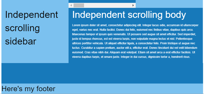
Imho most users will require those columns to take up 100%, especially when background is applied.
 brgrz
on 23 Jul 2017
brgrz
on 23 Jul 2017
@brgrz Thanks for reporting this. Is there any way you could open that as a new issue? I think this thread should be closed now as the grid is live and its a little hard to keep track of 😄
brettsmason
on 24 Jul 2017
brgrz
on 24 Jul 2017
Serious question. But why has the XY Grid been included by default considering it literally breaks everything?
Every template, every building-block, most components. Everything. Broken.
 HansUXdev
on 23 Aug 2017
HansUXdev
on 23 Aug 2017
XY Grid + the equalizer doesn't seem to work around anymore. Is there a built in feature of XY Grid that can solve the issue of multiple items to have equal heights?
 ableslayer
on 24 Aug 2017
ableslayer
on 24 Aug 2017
A simple question but I seem to struggle on this, why is there no mixin to just change the xy-cell size ?
For example I have this :
li {
@include xy-cell(6, $gutter-type: padding, $gutter-output: false);
margin-bottom: rem-calc(5);
text-align: left;
}
````
And I just want to change the xy-cell($size), to 4, instead of 6 for large breakpoint so I'm using this :
``` SASS
@include breakpoint(large) {
@include xy-cell(4);
}
But this override the parameters I have passed above, why is there no specific mixin to just target the cell-size ? There is a function but I can't find any specific usability ^^
Thanks!
 heyflo
on 4 Sep 2017
heyflo
on 4 Sep 2017
I'm having some problems making a grid "semantically" using mixins. I've posted this in Foundation forums and found a workoaround already.
http://foundation.zurb.com/forum/posts/54127-i-cant-reproduce-simple-xy-grid-with-mixins
Could someone please explain if this could be made using only "official" mixins? Am I doing something wrong? Thanks!
 sveggiani
on 6 Sep 2017
sveggiani
on 6 Sep 2017
@sveggiani are you able to link to a live link of your code? Not entirely sure from looking at the forum thread what you are trying to achieve. Everything will be possible with mixins, I just need a better idea of what you need to do in order to help.
brettsmason
on 6 Sep 2017
@brettsmason Hi, thanks for your response.
What I'm trying to achieve is to create a simple grid like this:
<!-- XY Grid clases (Works!) -->
<div class="grid-x grid-margin-x">
<div class="cell small-6">A</div>
<div class="cell small-6">B</div>
</div>
I would like reproduce that exact grid layout without using Foundation classes in markup but mixins:
<div class="item-row">
<div class="item-row__cell">A</div>
<div class="item-row__cell">B</div>
</div>
```scss
.item-row {
@include xy-grid;
}
.item-row__cell {
@include xy-cell(6);
}
But I'm not being able to express with mixins what the `.grid-margin-x` does. The only way I've found to achieve this is by extending that class into the row container styles:
```scss
.item-row {
@include xy-grid;
@extend .grid-margin-x; // <---- this!
}
I'm sorry I can't point you to a live example because I'm not being able to include Foundation SASS mixins in Codepen or similar tools.
Thank you very much.
sveggiani
on 6 Sep 2017
@sveggiani sorry for the delay.
So it looks like there might be a small bug with your use case - the base flex properties aren't being applied if you don't use xy-cell with full width.
Therefore for now, you would need to do this:
.item-row {
@include xy-grid;
}
.item-row__cell {
@include xy-cell-base;
@include xy-cell(6);
}
@kball looks like an issue here: https://github.com/zurb/foundation-sites/blob/develop/scss/xy-grid/_cell.scss#L123 however xy-cell-base isn't setup to work with a number: https://github.com/zurb/foundation-sites/blob/develop/scss/xy-grid/_cell.scss#L48
brettsmason
on 7 Sep 2017
@brettsmason I am using this code to achieve grid-margin-x :
.item-row {
  @include xy-grid;
  @include xy-gutters($negative: true);
}

.item-row__cell {
  @include xy-cell(6);
}
What about my issue above with the lack of xy-cell-size mixin ?
heyflo
on 7 Sep 2017
@brettsmason I've made some tests and the solution from @heyflo is the right for my case. Using @include xy-cell-base doens't solve the problem with margins in the container.
Thank you both!
sveggiani
on 7 Sep 2017
@sveggiani no problem 👍
In my case if you have any idea why there is no mixin such as grid-column-size for the XY Grid to just redefine the size of a cell depending on the breakpoint (see : https://github.com/zurb/foundation-sites/issues/10141#issuecomment-326993008), or if you have any idea on how to achieve this without redefining the whole xy-cell, I'll be thanksful !
heyflo
on 8 Sep 2017
@heyflo Sorry for missing your question - I'm taking a small break from contributing to Foundation at the moment so am not very active.
So to answer your question - I started off with having a xy-cell-size mixin to do what you mentioned. However with the introduction of the margin option things got a lot more complicated, as the gutter is then included in the size so it would have to be passed to the mixin too.
Question - are you using just padding gutters? If so maybe an option to change the default for the mixin, or a mixin to wrap code to set some defaults so you dont have to keep setting them might be a good idea.
With your example, you woud currently need to write:
li {
    @include xy-cell(6, $gutter-type: padding, $gutter-output: false);
    margin-bottom: rem-calc(5);
    text-align: left;

        @include breakpoint(large) {
            @include xy-cell(4, $gutter-type: padding, $gutter-output: false)
        }
}
To be honest the mixins do need a lot of work and probably a rework. They are fairly biased towards using margin gutters at the moment because at the time its what people seemed to be vocal about.
@kball Do you have any thoughts on how to make this scenario easier? I think we really need to completely redo the mixins at some point...
brettsmason
on 9 Sep 2017
@brettsmason Thanks for answering. That is what I am already using, I figured out there was no other solution. To point out what I wanted to do intially so it does make sense, I wanted to have some cells to have the full width (and not the calc(% - gutters)), so in order to do that I had to set the $gutter-type to padding and turn the output to false.
With some tests, I figured out that only having $gutter-output: false, doesn't remove the calc(% - gutters) for the width size, something I don't really understand. If you don't want gutters then I think the width should be a clear % and not a calc(% - gutters).
heyflo
on 11 Sep 2017
@brettsmason @heyflo @sveggiani I tried to accomplish the same: A grid-margin-x grid and thought the xy-grid-layout mixin should be exactly what is needed for that. So I used the following code:
.item-row{
  @include xy-grid();
    @include xy-gutters($negative: true);

    @include xy-grid-layout(1, '.item-row__cell', $gutter-type: margin);

    @include breakpoint(medium) {
        @include xy-grid-layout(2, '.item-row__cell', $gutter-type: margin);
    }
}
It wasn´t clear to me how to remove the padding gutter to achieve the margin gutter. Instead of using @include xy-gutters($negative: true); it would make more sense to me to do something like @include xy-grid($gutter-type: margin);
 jmartsch
on 12 Sep 2017
jmartsch
on 12 Sep 2017
@jmartsch I think you are right, using a parameter on the xy-grid just like like xy-grid($gutter-type: margin); which could be null by default, would actually remove the need to use another mixin to apply negative margin on that element when there is an xy-container as a parent.
Maybe they thought about more usages of that mixin (xy-gutters) that we don't think of. @kball or @brettsmason if you can shed some lights on this, I would be thanksful 👍
heyflo
on 12 Sep 2017
I don't have anything to contribute at the moment but have run into the same issue.
Very much appreciate the solutions provided but a bit surprised this doesn't work better out of the box in regards to building semantically.
 Shipwreck
on 24 Sep 2017
Shipwreck
on 24 Sep 2017
Hi there, a question (and perhaps a feature request?) — many of the designs I work with don't have square gutters. What do I mean by this? For example, gutters might be 20px wide and 18px tall. I'm not sure if the grid supports this currently?
My suggestion would be to support the following, for example:
$grid-margin-gutters: (
  small: 1.125rem 1rem,
  large: 1.25rem 1.125rem
);
Where I'm setting these in rem instead of pixels.
Is this possible / planned? I couldn't find an issue or much about this online.
Next step for me is to see if I can override some of the foundation mixins in my build and get something like this working. Will report back.
 tbredin
on 14 Feb 2019
tbredin
on 14 Feb 2019
Thanks everyobne for the helpful feedback.
We are closing this very long issue as separate issues and questions should be reported as new single issues.
 DanielRuf
on 19 Oct 2019
DanielRuf
on 19 Oct 2019
Related issues
 barrywoolgar
·
3Comments
barrywoolgar
·
3Comments
 johnbacon
·
4Comments
johnbacon
·
4Comments
 foodgy
·
3Comments
foodgy
·
3Comments
 g12n
·
4Comments
g12n
·
4Comments
 BicanMarianValeriu
·
3Comments
BicanMarianValeriu
·
3Comments
Most helpful comment
@brettsmason I am using this code to achieve grid-margin-x :
What about my issue above with the lack of xy-cell-size mixin ?