Foundation-sites: [XY Grid] Foundation 7 - 2 Dimensional Grid System - Using Feature Queries/CSS Grid and discussion on whether to fully DROP IE or not?
I know there are some who have proposed to let user code CSS Grid
But here is what i think,
For Foundation 7,
It has been decided to drop support for IE9 & IE10 ... I propose to drop support for IE11 also.
Whoever need to support IE, should use foundation 6
What are the benefits ??
Well we can use feature queries combining css grid with fallback to flex grid.
@supports (display: grid) {
  .grid-x, .grid-y {
    display: grid; // CSS Grid
  }
}
@supports not (display: grid) {
  .grid-x, .grid-y {
    display: flex; // Flex Grid as fallback
  }
}
Browser Support
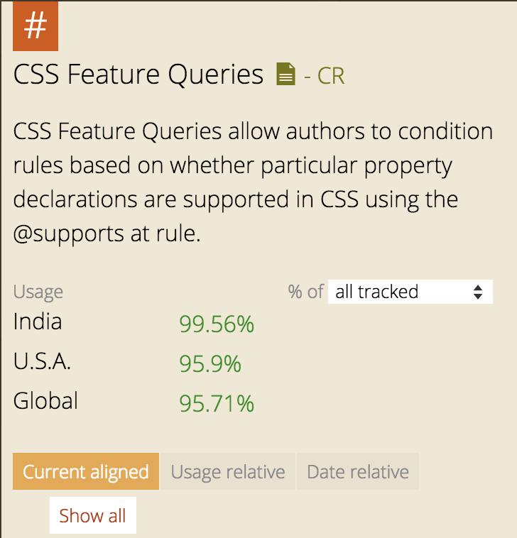
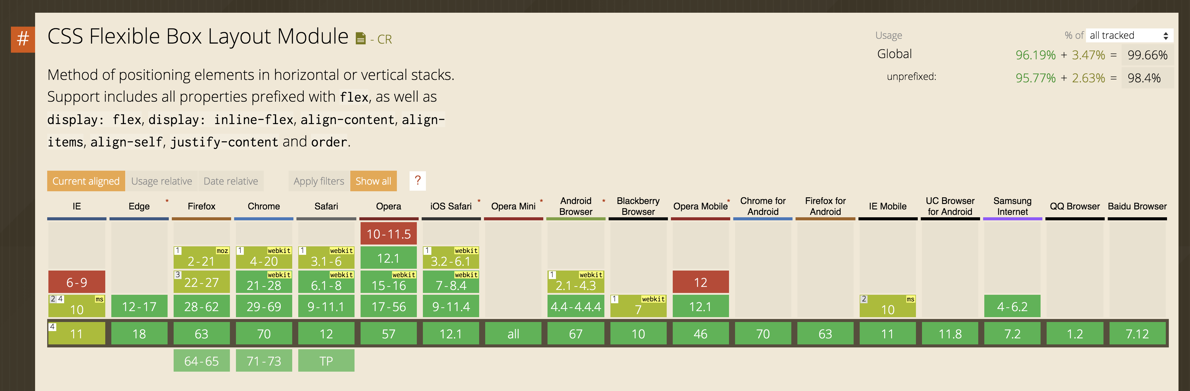
Feature Queries : http://caniuse.com/#feat=css-featurequeries
CSS Grid: http://caniuse.com/#feat=css-grid
=> Let's Make the web Great again!
 IamManchanda
All 91 comments
I like this idea (a lot), but we need to remember that IE 11 has more global usage than Edge 14, 15 and Safari 10 combined. However, I'm assuming that IE 11 usage will drop.
Also, I'm much more in favor of the "decisions over options" methodology (to some extant). When it comes to something like the grid, which is used across almost every component, we should make a decision to which grid system to use and stick to it - whether that be CSS Grid or Flexbox.
My 2 cents.
 JeremyEnglert
on 5 Jun 2017
JeremyEnglert
on 5 Jun 2017
I like the idea, but as long as IE 11 is still included in Windows 10 and still set as default browser in corporate environments (like in the company I work) it's probably too early for a move this big.
The consumer market is totally different and dropping support for IE 11 wouldn't hurt much there.
 Tralapo
on 5 Jun 2017
Tralapo
on 5 Jun 2017
I have not played with feature queries at all. But can you not just do this and have the best of both worlds?
.grid-x, .grid-y {
  display: flex; // Flex Grid as fallback
}
@supports (display: grid) {
  .grid-x, .grid-y {
    display: grid; // CSS Grid
  }
}
 joeworkman
on 5 Jun 2017
joeworkman
on 5 Jun 2017
@joeworkman I hope this would be an option.... but this is clearly a bloat
This is exactly what desktop first media queries did
We knew this wasnt the right way but as media queries wasnt fully supported in IE back then,
we decided to go to desktop first media queries
For eg Gutters
For flex, we need to add gutters by margin and padding
CSS Grid have this inbuilt in them aka grid-gap so i guess we need override the margin and padding stuff!
I gave a like to your comments as you cared... thank you for that, but also
i gave a dislike as i dont think this is a good option :)
IamManchanda
on 5 Jun 2017
60% of IE users are still using IE11. That number is obviously trending downwards. Just 4 months ago, that number was 70% according to https://www.w3schools.com/browsers/browsers_explorer.asp
So it really depends on the timetable for F7. If it was today... I would vote _no way_. That may be a different story 6 months from now.
joeworkman
on 6 Jun 2017
I think dropping IE11 support is not an option yet. What about fallbacking feature queries with modernizr? Maybe there is a way to detect the support for @supprts in first place and then include modernizr to detect other missing features and fallback css grid to flex grid?
 Baedda
on 6 Jun 2017
Baedda
on 6 Jun 2017
As per the discussion with other yetinauts in a DM
=> Dropping IE11 is not looking a possibility due to its corporate usage and this will stay even 6 months from now.
So, In my personal views (and also as per the discussion i had with @kball while back)
Here are the options we are left with
- Apart from
grid-xandgrid-yof flex grid
We can have a new grid typegrid-xyaka css grid
and to treat it the same way we treat Native Progress or Native Meter - As we are dropping legacy float and legacy flex grid for F7
We can think of creating another grid system that will be of CSS Grid which will work on cutting edge browsers and but will be a dynamite!
So in that case we will be having two grids
a.) XY Grid - Legacy:grid-xandgrid-ywith good browser support handled by flexbox
b.) XY Grid - New:grid-x,grid-yandgrid-xywith cutting edge browser support handled together by flexbox and CSS Grid.
Poke @zurb/yetinauts @Tralapo @joeworkman @Baedda @JeremyEnglert
PS: Dont focus on class names i am using here, it might change in F7! Just the concept i wanted to share it in with you guys.
IamManchanda
on 12 Jun 2017
But i have to say that IE 11 is blocking us to not only use css grids but more importantly CSS Variables
IamManchanda
on 13 Jun 2017
@IamManchanda I'm sorry if I'm confusing our discussion from twitter - but to aid in that discussion, here is a starting gist for discussing fallbacks
 gregwhitworth
on 14 Jun 2017
gregwhitworth
on 14 Jun 2017
Are you still against my fallback css idea? https://github.com/zurb/foundation-sites/issues/10134#issuecomment-306196702
joeworkman
on 14 Jun 2017
I am not against it ...
I just feel it's equal to desktop first media queries way back when responsive era began
Also,
We need to do lot of overrides which concerns me
Correct me if am wrong on overrides @brettsmason?
I repeat,
For eg Gutters
For flex, we need to add gutters by margin and padding
CSS Grid have this inbuilt in them aka grid-gap so i guess we need override the margin and padding stuff!
IamManchanda
on 14 Jun 2017
Greg I will let you know once I reach home... Currently on travel
IamManchanda
on 14 Jun 2017
I can agree that its less than ideal. However, in your plan of attack, you are still implementing both a CSS Grid and a Flexbox grid. Unless I misunderstood... Therefore, its not much extra work to support both at the same time with this approach, no?
joeworkman
on 14 Jun 2017
@joeworkman @gregwhitworth
Greg your above simple gist is a nice example to show my concern
#test {
    width: 100px;
    height: 100px;
    background: red;
}
@supports(--has: "custom props") {
    #test {
        background: green;
    }
}
What if i say you that i dont need that width and height ...
For adding one, i will be adding two overrides!
So it would become
#test {
    width: 100px;
    height: 100px;
    background: red;
}
@supports(--has: "custom props") {
    #test {
        background: green;
        width: auto;
        height: auto;
    }
}
which concerns me a bit here though i am not against it. The perfect would be
@supports(--has: "custom props") {
    #test {
        background: green; // No overrides needed
    }
}

@supports not (--has: "custom props") {
    #test {
        width: 100px;
        height: 100px;
        background: red;
    }
}
I'm strongly against supporting two grids. We did that with Foundation 6 (now we're supporting 3) and it creates a ton of extra work and confusion. We need to decide on a grid and stick to it (which is why I'm glad the "Flex Grid" and "Float Grid" are now considered legacy).
It's hard because we need to find the balancing point between flexibility and ease of use. But when it comes to the grid, we need to be making decisions .
JeremyEnglert
on 18 Jun 2017
@JeremyEnglert In that case... What you think of feature queries?
IamManchanda
on 18 Jun 2017
And also
Apart from grid-x and grid-y of flex grid
We can have a new grid type grid-xy aka css grid
and to treat it the same way we treat Native Progress or Native Meter ?
IamManchanda
on 18 Jun 2017
Does IE 11 support feature queries yet? I'd be nervous to drop IE support completely.
I think we should also test that components work with "native" items such as CSS Grid.
But supporting multiple grids can be a nightmare.
JeremyEnglert
on 18 Jun 2017
That is where my this point comes in
Apart from grid-x and grid-y of flex grid
We can have a new grid type grid-xy aka css grid
and to treat it the same way we treat Native Progress or Native Meter ?
IamManchanda
on 18 Jun 2017
@JeremyEnglert IE11 does not support feature queries, but that in of itself allows you to utilize outside feature queries your fallback for IE11- and your fallback for browsers that don't support display: grid. Make sense?
@IamManchanda I get your worry about needing to duplicate all of the code, but I think you should convert one component and see if it's truly as bad as you think. At any rate, I'm sure you all have what you need to tackle this.
gregwhitworth
on 19 Jun 2017
@gregwhitworth , @JeremyEnglert - yes most non-cssgrid fallbacks can't quarantine legacy fallback code from modern browsers. On a recent project using cssgrid I used an 'unframework' mixin to reset within the supports(display:grid) query - and that approach isn't too bloaty IMO.
In the grand picture, I am super keen to be using cssgrid more _today_, but increasingly I've come to ponder how much of a framework is actually needed to implement cssgrid - part of it's appeal is to make frameworks redundant. But what I have wanted the most out of a framework is a way to manage fallbacks for cssgrid. (Hence the attraction of this discussion). CSS Grid should be encouraging us to do far more interesting things than the narrow range of 12 col modular layouts we've gotten used to.
The simplest legacy encompassing solution is to support IE via a single column (mobile-esque) layout, and go to town for with cssgrid for modern browsers. Sooner or later that is what we will ALL be doing.
But if we still have to do better for IE todau, then managing fallbacks more generously seems to me to be a good use case for grid frameworks in 2017.
 Timoti
on 20 Jun 2017
Timoti
on 20 Jun 2017
That said I just noticed that rachel andrew demonstrates that unfloating and unclearing isn't necessary for fallaback, here - https://rachelandrew.co.uk/css/cheatsheets/grid-fallbacks
Timoti
on 20 Jun 2017
IamManchanda
on 22 Jun 2017
Only thing i can say you to all you guys @Timoti @gregwhitworth @joeworkman @JeremyEnglert @Baedda and also @zurb/yetinauts that how can IE just stop the such advancement of the web where you feel like you are using frankly maths and/or paintbrush to design a web rather than the codes!

IamManchanda
on 26 Jun 2017
@kball @brettsmason I mean just compare this few line of code with hardwork you guys have put in for frame grid (if i am understanding correctly)
.grid {
  display: grid;
  grid-gap: 10px;
  grid-template-columns: repeat(4, 150px);
  grid-template-areas:
    "sidebar header header header"
    "sidebar content content advert"
    "footer  footer footer advert";}
.cell {
  &--header { grid-area: header; }
  &--sidebar { grid-area: sidebar; }
  &--advert { grid-area: advert; }
  &--content { grid-area: content; }
  &--footer { grid-area: footer; }
}
Source: https://codepen.io/IamManchanda/pen/zzEmXp?editors=1100
IamManchanda
on 26 Jun 2017
Another very big reason why css grid should be used
is the Nested Grid => https://codepen.io/rachelandrew/pen/NqQPBR
Currently we are hacking like this
.grid-x { margin: 0 -15px;}
.cell { width: calc(100% * 1/3 - 30px); margin: 0 15px;}
and what we are getting
<div class="grid-x grid-margin-x">
  <div class="cell">Cell 1</div>
  <div class="cell">Cell 2</div>
  <div class="cell">
    Cell 3
    <div class="grid-x grid-margin-x">
      <div class="cell">Cell 3A</div>
      <div class="cell">Cell 3B</div>
      <div class="cell">
        Cell 3C
        <div class="grid-x grid-margin-x">
          <div class="cell">Cell 3CX</div>
          <div class="cell">Cell 3CY</div>
          <div class="cell">Cell 3CZ</div>
        </div>
      </div>
    </div>
  </div>
</div>
Instead with css grid, without any hack we can just do
<div class="grid-x grid-margin-x">
  <div class="cell">Cell 1</div>
  <div class="cell">Cell 2</div>
  <div class="cell">
    Cell 3
    <div class="cell">Cell 3A</div>
    <div class="cell">Cell 3B</div>
    <div class="cell">
      Cell 3C
      <div class="cell">Cell 3CX</div>
      <div class="cell">Cell 3CY</div>
      <div class="cell">Cell 3CZ</div>
    </div>
  </div>
</div>
One another very big reason why css grid and flexbox should be used together is that they share the same Box Alignment Module which powers them both (ofcourse with some differences, but thats good. Isnt it? )
One More Good reason is Block Grid
https://codepen.io/IamManchanda/pen/QgqoPa?editors=1100
grid-template-columns: repeat(auto-fill, minmax(200px, 1fr));
Watch this => https://drive.google.com/file/d/0B4EN5uGMUjoZTkkxc3RQRjloVFE/view
@JeremyEnglert
I'm strongly against supporting two grids. We did that with Foundation 6 (now we're supporting 3) and it creates a ton of extra work and confusion (which is why I'm glad the "Flex Grid" and "Float Grid" are now considered legacy).
I admit it sucks to support multiple grids but if we not going to support css grid, how will the web move forward... You cant just say no to web enhancement because GrandUncle IE doesnt want it!
We need to decide on one grid and stick to it
You know very well if we decide to stick with one grid, then whats gonna happen. We will think of the GrandUncle IE and the current Grid will be the one who will win.
For me though I will stick to support two grid and for me the best option is to
- XY Grid - 1D : The current Grid system,
- XY Grid - 2D : The Grid system where flexbox and css grid is used together. Some feature queries too maybe (with or without
@supports notis an another debate). Optional Nested Grid with cutting edge browser support etc.
IamManchanda
on 26 Jun 2017
I admit it sucks to support multiple grids but if we not going to support css grid, how will the web move forward... You cant just say no to web enhancement because GrandUncle IE doesn't want it!
No one wants to support IE, but it still has too much usage to abandoned. This could change by November, but I can't imagine us being in a spot to fully drop IE support even then. But, who knows!
JeremyEnglert
on 6 Jul 2017
Unfortunately IE 11 will stay for some time (specially corp usage)
See
- https://www.w3schools.com/browsers/browsers_explorer.asp
- https://www.microsoft.com/en-in/windowsforbusiness/end-of-ie-support
Also https://rachelandrew.co.uk/archives/2017/07/01/you-do-not-need-a-css-grid-based-grid-system
Yes its true that we should not use the grid spec the same way we have historically used the grid.
But here are some usecase I Would like:
1. Nested Grids => https://codepen.io/rachelandrew/pen/NqQPBR
See my above comment => https://github.com/zurb/foundation-sites/issues/10134#issuecomment-311077020
2. Use it as an 2D Layout Grid System (Optional due to browser support)
What I mean on this is that,
If user is happy on using CSS Grid and the cutting edge browser support,
We should help the user to design the layouts of the website in seconds with a simple sass map and mixins
The user's html would something look like this below where &--myCustomTemplate can generate a custom mixin for template areas
<div class="grid-layout grid-layout--myCustomTemplate">
  <div class="cell cell--header">Header</div>
  <div class="cell cell--sidebar">Sidebar</div>
  <div class="cell cell--advert">Advert</div>
  <div class="cell cell--content">Content</div>
  <div class="cell cell--footer">Footer</div>
</div>
whereas sass mixin would be something like
&--myCustomTemplate {
    @include grid-layout(
        "sidebar header header header"
         "sidebar content content advert"
         "footer  footer footer advert";
    )
}
At our end,
By default we can have a sass map with a regular layout types values like
$grid-layout-types: (header, sidebar, advert, content, footer)
which will automatically generate the below code (so user dont have to add it)
.cell {
  &--header { grid-area: header; }
  &--sidebar { grid-area: sidebar; }
  &--advert { grid-area: advert; }
  &--content { grid-area: content; }
  &--footer { grid-area: footer; }
}
Now if a user needs a custom type like sidebar2 he just need to add this in map and map will automatically generate the code.
BTW this below thing blow my head while making this => https://codepen.io/IamManchanda/pen/zzEmXp?editors=1100
IamManchanda
on 6 Jul 2017
New version should use the most advanced possible HTML features available., so that's CSS grid. Given that decision I don't believe there should be a fallback. Is there a fallback that covers the same features 100%? Probably not. So in a new version I wouldn't consider fallbacks at all. Flex is a decent layout system but it is not a grid fallback no matter how you bend it.
Also, on the topic of IE support I'd discountinue it. It's unfortunately a browser that lost all support even within MS so if enterprise wants to stick with it in their internal environments for whatever reason they should find their own ways. Modern websites are going forward. It's a bit different with custom web apps when you have a client on the other side and if you have a client that demands IE support you need to communicate to them what that means in terms of development so all in all supporting old tech costs more. These decisions are pretty much made case by case and that's why you should not base you next CSS framework on it.
Otoh, someone already mentioned that CSS grid makes the case for custom frameworks less viable because it solves the grid problem by itself. This is an interesting POV and one that I would seriously consider. Meaning, with the introduction of CSS grid, one does not need a grid component in their CSS framework. Meaning, CSS grid marginalizes CSS frameworks to more of a styling utilities and less of a layout systems.
Best
 brgrz
on 9 Jul 2017
brgrz
on 9 Jul 2017
Good article on fallbacks... https://www.smashingmagazine.com/2017/07/enhancing-css-layout-floats-flexbox-grid/
joeworkman
on 26 Jul 2017
If adobe can take a decision on dropping flash for better web,
Then why can't foundation decide to drop IE!
Web Always Wins if we let it play!
IamManchanda
on 26 Jul 2017
Not the best analogy... Even IE11 supports all of the technology that ultimately killed Flash. HTML5 video, Canvas, WebGL, CSS transitions and animations. And even then, flash will be around until 2020. Thats a long as time.
Don't get me wrong. I would love to drop IE. I really really would. Its just not practical. For now at least, the corporate world still runs a majority on IE. People still browse the web from their work machines. Most of these people don't have a choice as to what browser they get to use. Foundation needs some sort of decent layout for IE users. If someone browses my site from work using IE11 and the layout is completely busted, they will leave my site and never go back. That means actual money in my pocket. This is real. Its not some technological utopian debate.
joeworkman
on 26 Jul 2017
Hey @joeworkman I understand ... just getting bit emotional :smile:
IamManchanda
on 26 Jul 2017
Just sharing some links which belongs to this discussion forward
https://css-tricks.com/browser-compatibility-css-grid-layouts-simple-sass-mixins/
https://css-tricks.com/css-charts-grid-custom-properties/
Please note that
IE 10-15 supports old spec ( http://bit.ly/2vMH93h shows how we can use old spec )
Edge 16+ Supports CSS Grid
Latest Firefox supports CSS Grid
Latest Chrome supports CSS Grid
Latest Safari supports CSS Grid
Latest Opera supports CSS Grid
Latest iOS Safari supports CSS Grid
Latest Android Browser supports CSS Grid
Latest Chrome for Android supports CSS Grid
Latest Firefox for Android supports CSS Grid
and here some code i found out on converting CSS Grid to old spec too
Credits: @gisu
@function box-gap($boxes, $gap) {
  $box: ();
  @for $i from 1 through length($boxes) {
    $box: append($box, nth($boxes, $i), space);
    // Adding Gap Between
    @if $gap > 0 {
      // Not last Loop
      @if $i != length($boxes) {
        $box: append($box, $gap, space);
      }
    }
  }
  @return $box;
}
@mixin grid-columns($gap, $columns) {
  /* autoprefixer: off */
  grid-template-columns: $columns;
  /* autoprefixer: on */
  @if $gap > 0 {
    grid-column-gap: $gap;
  }
  .old-grid-spec & {
    -ms-grid-columns: box-gap($columns, $gap);
  }
}
@mixin grid-rows($gap, $rows) {
  /* autoprefixer: off */
  grid-template-rows: $rows;
  /* autoprefixer: on */
  @if $gap > 0 {
    grid-row-gap: $gap;
  }
  .old-grid-spec & {
    -ms-grid-rows: box-gap($rows, $gap);
  }
}
@mixin grid-matrix($map) {
  $matrix: ();
  @each $index, $row in $map {
    $list: null;
    @for $i from 1 through length($row) {
      $list: append($list, unquote(nth(($row), $i)), space);
    }
    $matrix: append($matrix, quote($list), space);
  }
  grid-template-areas: $matrix;
}
@mixin grid-area($area, $map, $columnGap: false, $rowGap: false) {
  // Init Vars
  $gridColumnStart: '';
  $gridColumnEnd: '';
  $gridRows: ();
  $gridRowHeight: '';
  $areaExists: 0;
  // Output regular Area
  grid-area: $area;
  // Generate Old Spec Coordinates based on Area
  .old-grid-spec & {
    // Get Width element
    @for $i from 1 through length($map) {
      @if sl-contain(map-get($map,row#{$i}), $area) {
        $areaExists: append($areaExists, 1);
        $gridRowHeight: append($gridRowHeight, $i);
        $gridColumnStart: index(map-get($map,row#{$i}), $area);
        $gridColumnEnd: sl-last-index(map-get($map,row#{$i}), $area);
        $gridRows: append($gridRows, $i);
      }
    }
    // If Area exists in the Map
    @if length($areaExists) > 1 {
      // Convert Coordinate if Column Gap is active
      @if $columnGap {
        -ms-grid-column: $gridColumnStart + ($gridColumnStart - 1);
        -ms-grid-column-span: $gridColumnEnd - $gridColumnStart + 1 + ($gridColumnEnd - $gridColumnStart);
      } @else {
        -ms-grid-column: $gridColumnStart;
        -ms-grid-column-span: $gridColumnEnd - $gridColumnStart + 1;
      }
      // Add Row Coordinates
      @if $rowGap {
        -ms-grid-row: nth($gridRows,1) + (nth($gridRows,1) - 1);
        -ms-grid-row-span: length($gridRowHeight) - 1 + (length($gridRowHeight) - 2);
      } @else {
        -ms-grid-row: nth($gridRows,1);
        -ms-grid-row-span: length($gridRowHeight) - 1;
      }
    }
  }
}
Just my 2 cents but I completely agree with @JeremyEnglert about the two grids because foundation 6 from day one has been a mess due to having two grids and now three grids... I never really liked the legacy flex grid and never used it as a result. XY-grid is nice because it works just like the original float-grid (before people screwed up the block grid -_- ...) but also has different naming so it doesn't conflict. So it would be nice to start with the xy-grid in foundation 7.
Moving forward however, I think the most practical solution is to polyfill feature queries in ie 11 and progressively enhance from there rather then dropping I.E. all together because that's simply not an option for any user that has enterprise clients or customers over 55+. Having feature queries supported will go a long way because at present, they are sort of useless considering the main browser you need to use them for consistently doesn't even support them.
As for css-grid replacing a traditional 12 col css grid, its definitely interesting. Can it? Yes. Will it though? IDK... css grid is powerful and awesome but debugging it can be much more difficult...
I do however see it being used to make components significantly more lightweight and layouts are obviouly a godsend...
@IamManchanda shows a good example of a block-grid with css-grid but you can also make a traditional grid very easily with it too. Additionally creating layout-based mixins may end up being very useful.
 HansUXdev
on 24 Aug 2017
HansUXdev
on 24 Aug 2017
Why not just create a separate repo 2D grid which can be a drop in replacement for Foundation 7 XY Grid
In General how is see it in this current era,
For Websites, Use Flexbox as it's the right choice as it supports IE and mostly you need that support as discussed above
For WebApps, Use CSS Grid coz its different audience altogether where latest and greatest is utmost importance.
See => https://twitter.com/SaraSoueidan/status/899946776324689920
IamManchanda
on 24 Aug 2017
tl;dr Mark the new xy-grid as "progressive, no IE support", keep original xy-grid and mark as "legacy" but not "deprecated". What is the market share threshold for removing IE support?
Not to call anyone out, but I like statistics so hoping this discussion is being argued from a point of fact:
still set as default browser in corporate environments
not an option for any user that has enterprise clients or customers over 55+.
For now at least, the corporate world still runs a majority on IE.
Is there reporting available on the amount of corporations which still use IE, or that consumers aged 55+ are using IE? Not saying these statements are wrong, just having trouble verifying them.
Unfortunately IE 11 will stay for some time (specially corp usage)
Seehttps://www.w3schools.com/browsers/browsers_explorer.asp
https://www.microsoft.com/en-in/windowsforbusiness/end-of-ie-support
If we are waiting for Microsoft to drop support of IE 11, than we're really waiting for them to drop support for Windows 10 (as per their product lifecycle disclosures). That happens in 2025. Are we really going to wait 8 years to introduce css-grid?
Also, I think I may be a bit ignorant to reasons why it's not possible to include both the xy-grid from v6, as well as an entirely separate xy-grid using css-grid that is new in v7, keep both available, and simply mark the new xy-grid as "progressive", and mark the original xy-grid as "legacy" but not "deprecated", allowing the end-user to use whichever grid they need, dependent upon project requirements.
The original xy-grid is fairly well matured and bug free at this point. So the argument against having 2 grids due to the maintenance nightmare don't stand IMHO. I could be speaking out of turn here, as I'm not privy to the challenges that were faced. But I can't imagine there is still a flurry of tickets for the original xy-grid.
Lastly, we haven't yet stated what defines our ability to move away from IE. What market share is appropriate for finally making the switch. If we are still going to wait, then what is it, precisely, that we are waiting for?
 mindfullsilence
on 13 Oct 2017
mindfullsilence
on 13 Oct 2017
Also, as a suggestion, I tend not to rely too heavily on w3schools statistics, as their sample size is relatively small, and consists only of visitors to their site, which is fairly biased towards the more tech-savvy. I propose using something like StatCounter as its sample is taken from visitors of a couple million sites and visitor hits ranging in the tens of billions across the globe.
mindfullsilence
on 13 Oct 2017
FWIW,
The link you shared is for US
Global usage is here
http://gs.statcounter.com/browser-market-share#monthly-201609-201709
Some fun stuff,
My Country has UC browser support of 36% and that browser even support current flexbox properly!
PS: Global browser support is also 8%
http://gs.statcounter.com/browser-market-share/all/india#monthly-201609-201709
Amazed why people so much care about IE instead of UC!
Important: Thing to note though is that UC supports Feature queries which IE doesn't support!
IamManchanda
on 13 Oct 2017
@mindfullsilence I agree with you but supporting 2 grids has been the real pain taking lessons from very own F6 which has 3 grids now!
By the way, Guys please look into https://github.com/zurb/foundation-sites/issues/10661
IamManchanda
on 13 Oct 2017
Also if you are looking at countries data,
36% (UC) of 1.325 billion (or 462 million), and
13% (UC+QQ) of 1.388 billion (or 738 million)
is greater than
6% (IE) of 326 million (or 286 million)
Source: http://www.internetworldstats.com/top20.htfwm
Countries Discussed: India, China and USA
FWIW, Saying it again
UC browser supports Feature Queries, IE doesn't support it!
IamManchanda
on 13 Oct 2017
Ok, sorry for the long delay in being back in this thread. I am kind of at a loss here, from what zurb seems to offer - the -ms- grid should work just fine. It's an explicit grid system. Additionally, you don't have to pollyfill @supports - css fails gracefully so IE will not go into a declaration block it doesn't understand so you can use @supports(display: block) and IE will not go into it. This allows you to target all of IE outside of the declaration block. This allows you to embrace progressive enhancement and do as Zurb sees fit for IE. That said, I think the explicit grid will work just fine for what your framework is doing and all other browsers within an @supports block will use the standard grid (including Edge 16 which shipped yesterday).
gregwhitworth
on 18 Oct 2017
@gregwhitworth { Talking about 2D complex grid structure here, Sass Mixins, no classes! )
This below code seems working for IE 10 and 11?
/**
 * IE 6-10 Browser support = around 0%
 * IE 11 Browser Support = 3% (Going down)
 * But Still works in IE 10 & 11
 */

@supports (display: grid) {
  .grid-xy {
    /* Holy Grid */
    display: grid;  /* Latest Chrome, Firefox, Safari, Opera, Edge */
  }
}
@supports not (display: grid) {
  @supports (display: flex) {
    /* Progressive Enhancement as a fallback as much as possible */
    .grid-xy {
      display: flex;  /* Old Chrome, Firefox, Safari, Opera, Edge, Opera Mini */
    }
  }
  @supports not (display: flex) {
    /* Progressive Enhancement only, mobile based Enhancement */
    .grid-xy {
      display: inline-block; /* UC Browser, QQ Browser */
    }
  }
}

/* IE 10 & 11 fallback */
/* Sass Customisation to rip this duplicate code if you DONT want to support IE */
@media screen and (-ms-high-contrast: active), screen and (-ms-high-contrast: none) {
  .grid-xy {
    display: flex;  /* IE 10, 11 */
  }
}
V7 requests are being closed for the time being. We have them labeled so we can readdress them in the future.
IamManchanda
on 28 Jan 2018
Reopening as I think it's time!
Here is the current browser support for feature queries
https://caniuse.com/#feat=css-featurequeries
I would like to propose
/**
 * IE 6-10 Browser support = around 0%
 * IE 11 Browser Support = 2.65% (Going down)
 * But Still works in IE 10 & 11
 */

@supports (display: grid) {
  .grid-xy {
    /* Holy Grid */
    display: grid;  /* Latest Browsers */
  }
}

@supports not (display: grid) {
   /* Flexbox Fallback */
  .grid-xy {
      display: flex;  /* Legacy Browsers */
    }
}

/* IE 10 & 11 fallback */
/* Sass Customisation to rip this duplicate code if you DONT want to support IE */
/* https://paper-leaf.com/blog/2014/09/targeting-ie-10-11-browsers-css/ */
@media screen and (-ms-high-contrast: active), screen and (-ms-high-contrast: none) {
  .grid-xy {
    display: flex;  /* IE 10, 11 */
  }
}
Old Notes: @kball had an experiment for the same last year => https://github.com/kball/gridkit
by taking ideas from => https://codepen.io/primalivet/pen/ryjKmV/
IamManchanda
on 8 Sep 2018
@IamManchanda Interesting proposal. But, now that we have an "official" CSS grid I am having hard time figuring out whether personally I'd still use a grid provided by various CSS frameworks, which will probably be just a kind of wrapper around CSS Grid spec. For me, a grid provided by a framework would have to offer significant benefits either in terms of simplicity (due to the CSS Grid spec being quite verbose and broad covering) or offering something else, something extra I couldn't find in the spec (having hard time thinking what that extra could be). Also, have you considered how do you plan to wrap the verbosity of CSS Grid features in a layer of Foundation classes?
What I'm trying to say is, we have waited so long for W3C solution to two dimensional grids and now that we have it, I'd like to stick to it as much as possible, possibly ditching all other grids we facilitated over the years. Does that make sense?
I do still like other features a CSS framework provides, common form styles, buttons, lists, some JS components etc.
brgrz
on 8 Sep 2018
Couldn't agree more
Yeah you are right on that
One thing in my brain is also that we should drop grid all over and make foundation 7 components only framework and focus on making those components environment agnostic ( Components & Building Blocks with Sass/CSS & environment agnostic JavaScript )
Environment agnostic JavaScript => A layer to do JavaScript functionality in either Vanilla JS or your favorite framework like React/Vue etc
IamManchanda
on 9 Sep 2018
If we go this path => Dropping Grid all over then I would say we should have a tutorial page in the docs with video/blog learning resources on how to use CSS Grid and how to do respective fallbacks
IamManchanda
on 9 Sep 2018
BTW if you care, here is one component/building block that can be added with CSS Grid 😄
=> https://codepen.io/IamManchanda/full/MrdXpW
{ Note: Look from your desktop as not worked on mobile optimization as of yet)
{ Spoiler: Design changes on every page refresh }
IamManchanda
on 9 Sep 2018
I was pretty vocal on here about dropping IE11. A year later and I feel more comfortable with it for sure. I am cool with going all in with CSS Grid. It would be nice to possible provide some helper classes to maybe build some pre-made grids. Would be a nice addition.
I also think that it would be nice to add things to the framework so that if someone visits with an older browser, the page at least displays some sort of presentable data. I am working on a new site with CSS Grid and went to show my dad on his iPad last night. It was running iOS9 and the page was almost completely blank. Oops.
joeworkman
on 9 Sep 2018
I also don't see why the xy-grid could not still be incorporated as an optional add-on. Seems like there could still be a lot of use left in there.
joeworkman
on 9 Sep 2018
Going vanilla JS? If I had 10 thumbs I would put them all up ;-)
joeworkman
on 9 Sep 2018
Not being an expert on CSS grid (yet) I was wondering if there are stuff that's currently easy to do with the Foundation grid but not possible (or limited or less easy) with CSS grid? I thought I read something somewhere along these line but I can't find it now.
 Aetles
on 9 Sep 2018
Aetles
on 9 Sep 2018
IE11 will be supported until 2020.
Why not leave this open to the users? Personally I would not want to see another grid in Foundation as we already have many (grid, float grid, xy grid and so on).
 DanielRuf
on 9 Sep 2018
DanielRuf
on 9 Sep 2018
We are reinventing the wheel again.
LostGrid and Susy for example provide this what we have in xy grid
http://oddbird.net/susy/
http://lostgrid.org/lostgrid-example.html
DanielRuf
on 9 Sep 2018
How it stands today, What I feel would be best be:
- Drop Grid all over ... Yes we already have many (flex grid, float grid, xy grid) and it's damn time to rip them all over
- Create a Page in the docs that teaches by providing resources (like Rachel's Blogs, WesBos Videos) to user's on how to make your own grid with CSS Grid. Tell them how we can fallback it with Flexbox. Tell them about feature queries. Tell them about Progressive Enhancement => https://s.codepen.io/matuzo/debug/Emddvx
- Make Components/Building Blocks which should be our responsibility for the modern web as a Web Framework... Making Components/Building Blocks whether it's old one, or a new one. Whether it's Flex one, or CSS Grid or JavaScript or combination of these pieces together and just build them ... and advance the web with a new era of Modern Web... move away from shadows from Bootstrap and instead Advance the web.
- Start the Car and Fly! 🚗 ✈️
Old notes that @kball threw last time we talked about it
CSS Grid is awesome but we should not behave with CSS grid the way we have behaved with other hack layouts.
My Notes:
We should instead let user teach how to make grid because this is something we can't and shouldn't do as a framework. Instead what we should focus on is making components and by that I mean Modern Components. That should be our responsibility with CSS Grid or Flexbox or Modern JavaScript or any new technology!
=> Making Components/Building Blocks
Thanks, I rest my case. Cheers!
IamManchanda
on 9 Sep 2018
I would keep the xy-grid as option. And I would add helpers or building blocks for common usecases suitable css grids, which anyway there's plenty around (which can be reviewed considering a11y, responsive etc). I also agree that a good documentation about this is a very neat addition.
 mattbag
on 10 Sep 2018
mattbag
on 10 Sep 2018
Not having any grid component is suicide for the Foundation framework. We on this thread are not the only target audience for Foundation. Saying that people should just learn CSS Grid is the exact same thing as saying that Foundation 5 users should just learn to use floats. There was no need for a grid in Foundation 5, just set your percentage and float, right?
We have to think about the users that choose a framework because it makes building a site easier. CSS Grid is awesome. But if we don't give some sort of easy to use framework around it, then Foundation will die.
Let's get real, any quality website that has ever shipped with Foundation does not use many of the components. What does it use? The grid.
So by removing that grid from the framework, you are essentially making its audience developers that want to build quick mockup sites or production sites that will look like a "Foundation 7 Site". Less people will use the framework and it will die.
joeworkman
on 10 Sep 2018
What might be useful in a Grid-based ‘framework’?
https://rachelandrew.co.uk/archives/2017/07/01/you-do-not-need-a-css-grid-based-grid-system/
joeworkman
on 10 Sep 2018
I agree with @joeworkman!
Foundation has been great for providing a coherent 'set of tools', including a grid!
In the end it is just html, css and js. What matters is what is added by using Foundation.
As a webdesigner/developer I can always code css myself, also with the CSS grid I 'll be able to do so.
I use Foundation, because I want a framework to make 'my live easier' and to not have to invent everything myself, to create solid code that works on all browsers, is responsive etc., looks great, gives me freedom to Develop and Design. To combine code/elements that work well together. To have elements that are a family in terms of look and feel and workflow.
Foundation7 could still provide that including 'a grid'. Not by using old grids or developing new grids, but by providing (probably) a couple of decent standard (grid-mixins) sets to very easily start working from based on the CSS grid. And build all other and new components based on the CSS grid.
Foundation is great when I need an easy to use mixin for some element. Especially if that element uses the same 'engine' and 'specs' as the grid and other components it is relating to.
For Compatibility: if Foundation v7 would provide a 'rebuild' of the current float+xy-grid but now as a 'wrapper' component using the CSS grid als base and without changing the names and behavior in html, that would be great for consistency/compatibility. I don't have to start re-writing html in hundreds of sites (again), I can just upload Fv7 and continue updates and development from then on using F7 and the CSS grid as a base. So all the names and labels and behavior stays the same. As a start...
Maybe a whole set of grid components is needed for it or interesting or possible... Just build and provide them mixins. Or the possibility to play around with the options as a F7 user.
Again: I use a framework to make live more pleasant and easy. Not to spend more time on updating code on a framework that delivers an update that is not compatible.
Continuity is also important.
So yes, ditch the 'self developed/old grids' and incorporate the CSS grid as new css language in the framework making great components as usual: grid (CSS grid mixin!), form, buttons, cards, tabs, etc.
In the end it is all about 'content management and positioning' in elements wether a grid, or card or a top-bar or even a button.
The questions maybe should be:
How can F7 incorporate the CSS grid standards and provide easy to use (grid) components with it for fast and creative website development? Including backward compatibility for older browsers as options to choose.
 zzplab
on 10 Sep 2018
zzplab
on 10 Sep 2018
@joeworkman
Saying that people should just learn CSS Grid is the exact same thing as saying that Foundation 5 users should just learn to use floats. There was no need for a grid in Foundation 5, just set your percentage and float, right?
Floats were used to hack together a grid because there was no CSS grid back in the days. Now that we have a robust grid ootb within the CSS spec there is no need for another grid.
@zzplab
For Compatibility: if Foundation v7 would provide a 'rebuild' of the current float+xy-grid but now as a 'wrapper' component using the CSS grid als base and without changing the names and behavior in html, that would be great for consistency/compatibility. I don't have to start re-writing html in hundreds of sites (again), I can just upload Fv7 and continue updates and development from then on using F7 and the CSS grid as a base. So all the names and labels and behavior stays the same. As a start...
Maybe a whole set of grid components is needed for it or interesting or possible... Just build and provide them mixins. Or the possibility to play around with the options as a F7 user.
Huh, do you realize what you are requesting? How would you go about wrapping around such a verbose and robust grid spec as the CSS Grid is? This is a major undertaking and lots of work mostly not needed just to cater to people who don't really want to invest time to learn the new spec.
Also, worth noting, you don't always need a grid. CSS Grid spec was done with two dimensions in mind. Often times you only need one dimension and you can do that just fine with flex.
I do agree, to some degree, that we could keep the existing XY grid around but keep it the way it is now (not reimplement it based on CSS Grid).
brgrz
on 11 Sep 2018
Very interesting discussion. I think it's time to rethink frameworks like Foundation, Bootstrap and similar. What I often hear is for example: "I only need a grid" or "Customizing Foundation buttons is so complicated, I write it on my own".
I think there is no need for a grid anymore. There is CSS grid and Susy, so no need to fight this battle. What I would really love to see is a framework that helps creating common components (buttons, accordions, tables and so on). And I would really love to see that I can drop in additional styles easily. Box-Shadow for Buttons. Bold, black headlines for accordions. Just this two things are not easy to do with current Foundation.
 DaSchTour
on 11 Sep 2018
DaSchTour
on 11 Sep 2018
As a creative developer I do not need F7> grid, I agree. But my business is build on Foundation grid since v5. I 've build many sites with client CMS, public environment and user login environment. They all share certain components, controllers, models and views and are related on css/js/html/php level.
It would be great if -for a certain period- F7 would provide fallback for all the float/xy grid classes used in html. Not as a standard or so, but to help us F-users make the switch more easily with less effort. I don't know if that is possible, haven't tried that yet. If not possible, fine, so be it.
I love developing directly with the new CSS grid, that's not the issue. It's about why, how and what F7 can do in terms of continuity (my business need) AND new developments (my creative need).
Every website I develop or re-develop is always with the latest F version and latest techniques.
But I also need to maintain and update those who don get a new design, but still need to work well in the newest browsers and environments and use updated components. Preferably with minimal effort/time.
Best practice is that I would need only one source/library for all shared components instead of 3-4 as in the past before Foundation and now again with F5 + float + flex + xy.
So even an older website originally build with Foundation 5/6 could then be updated using the new CSS grid more or even very easily and use newer updated components without re-writing to much (html) code from float to xy and now to CSS grid.
It's about making life as a business easier and being able to spend more time on the interesting part of the job: developing/designing. Not about limiting possibilities as a designer/developer.
Well developed PHP code in version 5 still works fine in PHP 7.
I cannot say the same about Foundation. Maybe not realistic in the sense that the front-end web possibilities and demands have developed a lot. Maybe that is not an ambition. In terms of updating and maintaining Foundation that has made it time consuming and slow.
If I start using Susy ... and other well developed and maintained components by other parties, what do I still need Foundation for...?
I think it's time to rethink frameworks like Foundation...
I agree and wish you 'wisdom' with that. Back to the dream 'Why Foundation?' !
zzplab
on 11 Sep 2018
But I also need to maintain and update those who don get a new design, but still need to work well in the newest browsers and environments and use updated components. Preferably with minimal effort/time.
This I don't get.
I'm doing similar work as you do. Either you redesign/refresh site/app or you don't. I don't see the middle ground here. Don't see how you could just bump the Foundation major version in a project that's currently using F5 and expect it to work with F6. Why would you even want to do that? The site works as it was designed, envisioned and positioned at the time it was produced. It most likely also works in the new browsers too (it's rarely the case new browsers would drop support for something). If an update/refresh is needed, you do it with new goals, new practices and new tools.
brgrz
on 11 Sep 2018
You-re right: I'll re-frase to where my main issues are:
'But I also need to maintain and update those who don't get a new design, but still need to co-work well in related environments (CMS/user-login) and use updated or new developed components.'
So if the CMS backend is using the latest Foundation code developments (for example xy-grid), I have issues with websites build on older front-ends (F5/float grid).
I have build sites in F5 around php5 code base. On the php7 system F5 is not integrated/supported in CMS and framework anymore. For security I have to move the sites to php7. The client is not in need of a website update. But I have to keep it working fine. The 'older' sites work fine with latest php7, jQuery3 and so on, but not Foundation.
zzplab
on 11 Sep 2018
@zzplab That's likely an issue with CMS backend and frontend being too coupled. Preferrably, you should run and update them separately.
brgrz
on 11 Sep 2018
That design choice I would today make different, yes. In those days it was a good way to go, assuming that it would be easier to keep Foundation up-to-date within all sites and systems when new versions would come out just like php etc.
You cannot just flip-flop big changes and make them happen instantly. You will always need some sort of transition period from one way/version/system to another.
For me as a designer from F5>F6>F7/CSS grid. But also for the visitors of all sites using older browser versions.
Foundation could inspire, lead a way for their user-developers in the transition to CSS grid. Provide examples, info, mixins, whatever. Make themselves valuable in contributing to make this transition happen smoothly for all of us designers using Foundation. Or not.
zzplab
on 11 Sep 2018
@brgrz
Floats were used to hack together a grid because there was no CSS grid back in the days. Now that we have a robust grid ootb within the CSS spec there is no need for another grid.
Yes. But the old grid made it super simple to build basic things. All I am thinking is that it would be essential to have some example + helper classes to make those simple layouts in grid as well. Example: a 2, 3, 4 column layout in grid. This would add very little weight to the framework but add a lot of value IMHO.
joeworkman
on 11 Sep 2018
Found this... https://github.com/BorderTech/cssgrid
Could be an interesting place to start.
joeworkman
on 12 Sep 2018
I think there is no need for a grid anymore. There is CSS grid and Susy, so no need to fight this battle. What I would really love to see is a framework that helps creating common components (buttons, accordions, tables and so on).
I concur with @DaSchTour and @brgrz here. The creative side of me says we don't need hacky grid anymore.
Yes. But the old grid made it super simple to build basic things. All I am thinking is that it would be essential to have some example + helper classes to make those simple layouts in grid as well. Example: a 2, 3, 4 column layout in grid. This would add very little weight to the framework but add a lot of value IMHO.
I concur with @joeworkman but I think we can make it opt in and move it to https://foundation.zurb.com/sites/docs/prototyping-utilities.html or something similar of helper classes
That being said, I do think that these helper classes have not been advertised the way it should have been to let user know it's right usage!
Example: Component Styling is just so cool that I can't tell. I am not saying because I build them for Foundation 6.4 but because I used them a good lot for prototype/demo cases and also as a mixin in a real development workflow. But the thing is lot of user even don't know which hurts me a bit.
Don't wanna go off topic but I feel we can improve the docs but referencing helper classes in the main docs pages ... example in this specific case... Having a section in buttons/tables/card page which link to component styling of prototype utilities and so on!
And I would really love to see that I can drop in additional styles easily. Box-Shadow for Buttons. Bold, black headlines for accordions. Just this two things are not easy to do with current Foundation.
@DaSchTour Have you looked at https://foundation.zurb.com/sites/docs/prototyping-utilities.html#component-styling
IamManchanda
on 12 Sep 2018
FWIW it's the solid grid and the grid classes that made me come back to Foundation every time I've tried other frameworks. I've just not found anything that's been cleaner, more logic and simpler to use, both for fast prototyping but also for production sites. (I guess I should be looking at something like Tachyons since I prefer classes over css/mixins.)
Aetles
on 12 Sep 2018
@IamManchanda this component-styling this is the completely wrong direction. I want a framework that works somehow like this. Warning: pseudo-code!
.button {
  @include button(bold, hollow, box-shadow, padding .5rem 1.5rem, colors: (primary, secondary, warning));
}
The framework should not create any line of code but just provide mixins to simply create such components.
DaSchTour
on 12 Sep 2018
@DaSchTour That sounds an interesting approach that I could see working well.
Could you expand on how that mixin would work potentially?
In terms of grid, I think keeping something as opt-in is the right way to go and let people use native grid without a framework getting in the way.
 brettsmason
on 12 Sep 2018
brettsmason
on 12 Sep 2018
this component-styling this is the completely wrong direction. I want a framework that works somehow like this.
Yes, I am personally open to that!
IamManchanda
on 12 Sep 2018
For the notes,
I made this (most probably this should be done on user end not framework end but not sure)
IamManchanda
on 16 Sep 2018
For the notes,
I made this (most probably this should be done on user end not framework end but not sure)
=> codepen.io/IamManchanda/pen/oPdWqm – @IamManchanda
We shouldn't create Sass which doesn't work without the user taking care of the JS part completely himself. Instead a minimalistic check should be part of Foundation's core imo.
What I don't like about your example is the duplicate fallback (one within @supports and one within .no-ie1011). But I don't know a better way either to catch browsers that support @supports but don't support display: flex.
If we don't use @supports not (display: grid) but only JS to catch those browsers
if (!Modernizr.supports || !CSS.supports('display: flex')) {
  document.body.classList.add('no-cssgrid');
}
there will be a FOUC for those browsers.
Nevertheless it feels wrong to me to have the fallback CSS twice in the output.
 SassNinja
on 17 Sep 2018
SassNinja
on 17 Sep 2018
I've reread this issue again and I think I missed sth:
you don't wanna end up overriding CSS for modern browsers, do you?
So avoid something as
div {
  display: flex;
}
@supports (display: grid) {
  div {
    display: grid;
  }
}
If so I can't imagine another way than shown in your example even if I still don't like the duplicate fallback.
SassNinja
on 17 Sep 2018
This is a good idea. Where are we in terms of implementing foundation 7? Especially now that Microsoft adopts ~WebKit~ Blink / Chromium, I think we can leave old IEs behind without bad conscience 😉
 phifa
on 9 Dec 2018
phifa
on 9 Dec 2018
Especially now that Microsoft adopts WebKit
Not WebKit but Blink / Chromium which is a fork of WebKit.
DanielRuf
on 9 Dec 2018
@SassNinja @phifa @DanielRuf Thanks for your comments but Well Things have changed slightly on my researched context from my last comment 😜...
Now thanks to our friends at autoprefixer, CSS Grid has good partial support in IE10, IE11 & Edge 12-15 ... see https://css-tricks.com/css-grid-in-ie-css-grid-and-the-new-autoprefixer/
Please note Edge16+ browsers Implement CSS Grid anyways with Full Support regardless of it being EdgeHTML/Chakra or Blink/V8 (Chromium). So basically I am confused that do we really now need to have a special flexbox fallback or not because => For IE/Edge we should be providing Modern Griddy Layout & not legacy Fallback
Funny it may sound but the Flexbox Fallback if it is needed, its not for IE/Edge but for Chrome/Firefox/Safari/Opera etc (there oldie versions). That being said, they all are evergreen browsers.
Please note that CSS Grid is nearing almost 93% (tracked) browser support and thus is good enough for Foundation new Version especially if we can support the last dying IE 10-11 and also considering that Foundation 7 will take at least 6 months from now ...

That being said, Reason for thinking about fallback is not for IE/Edge but other Modern Browser's old versions... Flexbox has whooping almost 100% (tracked) browser support which really confuses me on what would be best. Do we need really need flexbox fallback now or not for CSS Grid.
What do you think @ncoden ?? Also cc @JeremyEnglert @brettsmason
Especially now that Microsoft adopts Blink/Webkit
@phifa This doesn't matter to me anyways because Edge16+ has CSS Grid anyways so it won't matter to me ... at least for this feature
IamManchanda
on 9 Dec 2018
IMHO: No fallback, but keep xy grid as option.
This way if a consistent layout is required on a project, people can work with flexbox, otherwise css grid is easy enough to work with, and a specific fallback is easy to add case by case (depending on the budget). Autoprefixer will done some good work
mattbag
on 10 Dec 2018
Well the global statistics might look good regarding IE 11. But there are some markets that have much higher amount of IE 11 users. And slo keep in mind that IE11 does not support some crucial grid features. And still flexbox and grid are for different usecases and I don't think it makes sense to wrap grid into a framework.
To be honest I've looked into several UI kits, frontend frameworks latly and in the end decided to use non of them. The main reason was that they all bringt to much bloat and I can't just use some small parts for the things I need and leave the parts I don't need out of my bundle. And what I definitly don't need is a lot of classes to create a grid of which is may use 1%. The second reason was, that every uikit or frontend framework delivers or even depends on some own javascript that is hard to integrate into the own infrastructure and also brings a lot of function I don't need.
So please keep it slim and seperated into smart, small mixins and leave the JavaScript part!
DaSchTour
on 14 Dec 2018
We will only drop IE9 (and 10) support.
DanielRuf
on 14 Dec 2018
Let me chime in after another few months have passed. We have decided for new projects to drop support even for IE11 because it just lacks some crucial features (or they work differently than they do in modern browsers). We will display a prompt (somewhat like a cookie prompt) that the site hasn't been optimized for IE and that the visitor is getting worse experience (we will not block them completely though).
Now, that being said and having worked with CSS Grid a couple of times in the past months, I still find it somewhat lacking when compared to Foundation's XY grid. What I mean: the CSS subgrid hasn't been implemented yet (see https://www.smashingmagazine.com/2018/07/css-grid-2/) so when you hit a more complex example you will suffer. Also, I find it harder to come up with responsive grid because it is a lot more work to do than just placing small-x, medium-y, etc classes on divs (the process becomes more verbose with CSS grid).
I think personally I will weigh project by project when to use CSS Grid and when use Foundation's XY grid.
I still remain convinced that we do not need any new version of grid in the next version of framework, for more complex layout I will be using XY grid and for simpler layouts CSS Grid (hoping CSS subgrid to hit soon, ie in a couple of months).
brgrz
on 21 Dec 2018
DanielRuf
on 21 Dec 2018
I came across this thread. Yes, CSS grid is a game changer. However, I agree with
Brgrz above.
The main point - An outline of where this is going. We are on the way to Foundation 6.6 - albeit it has been slow going. Talking about CSS GRID for 7 is not realistic. Let's get to Foundation 6.6 and keep things updated. We need clear outline for road to 7.
Quote: I think personally I will weigh project by project when to use CSS Grid and when use Foundation's XY grid. I still remain convinced that we do not need any new version of grid in the next version of framework, for more complex layout I will be using XY grid and for simpler layouts CSS Grid (hoping CSS subgrid to hit soon).
- end quote.
I use Foundation XY for reasons above, it's built in accessibilty, lightweight, flexibility, ease of use (however lately I am finding I have do a lot more work to implement basic UI features such as - "on EXPAND Mobile menu - color, state." where as with Foundation 5 this was easily done."
The CSS side of things should be as robust as the SCSS - everyone has their own method of working. Personally I find it easier to work in CSS - CSS can always be converted to SCSS.
That way again - I am not locked into SCSS.
 ghost
on 26 Aug 2019
ghost
on 26 Aug 2019
So personally, I have largely stopped using foundation ever since the xy grid.
Honestly, IMHO it broke the REAL power of this framework. By standardizing it over the legacy grid it made the cli and building-blocks library really annoying to work with because you always have to comment it out and uncomment the legacy grid. That's without even mentioning the other braking changes with the .column class that was recklessly and needlessly changed..
It got to the point where I've actually forked the entire CLI and rebuilt it for styleguides, emails, prototypes (zurb template + templates + building blocks), fullstack express with handlebars, markojs server, etc.
The old block grid + cli + building blocks means I can literally train a bunch of 16-17yr highschool students to build a one page site in under and hour. That's under extreme pair programing where they switch out every 1-2min. I'd love to see any other framework make that happen...
As for my proposal for the road map to F7 (though it's easier said than done).
We drop jQuery.
We drop XY and the grid all together (I know its radical, but hear me out).
We provide mixins for building grids (float, flex, grid) including mixins for the old xy and float (all of us are happy).
We instead break things down to the layout level and the component level.
Instead of a "grid" we focus on building "semantic layouts" as mixins and functions with named area helpers.
@mixin sm-single-layout($left-gutter, $middle-gutter, $right-gutter){
      grid-template-columns: $left-gutter  $middle-gutter  $right-gutter;
      grid-template-areas:
        // loop through center
         "....... f7-header ......."
         "....... f7-sidebar ......."
         "....... f7-sidebar2 ......."
         "....... f7-content ......."
         "....... f7-footer .......";
}

@mixin lg-three-layout($left-gutter, $middle-gutter, $right-gutter){
      grid-template-columns: $left-gutter  $middle-gutter  $right-gutter;
       grid-template-areas:
              "header header  header"
              "sidebar content sidebar2"
              "footer footer  footer";
}
The examples above are "scoped" by media query and applied to the body.
This reduces the overall css from 50-100's in any grid to, maybe a few dozen by layout "curation".
On the js side, foundation should focus connect the above to houdini layouts and js in css. If F7 doesn't focus on houdini, then quite frankly it'll end up like F4A... As devs we about to have essentially full control of the layout and its unbelievable so lets use it.
Then we get to the really meat.
We focus on a customizable CLI that is focused on building a community around universal "blocks" or components. These are installable like the current blocks but instead have no dependancies on jQuery, foundation mixins, settings, etc. You can install them anywhere as either a zip or in src/component/${block-name}. Maybe even pipe them through a build process (convert the .html to jsx/marko/hbs, convert css to jss and include in one file).
Than the hard part is the js part, either framework agnostic (unlike F4A) or we go all in on react with an entire library dedicated to hooks, API's, animations, etc.
Finally, and I'm really stretching here after all the high level stuff above but we focus on the cli having the following options:
- styleguide / documentation generator for components, layouts and maybe a small puppeteer script to grab content and styles from a desired url (automate styleguide creation).
- zurb template(s) with parcel and either postHtml or a markojs like parser. This means users have the base template html files like the inky email template does but also the power to customize it with "blocks" and either use yml / front matter or dare to go into the ES6 realm of MarkoJS like below:
$locals: {
  array: ['foo', 'bar'],
  object: { foo: 'bar' }
};

<each loop="item, index in array">
  <p>{{ index }}: {{ item }}</p>
</each>

<each loop="value, key in anObject">
  <p>{{ key }}: {{ value }}</p>
</each>
- able to deploy fullstack apps (todo apps) maybe with loopback and waterline orm.
HansUXdev
on 31 Aug 2019
Hi @HansUXdev,
thanks for the feedback. You can still use the other grids too. We have different builds and you can set it in settings.scss too.
We know that it is not perfect.
DanielRuf
on 31 Aug 2019
Most things that you propose are already on our upcoming roadmap.
css in js is not an option. It will be framework agnostic. We will not use parcel, marko or posthtml for different reasons. A frontend framework has nothing to do with the deployment of a fullstack solution.
Same for houdini.
convert the .html to jsx/marko/hbs, convert css to jss
This makes more sense when you replace "to" with "from".
Please keep the discussion focused on the XY grid here - otherwise it's hard for us to keep track of it.
DanielRuf
on 31 Aug 2019
Related issues
 Jared-Dev
·
3Comments
Jared-Dev
·
3Comments
 lspoor
·
3Comments
lspoor
·
3Comments
 curtisblack2004
·
3Comments
curtisblack2004
·
3Comments
 anware
·
3Comments
anware
·
3Comments
 udf2457
·
3Comments
udf2457
·
3Comments
Most helpful comment
Not the best analogy... Even IE11 supports all of the technology that ultimately killed Flash. HTML5 video, Canvas, WebGL, CSS transitions and animations. And even then, flash will be around until 2020. Thats a long as time.
Don't get me wrong. I would love to drop IE. I really really would. Its just not practical. For now at least, the corporate world still runs a majority on IE. People still browse the web from their work machines. Most of these people don't have a choice as to what browser they get to use. Foundation needs some sort of decent layout for IE users. If someone browses my site from work using IE11 and the layout is completely busted, they will leave my site and never go back. That means actual money in my pocket. This is real. Its not some technological utopian debate.