Foundation.mozilla.org: RCS Challenge + Playbook: pre-launch list
Background:
Work from this ticket: #5595 - on that ticket we ended up doing a little QA with the existing content that was uploaded to the site.
- [x] make sure content is finalized
- [x] do a last design review (usability issues/formatting issues), all illustrations are done so we shouldn't have any asset to create. For the design review, check if:
- Typeface size of all items are increased(from h3 to h2)
- universities examples are h3.
- The first paragraph is styled "large"
- There is a clickable bulleted list in "Examples"
- All pages are consistent
- All links are working
- [ ] Once launched, remove the redirect because everybody will know the new URL. Current redirect from "https://foundation.mozilla.org/what-we-fund/awards/responsible-computer-science-challenge-rcs-playbook/ " to "https://foundation.mozilla.org/en/what-we-fund/awards/teaching-responsible-computing-playbook/"
- [x] publish "Resources" page on Wagtail
- [x] publish "Overview" draft (containing link to "Resources" page)
- [x] delete "Community" page
- [x] make sure everybody who needs to have access to this page have the permission (list will be sent by Kathy) OR confirm with Kathy she will be the central point of contact (discussion happening in the doc highlighted on this ticket)
- [ ] deliver jpgs/png/layered file of the banner so Kathy can use it for different projectsNOT NEEDED ANYMORE, WE DECIDED TO USE UNPLASH FOR ILLUSTRATIONS AND TOP BANNER WAS REMOVED IN THE NEW VERSION OF THE SITE.
Relevant document:
- [x] [Shared doc](https://docs.google.com/document/d/1bIu5apYyfS8481kDP9_Z327wTLf8DJrvxLSSyfZ8YOo/edit?usp=sharing) between Taís, Kathy and Jenn.
 taisdesouzalessa
All 18 comments
In email conversation with Kathy, we have some small tweaks to do to the page:
- [x] Figure out "Authors and Contributors" section.
Recommendation here. We can add "Authors" on top of the article (with anchors to the bottom) section. If we have "Authors and Contributors" we can change the title and anchor.
- [x] Overtime, we are hoping to have more contributors from around the world. What do you think is the best way to manage that?
I suggest to have a few gatekeepers (you and a small group of moderators). Once you have the group we can ask engineers to give access to Wagtail to this small group.
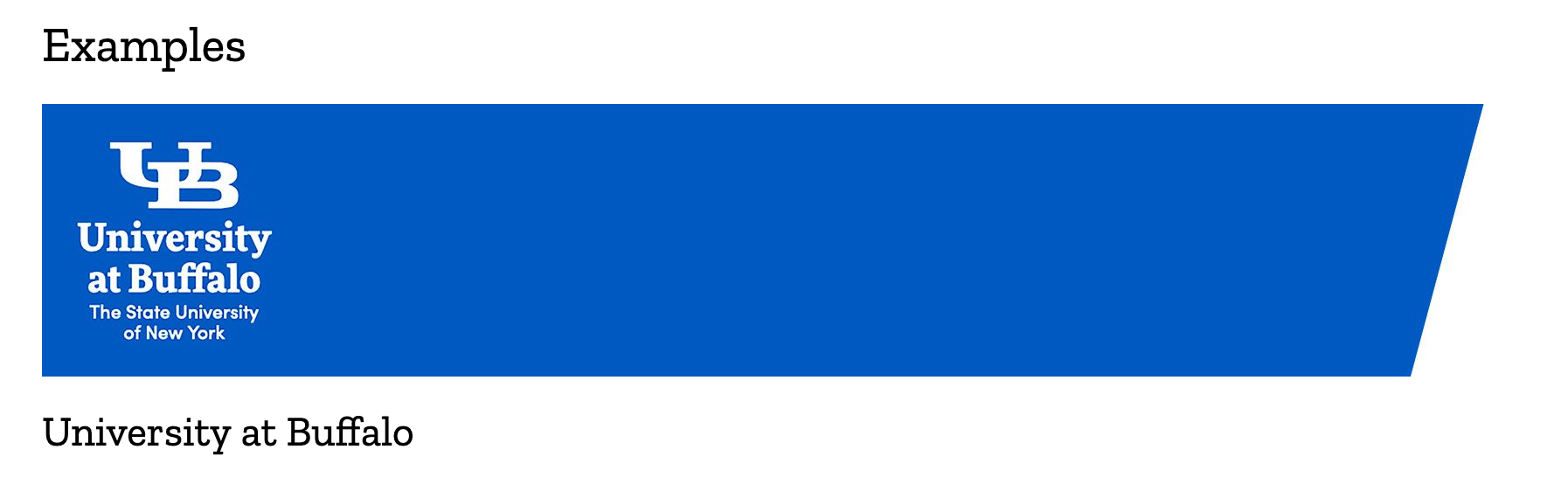
- [x] In the example section, we plan to have multiple examples. And some examples can get really long, like the University of Buffalo one here. Do you think we should think of a way to make this cleaner, or is it OK to have a really long page and examples on top of each other?
We could add a little header on top of each example to make the distinction better (see example here) - I think it is okay of the text is long so people are still in the context of the same page. We may have an issue if you have 4 or 5 long examples like that (then we may need to break down the page)
taisdesouzalessa
on 20 Feb 2021
Oh I love the examples section being separated by a big logo or segment like this!
I also think authors at the top is great. So does this mean the top shows just author names, and then when they link to the bottom, they see contributors too? @taisdesouzalessa
 kathytpham
on 25 Feb 2021
kathytpham
on 25 Feb 2021
Oh and also, suggestions on best ways to create the headers? @taisdesouzalessa
kathytpham
on 25 Feb 2021
After talking and brainstorming with Kathy today, we may have a new alternative for those headers, instead of using the unversities' logos.
Suggested approach: https://foundation.mozilla.org/en/what-we-fund/awards/responsible-computer-science-challenge-rcs-playbook/topics/discuss-justice-equity/#univ[…]eley
Changes:
I increase the typeface size of all items (from h3 to h2), so universities examples can now be h3. The first paragraph is styled "large" so we can keep the links with colors. The clickable bulleted list in "Examples" makes it easier for users to jump to any university they want to see. I think this solution works pretty well for desktop and mobile. Let me know what you think.
I also think authors at the top is great. So does this mean the top shows just author names, and then when they link to the bottom, they see contributors too?
@kathytpham could we use a term that fits both? Maybe: "Authors and Contributors"? Or "Credits"? I think it would be good to have both authors and contributors at the top, with the distinction between them.
taisdesouzalessa
on 25 Feb 2021
Kathy is on board with the new approach and updated the published pages to reflect that.
taisdesouzalessa
on 26 Feb 2021
Any idea when this will be unblocked?
 kristinashu
on 1 Mar 2021
kristinashu
on 1 Mar 2021
Kathy is currently working with another person to populate these pages. @kathytpham I think we will move this task to our side queue until all the copy is published. Does that work for you, Kathy? We went as far as we could with this task and now we just need to do a final review once all content is in place.
@kristinashu if Kathy agrees with the above, we can put this task in the "Icebox" until all the copy is done.
taisdesouzalessa
on 1 Mar 2021
Yes, that works, I think! We actually added all the sections (we have 4 more pending but they will need some copy edits, and they follow the format of the others). We then will update the Topics and Overview pages with more content, and then should be done!
We also need to make sure all the links to the playbook work as well.
kathytpham
on 3 Mar 2021
Cool! Thanks @kathytpham :) Please ping us here once it is all done and then we will fit this task into the most suitable sprint.
Our sprints run from 2 to 2 weeks (so we just take new projects every 2 weeks) so please keep in mind this timeline when planning the launch of the playbook. This sprint started on March 2nd and goes until March 15th - the next sprint is from March 16th to 29th and so on.
We will do a QA for all the links before launching to make sure it all works as expected. It is part of the design review.
Thanks and looking forward to the launch. So much good content there!
taisdesouzalessa
on 3 Mar 2021
Thank you for this update! We have a MozFest panel on March 17th, so we will share the playbook with a small group then. We are working with the comms team on a launch plan. It sounds like we should plan for sometime March 16th-29th for full launch?
kathytpham
on 3 Mar 2021
@taisdesouzalessa We are ready for the design review! All the sections are up. We updated the overview section. A few questions:
- What do you think of the topics page? The icons are square so some of them are cutoff. Should I change icons, or do non-square (if that is an option)
- Do we have search option on our pages? Is that something we want to include?
- Thoughts on how the overview page looks?
- This page has examples from 4 universities. https://foundation.mozilla.org/en/what-we-fund/awards/teaching-responsible-computing-playbook/topics/discuss-justice-equity/
kathytpham
on 17 Mar 2021
Hi @kathytpham so happy this project is ready for review. Great work on that, it is so complete and it looks nice! 👏
About your questions:
What do you think of the topics page? The icons are square so some of them are cutoff. Should I change icons, or do non-square (if that is an option)
I think the icons are okay as is. It is better to keep them square for consistency and the parts that are cut are non-essential for the understanding of the images (I didn't identify any weird cut there).
Do we have search option on our pages? Is that something we want to include?
Unfortunately we don't have this option on Wagtail at the moment. However if we have it one day (I feel our blog could benefit from that), we can make sure to include it in this guide as I think it would be beneficial to users.
Thoughts on how the overview page looks?
It looks very nice and clear!!
This page has examples from 4 universities. https://foundation.mozilla.org/en/what-we-fund/awards/teaching-responsible-computing-playbook/topics/discuss-justice-equity/
I think it looks okay with the anchors text helping people to go to a specific example if they wish. I will organize the spaces between universities on this page and I think that will help a bit with hierarchy.
I started a QA document today, could you take a look at my notes there? Tomorrow I'll QA the individual Topic pages.
taisdesouzalessa
on 19 Mar 2021
Increased estimate on that. The QA is taking longer than expected because there are many pages to review. QA list here
taisdesouzalessa
on 19 Mar 2021
QA is completed. Waiting on Kathy's feedback for next steps: improving site based on QA.
Also sent an email to both Kathy ans Jenn about the integration of this page with RCS Challenge. Double checking with them if they are okay with what we have now and asking if I can delete "Community" to clean things up.
taisdesouzalessa
on 22 Mar 2021
Kathy will book a 1 hour working session with me on this project (sometime this week)
taisdesouzalessa
on 24 Mar 2021
Kathy and I met and she needed some help on how to make the "Overview" page more clear to users so they know what to expect from the guide an how to use it.
I gave my recommendations and applied them to the page:
- Detach "Authors and Contributors" from "Overview"
- Styled "Here are a few things to consider as you read through the Playbook:" so it gets easier for user to scan.
Here is the final version: https://foundation.mozilla.org/en/what-we-fund/awards/teaching-responsible-computing-playbook/
@kathytpham the QA list is here - all the changes suggested there can be done for you or the contributors (I don't think there is design help needed, but feel free to ping me if you get stuck).
I think this project is done from the design perspective \0/ - Kathy, do you have everything you need from us? My goal is to close this ticket this sprint (that finishes on Monday, March 29th).
taisdesouzalessa
on 26 Mar 2021
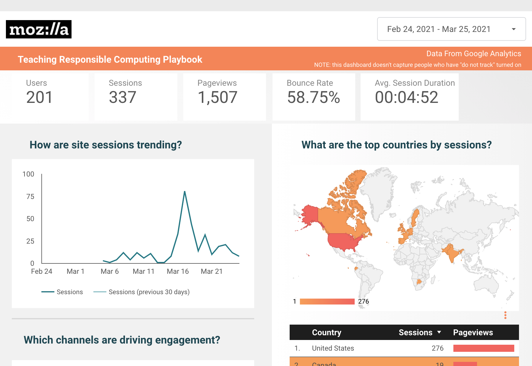
Sent a google data studio dashboard to Kathy.
taisdesouzalessa
on 26 Mar 2021
@kathytpham I will close this ticket since I believe all the design tasks are done and the QA list is actionable by you and contributors (the changes are mainly in copy and links).
If you need anything else from us, we can then open a new ticket and fit it into our future sprints. Thanks for the collaboration on this project, Kathy! I am super happy with the final version of the Playbook, so informative. Can't wait to see people using it.
taisdesouzalessa
on 30 Mar 2021
Related issues
 alanmoo
·
3Comments
kristinashu
·
4Comments
kristinashu
·
5Comments
alanmoo
·
3Comments
kristinashu
·
4Comments
kristinashu
·
5Comments
 hannahkane
·
3Comments
kristinashu
·
5Comments
hannahkane
·
3Comments
kristinashu
·
5Comments