Foundation.mozilla.org: Homepage wireframe update
Iterate on the homepage to consider 2 new feedback pieces from InVision:
- "Anil has highlighted that we might miss the our current hero space (accessible project with a clear CTA), should we add that back in? I still think it should be below the value prop and TBD titles but maybe above the blog posts."
- Titles check (by content team)
 kristinashu
All 9 comments
Here are the options for this ticket. First, a bit of background information:
Challenge: how can we balance the needs of new users and returning visitors? For a new visitor to the home page, having a value proposition is very useful to quickly understand what we do and why. For a recurring visitor, seeing the same message again and again can be frustrating (they may want to jump straight into the "fresh" content.
Analytics: during 2020, most visitors to our homepage (/en/ only) are new. We have around 8x more unique page views from new users than from returning ones. Also, more than 70% of them see our homepage from desktop devices.
Future: since we plan to shift our audience targeting, we should consider the site in mobile as well. We may see more people using our page on mobile in the future.
Proposals:
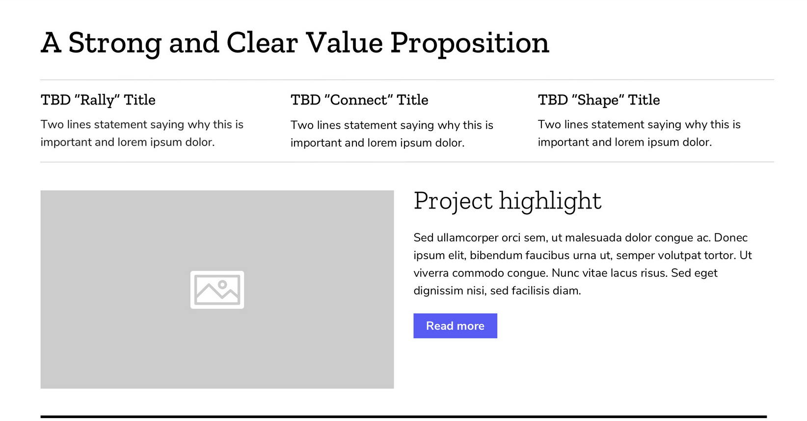
V3 (see full page)
Comments:
I like how value prop and the 3 areas are all together on top. They don't take too much space. The issue is on mobile, where returning visitors will have to scroll past this area to see "fresh" content.
Screenshot:
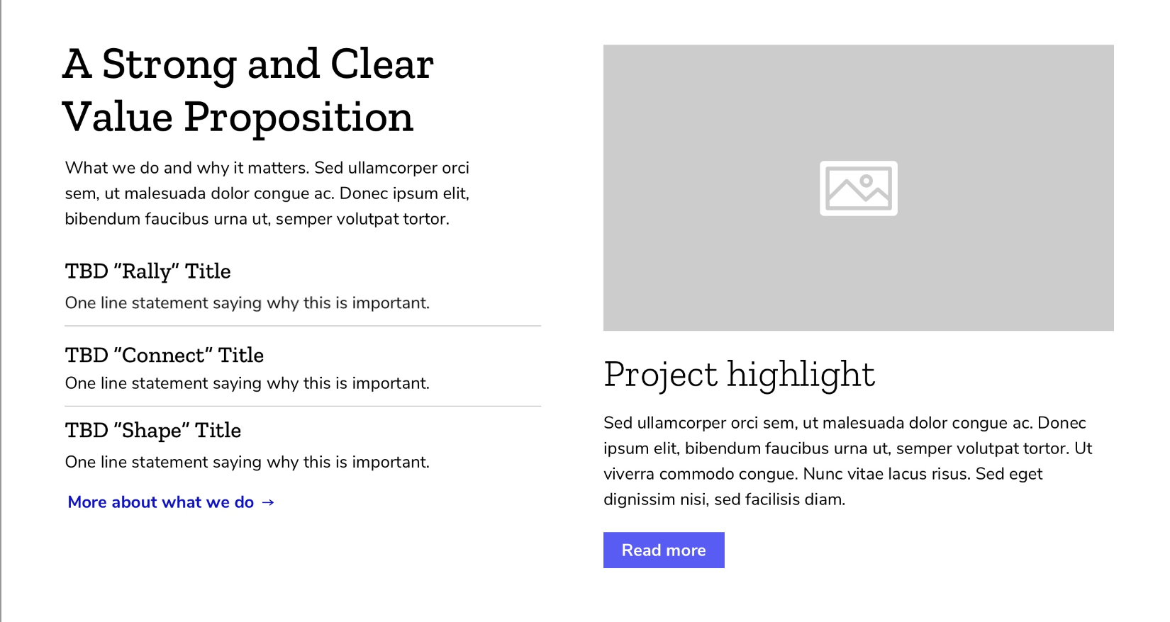
V4 (see full page)
Comments:
I like how this option has a simple value prop on top that is easy to scan. For new users, they can quickly understand what we do (and dive a bit deeper after the highlight). For returning users, they can ignore it and go straight to "fresh" content. It works well in mobile. This is my favorite option.
Screenshot:
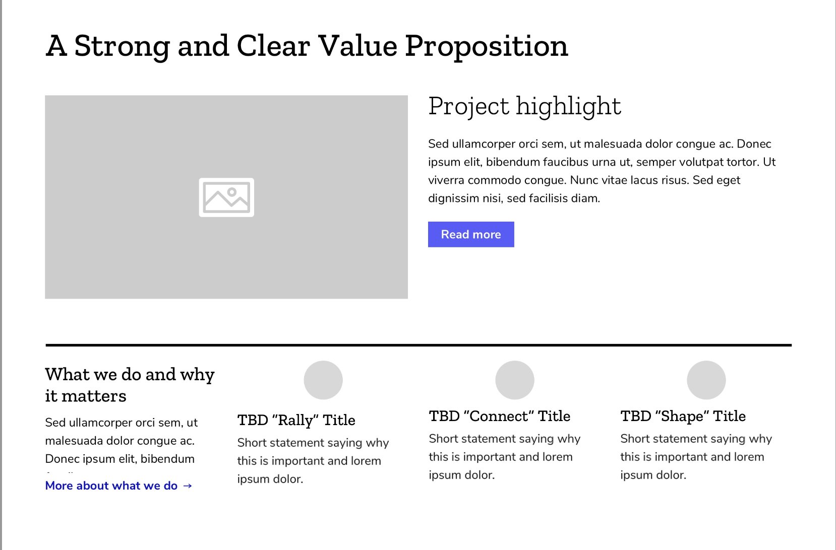
V5 (see full page)
Comments:
I like how value prop integrates with the "fresh" content on the right. It gives the feeling that the highlight is part of the value prop. The issue we may have with this proposal is when the highlight (content on the right) has a headline with 2 lines and lots of description. The hero space would look unbalanced. Also it can be a challenging layout for returning visitors on mobile since they will have to scroll a bit before seeing the "fresh" content.
Screenshot:
@beccaklam @kristinashu could you please share some feedback with me in InVision? Once we choose a proposal I will add it to our main prototype. Thanks
 taisdesouzalessa
on 19 May 2020
taisdesouzalessa
on 19 May 2020
Thanks Tais! I like both v3 and v4. But if I had to chose I would lean towards v3 since the flow and structure is more straightforward. Perhaps we can mockup both versions once the copy is more final.
I think highlighting one current and accessible project is useful of new users as well as returning. It feels less overwhelming if there's a super clear CTA and seeing an example also helps to explain what we do.
kristinashu
on 20 May 2020
@taisdesouzalessa
V3 - The two grey lines segmenting this area in context feels a bit tight being so close to the nav line above as well (perhaps you do not need the grey line above, use small images instead or just none as options to open up this area a bit).
V4 - This is an interesting value prop sandwich where it frames fresh content with evergreen context above and below it. I do prefer the three column style in V3 over this four column (I don’t think you need that 'what we do and why it matters' blurb as the three should be self-explanatory?) but if it is really needed considering taking the title ‘what we do and why it matters’ above the three column. I also wonder if the project highlight is clear it is always changing since it comes right after the value prop and not describing more of the value prop itself (I think including a category/date/author byline could helps distinguish this is fresh content). If this whole section is considered together you may not need the top hr to be thick black but thin grey or none to lighten the visual weight in this area.
V5 - This feels text dense above the fold for some reason but I know it is the same amount (maybe the additional lines are feeling busy). Also, my eye is bouncing around quite a bit horizontally and wants to read the title value prop + image heading rows instead of columns on desktop (maybe because I am a returning user as well).
+1 to consider mobile experience even though it is currently <30%
 sabrinang
on 20 May 2020
sabrinang
on 20 May 2020
Thanks for the feedback! I'll reiterate on the versions (plus add mobile) tomorrow.
About the titles check (item number 2 of the ticket list):
I sent an email to the Content team asking for an async brainstorm - low pressure, only if they have the time and interest (doc here). I will also add some ideas there and by Monday we will have the best ones placed on the wireframe.
taisdesouzalessa
on 20 May 2020
Here are 2 versions of this page, based on feedback received (I discarded V5 because it doesn't seem a good approach for the problem we are trying to solve):
• V3 wireframe (desktop)
• V3 wireframe (mobile)
• V4b wireframe (desktop)
• V4b wireframe (mobile)
I added comments on InVision so we can discuss in the layout context.
cc: @kristinashu @beccaklam @sabrinang
taisdesouzalessa
on 20 May 2020
Sounds like V4 is the winner!
@taisdesouzalessa Anil has update the homepage copy, could you please update the comp with it?
kristinashu
on 21 May 2020
After design critique I improved the wireframes and here is the latest version (with updated copy):
Desktop: Wireframe here
Mobile: Wireframe here
I had to break down the copy in 2: I hope that is okay.
I also updated the prototypes to reflect this new version of the home page.
cc: @kristinashu @beccaklam
taisdesouzalessa
on 21 May 2020
Jen, Audrey and I did a brainstorm on labels for this page. Brainstorm documented here. As we populate this page with real content we should also consider improving the labels with the suggestions by the team.
taisdesouzalessa
on 25 May 2020
Task completed! Closing this ticket.
taisdesouzalessa
on 25 May 2020
Related issues
kristinashu
·
5Comments
 alanmoo
·
3Comments
sabrinang
·
5Comments
kristinashu
·
5Comments
kristinashu
·
3Comments
alanmoo
·
3Comments
sabrinang
·
5Comments
kristinashu
·
5Comments
kristinashu
·
3Comments