Foundation.mozilla.org: [Components] Spacings Implementation ticket
Based on discussion on #1404, here is the implementation ticket.
[x] Add margin top and bottom of 16px by default on all components (expected behavior is to have a margin collapse as per Gavin's comment). Here is a list of the components that need to be updated (I don't have full knowledge of the items that are also components, so please correct me if something seems off/is missing there @gvn)
[x] Keep the line break available to users

[x] "Healthy Internet" component should have a bigger margin-top. Margin bottom is 8px+48px so margin-top should be the same (8px+48px)

cc: @kristinashu @xmatthewx @gvn let me know if this makes sense to you. Assigning this task to Gavin
 taisdesouzalessa
All 10 comments
I think we should also change the "Spacer" component to be optionless and just be 16px tall.
@taisdesouzalessa @kristinashu thoughts?
 gvn
on 30 Apr 2018
gvn
on 30 Apr 2018
I think the "Spacer" component can be useful because there are scenarios (like "Example B" here) in which the layout would benefit if different blocks of text have more spacing between them instead of the constant 16px.
That being said, I do think our spacer has an overwhelming amount of options (@sabrinang and I talked about it in the past and we have some opinions about it - feel free to add your comments here, Sabrina):
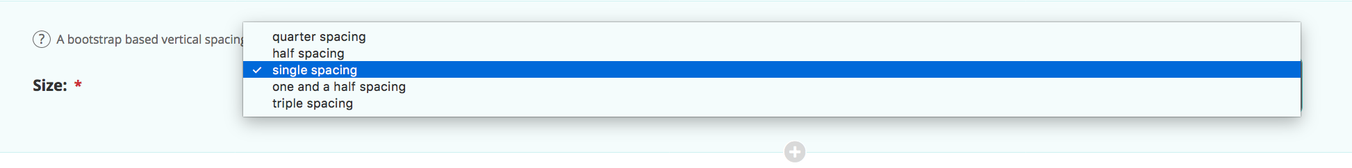
Maybe just 3 would be enough? And named: small (equivalent to my-2 which is equal to 8px)/medium (equivalent to my-4 which is equal 24px) / large (equivalent to my-5 which is equal 48px)
I even wonder if the "medium" is necessary since it is so close to 16px...what do you think?
taisdesouzalessa
on 30 Apr 2018
Keep in mind if it's fixed you could still add multiple spacers in a row...
gvn
on 30 Apr 2018
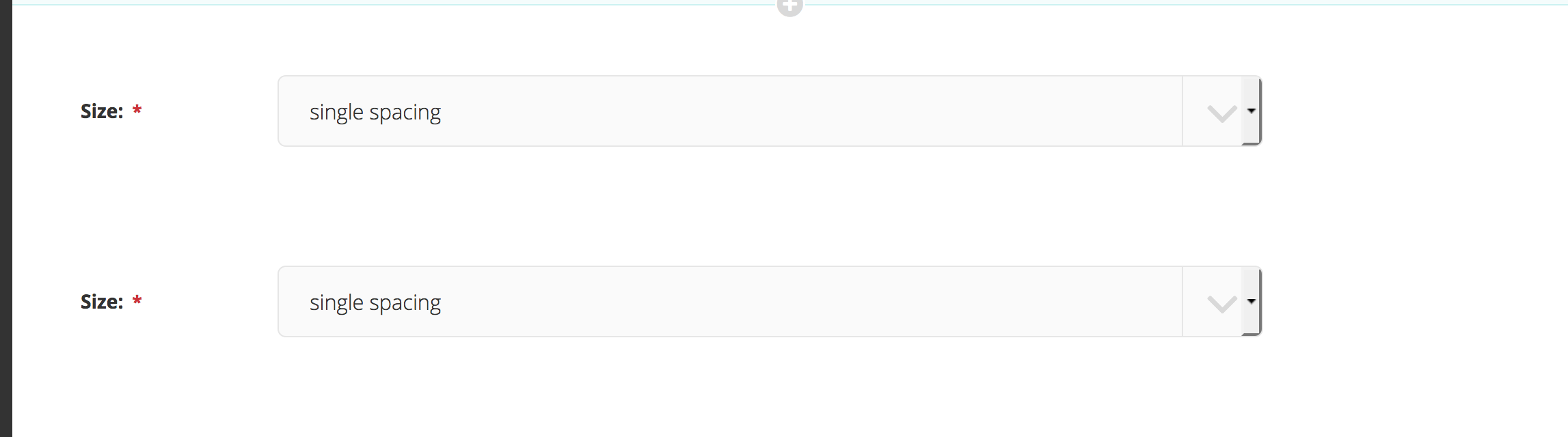
I like the idea of only having one spacer component. @taisdesouzalessa do you think 16px (and multiples of 16px) would work? Or do we need the smaller 8px spacer?
 kristinashu
on 30 Apr 2018
kristinashu
on 30 Apr 2018
The only scenario I thought that a 8px vertical space would be useful was for captions - but I think we can make this standard for this type of component (so users don't have a choice?). If spacing is built in the component then 8px isolated spacing may not be necessary...

@gvn for the scenario you pointed out adding multiple spacers in a row you meant something like that (imagine there is no dropdown menu, so if I want a spacing of 32px, I would have to stack 2 spaces of the default 16px):
taisdesouzalessa
on 30 Apr 2018
The only scenario I thought that a 8px vertical space would be useful was for captions - but I think we can make this standard for this type of component (so users don't have a choice?). If spacing is built in the component then 8px isolated spacing may not be necessary...
Those caption margins are built into the component itself so will remain the same.
@gvn for the scenario you pointed out adding multiple spacers in a row you meant something like that (imagine there is no dropdown menu, so if I want a spacing of 32px, I would have to stack 2 spaces of the default 16px):
Yes. :)
gvn
on 30 Apr 2018
Excellent, sounds like we can just have the one spacer size!
kristinashu
on 30 Apr 2018
Yep, I think we can give this a try and see how staff build their pages. We can always increase complexity if the need arises but I am cool with starting simple first!
taisdesouzalessa
on 30 Apr 2018
Made an audit of the implemented spacings. There are still a few issues to solve (marked in purple): https://redpen.io/ye8382707324177761
The 3 of us should chat to see what's worth it to solve and what's not :) - @gvn @kristinashu
taisdesouzalessa
on 17 May 2018
After chatting with @gvn we decided I should file individual tickets per tweak. Here they are:
1550 - Missing margin bottom in <ul> element
1551 - Misalignment between image and text in Image Text component
1552 - Spacing between components = 32px
1553 - Big gap on the bottom of pages
taisdesouzalessa
on 22 May 2018
Related issues
 mmmavis
·
4Comments
mmmavis
·
4Comments
 alanmoo
·
3Comments
alanmoo
·
3Comments
 xmatthewx
·
3Comments
kristinashu
·
3Comments
taisdesouzalessa
·
3Comments
xmatthewx
·
3Comments
kristinashu
·
3Comments
taisdesouzalessa
·
3Comments
Most helpful comment
Excellent, sounds like we can just have the one spacer size!