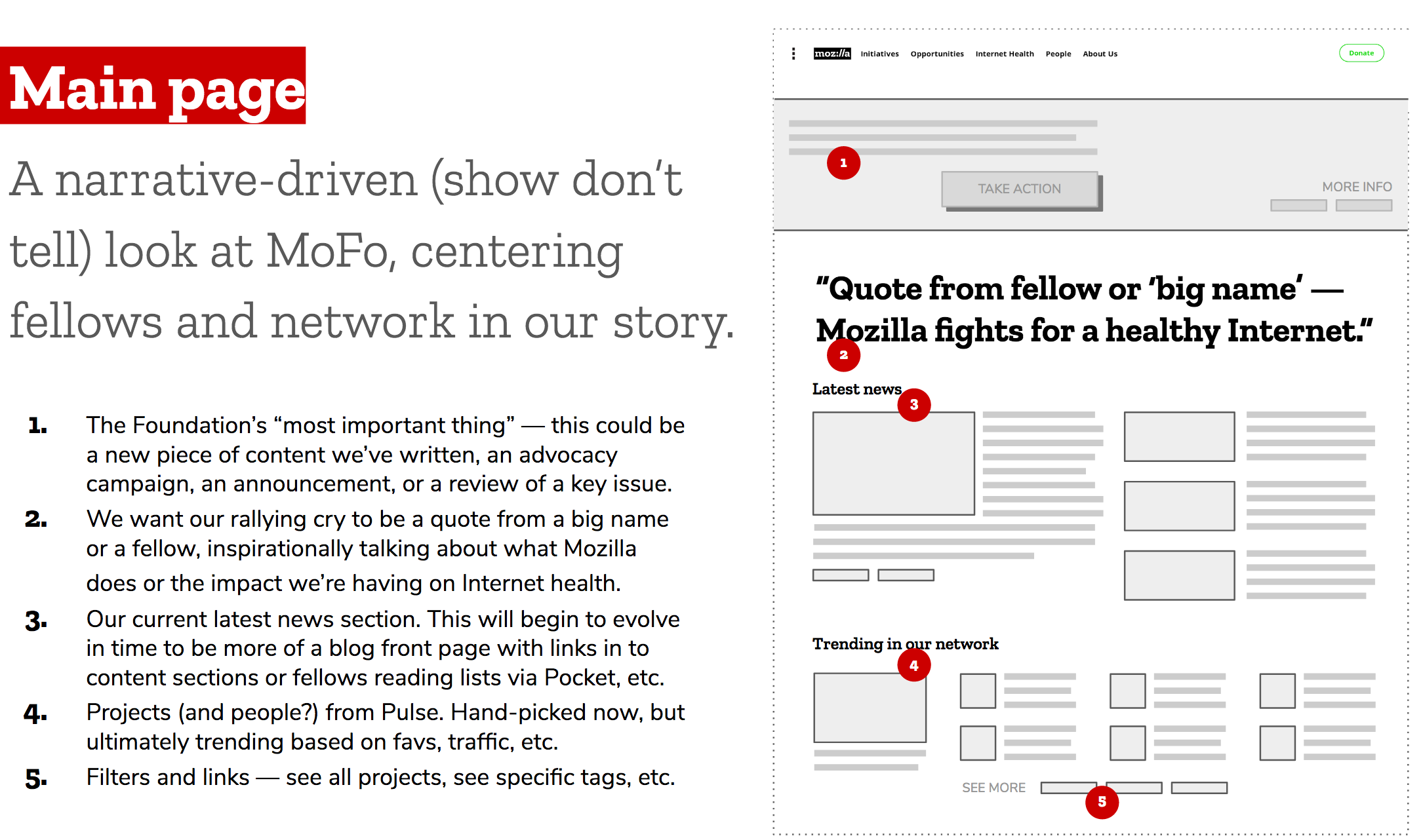
Foundation.mozilla.org: Design new homepage
New Homepage will include lead feature, news, projects.
Design for phased implementation.
Note:
- design feature box for use at top of Participate page.
- consider 1 or more feature box templates (e.g. with/without CTA) (choose 1 for initial implement with real content)
design
 xmatthewx
All 7 comments
Based on Jesse's wireframes
 kristinashu
on 6 Mar 2018
kristinashu
on 6 Mar 2018
@xmatthewx @jessevondoom here are a bunch of different home pages designs :
- Comps go from minimal updates to more complex
- 01-07 show different banner and nav options
- 08+09 show different body content options
There's a bunch so please veto some! I will continue to explore more directions but wanted to share some progress along the way.
kristinashu
on 9 Mar 2018
Here are some thoughts...
- I like phased approach. Let's build and release in stages!
- I like the clean nav options. less busy. fewer elements.
- I like the big CTA particularly in 06, but also 05 & 07. not so much with 01-04 (though maybe good as staged builds toward final design).
- Quote+photo changes the vibe from critical-internet-news-site to we-are-a-nonprofit-please-like-us site. My fault. I original suggested we have an orienting quote or fact, but I think we should either remove it, or display it more like a this-just-in text-only feature. Astounding facts or urgent headlines. Or punt it.
- I like the news cards best on 08. I also like that our current News box gives us some hierarchy. This might be resolved by something like 06's top feature + 08's news cards with nothing in between.
- I see you've included Projects alongside News in v08. I feel unsure about this. Curious what you and @jessevondoom think.
- I like how you've gone full width with newsletter signup. Don't hesitate to remove the awkward & silly "Get Connected" phrase, or drop icon/gray background box.
xmatthewx
on 12 Mar 2018
Updated v2 options are great. @jessevondoom - when you comment, look for v2.01-v2.03.
xmatthewx
on 15 Mar 2018
Still working on the design but here is a WIP list of things that would need to be done to implement these designs, in order of logic/priority:
1. Network Leaders
- remove entire section (title, images, text, button)
2. Email Signup
- remove "Get Connected" title
- background image is full width and reduced height
- remove icon
- add to the bottom of every main page?
3. Nav
- white background with divider
- remove Signup button
- (eventually add a Donate button)
4. Banner
- reduced width of text
- add CTA button
- option for in body text links
- add image
- (eventually add different banner layout options)
5. Get Involved/Trending
- update title
- 2 up feature boxes (image, white box over top (same as overlap as featured news) section title in small grey, title, body copy)
- 3 down feature list (image, section title in small grey, title, body, dividing line)
- add Pulse projects (section title and line, image with title)(manually upload for now)
6. Quote
- add quote style - might want a different quote at the bottom of different pages
Mobile
- note full width images and some content is hidden
kristinashu
on 23 Mar 2018
🎉1
cc @gvn @mmmavis
kristinashu
on 29 Mar 2018
Opened implementation ticket - Build updated home page #1234
kristinashu
on 2 Apr 2018
🎉2
Was this page helpful?
0 / 5 - 0 ratings
Related issues
 taisdesouzalessa
·
5Comments
kristinashu
·
3Comments
taisdesouzalessa
·
5Comments
taisdesouzalessa
·
3Comments
taisdesouzalessa
·
5Comments
kristinashu
·
3Comments
taisdesouzalessa
·
5Comments
taisdesouzalessa
·
3Comments
 sabrinang
·
5Comments
sabrinang
·
5Comments
Most helpful comment
Opened implementation ticket - Build updated home page #1234