So @skjnldsv and I just did a design review of the latest state in https://github.com/nextcloud/forms/pull/256, here are items to be done. :)
cc @nextcloud/forms feel free to attach your name to items which you would like to pick up (I will do some design and wording ones). Bold items are ones we considered more important.
Fresh usability test with 3 separate people
Sorted somewhat by importance, duplicates some of the items below, but repeating to emphasize their importance:
- [ ] "Only allow one response per user" is confusing, should only be visible when possible → #436
- [x] Sometimes question title is not saved _-> Seems to be outdated._
- [x] Submission view: Pressing Enter in short text submits whole form (if everything is filled), unexpected #413
- [x] Questions with either empty titles or empty answer options are not shown – we should communicate that to the form creator and highlight those unfinished questions? #415
- [x] Not clear which question type (multiselect or checkboxes) is used, should show checkboxes / radio buttons in edit mode too #409
- [x] Not possible to switch question type #352 -> scheduled for V2.1
- [x] Sometimes last response option is not saved when using Tab-key to advance to next field #396
- [x] Not clear that "New question" is editable, should not be prefilled → pull request https://github.com/nextcloud/forms/pull/367 @jancborchardt
- [x] Not clear that "New form" is editable, should not be prefilled → pull request https://github.com/nextcloud/forms/pull/367 @jancborchardt
- [x] Submission view: "People can enter a short answer" for short/long text makes no sense, needs to be differentiated. In create view: "People can enter a short answer" and in submit view "Enter a short answer" #389 _(we can do a quick-fix to make it "Short answer text" and disable the field?) - @jancborchardt for the quick fix_
- [x] Questions with empty titles are possible and will be shown, should be pointed out #397
- [x] Not clear how to get share link, needs to be in sidebar next to radio option too, and ideally in responses view too when empty
- [x] Autosave sometimes messes with input of questions, try typing in answer options fast and sometimes characters disappear https://github.com/nextcloud/forms/pull/327
- [x] "Add question" button position confusing on top, should be below questions https://github.com/nextcloud/forms/pull/328
- [x] Icon of multiple choice question should use radio icon to reduce confusion about what "Multiple choice" is https://github.com/nextcloud/forms/pull/329
Create
- [ ] Add bottom padding to compensate the add new answer input (optional if looks weird) → #434
- [x] Icon of "Add a question" button should be white in the dark theme as well, as otherwise it's not enough contrast. (But also honor theming color.) #429
- [x] Show number of responses on responses button like "15 responses", and in the action menu as well #422 ->scheduled for V2.1
- [x] Focus on title after creation → @jancborchardt pull request https://github.com/nextcloud/forms/pull/369
- [x] Replace fake title with empty string and show placeholder, fallback to default title
- [x] In edit mode, not enough difference between choices types:
- [x] Default question title is not great, put more details on chat question title type "New multiple choice question" #389
- [x] Checkbox/Radio should not shift horizontally
- [x] Align checkboxes with title.
- [x] Still show checkbox when editing #409
- [x] Descenders of form title are cut, improve padding #410
- [x] Input of long option-text gets messy, see comment → pull request https://github.com/nextcloud/forms/pull/366
- [x]
Remove auto completionactually quite useful when creating similar forms - [x] Form title needs to be marked up as h2
- [x] Empty content wording @jancborchardt
- [x] 3 blue buttons, too much.
- [x] No need for emptycontent , add text to new question menu +
- [x] Show results not primary @jancborchardt
- [x] "Add new answer" => "Add answer number x"
- [x] Remove apostrophes from loading message
- [x] Multiple choice could use the radio circle as icon to be more clear about what it is @jancborchardt https://github.com/nextcloud/forms/pull/329
- [x] Change short/long answer placeholder to "People can enter a short answer" @jancborchardt
- [x] Put new question menu on the left
- Add question zindex issue
- [x] Lower opacity of drag handle
- [x] Title in narrow view is too narrow
- [x] Mandatory in title with star *
Submit
- [ ] Long Form-Titles just get cut → #435
- [x] Line-Breaks in description are not shown in Submit-View #424
Navigation
- [x] Sort by last submission
- [x] New forms should be sorted up top
- [x] Change copy to clipboard to "Copy share link" @jancborchardt
- [x] Put form icons as default for all, and checkmark when expired @jancborchardt https://github.com/nextcloud/forms/pull/326
Sidebar
- [ ] Invert logic of "Only allow one response per user" → "Allow multiple responses per user" and only show if relevant → #436
- [x] Improve shared user component view #425 -> scheduled for V2.2
- [x] Disable typing on expiration field. When manually changing the text, expires falls back to 1970. #414
- [x] Don’t open sidebar by default on mobile as it overlaps/hides the form info
- [x] Wording @jancborchardt
- [x] Structure @jancborchardt
Results
- [x] "Summary" view in results #314 ->scheduled for V2.1
- [x] Statistics => Results and be an H2 @jancborchardt
- [x] Add "Back to form" in the top navbar @jotoeri
- [x] Export to csv should be bellow Heading @jancborchardt
- [x] Just the title as H2: "Results of formtitle" @jancborchardt
A11y
- [x] Check everything with WAVE, Axe and/or Lighthouse
- [ ] Explore drag&drop with keyboard, maybe focus the handle and use arrow up/down → https://github.com/nextcloud/forms/issues/317
Later
[x] Decide better icons maybe to illustrate what form type it is
[x] Add navigation second line status #423 -> scheduled for V2.1
- [x] Add navigation new submissions count #422 -> scheduled for V2.1
 jancborchardt
All 22 comments
Followup from review-branch:
- [x] Discuss NavigationIcon on separate branch
 jotoeri
on 27 Apr 2020
jotoeri
on 27 Apr 2020
- Use isMobile mixin for sidebar-open true/false
You're talking about the navigation or the sidebar?
 skjnldsv
on 27 Apr 2020
skjnldsv
on 27 Apr 2020
You're talking about the navigation or the sidebar?
Sidebar. Jan changed the default-opening of the sidebar to false. This is necessary on mobile, but i think on desktop it would be nice to see the settings directly.
See https://github.com/nextcloud/forms/pull/297#discussion_r415563964
jotoeri
on 27 Apr 2020
AH, yes then :)
Sorry, people are often confused and calling both of them sidebar ;)
Because the navigation is coming with the next 2.0.0 release of our Vue components.
Definitely for the Sidebar, we should use the isMobile mixin :rocket:
skjnldsv
on 27 Apr 2020
- [ ] Title is cut off
- [ ] Hide title too when submitting/success
skjnldsv
on 29 Apr 2020
- [ ] Title is cut off
Do you mean the descenders of letters like g, y, j and the like are cut off in the share view? Cause I fixed that in the design/firther-fixes pull request.
- [ ] Hide title too when submitting/success
We said it would be nice to still show the title to keep the context.
jancborchardt
on 29 Apr 2020
Do you mean the descenders of letters like g, y, j and the like are cut off in the share view? Cause I fixed that in the design/firther-fixes pull request.
Yes :)
We said it would be nice to still show the title to keep the context.
Yes, but people trying it last night said it looked weird :shrug:
skjnldsv
on 29 Apr 2020
Do you mean the descenders of letters like g, y, j and the like are cut off in the share view? Cause I fixed that in the design/firther-fixes pull request.
@jancborchardt but still not completely gone...

jotoeri
on 29 Apr 2020
Ah, I might have broken it again then.
You used overflow-x that trigerred scrolling Jan. We should make sure to not use overflow hidden then. Or a proper line-height :thinking:
skjnldsv
on 29 Apr 2020
Ah, I might have broken it again then.
You usedoverflow-xthat trigerred scrolling Jan. We should make sure to not use overflow hidden then. Or a proper line-height :thinking:
Yep, or padding instead of margin.
jancborchardt
on 29 Apr 2020
- [ ] Allow line breaks in Form description (currently line breaks are only a white space)
skjnldsv
on 30 Apr 2020
Added some points which came up in usability tests with 2 people to the original post above: https://github.com/nextcloud/forms/issues/296
jancborchardt
on 1 May 2020
- [x] Autosave sometimes messes with input of questions, try typing in answer options fast and sometimes characters disappear
*
You mean answers. Never seen this in questions and I cannot reproduce the issue
EDIT: solved https://github.com/nextcloud/forms/pull/327
skjnldsv
on 1 May 2020
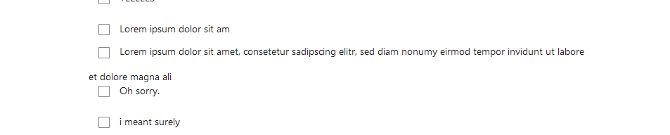
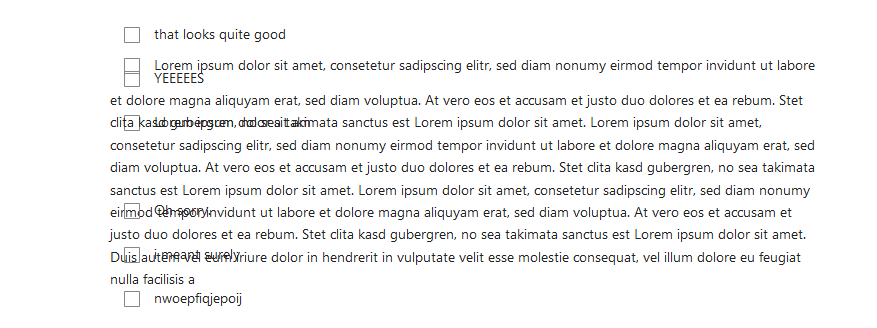
- Input of long option-text gets messy (also added above in create-section)
jotoeri
on 3 May 2020
Nice catch, probably just need a proper white-space and overflow :)
skjnldsv
on 3 May 2020
* Input of long option-text gets messy (also added above in create-section)  
Is this (overflow) the same as at 01:11 in this testing video? When a user is entering an answer, the text in the long text answer does not wrap to the input field.
If it's not I can open a bug for it.
 ei8fdb
on 6 May 2020
ei8fdb
on 6 May 2020
Is this (overflow) the same as at 01:11 in this testing video? When a user is entering an answer, the text in the long text answer does not wrap to the input field.
It’s not. :) The one mentioned by @jotoeri is about when the text given in answers of multiple choice or checkboxes is too long and wraps.
Your case is where the text of an answer doesn’t wrap – and this is intentional in that case as you chose "Short answer". We do have the separate "Long answer" text :)
jancborchardt
on 6 May 2020
@jancborchardt
- [ ] Sometimes question title is not saved
Can you provide more information on this? I didn't find a way to reproduce it. How did you produce? Or is it even outdated already?
- [ ] Use isMobile mixin for sidebar-open true/false
How do you think about this one? To be honest after getting used to the current view, i'm not sure anymore, if the simple view as it is, is better.
- [ ] Invert logic of "Only allow one response per user" → "Allow multiple responses per user" and only show if relevant
- [ ] "Only allow one response per user" is confusing, should only be visible when possible
Are you sure about these ones?
- To invert the logic is not reasonable imo, as on public-view, we can't control that. Non-logged-in users are anonymous and can not be controlled to submit only once. So we would have different logic on public (multi-submit) and non-public forms (default single-submit).
- To show it only when possible, i can implement, if you really want it. However i think it would be good, that users see the possibility to restrict that. If we implement this, users do not at all see this feature if they don't change sharing just by fun (default sharing is public). And at least in my head, the disabled checkbox is a common thing to show an option, that is only available under conditions.
If i imagine, i open the sidebar, see this feature and want to use it, i think about why it is disabled and maybe choose a different sharing-setting. If i don't see the feature, i won't think about? ;)
jotoeri
on 28 May 2020
- [ ] Sometimes question title is not saved
Can you provide more information on this? I didn't find a way to reproduce it. How did you produce? Or is it even outdated already?
Yeah, I couldn’t reproduce that since some time either, and don’t remember when and why it happened. Might have been fixed by something else along the way.
- [ ] Use isMobile mixin for sidebar-open true/false
How do you think about this one? To be honest after getting used to the current view, i'm not sure anymore, if the simple view as it is, is better.
If you are fine with the simpler view, I’m all for it! :)
- [ ] Invert logic of "Only allow one response per user" → "Allow multiple responses per user" and only show if relevant
- [ ] "Only allow one response per user" is confusing, should only be visible when possible
Are you sure about these ones?
To invert the logic is not reasonable imo, as on public-view, we can't control that. Non-logged-in users are anonymous and can not be controlled to submit only once. So we would have different logic on public (multi-submit) and non-public forms (default single-submit).
To show it only when possible, i can implement, if you really want it. However i think it would be good, that users see the possibility to restrict that. If we implement this, users do not at all see this feature if they don't change sharing just by fun (default sharing is public). And at least in my head, the disabled checkbox is a common thing to show an option, that is only available under conditions.
If i imagine, i open the sidebar, see this feature and want to use it, i think about why it is disabled and maybe choose a different sharing-setting. If i don't see the feature, i won't think about? ;)
What do you think about just removing that setting? It’s mainly just confusing and basically the _only_ use it has is to allow multiple answers for logged-in users. Which actually doesn’t make a lot of sense – people should only be able to respond once, otherwise it would skew a survey.
jancborchardt
on 28 May 2020
otherwise it would skew a survey.
Hm, that depends on use-case, i think? Of course for statistical reasons you're right, but then we would need to restrict that especially on public forms, which probably is the most common use-case for statistical data? And i currently don't really know a way to do that as far as we don't receive a mac-address...
Having a use-case to collect information without statistical importance, i could quite well imagine, that it's good if users can add data multiple times. So i wouldn't completely remove the possiblity for logged-in users.
-> We could leave the logic 'Allow only one response', but set it to true by default and only show, when possible?^^ Indeed, that sounds a bit like a strange special case. But we would have same logic as on public view and it is the default-case for logged-in users. And then it would indeed be necessary, to only see it, if it has an effect.
-> In fact this would be your first solution, just with inverted text, to have the same logic on public & logged in? 😅 🙈
jotoeri
on 28 May 2020
Shall we close all those overview issues like this one and release final?
Then we can narrow on individual ones?
skjnldsv
on 2 Jun 2020
Yup! :) Opened separate issues for the remaining ones:
- Content below jumps if a question above it switches view/edit mode #434
- Difference of edit and view mode when there are multiline questions and answers #435
- Fix setting "Only allow one response per user" #436
jancborchardt
on 2 Jun 2020
Related issues
 dawidol
·
6Comments
dawidol
·
6Comments
 xadium
·
4Comments
xadium
·
4Comments
 samtuke
·
5Comments
samtuke
·
5Comments
 Chartman123
·
6Comments
Chartman123
·
6Comments
 Sohalt
·
6Comments
Sohalt
·
6Comments
Most helpful comment