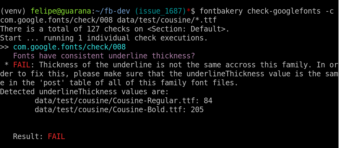
Fontbakery: com.google.fonts/check/008 should list differing values.
Analogous to #1684, this test should list everything that differs.
I think this should be a general principle when comparing family members. Always tell the user what differs where so he can find and fix the error quickly.
 madig
madig
All 8 comments
thanks for reporting this :-)
 felipesanches
on 15 Jan 2018
felipesanches
on 15 Jan 2018
felipesanches
on 19 Jan 2018
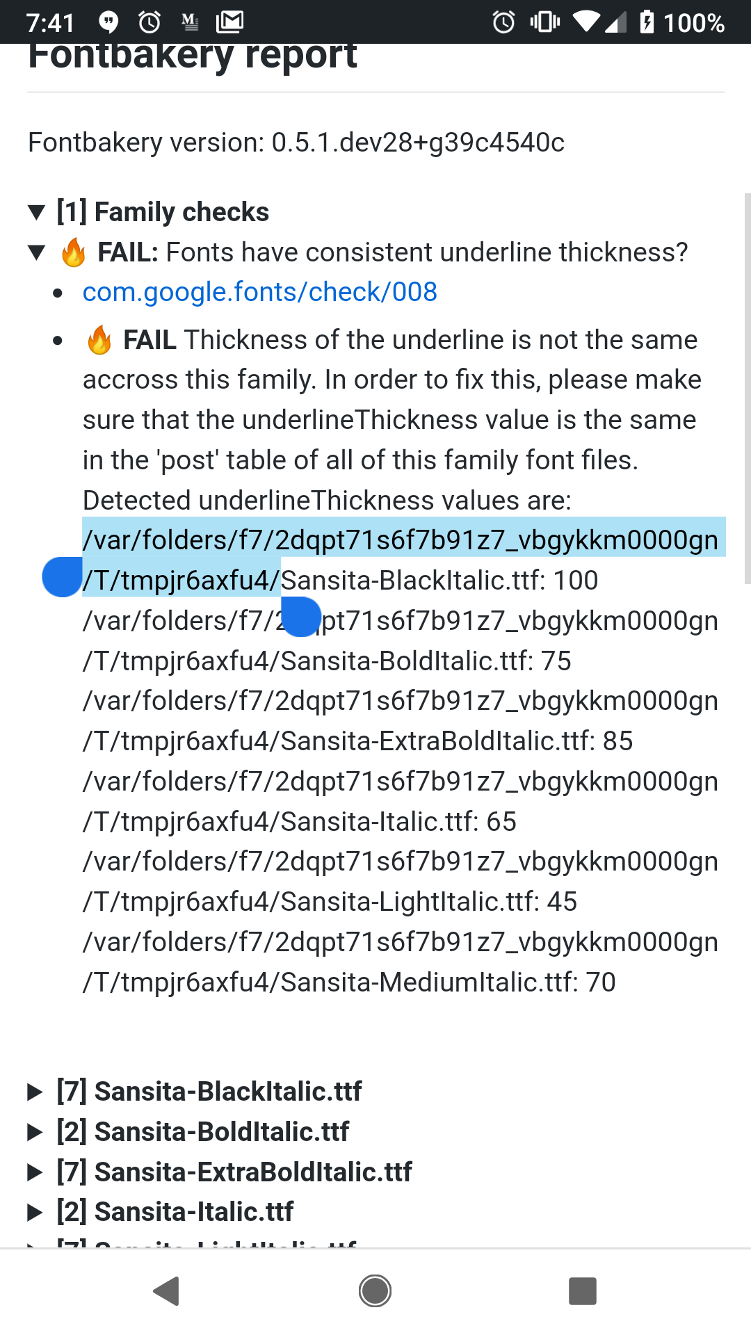
In https://github.com/Omnibus-Type/Sansita/issues/4 there is user feedback that this check is tooooo opinionated.
It should accept if a family has a progressing set of underline values that match the weight progression
Also the paths are bit distracting, I'm not sure they are relevant, just filename and extension is ok
 davelab6
on 8 Nov 2018
davelab6
on 8 Nov 2018
For the rationale on this test we have:
Dave C Lemon (Adobe Type Team) recommends setting the underline thickness to be consistent across the family. If thicknesses are not family consistent, words set on the same line which have different styles look strange. See also: https://twitter.com/typenerd1/status/690361887926697986
I really have no opinion on this check. It's not going to break the fonts if the underline thicknesses are different, it's just opinions.
 m4rc1e
on 8 Nov 2018
m4rc1e
on 8 Nov 2018
Hilariously I wrote the rationale for this ;-) https://github.com/googlefonts/fontbakery/issues/1692
pot, kettle, black
m4rc1e
on 8 Nov 2018
what should we do, then?
felipesanches
on 8 Nov 2018
Perhaps we should downgrade this to WARN?
Imo FAIL should only be used for very serious issues. Underline thickness isn't a major.
m4rc1e
on 8 Nov 2018
While not that major, I think its important to get this improved across the catalog as a sign of quality, so I want to keep the FAIL status, but I think we should accept both the Lemon Approach and the Cosgaya Approach :)
davelab6
on 8 Nov 2018
Related issues
davelab6
·
4Comments
 chrissimpkins
·
5Comments
chrissimpkins
·
5Comments
 bghryct
·
8Comments
felipesanches
·
6Comments
bghryct
·
8Comments
felipesanches
·
6Comments
 eliheuer
·
5Comments
eliheuer
·
5Comments