Font-awesome: upgraded to 4.2 - icons are not sharp
Just upgraded to 4.2 from 4.1... nothing has changed except the version. Right off the bat I noticed the icons are not as sharp as before - they are somewhat pixelated. What was changed between these two versions to cause this?
 morrow95
All 44 comments
could you please post comparative screenshots?
 tagliala
on 3 Sep 2014
tagliala
on 3 Sep 2014
Here you go... this is just an example of a side menu of mine. 4.1 is on the left... 4.2 is on the right.

morrow95
on 3 Sep 2014
could you please provide a fiddle showing this issue and add more info (browser / os / version...)?
tagliala
on 3 Sep 2014
Like I said, nothing has changed on my end other than going from 4.1 to 4.2.
Results are the same on latest ff, ie, opera... slightly less pronounced with Chrome, but still a difference.
All I am looking for is what changed between the two versions. I can appreciate asking for a fiddle, but nothing has changed on my end - the difference is the font-awesome version.
morrow95
on 4 Sep 2014
@morrow95 the problem is that I can't confirm
font hinting changed from 4.1.0 to 4.2.0 but I can't confirm your problem
Here it is the refresh icon in Chrome 37 / Windows 7

And here it is firefox 32, windows 7

Are you using icons at 14px?
tagliala
on 4 Sep 2014
16px for this side menu example, but like I said it shows perfectly fine on 4.1.
Is that the 'change' I am looking for... were the fonts optimized for specific font-sizes or something since 4.1?
morrow95
on 5 Sep 2014
no, there were font adjustments to solve the following bugs: #3683 #3440 . But icons are designed to work at 14px and multiples
tagliala
on 5 Sep 2014
We're experiencing the same issue. Here's an example of 4.1.0 and 4.2.0 icons side-by-side at 14px: http://jsfiddle.net/j76phhdc/
There are screenshots from IE 10, FF 32, and Chrome 39 on that fiddle too.
 sclaypcc
on 8 Dec 2014
sclaypcc
on 8 Dec 2014
@sclaypcc brand icons are imported as they are, without adjustments, so please do not look at brand icons for pixel perfection at 14px. At least this could be documented
Moreover, the reddit alien needs improvement because of #3959
tagliala
on 8 Dec 2014
@tagliala
On browsers rendering with DirectWrite, the default behavior is to allow full subpixel precision rendering of a font at sizes of 21px or greater. And the icons in the font set look _fine_ at those sizes, if occasionally somewhat blurred.
This has very little to do with rendering at exact multiples of 14px. (Which is a big WTF, btw.)
The problem is that at pixel sizes below 21px, browsers apply the hinting embedded in the font, which in FontAwesome 4.2 and up is just utterly, utterly broken. This problem is not limited to brand icons. It affects all the icons in the set, but is just more noticible on icons with intricate detail (like most brand icons...) than on others.
You can, infact, work around the poor rendering fidelity due to the broken hinting by setting a css rotation small enough to remain visually undetectable, but large enough to force the affected browsers (IE, Firefox, Chrome) to start rendering fonts with full sub-pixel geometric precision.
Here's a snap of the unfixed icon in the searchbox on FontAwesome's own icon overview page, as seen in Firefox on Windows 7 with Direct2D and DirectWrite enabled:

And here's the same, with a transform:rotate(0.001deg) added to the .fa class via the developer tools:

Notice the difference there?
 rjgotten
on 9 Sep 2015
rjgotten
on 9 Sep 2015
@rjgotten thanks for the very detailed info
The problem is that at pixel sizes below 21px, browsers apply the hinting embedded in the font, which in FontAwesome 4.2 and up is just utterly, utterly broken. This problem is not limited to brand icons. It affects all the icons in the set, but is just more noticible on icons with intricate detail (like most brand icons...) than on others.
any info on how Dave could fix this?
tagliala
on 11 Sep 2015
any info on how Dave could fix this?
Generally speaking, you need hinting set up properly to get a font to render at subpixel position in Windows. If hinting is not present, then as far as I know both DirectWrite and GDI ClearType will default to snapping towards the nearest whole pixel. This is what FontAwesome 4.2+ is currently doing, I believe.
Browsers rendering with DirectWrite have a hardcoded behavior to skip hinting tables altogether and render at full subpixel precision for font-sizes greater than 20 pixels. The rotation hack forces them to do the same with font-sizes of 20 pixels or smaller. However, that does not fix the issue for browsers stuck with GDI ClearType, which iirc does not have the same behavior of starting to render at full subpixel precision.
I don't think there's a way around it: you _must_ have proper hinting tables to fix this completely.
The good news is that having TTFAutoHint generate hinting works OK for most icons, atleast given a cursory glance.
rjgotten
on 11 Sep 2015
@davegandy
tagliala
on 12 Sep 2015
Yup applying this to 21px and below is a temp fix:
transform:rotate(0.001deg)
Kudos to @rjgotten
Somone pointed out this issue before (about a year ago) but it was dismissed just by saying "use multiplier of 14px"
This has very little to do with rendering at exact multiples of 14px. (Which is a big WTF, btw.)
@tagliala @davegandy Taking the time to verify the issues rather than dismissing it with no basis would be more productive considering other people take time to file these issues to help out in the first place...
Dave
 SiteSplat
on 27 Sep 2015
SiteSplat
on 27 Sep 2015
@SiteSplat
https://github.com/FortAwesome/Font-Awesome/issues/4296#issuecomment-54428735 I took time to verify :)
tagliala
on 28 Sep 2015
Ok, has a solution been found yet? this issue has been around for well over a year now. I'm not sure why its labeled as "enhancement" when its a bug. It did not happen until after v 4.1.0.
If these things are not addressed right away what's the point of even releasing new versions? Needless to say that a prompted reaction for a product of this importance is the first thing should be in place.
I also have concern about the black tie package at this point...
SiteSplat
on 5 Nov 2015
ping @tagliala @davegandy has this been addressed on v 4.5? I dont see it in the changelog. Thanks!
 neuropass
on 8 Dec 2015
neuropass
on 8 Dec 2015
please provide evidence and affected browsers for this issue, meanwhile closing here
Relevant comments: https://github.com/FortAwesome/Font-Awesome/issues/4296#issuecomment-54428735
tagliala
on 8 Dec 2015
Naaa why would they address it? 20 new icons are more important then fixing a core bug that 40k++++ people are stuck with.
Do yourself a favor and start using SVGs or another font library instead. This has been opened for a year and now apparently closed up as well. How ridiculous
@tagliala Provide evidence? are you reading the tickets at all?
SiteSplat
on 8 Dec 2015
@SiteSplat this issue has 19 comments out of 40k+++ people and 8 comments are mine.
I cannot reproduce this bug, as I said multiple times.
Please provide a couple of fiddles that show this issue. Please also include browsers and OSes affected
tagliala
on 8 Dec 2015
@tagliala
I cannot reproduce this bug, as I said multiple times.
"Works on my machine" is not a valid reason to close a bug, no matter which way you slice it. That's just bad form.
please provide evidence and affected browsers for this issue, meanwhile closing here
There is no need to ask for further proof of the issue's existence, when you already have the screen grabs I lifted straight from the official FontAwesome website with and without the temporary workaround that I proposed applied.
Those list Firefox with Direct2D and DirectWrite enabled on Windows as the target browser, platform and rendering technologies. But it's the same for Chrome and Internet Explorer which also use Direct2D and DirectWrite. (See the pattern there?)
You even asked right here in this thread how to go about fixing this problem and I described the process. The fact that you even asked for how to fix this means you already acknowledged the problem. Backing out now quite frankly makes you look like a _tool_.
And please, don't respond with the suggestion that the icons in the font are only supposed to look okay at fixed 14px increments. That's a simply idiotic position to take, given the fact that half the reason you'd use an icon font is that it allows seamless vector-based scaling.
rjgotten
on 8 Dec 2015
@rjgotten I couldn't have said it better. Funny because I was just gonna quote your posts from Sep 9th and 11th. Then I thought, why bother? They obviously don't want to fix it. I had pointed this out just a few days after the original poster: https://github.com/FortAwesome/Font-Awesome/issues/4442
SiteSplat
on 9 Dec 2015
@rjgotten
They obviously don't want to fix it.
This is far from being true.
@rjgotten
"Works on my machine" is not a valid reason to close a bug, no matter which way you slice it. That's just bad form.
I could say the same for your machine.
Just tested this stuff again on 3 machines, here are the results
Win 10
:white_check_mark: Chrome 46 / Win 10
:white_check_mark: MS Edge 13 / Win 10
:white_check_mark: Firefox 42 / Win 10
:white_check_mark: IE 11 / Win 10

OSX 10.11.2 (non-retina)
:white_check_mark: Chrome 46 / OSX 10.11.1
:white_check_mark: Firefox 42 / OSX 10.11.1
:white_check_mark: Safari 9.0.1 / OSX 10.11.1

Win 7 (vm box)
:white_check_mark: Chrome 46 / Win 7
:x: Firefox 42 / Win 7
:x: IE 9 / Win 7

Please also notice this issue in FF42 / Windows 7:

As I said multiple times, Dave had to change something to address #3683 and #3440 and that bug affected more browsers and OS of this one, even at the base font size of 14px.
I've also tested glyphicons (http://jsfiddle.net/tagliala/9qg96Lna/2/):

As you can see, they have the same issues of FA, even at the base font size of 16px. They work better at 18px. You may consider switching to glyphicons for your use case
AFAIK, Dave uses Font Squirrel to generate webfonts (http://www.fontsquirrel.com/tools/webfont-generator) giving the .otf file as input. If you are able to find settings which improve the rendering (without messing up with #3683 and #3440), feel free to share
The title of this issue is: "upgraded to 4.2 - icons are not sharp" and this is not true. They are not sharp at non multiples of 14px on some browser (FF / IE) and some OSes (win7, maybe 8?). In this case I will reopen for sure, but do not expect a magic wand to fix this stuff.
Hope it helps
tagliala
on 9 Dec 2015
OSX 10.11.2 (non-retina)
The Quartz rendering engine ignores hinting information baked into fonts and does its own thing. The fact that a font works OK on Macs means absolutely nothing. Infact, I'd go sofar as to say that the fact that many type designers never bothered inspecting their work outside of the safe little cushioned isle of their Macs, is one of the leading causes for the absymal state of cross-platform rendering fidelity for many fonts currently available for use on the web.
Win 10
Windows 10 changed the rendering rules for DirectWrite, iirc.
That may include Microsoft having switched to a similar approach as Apple: ignore hinting always, always rendering at full precision and do the subpixel handling yourself.
Win 7 (vm box)
Please also notice this issue in FF42 / Windows 7:
That would probably be becaus in a basic Windows VM installation DirectWrite is _disabled_ due to lack of hardware support. Firefox then falls back to GDI rendering. The default behavior of GDI rendering in Windows applications is to adher to the OS setting for ClearType. And in most VM installs it will be _turned off_ by default. Hence all the jagged edges in Firefox on both the icon font and the normal text.
IE though, while it will also not have DirectWrite, will by default override the OS level setting for ClearType and will render with ClearType _enabled_, so in IE's case the normal text will be ok, and only the icon font will be jaggy because the icon font is not properly hinted. (Sidenote: hinting is actually much more important for GDI rendering than it is for DirectWrite rendering.)
Chrome will, when DirectWrite is not available, fall back to its own internal font renderer which, if I remember correctly, will render with full geometric precision when no hinting (or broken hinting, or an unapplicable type of hinting) is present.
So.. I guess you just delivered the evidence you were looking for that proves the hinting is broken?
rjgotten
on 9 Dec 2015
+1
We are having the same issue here, IE11 on Win 7, search icon at 16px looks pixelated.
 Luukyb
on 18 Dec 2015
Luukyb
on 18 Dec 2015
Closed becuase? How about "WONT FIX IT" ? looks like more appropriate.
neuropass
on 29 Feb 2016
rjgotten's proposed workaround works, but the issue should NOT be closed because it has never been fixed and use "multiples of 14px" is just a plain stupid suggestion.
 hakimio
on 7 Mar 2016
hakimio
on 7 Mar 2016
Thank you @rjgotten ! :clap:
Here is what the icon looks like at 14px on Windows 10 x64 with Firefox Developer Edition x64

And with @rjgotten workaround applied:

 DaleGardner
on 18 May 2016
DaleGardner
on 18 May 2016
I know this topic has been closed out I just want to add that if you need to resize FA font size use "em" instead of pixels and it looks just fine in Firefox
resized font using pixels

Resized font using 'em'

 dnajar2
on 17 Jun 2016
dnajar2
on 17 Jun 2016
Or just use rjgotten's fix to make it work with pixels as well:
transform: rotate(0.001deg)
hakimio
on 17 Jun 2016
I know this topic has been closed out I just want to add that if you need to resize FA font size use "em" instead of pixels and it looks just fine in Firefox
Your example is rendering the coinstack icon at a larger size in the 'em' example than it is using in the 'px' example. That larger size just happens to produce a decent icon. Might well be that the larger icon's computed size exceeds 20 ~ 21 px and thus the icon would start rendering with full geometric precision.
rjgotten
on 20 Jun 2016
yeah no @dnajar2 that is not a fix... I 'm not sure why they are ignoring this. Its quite embarrassing if you ask me for a project this popular. Not even answering to this numerous posts @davegandy . Really? then we add _PLEASE HELP US txt_ file everywhere to support a project? Just get a grip. Can you also remove this from the main font awesome page:
https://gyazo.com/e52acfc3306d8cf90472a632837582c3.png
Unless you fix this ticket that statement about font awesome is a straight lie.
SiteSplat
on 21 Jun 2016
@SiteSplat all I was saying is that using em's worked for me, I was having a bad day with F.F. and when asked to take an approached that would fix the bad rendering of the fa-database icon I simply used em's to resize the font, because fa-2x was not big enough and fa-3x was too big, didn't mean to rattle a closed cage.
dnajar2
on 21 Jun 2016
So for reference, this has always bugged me like crazy. But it's less at the top of mind as I don't work on windows. I'm going to take a crack at fixing this.
 davegandy
on 6 Oct 2016
davegandy
on 6 Oct 2016
@davegandy please check that #3683 and #3440 will not come back when you are trying to address this bug.
I could add http://jsfiddle.net/tagliala/1rf32u7y/ and http://jsfiddle.net/24Mry/2/ to visual test cases, let me know
tagliala
on 7 Oct 2016
I ran into this lack of sharpness issue today, while using FA 4.3. I updated the Fiddle here http://jsfiddle.net/1rf32u7y/2/ to show this problem, comparing both the rotated and non rotated versions of the icons. The search icon is clearly much sharper when using the rotation fix. Will this ever be fixed?
(Screenshot using Firefox 47.0.1 in Windows 7.)

 edoher
on 19 Oct 2016
edoher
on 19 Oct 2016
Thanks @rjgotten for the quick fix till it is completely fixed (see https://github.com/FortAwesome/Font-Awesome/issues/4296#issuecomment-138948871).
 thekodester
on 30 Jan 2017
thekodester
on 30 Jan 2017
I'm not sure if it's exactly the same issue, but I visited this page on my PC:
http://fontawesome.io/icon/id-card-o/
Looking into the smallest 14px icon, it seems to appear blurry sometimes.
When I resize the window horizontally, it's sometimes crisp and sometimes blurry. It looks like some ClearType issue or something.
These are pictures of the same icon, just with the browser window having different width:


Using Windows 10 and Chrome 56, but the same thing happens on my PC in Firefox, IE and Edge.
What is happening? Can someone explain?
 tompazourek
on 16 Mar 2017
tompazourek
on 16 Mar 2017
@tompazourek nope, it is not the same issue.
It depends on centered content, and it is present on FA 3.2.1 too: https://jsfiddle.net/tagliala/veL8gdxx/1/
It is more related to #4306 than this one. Other icon fonts should be also affected.
tagliala
on 16 Mar 2017
@tagliala Sorry for being off-topic here then. Thanks for pointing me to #4306.
tompazourek
on 16 Mar 2017
@tompazourek no problem, thanks for bringing back that issue
tagliala
on 16 Mar 2017
To apply rotate workaround to element that already have transform you can use wrapper element or for example before:
.elementAlreadyHavingTransition:before {
    transform: rotate(0.001deg)
}
 UncleGoogle
on 23 Mar 2018
UncleGoogle
on 23 Mar 2018
This issue seems to be around for a while now. I remember me using an older version again in the past because I was stressing out on the jaggered edges.
Now, today, we purchased the latest PRO version. And guess what... Jaggered edges on smaller icons. I've seen the advice to only use multiples of 14px, or 16px (since the base font-size got bumped up.. WTH happened to 14 is the new 12???) but that ain't going to happen over here!
We are using the icons in a CMS, a CRM, all the websites we build... These are not mobile-only applications. That said, we use the icons in combination with Bootstrap 4. If we put an icon in a tab, .btn-sm or between tags the font turns ugly for most of the icons. And we can't just go and change all font-sizes for those icons.
If the rotate fix helps, you should obviously insert it in all stylesheets! I hope this will be in the next release or we'll be one of those paying users that'll stop paying. We payed because we thought this font was PROfessional?!
EDIT
Just tryed above rotate fix. Still jaggered edges. Fix this please!
EDIT
I wrote the above after getting the blame for this from some customers and I probably shouldn't have raged out like that ... and ... probably should've posted this inside the PRO repo.
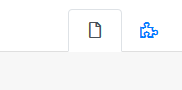
The transform fix did make some icons like .fas-info-circle look better, but complex things like the puzzle piece are still ugly.
 BrainFeeder
on 23 Mar 2018
BrainFeeder
on 23 Mar 2018
@BrainFeeder
WTH happened to 14 is the new 12???
Yes, kinda. The base font size of FA5 is 16px, so you will have issues with all other sizes that aren't multiples of 16px. If you had issues with FA4 and 12px, you will have issues with FA5 and 14px
Now, today, we purchased the latest PRO version.
Please open a new request in the Pro version repository. If you don't have access to that repo, please make sure you have linked your github account at fontawesome.com (in your user settings)
edit: just seen your issue on the Pro repo
tagliala
on 6 Apr 2018
Related issues
 ojvribeiro
·
3Comments
ojvribeiro
·
3Comments
 douglasdeodato
·
3Comments
douglasdeodato
·
3Comments
 brystfire08
·
3Comments
brystfire08
·
3Comments
 tdolph
·
3Comments
tdolph
·
3Comments
 Eschwinm
·
3Comments
Eschwinm
·
3Comments
Most helpful comment
yeah no @dnajar2 that is not a fix... I 'm not sure why they are ignoring this. Its quite embarrassing if you ask me for a project this popular. Not even answering to this numerous posts @davegandy . Really? then we add _PLEASE HELP US txt_ file everywhere to support a project? Just get a grip. Can you also remove this from the main font awesome page:
https://gyazo.com/e52acfc3306d8cf90472a632837582c3.png
Unless you fix this ticket that statement about font awesome is a straight lie.