Font-awesome: Bug with icons of sort
-
The icons:
- sort-alpha-asc
- sort-amount-asc
- sort-numeric-asc
Have a bug in my opinion, they should have the arrow UP, not down, as the -DESC icons.
 rafaelss95
All 23 comments
The label on the right side of the arrow is inverted, it is Z-A instead of A-Z.
This design is based on glyphicons' one
Leaving this open for discussion
 tagliala
on 24 Jun 2016
tagliala
on 24 Jun 2016
The arrow represents the reading order, from top to bottom, which is how we usually list items.
The asc/desc is represented by what's on the right:
- A to Z for ascending alphabetics, Z to A for descending
- 1 to 9 for ascending numerics, 9 to 1 for descending
- smaller to bigger for ascending amounts, bigger to smaller for descending
Everything is fine by me.
 vjacquet
on 24 Jun 2016
vjacquet
on 24 Jun 2016
I thought about this too. Intuitively, I expected the arrows to flip.
Right now, the symbols switch place, while the arrow stays pointing down. An alternative approach would be to let the symbols stay where they are, but flip the arrow instead.
Example (including the proposed sort-other-):


I think it I would prefer them to the type that is included now.
 Jacco-V
on 25 Jun 2016
Jacco-V
on 25 Jun 2016
If I think about it, imaging that icon on the first row of a table

:confused:
tagliala
on 25 Jun 2016
If I think about it, imaging that icon on the first row of a table
Could you clarify what you mean?
Jacco-V
on 26 Jun 2016
The meaning is the same for both: "As on top, Zs on bottom"
The arrow indicates the direction of reading, but if I imagine those icons on the heading of a table, :arrow_up: doesn't make sense, because I'm reading from the top to the bottom in both cases
tagliala
on 26 Jun 2016
How Microsoft Excel deals with this:

tagliala
on 26 Jun 2016
No need to agree with me. Just gave my opinion because the issue was left open for discussion. I would _personally_ prefer the arrow to change direction, instead of the letters changing position. At the same time, this is not a priority change by any means, just a 'would be nice to have'.
Edit: funnily enough, Microsoft's 'Custom sort' has the arrows pointing both ways :-)
Jacco-V
on 26 Jun 2016
I'll put in my 2¢. I think the recent change to just switching the arrow is misleading. If you have a list or table, you're always reading top down, not bottom up, so to me the Excel way makes more sense. And the old way of doing ascending/descending, because to me it matches conceptually the idea "I want A at the top, Z at the bottom, or higher numbers at the top, lower numbers at the bottom." I struggle to understand how the arrow flipping is "intuitive." Especially if it breaks from a convention established by a ubiquitous piece of software.
 jdhines
on 20 Mar 2018
jdhines
on 20 Mar 2018
I recently upgraded from v4.7 and couldn't believe the change from fa-sort-amount-asc to fa-sort-amount-down ... or is it fa-sort-amount-up. I'm still trying to decide which is which. As jdhines put it, you always read the list from top to bottom.
 houseoftech
on 11 Apr 2018
houseoftech
on 11 Apr 2018
@talbs could you please take a look?
IMHO the point is valid. Apparently, glyphicons also changed their approach 🤔

tagliala
on 12 Apr 2018
I just realized I can get what I want by flipping the up arrow vertically.
For ascending: <i class="fas fa-sort-amount-up" data-fa-transform="flip-v"></i>

For descending: <i class="fas fa-sort-amount-down"></i>

houseoftech
on 12 Apr 2018
@sensibleworld, what do you think?
 talbs
on 12 Apr 2018
talbs
on 12 Apr 2018
I just realized this is implemented differently for fas and fab.
<p>FAS</p>
<i class="fas fa-fw fa-sort-amount-up"></i>
<i class="fas fa-fw fa-sort-amount-down"></i>

<p>FAB</p>
<i class="fab fa-fw fa-sort-amount-up"></i>
<i class="fab fa-fw fa-sort-amount-down"></i>

Is this intentional? Is it documented somewhere?
 totymedli
on 29 May 2018
totymedli
on 29 May 2018
@totymedli That looks to be a glitch triggered by referencing fab, which is our brands style, and does not include the sort icons.
 sensibleworld
on 29 May 2018
sensibleworld
on 29 May 2018
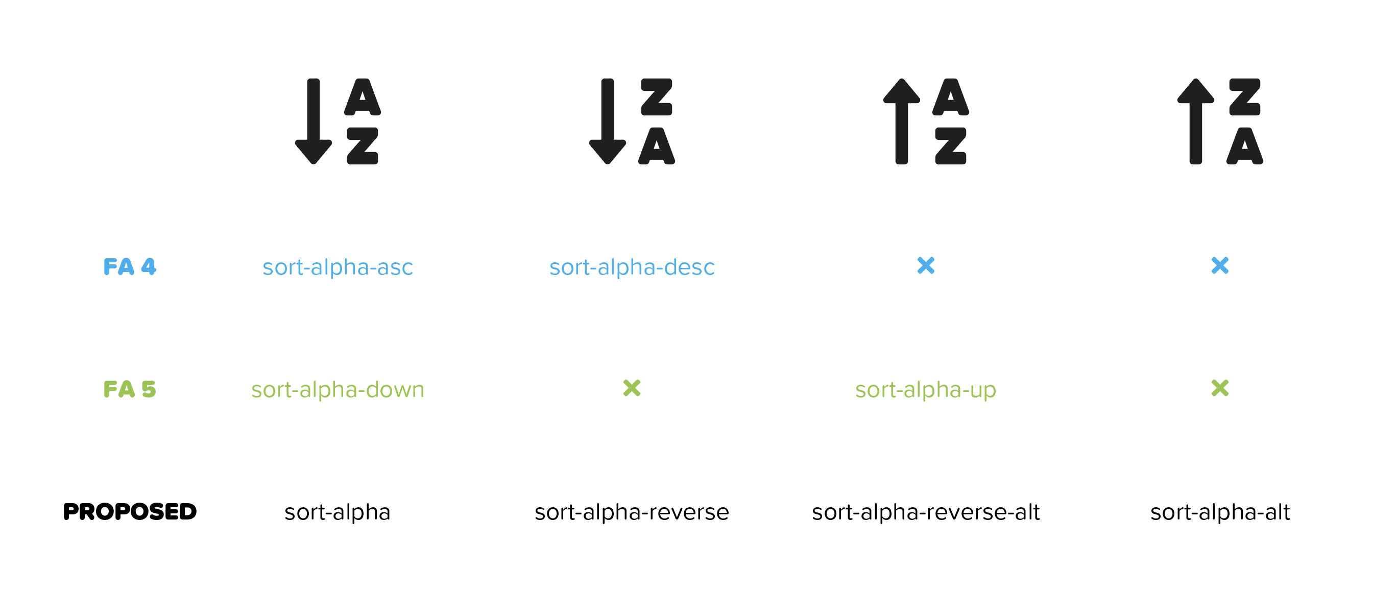
We're finding a lot of clients are having issues with the sorting ascending and descending icons in v5.x vs v4.x
Version 4.x
They appear to understand the icons from version v4.x since it indicates what you expect from the top down with respect to the arrow and value.

Version 5.x
Unlike in v5.x where they appear to be quite confused by the arrow changing position and the values remaining constant.

We're using up and down chevrons on our projects for now since it seems to be a common topic between our applications where the user is just clicking the icons until they get the result they expect to see with respect to the actual data instead of making an informed decision based on the icon. The clients appear to be okay with the chevrons based on ease of understanding, but they appear unrefined in the UI.
 mtpultz
on 25 Sep 2018
mtpultz
on 25 Sep 2018
I was able to tweak the svg using illustrator and replacing the path in the .js files with the new paths to make it look like the old way. I don't know how to fork this to submit a PR or something, but here's what I have for both sort-alpha-up and sort-numeric-up. I replaced them in the index.es.js and the index.js files.
var faSortAlphaUp = { prefix: 'fas', iconName: 'sort-alpha-up', icon: [448, 512, [], "f15e", "M187.3,395.31l-80,80a16,16,0,0,1-22.62,0l-80-80C-5.36,385.24,1.81,368,16,368H64V48A16,16,0,0,1,80,32h32a16,16,0,0,1,16,16V368h48C190.23,368,197.35,385.26,187.3,395.31Zm112.3,76A12,12,0,0,1,288.07,480H252.35A12,12,0,0,1,241,464.14l57.09-168A12,12,0,0,1,309.45,288H349a12,12,0,0,1,11.36,8.14l57.1,168A12,12,0,0,1,406.11,480H370.37a12,12,0,0,1-11.51-8.62l-8.3-28.3H307.69l-8.09,28.23Zm22.86-78.7h13.37l-6.6-22.94ZM335,167.93l67.45-95.7a11.94,11.94,0,0,0,2.19-6.91V44a12,12,0,0,0-12-12H267.67a12,12,0,0,0-12,12V72.93a12,12,0,0,0,12,12h56.46c-.73,1-1.49,2-2.27,3.13l-67.2,95.21a12,12,0,0,0-2.19,6.92V212a12,12,0,0,0,12,12H393.82a12,12,0,0,0,12-12V183.07a12,12,0,0,0-12-12H332.67c.74-1,1.5-2,2.28-3.14Z"] };
var faSortNumericUp = { prefix: 'fas', iconName: 'sort-numeric-up', icon: [448, 512, [], "f163", "M313.24,369.73l-19.45-20.79a12,12,0,0,1,.56-16.95l43.44-40.74A12,12,0,0,1,346,288h31.59a12,12,0,0,1,12,12V427.07h25.66a12,12,0,0,1,12,12V468a12,12,0,0,1-12,12H306.08a12,12,0,0,1-12-12V439.07a12,12,0,0,1,12-12h25.41V369.13c-7.25,6.58-14.21,4.92-18.25.6ZM286.13,96.41c0-32.65,23.86-67.36,68.09-67.36,38.25,0,79.43,28.87,79.43,92.23,0,51.28-32.24,105.77-92,105.77-17.83,0-30.54-3.55-38.55-6.78a12,12,0,0,1-6.92-14.7l9.24-29.48a12,12,0,0,1,15.47-7.72c13,4.61,27.87,5.28,38.1-4.13-38.74,5.07-72.87-25.36-72.87-67.83Zm92.27,19.34c0-22.29-15.3-36.51-25.83-36.51-8.65,0-13.17,8-13.17,15.84,0,5.66,1.82,24.16,25.17,24.16,10,0,13.38-2.15,13.74-2.73A2.31,2.31,0,0,0,378.4,115.75ZM176,368H128V48a16,16,0,0,0-16-16H80A16,16,0,0,0,64,48V368H16C1.81,368-5.37,385.24,4.7,395.31l80,80a16,16,0,0,0,22.62,0l80-80c10-10.05,2.92-27.31-11.32-27.31Z"] };
Here's how they look in an app I'm working on.


I hope this helps someone.
 dually8
on 2 Nov 2018
dually8
on 2 Nov 2018
@dually8 Thanks! Hoping to get this updated in the next release.
sensibleworld
on 2 Nov 2018
Thanks for all the feedback in this thread, folks! We agree that these icons need some updating, as their current implementation is confusing. We're working on an update, but I wanted to get some input before we made any drastic changes.
It seems like one solution is to simply keep all of the arrows pointing down, and having the "content" flip positions. That said, I think there may still room for the reverse to happen (the content remains the same, but the arrow flips). See below:
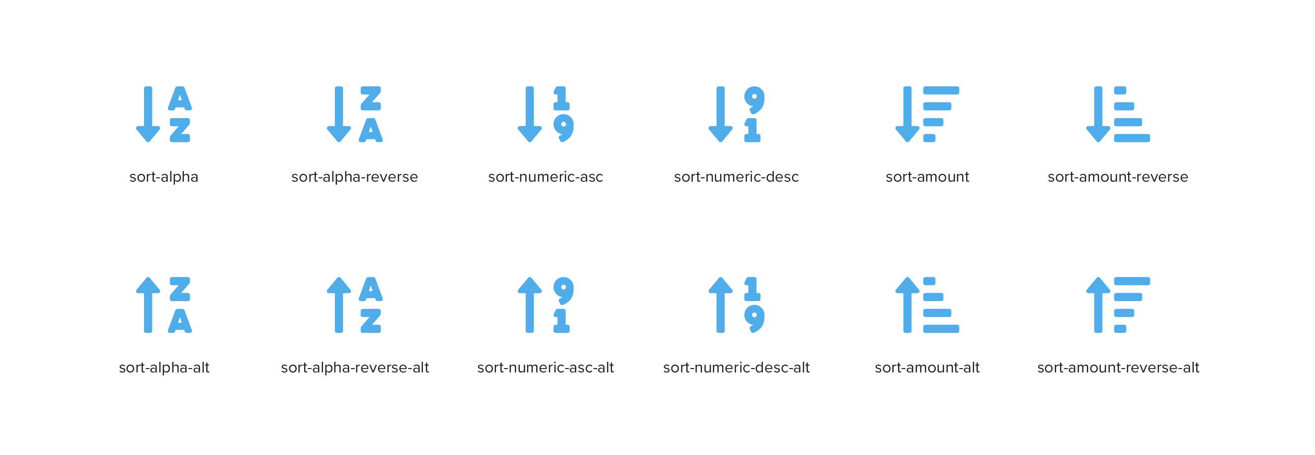
Do the naming conventions here make sense? Any suggested changes?
(cc: @robmadole @talbs)
sensibleworld
on 10 Dec 2018
This is a slightly better representation of the proposed update.
sensibleworld
on 11 Dec 2018
I wanted to offer another update on this issue, as it's been stagnant for a few months. The issue we've hit against is that renaming the icons is not a particularly easy task. Ultimately, this would be a breaking change that has implications across our v4 shim file, not to mention existing installations. We're still working on the best way to handle aliases, which is something that could work here, but we're not ready to take the leap on that quite yet.
All that said, I think I have a solution that should work for now (and maybe forever?). Essentially, we keep the existing icons as they are, but simply add an "alt" for each icon that has the content to the right of the arrow flipped. This way, all existing implementations remain unaffected and we can push the change forward quickly.
There's an added benefit of "pairing" the new icons with existing ones. sort-alpha-down and sort-alpha-down-alt work together in a similar way to sort-alpha-down and sort-alpha-up.
I think this may be the best way forward, but please check me on that and make sure my logic is sound. In the example below, black are existing icons/naming... blue are the suggested additions.

(cc: @robmadole @talbs)
sensibleworld
on 2 May 2019
@sensibleworld that's quite elegant! Even though this issue has had quite a few ups and downs I'm glad you got this sorted out.
 robmadole
on 17 May 2019
robmadole
on 17 May 2019
Alrighty then! We've finally released an update to these icons. It follows the general logic presented in this comment: https://github.com/FortAwesome/Font-Awesome/issues/9464#issuecomment-488652222
https://fontawesome.com/icons?d=gallery&q=sort&s=solid&v=5.9.0
sensibleworld
on 10 Jun 2019
Related issues
 AndersDK12
·
3Comments
AndersDK12
·
3Comments
 sezeresen
·
3Comments
sezeresen
·
3Comments
 huuphat
·
3Comments
huuphat
·
3Comments
 desspro
·
3Comments
desspro
·
3Comments
 jakuuub
·
3Comments
jakuuub
·
3Comments
Most helpful comment
Thanks for all the feedback in this thread, folks! We agree that these icons need some updating, as their current implementation is confusing. We're working on an update, but I wanted to get some input before we made any drastic changes.
It seems like one solution is to simply keep all of the arrows pointing down, and having the "content" flip positions. That said, I think there may still room for the reverse to happen (the content remains the same, but the arrow flips). See below:
Do the naming conventions here make sense? Any suggested changes?
(cc: @robmadole @talbs)