Focus-android: [meta] Multitasking V2
UX meta to track related issues. No milestone attachment necessary.
- [ ] #1248 Revisit Multitasking via tabs
- [ ] #1245 Polish sheet expand/collapse animation
- [ ] #1249 Animate web page switching interaction
- [x] #1231 New tab shows more than first subdomain
- [ ] #1257 Opening shortcuts/links always opens a new tab - even if there is a tab with identical URL open
- [ ] #1363 New tab button
- [ ] #1362 Close tab button
- [x] #1388 Open tab in background
- [ ] #1334 Back button behavior
- [x] #1365
- [ ] #1805 - "Singletasking"
 antlam
All 56 comments
Does this new issue mean that all those things have been moved to a new/later milestone?
 pocmo
on 4 Sep 2017
pocmo
on 4 Sep 2017
@pocmo I'd love if we could do #1245 before but generally speaking, yes.
As a quick note, we won't be assigning these [meta] issues to a milestone, it's mostly for UX to keep track of related issues.
antlam
on 5 Sep 2017
"Please add a proper tabs system maybe by changing the action flow button from delete history to tabs? Opening tabs by holding links to open in new tab is difficult."
 bbinto
on 10 Nov 2017
bbinto
on 10 Nov 2017
Tab management is the last remaining nit that stops me using FFF for all tasks.
Why not just have a button to open a new tab someplace? That's all you'd need.
 vext01
on 24 Jul 2018
vext01
on 24 Jul 2018
1231 and #1365 are closed.
 dimqua
on 7 Aug 2018
dimqua
on 7 Aug 2018
@vesta0 @brampitoyo i think @colintheshots has done some great work on changing our multitasking flow, can we plan to incorporate some of it in 8.0? This issue may be dated so we can close this one and add a new one for @brampitoyo to post his thoughts / mocks in?
 Sdaswani
on 17 Sep 2018
Sdaswani
on 17 Sep 2018
@Sdaswani I have a meeting with @brampitoyo later today to talk about this. @colintheshots and I also talked about it briefly last week. Once we have a mockup I'd like the team to break it down to smaller independent pieces that can be prioritized and I'd love to incorporate some in 8.0
 vesta0
on 17 Sep 2018
vesta0
on 17 Sep 2018
@Sdaswani After talking with @vesta0, we have decided on a few features that we like to consider for multitasking v2:
1. Open fresh new tabs quickly
Opening a new tab that contains a link of your choosing (not just link contained within the page you already have open) should be faster and simpler compared to other browsers.
In this mockup, “Open in new tab” is a new action that we add to our URL bar and keyboard.

Why it’s faster and simpler
Other browsers
- Tap multitasking button.
- Tap (+) button to open a new tab.
- New tab page opens. Tap on the URL bar.
- Type URL or search keyword.
- Type “Return” or “Go” on the keyboard.
Firefox Focus
- Tap URL bar.
- Type URL or search keyword.
- Tap “Open in new tab” button
- Alternatively, tap-and hold the “Return” or “Go” key on the keyboard, to pop open an “Open in new tab” button.
2. Get to an open tab quickly
Finding a tab that’s already open should be faster and simpler compared to other browsers.
In this mockup, you’d be able to search your open tabs by simply typing its name on the URL bar.
Why it’s faster and simpler
Other browsers
- Tap multitasking button.
- Tap “Find tab” (most browsers don’t have this; if they do, you need to hunt for the find box).
- Type tab name.
- Go to tab.
Firefox Focus
- Tap URL bar.
- Type tab name. Tab thumbnail appears on the side.
- Go to tab.

3. View all open tabs
This is a tricky one to justify. Having a tab list view doesn’t differentiate us from other browsers. And if we do build one, it’s very hard to make it quicker, faster and simpler to access.
However, since we don’t show anything when you tap on the URL bar, why not give this UI some superpowers?
- Tap URL bar in order to:
- Highlight current URL
- Show list of tabs underneath current URL:
- Current tab is highlighted (no need for tab name, because you already see its URL above)
- Every other tab is shown
- Start typing on the keyboard in order to:
- Go to a URL (manually or autocomplete, open in current tab or open in new tab)
- Search for keywords (verbatim or using suggestions)
- Find open tab in the tab list view.

This tab view isn’t really faster or simpler to access than other browsers, but it fits in with other components that we’ve designed as part of multitasking v2.
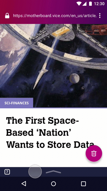
4. Close individual tabs
This is an easy one to design for. We can simply add some close “x” buttons to the side of each tab (whether it’s a tab name or a thumbnail).
Remember that our goal is to help privacy-concerned users get to their destinations quicker. If we can make things quicker, faster and simpler to access compared to other browsers, it’s probably a good starting reason to build it.
 brampitoyo
on 18 Sep 2018
brampitoyo
on 18 Sep 2018
In addition to this, it will help to user test multitasking UIs in other browsers and find out where they’re lacking. Although you can argue that our multitasking use case is quite different (because people frequently wipe all their tabs clean!)
brampitoyo
on 18 Sep 2018
Looks very interesting @brampitoyo ! @colintheshots your thoughts on this fits in with your refactoring work, i.e., hopefully you can use that MVP as a base for this work?
Sdaswani
on 18 Sep 2018
Also @brampitoyo should we replace this experience as the multitasking experience, or A/B test it with the old one? What about user education of the new experience (e.g., can these be explained in tool tips)?
Sdaswani
on 18 Sep 2018
Hi,
A firefox focus user here.
I'm really glad that this is being tackled. Since "request desktop site" and "find in page" have been implemented, I feel that tab management is the only lacking feature in firefox focus.
The proposed interface sounds efficient, but I wonder if it's obvious enough? And by that I mean, if I had not read this thread, would I know to:
- tap the location bar to see a list of open tabs?
- tap in the location bar to open a new tab?
I suspect the answer would be no, so why not add these actions into the vertical dots menu next to the location bar too?
Have you though about whether to keep the circle in the bottom right, with the number of open tabs? Under the new proposal it seems redundant, and covers part of the web page.
Cheers!
vext01
on 18 Sep 2018
Thanks for the feedback @vext01. User education / feature obviousness is a huge concern!
Sdaswani
on 18 Sep 2018
@Sdaswani the idea is to build a new approach to tabs and replace the existing multitasking experience so yes we definitely want to A/B test it first. And if we decide to go ahead then we need to explore user education components such as contextual onboarding, interactive tutorials, home screen tips, etc.
vesta0
on 19 Sep 2018
@vext01 This is a very important point to address:
[…] sounds efficient, but I wonder if it's obvious enough? […] would I know to:
- tap the location bar to see a list of open tabs?
- tap in the location bar to open a new tab?
Since the location bar is a starting point to go anywhere on the web (whether it’s browsing or searching), we think that all users will tap on the location bar at one point or another, and see what’s inside it.
Currently, we don’t show anything inside until they start typing a new keyword or URL – then search suggestions would show up.
There is a subset of users (I believe not in the majority) who will never see what’s inside the location bar. They always type new URL by erasing their history first and returning to the start screen. For them, multi-tabs is clearly not on their mind. They’re fine with “single-tasking”.
Ok. We’ve now established that:
- Almost every user will tap on the location bar
- The area underneath the location bar is currently empty
Our job is twofold:
- Convey the fact that the new, visual tab manager has now moved from inside the FAB, to underneath the location bar
- Teach users to reverse their habits (which is really tough)
Every other browser does this:
- Open a blank new tab first
- Then type URL
Our proposal was to do this:
- Type a URL first
- Then open it in a new tab
My first concept is to have a button on the bottom of the screen that visually says “tap here for the URL bar” when you have no tab open, and “tab here for the tab list” when you have more than one tabs open?
Unfortunately, to have a bottom bar, we’ll need to move the Erase Floating Action Button somewhere close by. I’m afraid that this will disorient some users.
Something like this:

My second concept is to avoid having users reverse their habits, and have an “Open new tab” button available directly underneath the URL bar.

In terms of being obvious, this concept is much more self-explanatory.
But there are two negative aspects to it:
- By adding an “Open new tab” functionality underneath the URL bar, the UI now tries to do too much. Tapping on the URL bar should allow users to edit their URL (and opening the URL they’ve edited in a new tab, if they choose). But now, it can also open a new tab – this is a feature that has nothing to do with URL editing.
- For users who are “single-taskers” (I argue that there’s a sizeable percentage – our stats say that most of our users erase while only running one tab), Focus loses its simple and pure browsing experience. The “Open new tab” button is so obvious, prominent, and unavoidable.
The benefit of my first approach (posted 2 days ago) is that, just like our current multitasking, it’s totally optional. We believe that people uses Focus differently than they use any other browser, so multi-tasking isn’t required.
But you can also argue that making multitasking optional means that it’s not as accessible as it should be. And a less accessible multi-tasking means that our users aren’t using Focus as much as they can.
To solve that specific problem, there’s also something to be said for giving users the option of staying on a single-tasking mode, when they first tap on the new URL bar:

That’s it from me this week. I hope these mocks can generate some good discussions, and I’ll approach it again with a fresh mind next week.
brampitoyo
on 20 Sep 2018
Coming back again to some multitasking explorations.
Recall our design goals:
- Open new tabs quicker than other browsers
- Getting to the right tabs quicker than other browsers
We bumped into some problems:
- In every other browser, users open a blank new tab, then type a URL. Typing the URL before opening a new tab feels upside down.
- In every other browser, the URL bar is used for searching, not for tab navigation.
So we need to accomplish both of these things simultaneously:
- Tasks should be achieved more quickly and feel simpler, minimal and more lightweight
- But we can’t break expectations of how multitasking are supposed to work
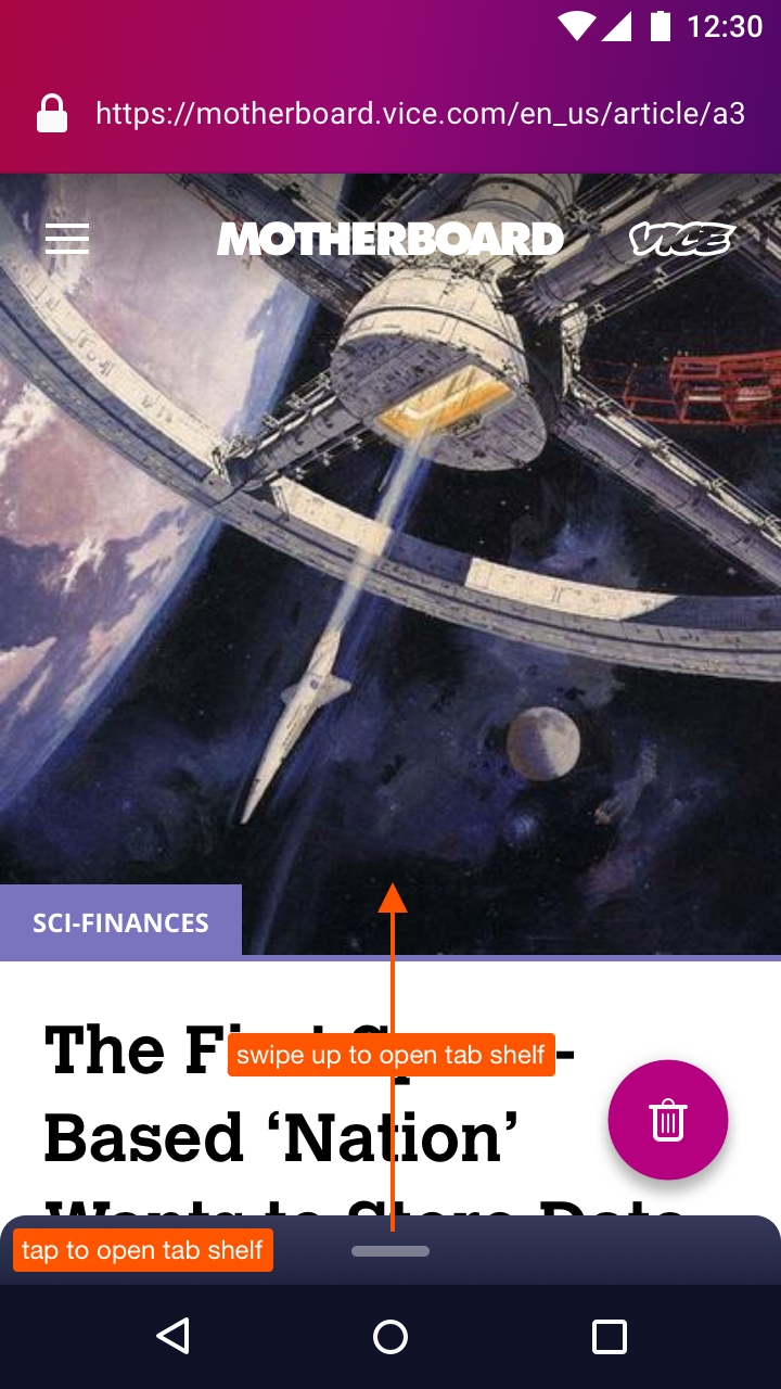
In this iteration:
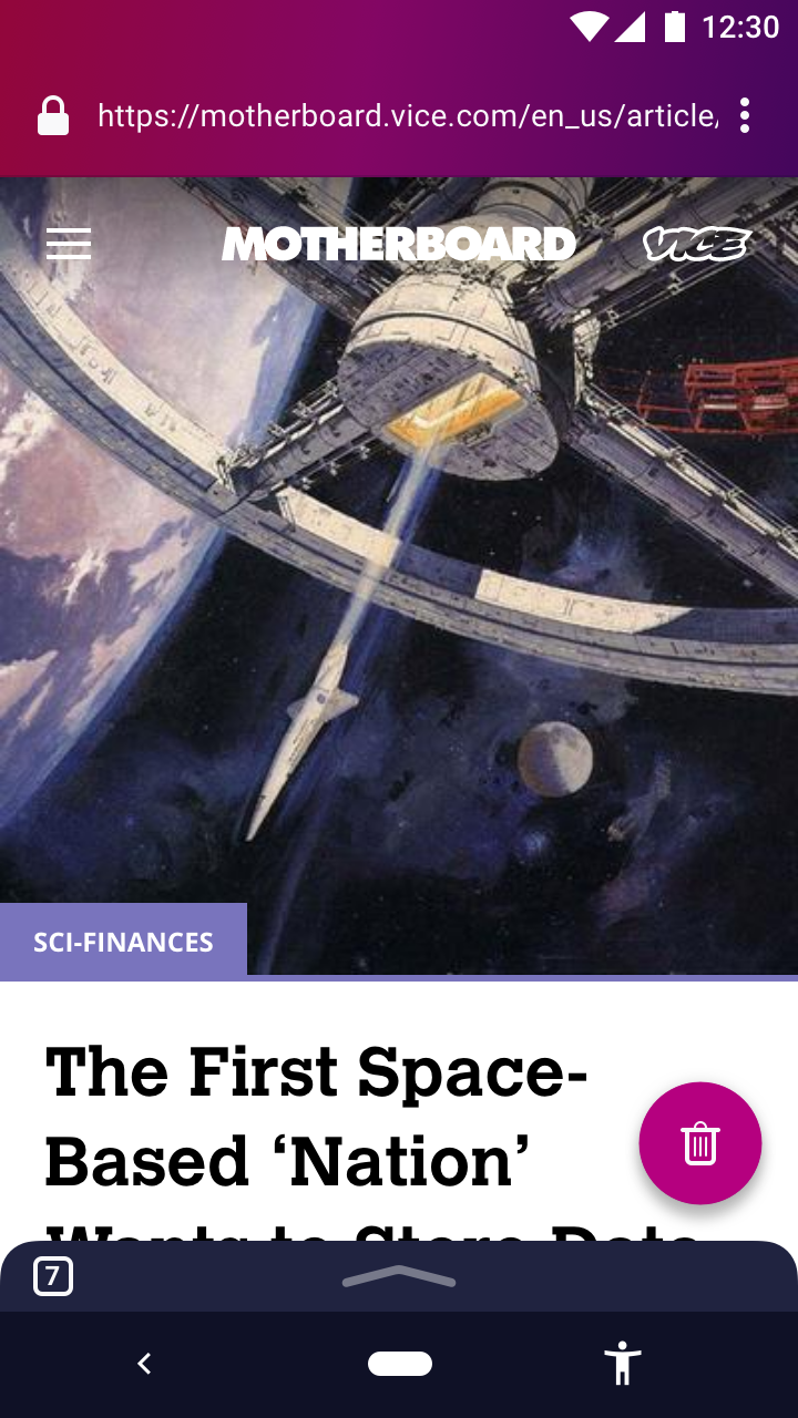
- Like other browsers, the URL and tab views are separate.
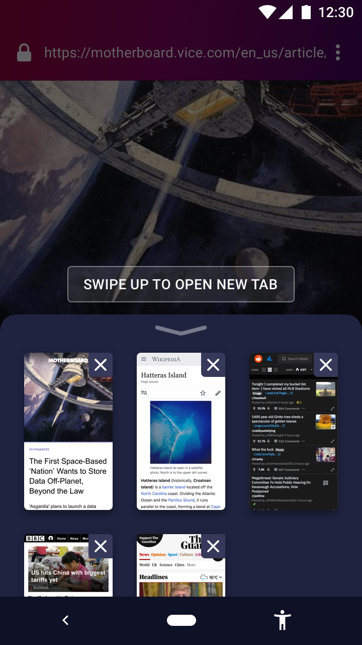
- To see all your tabs, flick up on the handle or drag it halfway up. Our data tells us that Firefox Focus users don’t open so many tabs. This “tab shelf” gives you just enough space to see 4–6 tabs at once. Scroll down the shelf to see more.
- Ultimately, opening new tabs should be faster and feel more lightweight compared to other browsers. We have many ways to do it:
- When the tab shelf is minimised, drag the handle all the way up. This means that you can open a new tab using one gesture!
- When the tab shelf is open:
- Flick up one more time
- Drag the handle the rest of the way up
- Tap the “New Tab” icon
- What happens to the existing multitasking button? It remains consistent as an “Erase” button all the time. @vesta0 noted that some of our users wanted the Erase button to not be mixed up with the Multitasking button. This design keeps them separate.
- Phone screens get bigger with every generation. It’s reasonable for our users to expect the address bar to be located up top. This is how every other browsers do it. But maybe we can try something ergonomic and reposition our URL bar down the bottom of the screen, so it’s more accessible by thumb?
- Either way, tab shelf and opening new tabs can still be accessed easily:
- If the URL bar is on the bottom, flick/drag up
- If the URL bar is on top, flick/drag down
- Either way, tab shelf and opening new tabs can still be accessed easily:

brampitoyo
on 25 Sep 2018
@brampitoyo should we expect new mocks?
Sdaswani
on 25 Sep 2018
@Sdaswani Yes. I’ve just posted new mocks up above, and will keep iterating on this design until I find something that ties all the loose ends together.
It looks like we’re starting to solve some of the problems already:
- Would users know to tap the URL to see a list of open tabs? Previously, the URL is doing double duty as a tab viewer. Now, the tab shelf is a separate UI that’s located nearby the URL, but accessed by flicking/dragging.
- Would users know to tap in the location bar to open a new tab? Previously, you need to look for the “Open new tab” icon and tap it. Now, “Open new tab” is located inside the tab shelf, not the URL bar. And you can open a new tab with one gesture (drag all the way to the top), so it’s actually quicker than other browsers.
- The only hitch: the new proposal seems efficient, but does it seem obvious that you can drag up to access the tab shelf and open a new tab? Maybe we need to change the handle icon into an upwards arrow. I’m not sure. But I was betting on the fact that having the handle alone is enough of a visual indicator that the user can swipe up (it works on Android 9.0 Pie and iPhone X, so it should work for us, right?)
brampitoyo
on 25 Sep 2018
Our data tells us that Firefox Focus users don’t open so many tabs.
I don't know about other users, but I do not usually open more than few tabs in Focus, since I can't close them after reading if I want to, see #1362.
reposition our URL bar down the bottom of the screen
Great idea, FYI the similar approach for multitasking is using by the FOSS-Browser.
dimqua
on 25 Sep 2018
Wow the URL bar at the bottom - does it auto-hide on scroll like it currently does at the top? I wonder if this could work if we kept the URL bar at the top still?
I'm not opposed to this change but it's a big change so we may want to user test it. Up to @vesta0 though.
Sdaswani
on 25 Sep 2018
Wow the URL bar at the bottom
Maybe I'm missing the point, but the UI doesn't need a total overhaul, you just need to add a "new tab" button somewhere. Then Focus is feature complete for me :)
vext01
on 25 Sep 2018
Then Focus is feature complete for me :)
Well, perhaps reading mode, but that's another story.
Thanks!
vext01
on 25 Sep 2018
Fair point @vext01 - we also have to work on tab management, but I promise we'll keep it simple and direct. :)
Sdaswani
on 25 Sep 2018
@brampitoyo I really like your innovative approach! It would be great to do some user testing to see what approach is more intuitive for an Android user while providing quick and simple tab navigation. Also mapping out the user journey (1-2 use cases) will help us understand which design aligns better with other features within the browser.
vesta0
on 25 Sep 2018
@vext01 @dimqua Thanks for your feedback!
While repositioning the URL bar down to the bottom of the screen is a great idea (one-handed navigation), I also agree with @Sdaswani and @vesta0 that it will need a lot of testing, and has little to do with multitasking.
Besides, the idea can still work even if we keep the URL bar up top.
So I’m updating my proposal to address that.
Now the URL bar sticks on top of the screen. The tab shelf sticks on the bottom of the screen. The Erase button stays where it is currently, with no change in functionality.
To open a fresh new tab, you can either:
- Access the tab shelf by tapping on it, or flick it up. Then, flick up one more time.
- Or, swipe up from the minimised tab shelf, most of the way towards the top of the screen.
Method 1 is shown in this demo video
Method 2 is shown below:

Let’s map out our user flow, and see whether our design really makes things faster.
There are three main use cases for multitasking, ordered by most to least common:
- Opening URLs contained within the current page in a new tab
- Opening unrelated URLs in a fresh new tab
- Finding/revisiting URLs already opened in a tab
In all mobile browsers, opening URLs contained within the current page in a new tab is a very common action. In fact, we already have this feature today. You can do it using the long-press context menu:

Opening unrelated URLs in a fresh new tab is less common, but is still very important. This multitasking v2 issue mainly deals with this problem:

Finally, finding/revisiting URLs already opened in a tab is even less common, but it doesn’t hurt to have it if we can shorten the steps:

You can see that, generally, our design shorten the steps that it takes to accomplish the tasks above.
brampitoyo
on 26 Sep 2018
Wow @brampitoyo I love what you have done here - I think Method 1 is a winner!
Sdaswani
on 26 Sep 2018
@Sdaswani Best of all, we can do both!
In the beginning, almost everybody will perform method 1: open/tap on tab shelf, read instruction, then swipe up again to open new tab.
Pretty soon, some users will learn that method 2 is available. It’s what would happen if you perform method 1, then instead of stopping in the middle, you continue to hold and swipe up.
In the end, some would prefer method 1 (flick twice), and some would prefer method 2 (swipe most of the way up). That’s fine. As long as opening new tabs feel light and fast, our goal is achieved.
brampitoyo
on 26 Sep 2018
Understood @brampitoyo Method 1 shows JiT info and then users learn and we go to Method 2, just like our home screen tips disappear when folks demonstrate they have learned. Awesome!
Sdaswani
on 26 Sep 2018
I'm concerned about wasting of space at the bottom which is used just for showing a number of tabs.
dimqua
on 26 Sep 2018
Hmm that is a fair point @dimqua .
Sdaswani
on 26 Sep 2018
I'm concerned about wasting of space at the bottom which is used just for showing a number of tabs.
I think it'll be more nice to have to have URL bar at the bottom of screen as some user with large screen have some problems with interacting with URL bar which is at the top of screen and isn't easy to tap , it'll be convenient to have URL bar at bottom, but both designs are fine.
 Scripterr
on 26 Sep 2018
Scripterr
on 26 Sep 2018
I don't see any downsides of keeping URL bar at the top for now, since an option to place it at the bottom can be probably implemented in the future.
dimqua
on 26 Sep 2018
Good point, @dimqua and @Scripterr.
I agree that the space at the bottom is a little problematic right now.
First and foremost, this area needs high affordance – to look and feel like you can interact with it. It might be difficult to find out that you can drag/swipe on this area without some sort of an indicator. The number of tabs icon make it look tappable, but not necessarily drag/swipeable.
In the revised mockup below, I’ve added an upwards arrow, but kept the number of tabs. The arrow makes it look and feel like you can drag it upwads, and the number of tabs makes it look tappable (for people who really prefer to tap – and actually, you can tap anywhere in this area).
If we’re now concerned that this area now looks visually busy, we can remove the number of tabs icon. I suspect that it’s more useful to know where all the tabs are located, and less useful to know how many tabs you have open.
When the tab shelf has been expanded, you can currently only open new tab using a swipe. You can even swipe all the way up to open a new tab instantly. This is awesome, and will make life really easy for a significant number of people.
What if you don’t have the reaction time needed to swipe a lot, so that tapping is much easier for you?
As explained above, you can already tap on the minimised tab shelf in order to expand it.
What if you can also tap on the open tab shelf in order to minimise it? We can turn the upwards arrow down. It’s clear now that you can drag either drag down the shelf, or tap the downwards arrow to minimise.
Let’s design it so that you can tap on the instruction in order to open a new tab. Notice where your finger goes after it swipes halfway to open the shelf. It’s somewhere in the middle of the screen. Now, the instruction has a button shape around it. It still says “swipe up”, but the button shape will help subtly suggest that you can also tap on it.
With these, you have a lot of flexibility in using multitasking. Just swipes and drags. Just taps. Or a combination of the two.
And if you can master the “drag most of the way up the screen” gesture, you will be rewarded with the ability to open a new tab using only one gesture, which is really efficient and lightweight.
To open the tab shelf, do this anywhere on the minimised shelf:
- Flick up
- Drag halfway up the screen, then release
- Tap the shelf
To open a new tab, do this:
- While the shelf is closed
- Drag most of the way up the screen, then release
- While the shelf is open
- Flick up
- Drag halfway up the screen and release
- Tap the “New Tab” button
To close the tab shelf, do this:
- Tap on an open tab
- Tap anywhere outside the shelf and the “New Tab” button (it’s the area with a transparent dark cover)
- Tap the downwards arrow
- Flick down
- Drag most of the way down the screen, then release
brampitoyo
on 27 Sep 2018
Cool stuff @brampitoyo - I look forward to you finalizing this with @vesta0 so we can start implementing!
Sdaswani
on 27 Sep 2018
Hi @Sdaswani, I’ve talked to @vesta0, and we’ve agreed that the design above is at a stage where it’s ready to be presented to Engineering at the upcoming work week, then implemented.
For the moment, all that’s missing are the updated animations, the Back button behaviour, and some notes about haptics. They’re posted below:
You can tap everywhere, including on the Back button.
You can swipe/drag to open/close the tab shelf, and to open a new tab.
You can swipe most of the way up to instantly open a new tab.
Finally, a note about where to put haptic feedback. It’s the thing that will make this feature feel amazing and nice to use:
No feedback
- When the user taps on a tab to select it
- When the user taps on the dark transparent cover to close the tab shelf
- When the user swipes down to close the tab shelf
Weak feedback (similar to when you press the “Back” system button):
- When the user taps on the up/downwards arrow icons to open the tab shelf
- When the user taps on the minimised tab shelf to open the tab shelf
Medium feedback (similar to when you activate a context menu):
- When the user swipes up and the tab shelf is opened
Strong feedback (not sure if it’s even possible, or a good idea? We can roll back to medium feedback)
- When the tab shelf is open, and the user swipes up to open a new tab
- When the user swipes up all the way to open a new tab (just one feedback at the end)
brampitoyo
on 27 Sep 2018
Why not keep the number of tabs where it is currently (the "Erase" button) to make the arrow thinner, but still tappable?
dimqua
on 27 Sep 2018
Thanks @brampitoyo . We can discuss this in sprint planning tomorrow if it's Engineering ready.
Sdaswani
on 27 Sep 2018
Great job everyone!
@vesta0 asked me to check out the latest ideas and provide some feedback.
I'll start writing this down but would love to talk in person (yeah!) with the team next week.
Without prescribing any solution in particular, I want us to stay focused on the user problems and start with the "easiest", "most obvious" improvements.
1) We probably should assume that we only have one more shot to make it right this time, at least for our release population, therefore I'd suggest our marching order should be, run usability studies on the mocks as early as possible before breaking issues into eng taks. We didn't do that for our v1 and quickly learned that we should have. Which of the ones do we feel the least confident / need early user feedback, could be first tested via e.g. usertesting.com. Let's discuss next week and set deadlines.
2) Can we break this down into different MVPs with specific deliverables: From all solutions, what's the biggest problem users are currently telling us they are facing or data shows that they are not doing. What's the biggest concern? There are lots of proposed changes and I'd suggest considering breaking it into several steps. Is there any solution we can try that we feel confident already will solve some of the user issues. If so, let's talk about it.
3) My 2 cents on reversing users habits (as it relates to open new tab / open existing tabs): Considering a) this feature is not used that often and b) people complain about floating icon, I'd feel comfortable moving ahead with reversing their habits
4) You knew this would be coming: telemetry and A/B testing, should we A/B test? And what are our success criteria measured by pure quantitative data? For example, thinking of retention as one of our big goals, do we assume this will help with retention (I think it will).
The only hitch: the new proposal seems efficient, but does it seem obvious that you can drag up to access the tab shelf and open a new tab?
This could be a good candidate for quick user testing.
bbinto
on 7 Oct 2018
@brampitoyo what is the status of user testing?
vesta0
on 29 Oct 2018
@vesta0 I believe @brampitoyo is waiting on a build from @colintheshots for user testing, but I'm not certain. If @brampitoyo can do user testing without this build that's great, but if not @colintheshots is working on this currently and is about to post the concepts he is working on.
Sdaswani
on 29 Oct 2018
Here are the prototype specs from @brampitoyo 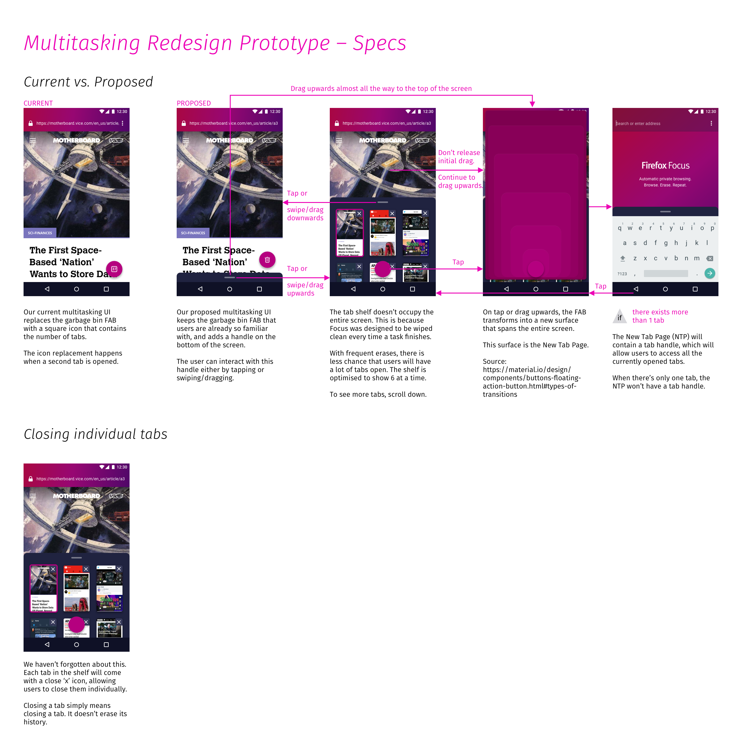
 colintheshots
on 29 Oct 2018
colintheshots
on 29 Oct 2018
Sounds like a plan, thanks @colintheshots
vesta0
on 29 Oct 2018
@vesta0 I’m in the process of writing a research study protocol. I will meet with Heather McGaw later this week and talk through it.
When that’s complete, we can plug the study questions into our user research platform (e.g. UserTesting), along with the prototype APK that @colintheshots is creating.
With both pieces in place, we will then run a pilot study, followed shortly by the full study involving 8–10 participants. Hopefully you and our team will be able to attend and observe!
brampitoyo
on 29 Oct 2018
I'm working on profiling and improving the performance of tabs before the user study. GeckoView tab thumbnail support will come second.
colintheshots
on 14 Nov 2018
TBH I would prefer to hide the bottom panel somehow, maybe just like the floating trash icon does, maybe implementing it on the top panel as an arrow and we just do the same movement but from up to down (I painted this really quickly on GIMP just to let you know the idea (or even removing the arrow at all if there's some "help" option in the menu that describes the whole thing)):

EDIT: BTW I love the idea (if it doesn't use this much space, I feel very stressed with this much space being occupied, like when it happened with IE years ago)
 moshpirit
on 20 Nov 2018
moshpirit
on 20 Nov 2018
Hi @colintheshots, here’s a spec of the tab shelf visual design and behaviour:
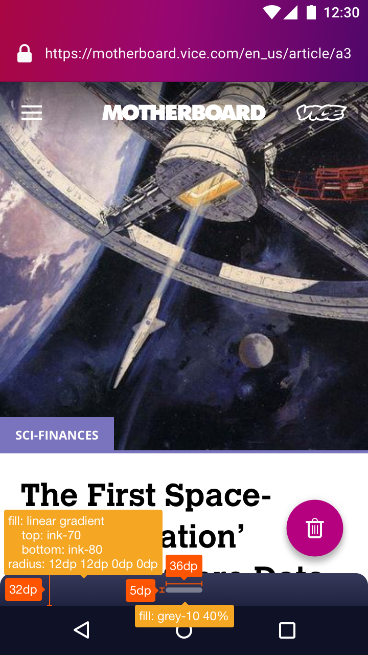


Additionally:
- Just as the erase button and the URL bar would both disappear when you scroll down the page, the minimised tab shelf should also disappear (by moving down). It will reappear when you scroll up.
- The transition between the plus icon and the upwards arrow is a bit too fast. I’ve sent you a new animation which has been optimised to fit the 56dp FAB dimension.
brampitoyo
on 20 Nov 2018
@moshpirit Your concept of having the tab shelf be attached to the URL bar is totally in line with one of the mockups I’ve designed earlier in the process, as shown below:

The mockup you posted was the reverse of mine: URL bar up top, with tab shelf below it.
We ultimately chose to place the tab shelf down below (no matter what the URL bar placement may be) because it’s closer to your thumb and will be quicker/easier to grab.
The “empty” area is put in by design. It’s there to help you have enough space for your fingers to drag down.
As Material Design’s touch target guidelines stated:
Touch targets should be at least 48 x 48 dp.
To save space, we’ve made ours 32 dp high, so technically, it breaks the guidelines. But we hope that having the area extend through the width of the screen be enough to make a large touch target.
One idea from your mockup that I thought was really clever is the fact that you’ve integrated the multitasking (number of tabs) icon in the URL bar. This means that the user can also simply tap on that button to access the tab shelf (in addition to swiping down, of course).
In my mockup, I’ve made the tab shelf not only swipeable, but also tappable.
brampitoyo
on 20 Nov 2018
because it’s closer to your thumb and will be quicker/easier to grab.
I would prefer to have the tab shelf on top and save the space (as much as possible), despite this fact.
you’ve integrated the multitasking (number of tabs) icon in the URL bar
This is not a new idea too, the same approach is used by Firefox for Android.
And this is another reason why I think that the tab shelf placed on the top isn't such a bad idea. As a Firefox user, I used to this.
dimqua
on 20 Nov 2018
@brampitoyo awesome!! I like it on top because of aesthetic reasons but I recognize this is more practical. This is probably up to you.
moshpirit
on 21 Nov 2018
Just as the erase button and the URL bar would both disappear when you scroll down the page, the minimised tab shelf should also disappear (by moving down). It will reappear when you scroll up.
FloatingActionButtons and Toolbars have this complex behavior built into the UI framework. The simplest implementation, without consuming too much time, for a similar behavior with the bottom sheet would be to peek the sheet if hidden on ANY scroll up and hide the sheet if peeking on ANY scroll down. It wouldn't behave identically to the FAB and Toolbar, which only appear when scrolling up near the top of the page. Is this acceptable or should I take extra time to match the same behavior?
colintheshots
on 26 Nov 2018
Bram agreed the current behavior is just fine. At this point, we seem ready for the customer trial. The only remaining issue is there is no disk caching of thumbnails at this point and we sometimes need to regenerate the thumbnails. Some might consider this a feature for forensic security reasons, but it limits us to around nine tabs.
colintheshots
on 27 Nov 2018
@colintheshots Showing 6 tabs at any one time was by design. Focus encourages aggressive/frequent erasure. Because tabs aren’t kept permanently, my hypothesis is that users probably won’t open many to begin with.
The problem is, I don’t know what number this will be and had to made an educated guess. Eventually, I landed at six tabs shown at a time, because it’s close to the limit of working memory according to Miller’s famous paper, “The Magical Number Seven, Plus or Minus Two”.
So I hope that we won’t run into the thumbnail caching issue. Not writing to disk is still a good general principle.
brampitoyo
on 27 Nov 2018
I'm a casual user who is curious about this, and I do have a couple of questions (pardon me if it is inappropriate to ask these questions):
- What is the current status of these changes?
- Would it be possible for me (a totally casual user; yeah I'm a developer also) to participate in customer trials? Is it too late for that now?
- While I think the proposed changes are nice, are we loosing some of the simplicity that the browser originally had? I'm thinking along the lines of _"is this too complicated for my dad?"_
 arjkb
on 15 Jan 2019
arjkb
on 15 Jan 2019
Please make it possible to open new empty tab, or at least make it possible to open entered URL in new tab. This I really miss going from Chrome
 ghost
on 3 Feb 2019
ghost
on 3 Feb 2019
I came here, because I've could not find open new tab button anywhere (also I could not find "report ux issue" button anywhere).
I've searched for the button in following places:
- The FAB. This was for me the most obvious place. I was expecting that (long)pressing it will give me a list of tabs (which it did) with option to create a new one or close some old one (which it did not to my great surprise)
- I've tried clicking address bar, expecting that perhaps some additional ui elements will show (including the new tab button), or at least that I'll be given an option to open url in new tab after typing it. I see you have discussed precisely this solution and it would be perfect for me, and please don't hesitate just because other browsers do it backwards! I do this this way all the time on desktop by using alt enter after typing url in old tab.
- I've searched in menu in upper right corner, because frankly, this was the only place left I haven't checked yet, and if one desperately needs some feature, one will search for it everywhere. However, this only means "click everything which looks clickable". I wouldn't for example come up with idea to swipefromthebottom or shake my phone.
- Ok... actually I did try to swipe to the side, as the last resort.
I think that your logic of "users of FFF do not have many tabs open so..." gets the correlation/causation backwards. If there is no simple way to open a tab, how am I supposed to have large number of tabs? If you need stats, then take them from a browser which has already a great multitasking support, not from your own!
I have currently 17 open tabs in Chrome.
Your product is excellent, I would ditch Chrome instantly if you just give me this "+" button somewhere I could find it.
 qbolec
on 16 Feb 2019
qbolec
on 16 Feb 2019
Hrm, still no way to easily open a tab.
I feel like we are over-thinking this somewhat. Why not just add a new tab button somewhere and deal with the UI overhaul separately?
vext01
on 4 Mar 2019
Related issues
pocmo
·
6Comments
brampitoyo
·
5Comments
 mcomella
·
5Comments
mcomella
·
5Comments
 STPR
·
6Comments
antlam
·
6Comments
STPR
·
6Comments
antlam
·
6Comments
Most helpful comment
I came here, because I've could not find open new tab button anywhere (also I could not find "report ux issue" button anywhere).
I've searched for the button in following places:
I think that your logic of "users of FFF do not have many tabs open so..." gets the correlation/causation backwards. If there is no simple way to open a tab, how am I supposed to have large number of tabs? If you need stats, then take them from a browser which has already a great multitasking support, not from your own!
I have currently 17 open tabs in Chrome.
Your product is excellent, I would ditch Chrome instantly if you just give me this "+" button somewhere I could find it.