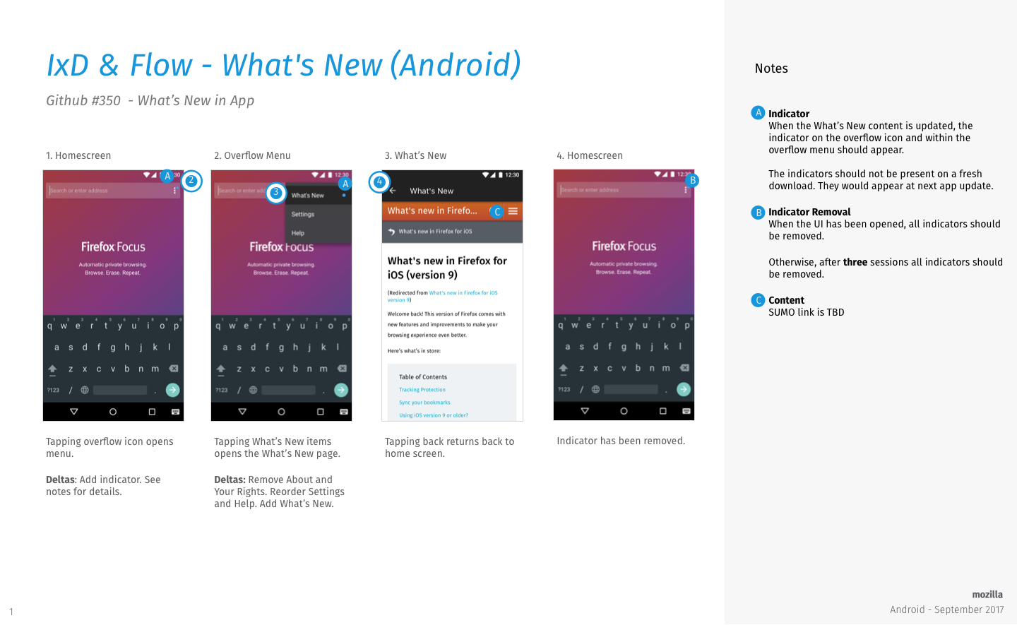
Focus-android: "What's New" in app
We want to inform our users of updates inside the app, rather than via the store update description.
UX to come up with a solution how to achieve that.
Requirements:
- needs to show the content of a What's New SUMO Page
- shows after update of the app
- the presentation does not conflict with the simplicity of the app
- easily to be localized and to be updated if needed (without releasing another app update)
 bbinto
All 18 comments
We could just add a small notification in the search bar with a message below indicating there was an update which can be clicked on to show whats new with the update. I attached a simple mock-up.
updates-focus.pdf
 gonzalde
on 24 Aug 2017
gonzalde
on 24 Aug 2017
also should only be shown when starting a new search and not when browsing other pages
gonzalde
on 24 Aug 2017
Eng: S
UX: L
bbinto
on 28 Aug 2017
We should talk about this next week with the iOS issue (also Ebony, also L)
 antlam
on 2 Sep 2017
antlam
on 2 Sep 2017
Moving to Folly for now, CC @bbinto
antlam
on 12 Sep 2017
Removed old spec pages to eliminate confusion.
Strings are TBD and visual spec is coming.LMK if you have any questions!
/cc @bbinto @pocmo
 lime124
on 26 Sep 2017
lime124
on 26 Sep 2017
@lime124 what's the difference between the top and the bottom spec? Or is this for us to choose what we prefer?
I'm a bit nervous to embed so much localizable text inside the app while features/updates listed in there could potentially fall off the release after string freeze. I was under the impressing we'd be pulling/linking to the SUMO page (which would be up to date at launch & localized).
Thoughts?
bbinto
on 27 Sep 2017
Yeah, having those strings in the app can become a problem. Linking out to SUMO and giving the community indefinitely time to create those pages in languages they can maintain is definitely easier for us!
In Fennec we have this "home banner" concept which shows an icon and message at the bottom of the screen. Almost like a Snackbar[1] with a link. I wonder if that's a helpful concept here too. Visually your design is way nicer than a boring SUMO page though. :)
[1] https://material.io/guidelines/components/snackbars-toasts.html
 pocmo
on 27 Sep 2017
pocmo
on 27 Sep 2017
@bbinto the spec is both pages. there was too much to fit on one page.
@brjones and I discussed that as well and we agree that string freeze makes it a lot more complicated as we don't know what's doing to get in or not until the end of the sprint.
@pocmo is it possible to have the strings on a webpage and then pull them into that UI? Is there something we can do to accomplish both goals.
lime124
on 27 Sep 2017
@pocmo is it possible to have the strings on a webpage and then pull them into that UI? Is there something we can do to accomplish both goals.
It's tricky. We would need a "loading" UI and loading the strings could fail of course. We'd almost build a little second browser for loading and rendering the "what's new" section. My gut feeling is that this would go from "S" to "L" for the engineering part.
pocmo
on 27 Sep 2017
Update: Card UI is TBD, so the what happens when you tap on "what's new" in the overflow menu is not final.
I believe the only strings that need to go into the actual app are:
"What's New" - overflow menu
and potentially "Next" and "Close" - card UI if that goes in
@BrianNJones what do you think of those strings?
lime124
on 27 Sep 2017
This doesn't look like it got updated. @brianNJones approved the strings earlier today.
lime124
on 28 Sep 2017
That's on me, Tif. I forgot to ask Anthony to updated to strings-approved. Thank you!
 BrianNJones
on 29 Sep 2017
BrianNJones
on 29 Sep 2017
Updated to remove card UI. Also here is the visual spec.
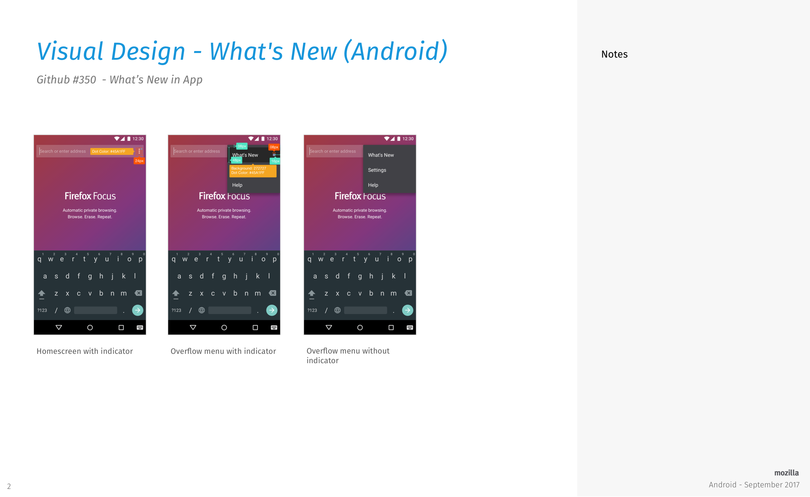
@antlam is going to provide the overflow icon with the indicator.
LMK if there are any questions or comments. Thanks!
lime124
on 4 Oct 2017
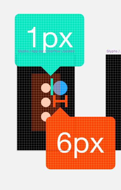
I think I'm going to try drawing the indicator icon in code - at least if it's only a colored circle then creating an "XML drawable" is simpler and it's a tiny file. However I'm unable to read the last spec slide. When opening it at full size the text gets blurry.
pocmo
on 4 Oct 2017
@pocmo if you're drawing the dot in code for the overflow icon, here's a spec that might help.
Blue dot is #45A1FF (Blue 40)
antlam
on 4 Oct 2017
@lime124 How does this look like?
pocmo
on 5 Oct 2017
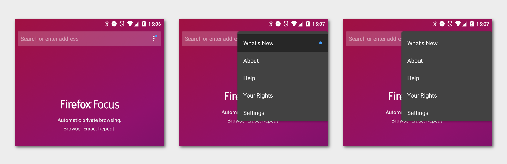
@pocmo and i chatted over Slack. Just a tiny tweak on padding. We're also going to remove "about" and "your rights" for a bit of menu consolidation. That's all I see. Thanks so much @pocmo !
lime124
on 5 Oct 2017
Related issues
 zekooooo
·
7Comments
zekooooo
·
7Comments
 danilodorgam
·
5Comments
danilodorgam
·
5Comments
 uncertainquark
·
6Comments
uncertainquark
·
6Comments
 maykonchagas
·
7Comments
maykonchagas
·
7Comments
 mcomella
·
5Comments
mcomella
·
5Comments