Focus-android: Improve/polish notification
This is how our notification currently looks like (with actions from #826). It looks rather dull and monotonous.
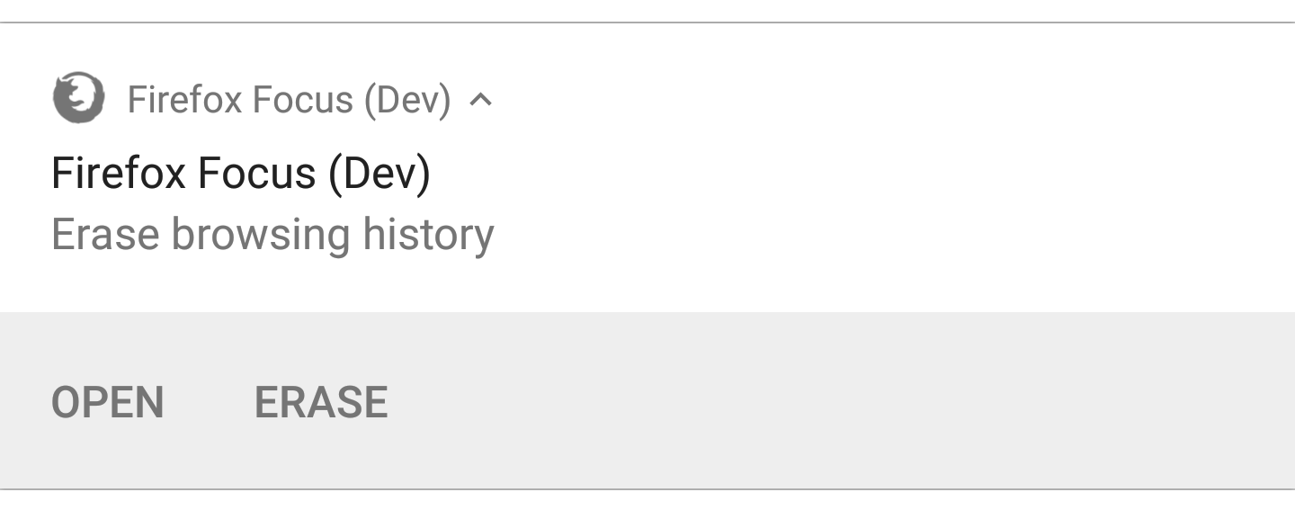
We could at least try to add a highlight color (see follow-up screenshots). Should we also update the wording?
We started with mimicking the Chrome incognito notification - but this one does not feel modern either.
 pocmo
pocmo
All 4 comments
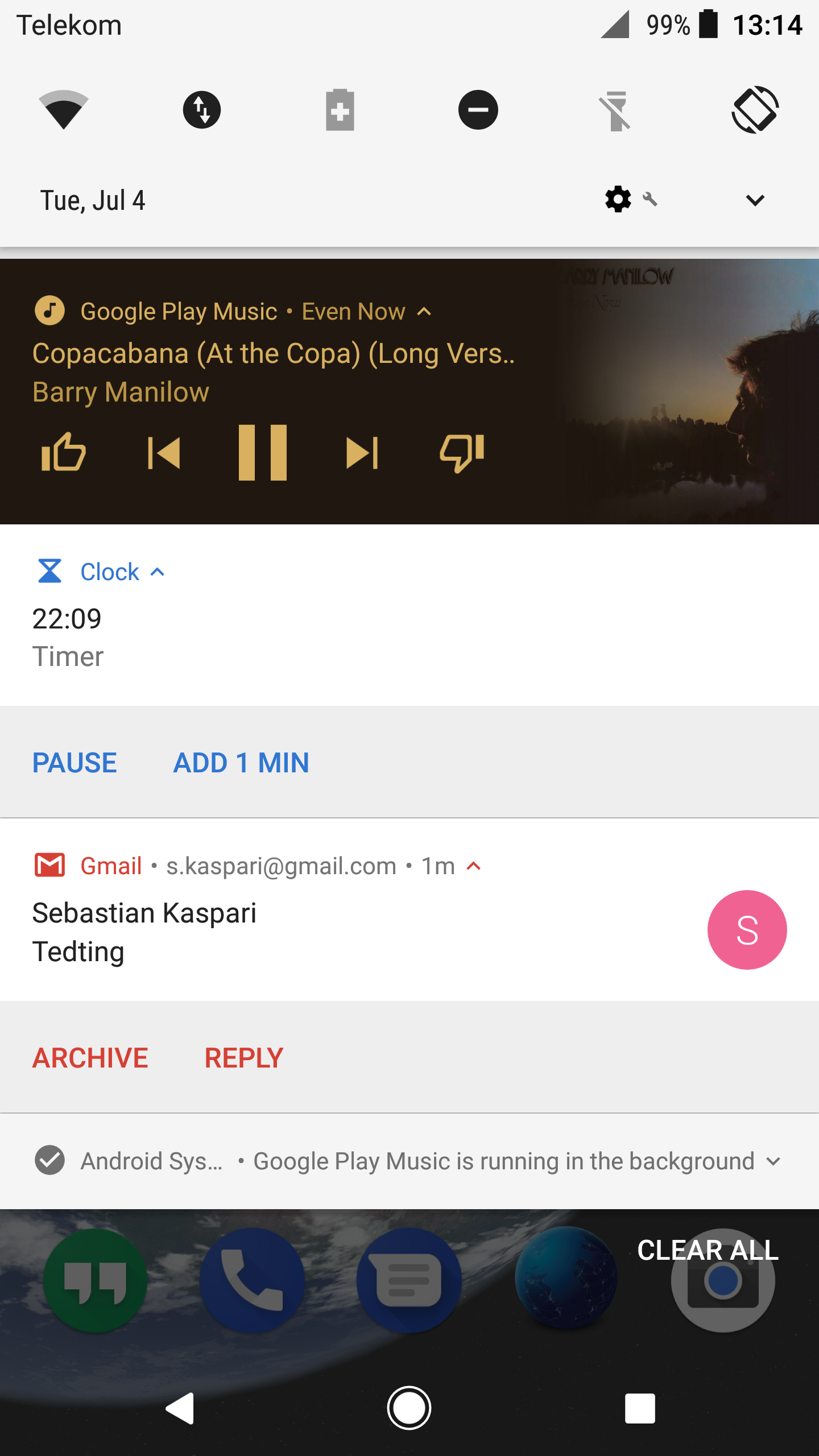
For comparison some other notifications from my device:
pocmo
on 5 Jul 2017
Using the FAB color for the notification:
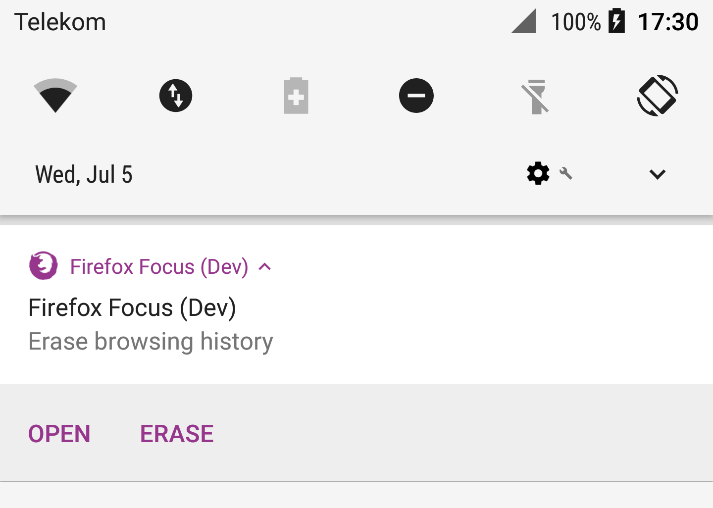
pocmo
on 5 Jul 2017
👍2
❤1
On Android O adding the launcher icon looks interesting too.
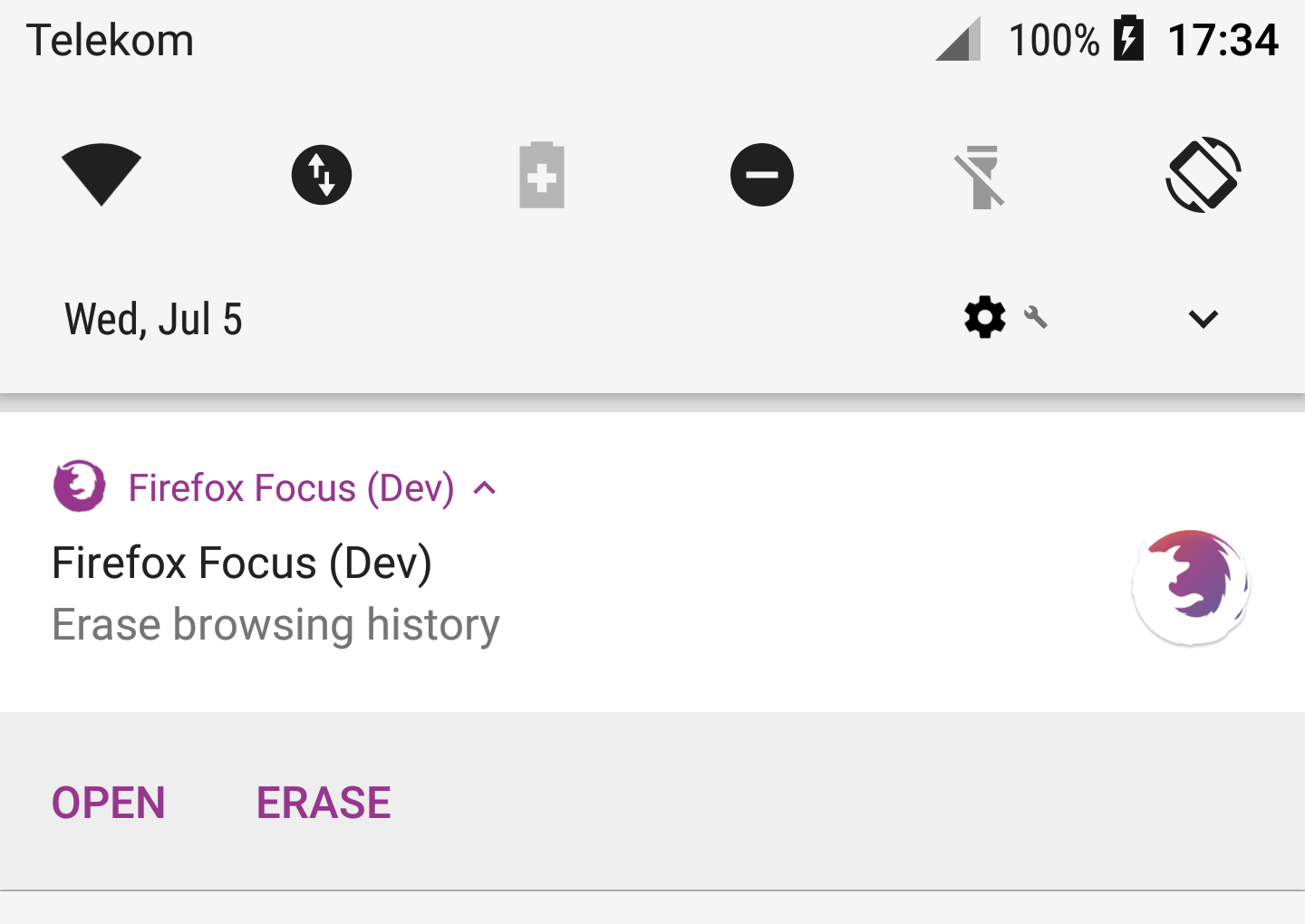
However it heavily depends on the system and Android version how the notification will actually look like (as long as we do not define a custom layout). On my Android 5.1 device the notification looks different and the color is used differently too.
pocmo
on 5 Jul 2017
👍1
looks good!
 antlam
on 5 Jul 2017
antlam
on 5 Jul 2017
Was this page helpful?
0 / 5 - 0 ratings
Related issues
 danilodorgam
·
5Comments
danilodorgam
·
5Comments
 jonalmeida
·
6Comments
jonalmeida
·
6Comments
 rpappalax
·
4Comments
rpappalax
·
4Comments
 zekooooo
·
7Comments
zekooooo
·
7Comments
 STPR
·
6Comments
STPR
·
6Comments
Most helpful comment
Using the FAB color for the notification: