Focus-android: Design icon to show blocking is OFF
The current icon – shield with ‘x’: https://cl.ly/3d1E1W1Q1o2y – isn’t yet final.

We should align this redesigned icon with the rest of Photon iconography.
 brampitoyo
All 40 comments
Android intern is coming next week! This looks like a great first bug :) Would the icons be finalized by then, or does this require more UX time (to be consistent with Photon design)?
 liuche
on 31 May 2017
liuche
on 31 May 2017
@antlam Do you think we can design a Photon-style 🛡 icon next week? We may be able to take what we’ve done in this bug and reuse it for the rest of Photon desktop and mobile.
brampitoyo
on 1 Jun 2017
We moved this after v1 to not rush it - so let's not rush it because of the internship again :)
Apart from the icon I wonder whether "having another button that opens the menu" is the best we can do here. Especially with other potentially buttons showing up. From my point of view there's a disconnect between the things we show in the menu (tracker counter, switch to disable blocking) and the icon in the menu: What does it actually mean? How can the user "explore" it - there's no direct action or detailed information to trigger?
 pocmo
on 1 Jun 2017
pocmo
on 1 Jun 2017


A few Photon-style shield icons.
Source: https://cl.ly/2W0R1B040s33
Thoughts, @antlam & @aminalhazwani?
brampitoyo
on 5 Jun 2017
Icons seen in context of the browser chrome:

brampitoyo
on 6 Jun 2017
@pocmo wrote:
From my point of view there's a disconnect between the things we show in the menu (tracker counter, switch to disable blocking) and the icon in the menu: What does it actually mean? How can the user "explore" it - there's no direct action or detailed information to trigger?
In my opinion, it would be helpful if the shield would pop up a separate menu that’s got an on/off switch, shows how many trackers are blocked, etc. This would effectively set up a direct relationship between the thing-that-is-tapped with the-menu-that-pops-up.
Another potential solution: when you pop the three-dots menu, we carry the same iconography in the blocking area. So the user mental model goes like this:

But then, our original problem was very different:
- We feel that tab bar background colour by itself doesn’t indicate
tracking = off - Something else was needed. But what? Icon was proposed as a potential solution
brampitoyo
on 6 Jun 2017
Thoughts, @antlam & @aminalhazwani?
@brampitoyo 👏 Option 2 and 3 seem to be the more aligned with the rest of the photon icons. We rarely use concave shapes (expect for the pin). I am also wondering if the top part of option 2 is still well perceivable when used at scale in the chrome and if it's necessary to add that level of detail. What do you think? Looking at icons in the mocks I am wondering if a solid icon would better perform compared to a outlined icon.
Beside the icon design is the icon displayed by default of after they disable TP? Do we need to show that TP is disabled if it was their choice? Alternately we could display a thin banner at the bottom which display that TP is disabled and they could either dismiss the notification or open the menu.
 aminalhazwani
on 6 Jun 2017
aminalhazwani
on 6 Jun 2017
@bram also another alternative is to strikes-trough the icon :)

aminalhazwani
on 6 Jun 2017
@aminalhazwani Would you mind sending over the Sketch source file of these icons? The SVGs I’d like to extract the strike-through shape and its right-hand negative space, to see whether they will look nice when applied to the shield.
brampitoyo
on 7 Jun 2017
Hi all! I'm the new intern who will be working on this feature. A few questions that may or may not have answers at this point. TP is controlled by 4 different fine settings, correct? Should the icon be displayed if any of the 4 TP options are off? Have we decided on a desired action to go along with the icon?
 ekager
on 8 Jun 2017
ekager
on 8 Jun 2017
See #443 and #637 for some history context. This icon will only show up if the user disabled blocking in the menu temporarily for the current session. One of the linked issues mentions that the icon should open the menu too (because that's where the user can enable blocking again) - but this is a bit awkward.
pocmo
on 8 Jun 2017
Thanks @pocmo ! I worked on this feature today and have it working with some placeholders. I used the notification icon for now until we have an appropriate icon designed and agreed upon. The icon currently opens the menu. My changes are linked above in my fork.
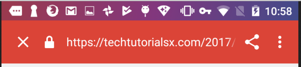
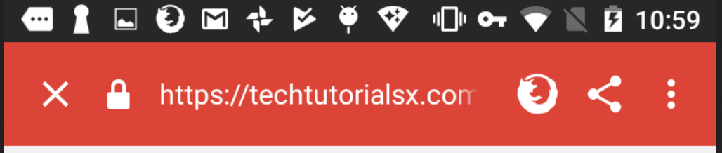
When TP is on:
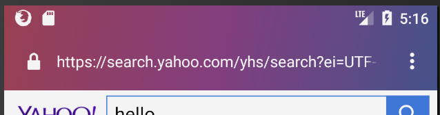
When TP is off:
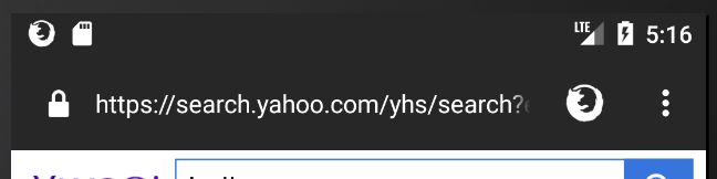
Right now the icon opens the menu:
ekager
on 9 Jun 2017
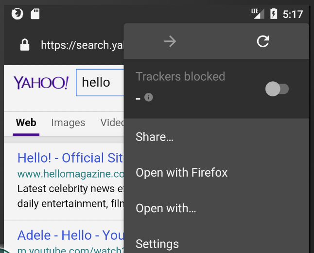
This is looking good! How does it look like in a "custom tab" or on tablets (we have slightly different toolbar there)? :)
pocmo
on 9 Jun 2017
On tablets it is displaying correctly:

On custom tabs I just added it to display as well:
ekager
on 9 Jun 2017
@ekager The idea behind the shield off icon is to make it as closely connected as possible to the three dots menu icon. We’d like to reinforce this connection by positioning them near and always right next to each other (ie. no other button should appear between the two).
Would this be possible?
brampitoyo
on 12 Jun 2017
@bram In one of your previous mocks you had this animation between menu button and shield button. The animation was a bit distracting but what do you think about badging like we do with the menu button on the desktop (and I think some other buttons in Photon?). Or is this too small on mobile?
pocmo
on 12 Jun 2017
@pocmo I like this idea a lot. It also aligns with what @antlam – who knows the Android platform much better than I do – wrote:
I think its more aligned with Android platform too because the icon in the toolbar on Android means something different than “click this icon next to me to see what’s inside”
What I’ve done was redesign the shield icon so the ‘x’ has a one-way slash (fits with the rest of our iconography), put it inside a badge, and use Photon’s shade of yellow.
And the size is alright for mobile, I think.
Thoughts?
brampitoyo
on 13 Jun 2017
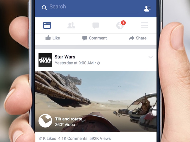
I like that it highlights the menu "There's something in here" - much more than a separate icon. I haven't seen this in another app so far - but it doesn't look alien to me.
pocmo
on 13 Jun 2017
I’ve seen it on Facebook and WeChat, so we know that it’s a familiar pattern!
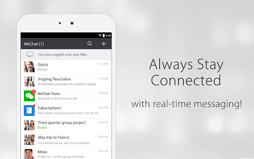
brampitoyo
on 14 Jun 2017
@ekager Here’s the icon asset: https://cl.ly/3V202G1d1Y00/download/blocking_off_white_10px.svg
And here’s the design specs:
Would this be enough information for you to create a new build and see what it looks like?
brampitoyo
on 14 Jun 2017
Hey @brampitoyo ! Thanks for the icon asset. Here are some screenshots after modifying on tablet and phone.
Tablet:
Phone:
ekager
on 14 Jun 2017
@ekager – Looks great!
@bryanbell – We’re using a badge indicator with a crossed out shield to indicate that Tracking Protection is off. What do you think of this icon in relation to the rest of Photon’s iconography?

If you’ve got a Tracking Protection icon in progress or already designed, we should work from that instead of designing our own. If not designed, then maybe we can reuse this icon for TP elsewhere?
brampitoyo
on 15 Jun 2017
@brampitoyo I'm working on surfacing Sync issues (like "verify your account" or "re-enter your login") on Android to be more like desktop. @antlam pointed me to this issue. I think we should follow suit. But the bigger question is: which takes priority? We can't show two at the same time.
 ryanfeeley
on 19 Jun 2017
ryanfeeley
on 19 Jun 2017
@ryanfeeley Agreed. I think notifications that require more immediate attention and can be more quickly remedied should take precedence over notifications that indicates status and tend to stay in place.
brampitoyo
on 19 Jun 2017
We have an icon for this now
You can find a repository of icons here
for Desktop: https://drive.google.com/open?id=0B6F4iApRJzosVTdaZjN3UHY5NG8
Android: https://drive.google.com/open?id=0B4vOYc4rq2YAeW0zbk1ScnBmejA
iOS: https://drive.google.com/open?id=0B4vOYc4rq2YAbXFXUVlGczFsNVU https://drive.google.com/open?id=0B4vOYc4rq2YAbXFXUVlGczFsNVU
On Jun 14, 2017, at 5:17 PM, Bram Pitoyo notifications@github.com wrote:
@ekager https://github.com/ekager – Looks great!
@bryanbell https://github.com/bryanbell – We’re using a badge indicator with a crossed out shield to indicate that Tracking Protection is off. What do you think of this icon in relation to the rest of Photon’s iconography?
https://user-images.githubusercontent.com/51007/27159860-d4b9a120-51bb-11e7-879d-952f58e4d374.png
If you’ve got a Tracking Protection icon in progress or already designed, we should work from that instead of designing our own. If not designed, then maybe we can reuse this icon for TP elsewhere?—
You are receiving this because you were mentioned.
Reply to this email directly, view it on GitHub https://github.com/mozilla-mobile/focus-android/issues/682#issuecomment-308593305, or mute the thread https://github.com/notifications/unsubscribe-auth/AAN-c5YOwSioCr8B_kt1JPepCWt-SWWkks5sEHgJgaJpZM4NrHXo.
 bryanbell
on 20 Jun 2017
bryanbell
on 20 Jun 2017
@ekager Take a look at the Android icons - the icons to use should be the tracking-protection.* files. You should be able to color them white (either in the svg itself or through using android:tint). As part of your changes from review comments, let's swap out the resource as well. Let me know if you need any clarification on any of this!
liuche
on 20 Jun 2017
@brampitoyo We shouldn't have to surface any Sync notifications in Focus because we don't allow people to log into sync, so I assuming the discussion with rfeeley isn't a conversation that's directly impacting this issue - let me know if there are other badges that we might want to show though!
@ekager I don't think you need to worry about changing anything else, because we won't have sync sign-in any any any time soon on Focus :)
The situation of multiple badges is a good case for having a "badging" object class though: it's easier to have a single class manage the state for badges so 1) the main activity doesn't have to show/hide all the subviews, 2) the object can maintain any of its own state that's not really relevant to the main activity (e.g., showing at most one badge at a time, maintaining the priority of which badge should be shown if multiple badges are "on" so the badges don't overlap), which are things that the main activity really shouldn't have to handle, and 3) it would be easier to add additional badges directly to a single BadgedImageView object class, rather than handling them separately (in the main activity).
That being said, I don't think we are handling any new badges (unless @brampitoyo has more ideas), so it could be a good exercise to design a BadgedImageView class, or you could keep the code simple and light (also good!) by just having a method called "enableTrackingProtection(boolean)" that also updates the views.
liuche
on 21 Jun 2017
@brampitoyo @bryanbell Could we get an SVG(*) for this?
(*) https://developer.android.com/studio/write/vector-asset-studio.html#about
pocmo
on 26 Jun 2017
The SVG that @bryanbell had designed can be found here:
https://drive.google.com/open?id=0B4vOYc4rq2YAZ0h5Q3VWMk41Skk
brampitoyo
on 27 Jun 2017
There's been a good amount of discussion here.
@bbinto I think this is ready for triage as well!
 antlam
on 3 Jul 2017
antlam
on 3 Jul 2017
@pocmo We’ve decided against using yellow as the badge background colour in favour of the same purple value that we use for the FAB #96368D.
Thanks to Bryan’s SVG, I was also able to reduce the size of the badge down to 16x16dp (the icon itself is scaled down 50% to 9x10) without compromising recognisability.
Here’s what it looks like. Better looking, and more in line with Photon and the rest of Focus.
brampitoyo
on 4 Jul 2017
Hi @brampitoyo ! I changed the background color, but the SVG is coming out distorted. Have you seen something like this before? Otherwise, do you think it's possible to get a new SVG?
ekager
on 6 Jul 2017
^ @bryanbell I think @brampitoyo might be on PTO - this SVG is distorted when I load it into Android Studio (other SVGs are working fine) do you think you could help or direct me to someone who can?
ekager
on 6 Jul 2017
@ekager This is odd. I’m not sure why the SVG is misbehaving.
It looks like an issue with the fill-rule property, but when I opened the file, it didn’t show that property.
brampitoyo
on 6 Jul 2017
@ekager I took the source icon file and re-run the compression process, it should work now. I tested it in-browser and I was able to change the fill by changing only the fill property of the svg tag. Previously the icon had two paths instead of one. Here's the code:
<svg xmlns="http://www.w3.org/2000/svg" width="24" height="24" viewBox="0 0 24 24"><path d="M17.9 10.825c-.27 2.815-.747 4.185-2.043 5.863a6.488 6.488 0 0 1-3.857 2.3 6.8 6.8 0 0 1-2.317-.92l-1.448 1.447a8.46 8.46 0 0 0 3.657 1.48l.107.01.106-.01a8.406 8.406 0 0 0 5.33-3.084c1.53-1.978 2.148-3.72 2.452-6.894.07-.732.1-2.054.106-3.26L17.954 9.8c-.015.428-.034.783-.054 1.025zM20.207 3.793a1 1 0 0 0-1.414 0l-.306.306a2.044 2.044 0 0 0-.3-.1L12 2.985 5.816 4A2.144 2.144 0 0 0 4 6.1c0 1.667.012 3.873.11 4.915A12.418 12.418 0 0 0 5.8 16.79l-2 2a1 1 0 1 0 1.414 1.414l15-15a1 1 0 0 0-.007-1.41zM6.1 10.826c-.072-.75-.108-2.426-.1-4.718a.148.148 0 0 1 .138-.137L12 5.015l4.79.783-4.79 4.79V7.04L8 7.7c.014 1.967.065 2.74.09 3a11.737 11.737 0 0 0 .626 3.164l-1.46 1.465A11.107 11.107 0 0 1 6.1 10.825z"/></svg>
If you need it smaller for the badge simply change only the width and height svg attributes.
Very soon we are going to update the design system icon website where you will find all icons for all the platforms ready to be used!
aminalhazwani
on 6 Jul 2017
Hey folks, cc @bram! I was re-reading the whole thread and I am wondering if the badge on the menu doesn’t look too much like a notification/alert. As it is displayed right now it seems to require the user to take immediate action. While I see the disabled TP as a message similar to the http/https icon. What do you think?
I understand your reasoning behind placing the badge closer to where you can re-enable TP but I am wondering if we could follow a similar placement as the one we use on desktop so that our users would always see related _connection_ information next to the url. Let me know!
aminalhazwani
on 7 Jul 2017
Hi @aminalhazwani. The badge was expressly designed to look like an alert (ie. when blocking is ON, there’s no badge). The reason why: Firefox Focus is and should be private by default. Ideally, we’d like users to browse without blocking as little as possible. When they do browse without blocking, we’d like them to to turn blocking back ON as soon as they can.
I hope this helps clarify the reason why we had to make the alert so strong, instead of it being a part of the site status (which my mockups had tried to do).
A similar placement as desktop may be necessary if we have multiple tabs where blocking can be OFF in one tab and ON in another. But if that’s the case, then I’d also like to consider moving the blocking control to the Control Center area. Basically, you tap the setting on the same place where a menu can pop up where you can change it.
Thanks for your feedback!
brampitoyo
on 10 Jul 2017
@brampitoyo thanks for your help! 9x10dp looks smaller than your mock for the blocking icon, did I misunderstand your requested dimensions?
ekager
on 10 Jul 2017
@ekager and I chatted about this issue two days ago, and decided to increase the dimension from 9x10dp to 12x13.33 dp. It gives us the closest approximation to the latest mockup.
brampitoyo
on 12 Jul 2017
 bbinto
on 14 Jul 2017
bbinto
on 14 Jul 2017
Related issues
 st3fan
·
5Comments
st3fan
·
5Comments
 runboy93
·
5Comments
runboy93
·
5Comments
 abusedcharacter
·
5Comments
abusedcharacter
·
5Comments
 uncertainquark
·
6Comments
uncertainquark
·
6Comments
 callahad
·
8Comments
callahad
·
8Comments
Most helpful comment
@pocmo We’ve decided against using yellow as the badge background colour in favour of the same purple value that we use for the FAB
#96368D.Thanks to Bryan’s SVG, I was also able to reduce the size of the badge down to 16x16dp (the icon itself is scaled down 50% to 9x10) without compromising recognisability.
Here’s what it looks like. Better looking, and more in line with Photon and the rest of Focus.